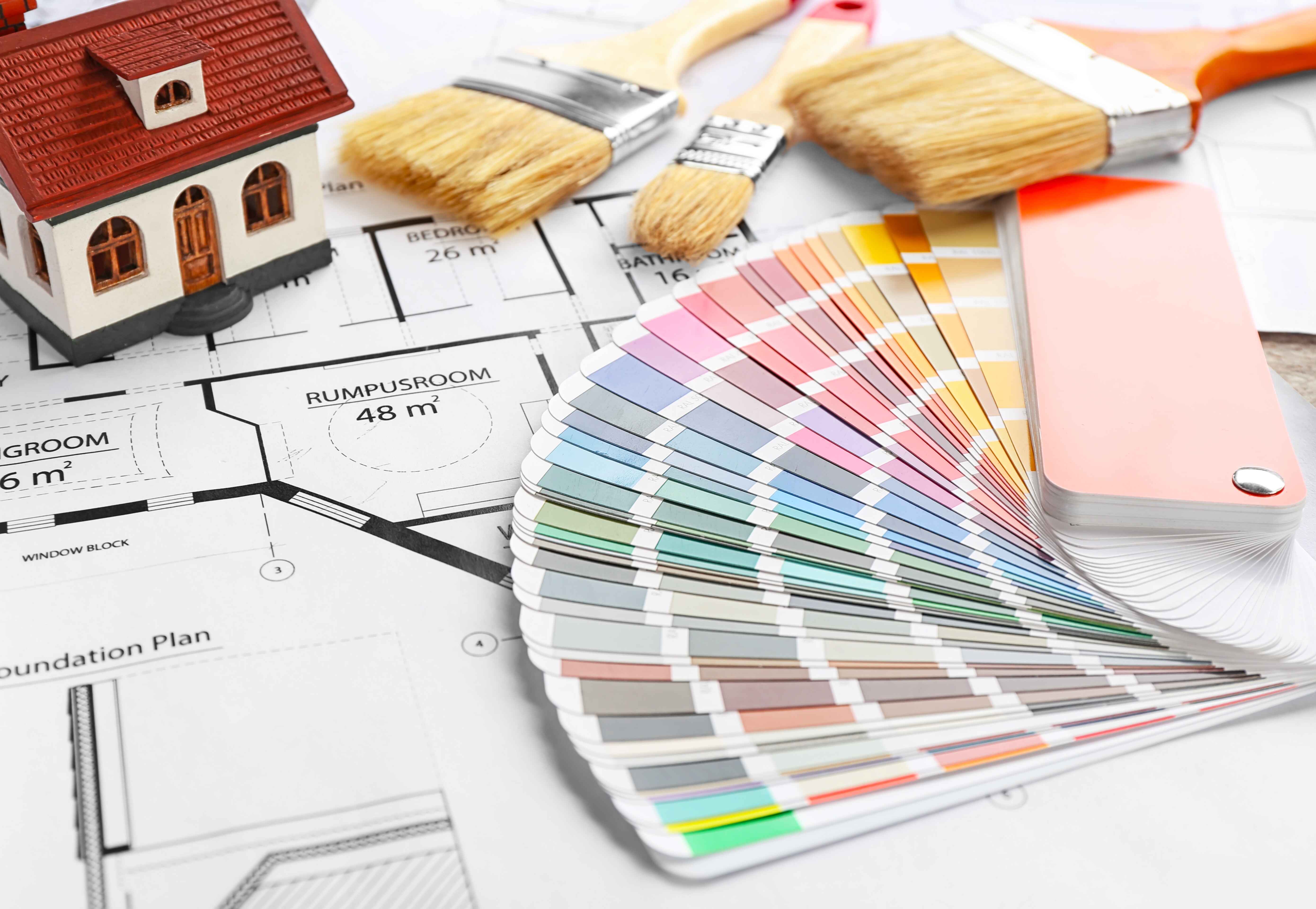
Picking interior home colours might be one of the most fun steps of painting your home. You get to browse through a plethora of options, from the modern grey colour to the classic beige. Every room colour deserves careful consideration.
In this comprehensive guide to interior home colours, we will explore colour trends and the latest wall paint ideas. We will look at the different shades of the most popular colours and break down which room colour is better for a particular space.
Earthy and Neutral Tones
Grey Colour Palette – Winter Waltz, Gentle Dawn and Charcoal Sky
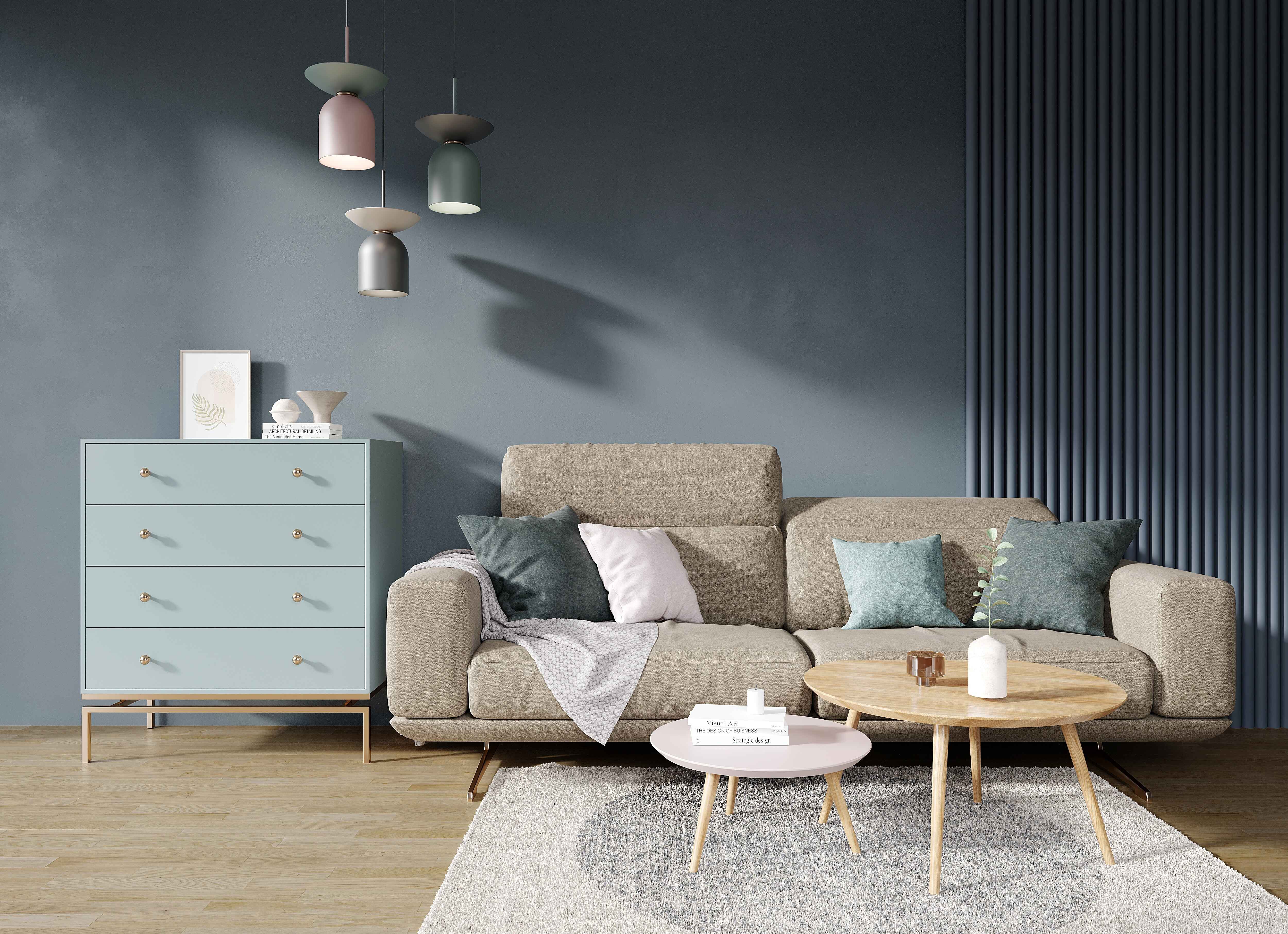
Winter Waltz:
- A soft, cool grey colour shade that is the perfect choice if you’re looking for a neutral paint colour with warmth.
- Winter Waltz exudes a subtle warmth that adds a touch of coziness to your surroundings.
- A perfect choice for those seeking a paint color that complements different design elements.
Gentle Dawn:
- A pastel shade, it is a mix of green and grey colour.
- It is reminiscent of nature and earth.
- Room colour with this shade will give a calming effect.
Charcoal Sky:
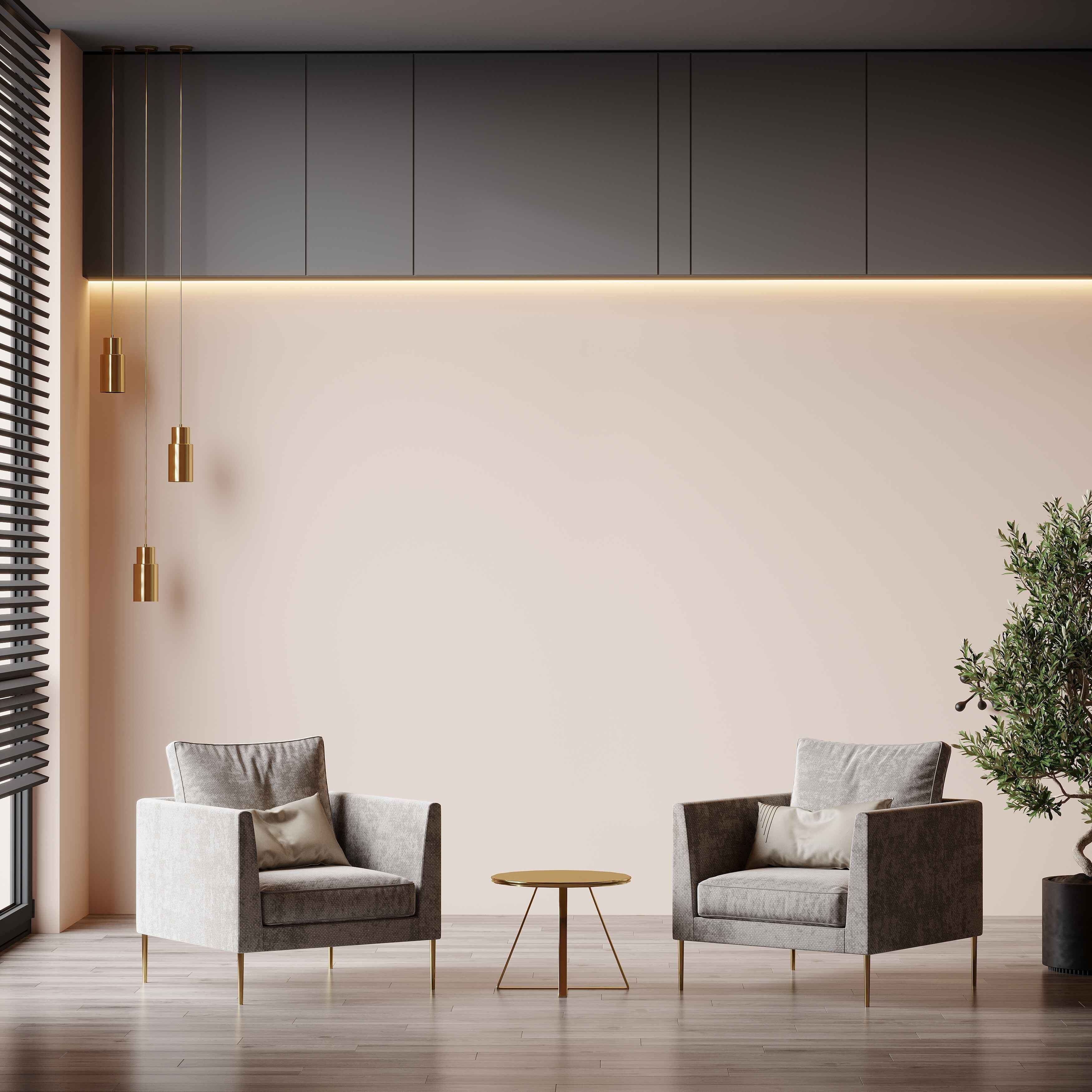
- A muted tone, it is closer to black than to grey colour.
- Colour trends often think of lighter and darker shades of this tone when talking about grey colour.
- Its darker undertones invite a contemporary and bold aesthetic, offering a unique opportunity to play with the interplay of light and shadow in interior design.
Grey colour walls are leading the colour trends in 2024. There are several reasons why it is the latest beloved choice of home decorators.
- Elegance and Modernity: Grey colour is regarded as elegant and modern in its style of fashion. The cosiness it imparts gives a sense of belonging, inclusion, and acceptance.
- Versatility: Colour trends show that this room colour serves as an excellent backdrop for artwork, furniture, drapes, and more.
- Maturity and Sophistication: Above everything, the grey colour is a mature, no-nonsense voice saying – let’s get down to business.
- While it is possible to regard it as the latest paint colour for living room you should go for, grey colour is best suited for spaces like plush home offices.
Want to know more about the extensive list of shades and colour trends? Check out Berger Paints Colour Catalogue.
Ivory Colour Palette – Organic Ivory, Antique Ivory and Porcelain Cup
Organic Ivory:
- A favourite neutral shade of colour trends.
- An off-white colour with a slight tint of yellow. The yellow undertone imparts a subtle warmth.
- Room colour that helps add depth when paired with rich wood furniture.
- Perfect room colour for living room and kitchen.
Antique Ivory:
- One of the pale-mid neutral interior home colours with a hint of yellow.
- Shade of ivory that’s warmer than pure white.
Porcelain Cup:
- A delicate and refined ivory shade that falls within the light brown spectrum.
- It has a warm undertone that adds a touch of sophistication and elegance to any space.
Here are a few reasons why ivory may just be the shade you’re looking for:
- Sophisticated: Ivory stands out as a favourite neutral among current colour trends. It is seen as a demure, sophisticated choice to go with interior home colours.
- Delicate and Warm: Given its hint of yellow, it exudes a certain charming warmth. The cream colour imparts a delicate nature to it, creating an inviting atmosphere.
- Every Colour’s Best Friend: Ivory and its many neutral shades marry well with most interior home colours. Depending on the undertones of the colours, the latest wall paint ideas choose one over the other to go with the room’s accessories.
- Timeless: This neutral shade might be topping 2024 colour trends but ivory and its shades are regarded as timeless interior home colours.
Why wait for the perfect room colour? Hire Berger Paint’s Express Painting services now!
Light Brown Colour Palette – Sundrenched Sand, Panama Hat and Cinnamon Sprinkle
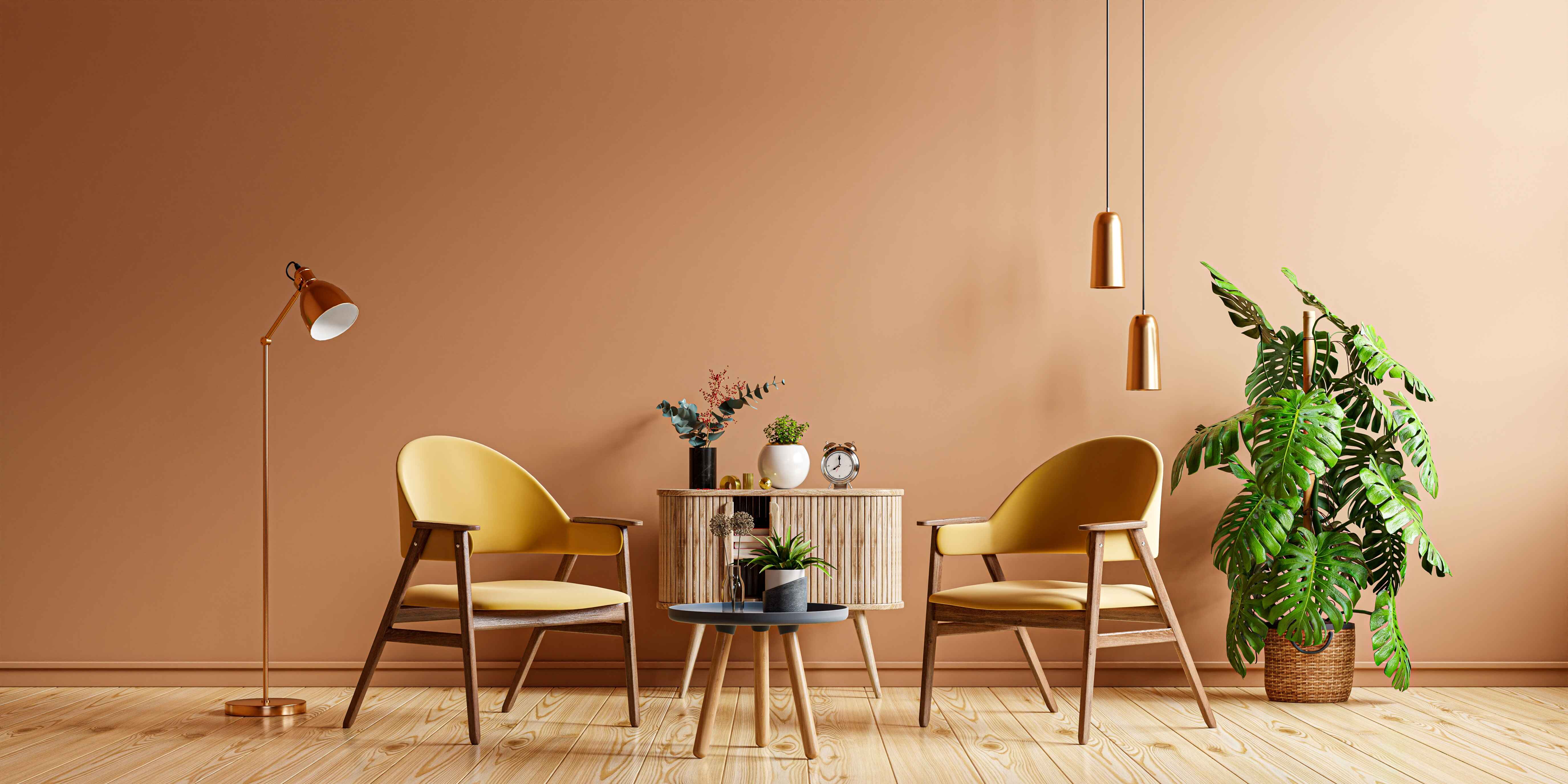
Sundrenched Sand:
- Earthy and organic room colour that is reminiscent of sandy beaches and the warm glow of sunset.
- Marries well with darkwood furniture.
Panama Hat:
- This light brown shade has warm undertones, reminiscent of the earthy tones found in natural materials.
- As interior home colours go, this one is vibrant enough to make a statement without being overpowering.
- It is inspired by the natural warmth of a Panama Hat, offering a blend of brown and tan colours.
- Colour trends show that it works particularly well in living rooms, bedrooms, and dining rooms.
Cinnamon Sprinkle:
- Rich brown colour that reminds you of warm spices.
- Adds warmth and character to the space.
2024 colour trends are all about getting closer to nature. Bringing little bits of the earth into your home by way of organic interior home colours is all the rage.
- Rich and Classic: Shades of light brown are dominating the colour trends with their rich look.
- Neutral Alternative to Black: Decorators prefer interior home colours that as serve as a backdrop. It allows them to put accessories like artwork and furniture into the spotlight.
But instead of black which, firstly, causes spaces to look smaller, and secondly, absorbs light causing spaces to look darker, this neutral shade helps give the sense of space and reflects ambient light, making the room feel fresh. - Bring in Peace: Why do colour trends love this shade? Because the brown colour palette makes a room feel peaceful and secure.
Pastel and Minimalist Tones
Lavender Colour Palette – Spring Lilac, Obsession and Just Demure
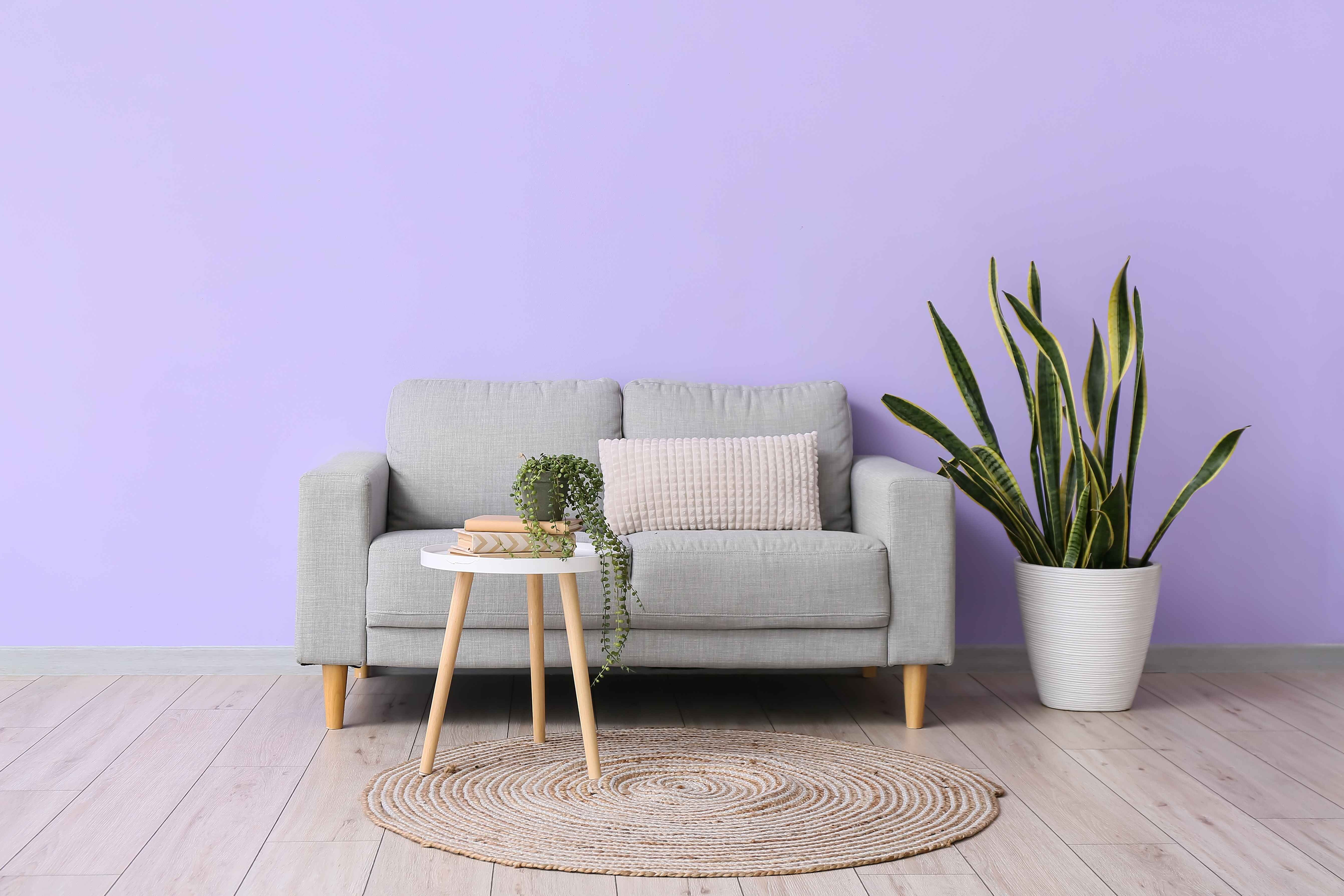
Spring Lilac:
- Soft and delicate pastel purple that evokes a sense of freshness.
- Suitable for bedrooms, children’s nurseries, and reading nooks.
Obsession:
- A rich and intense lavender hue creates a luxurious and sophisticated ambience.
- Works well with both modern and classic decor and colour trends.
Just Demure:
- Subtle and soft lavender tone.
- Colour trends rely on this shade to create a soothing atmosphere.
- Lavender interior home colours are used in relaxation spaces for added elegance.
Here’s listing down all the reasons lavender and lilac are ideal choices for repainting your dream home.
- Dramatic and Sophisticated: The lilac and lavender colour trends rose out of the need to break away from the traditional idea of sophistication.
- Creatively Luxurious: Conventionally, darker shades of this colour are associated with royalty. Adopting them in your interior home colours is a great way to add a sense of luxury, not by adding gold and silver, but lilac instead.
Pastel Blue Colour Palette – Soft Jade, Aqua Appeal and Eastern Light
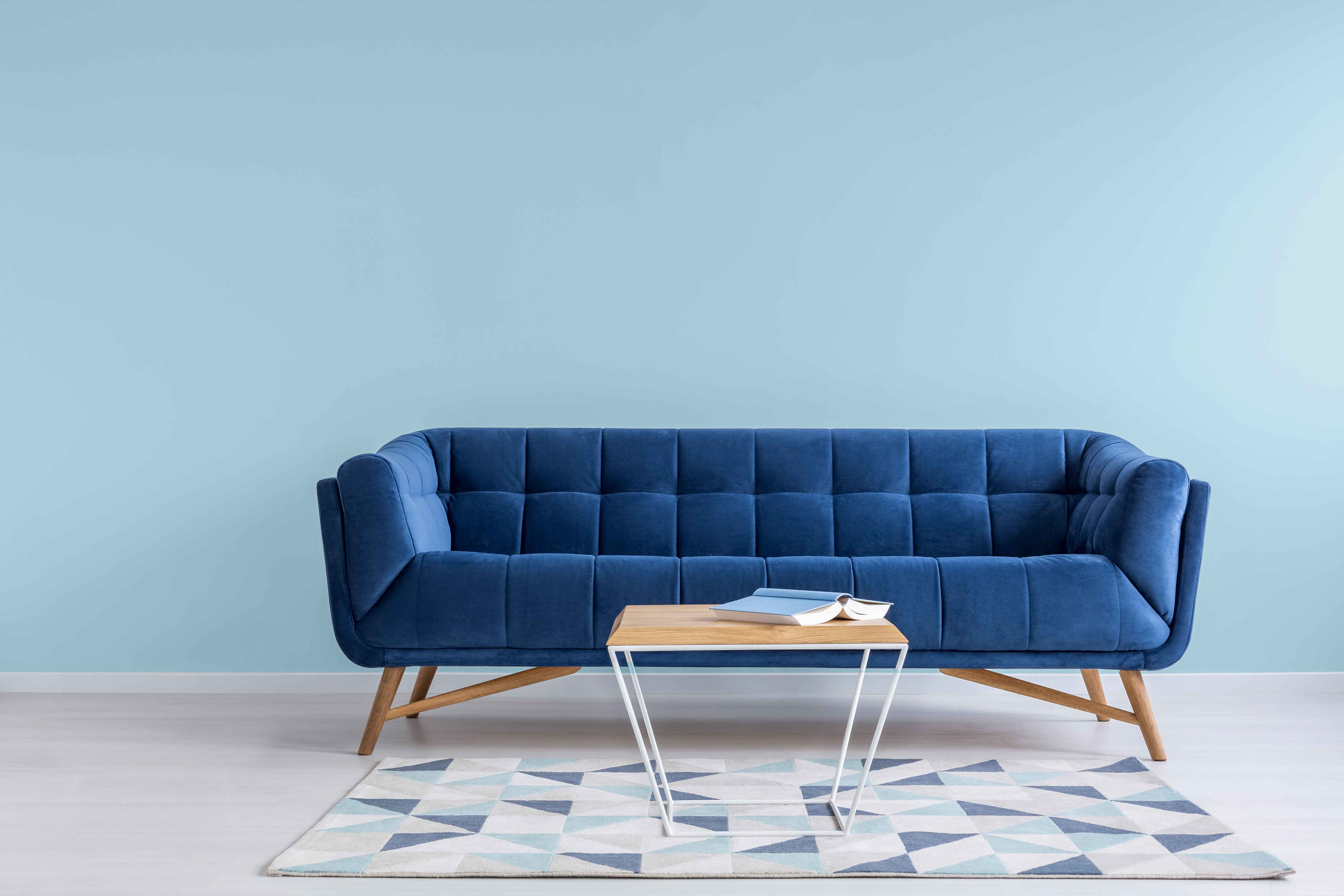
Soft Jade:
- A pastel blue-green with a hint of jade that evokes tranquillity through a connection to nature.
- Creates a peaceful atmosphere with a touch of natural freshness.
- Ideal for bedrooms, fostering a calm and restful environment.
Aqua Appeal:
- A refreshing aqua blue colour with a subtle undertone that captures the essence of crystal-clear waters.
- The blue colour reflects natural light and infuses vibrancy.
- Perfect for bathrooms, creating a spa-like atmosphere.
Eastern Light:
- A serene and gentle blue colour that creates a peaceful ambience.
- Ideal for meditation or reading corners.
Pastel blues are an all-time winner, through the years and beyond. Here’s why:
- Blue Colour Lies at the Heart of Latest Wall Paint Ideas: The simplest trick to change the look of interior home colours is to add this tone of blue colour.
- Soothing: Colour trends love the blue colour because of the relaxing effect it has. Incorporating it in some form in the furniture or interior design creates an inviting atmosphere.
- Light and Airy: Lighter shades of blue colour reflect light, creating an illusion of space and making the room feel breezy.
Looking for a designer wall finish for the latest colour trends? Use Berger Paint’s interior wall coatings for flawless finishing.
Vibrant and Cheerful Tones
Magenta Colour Palette – Cameraderie, Old Country Roses and Tight Embrace
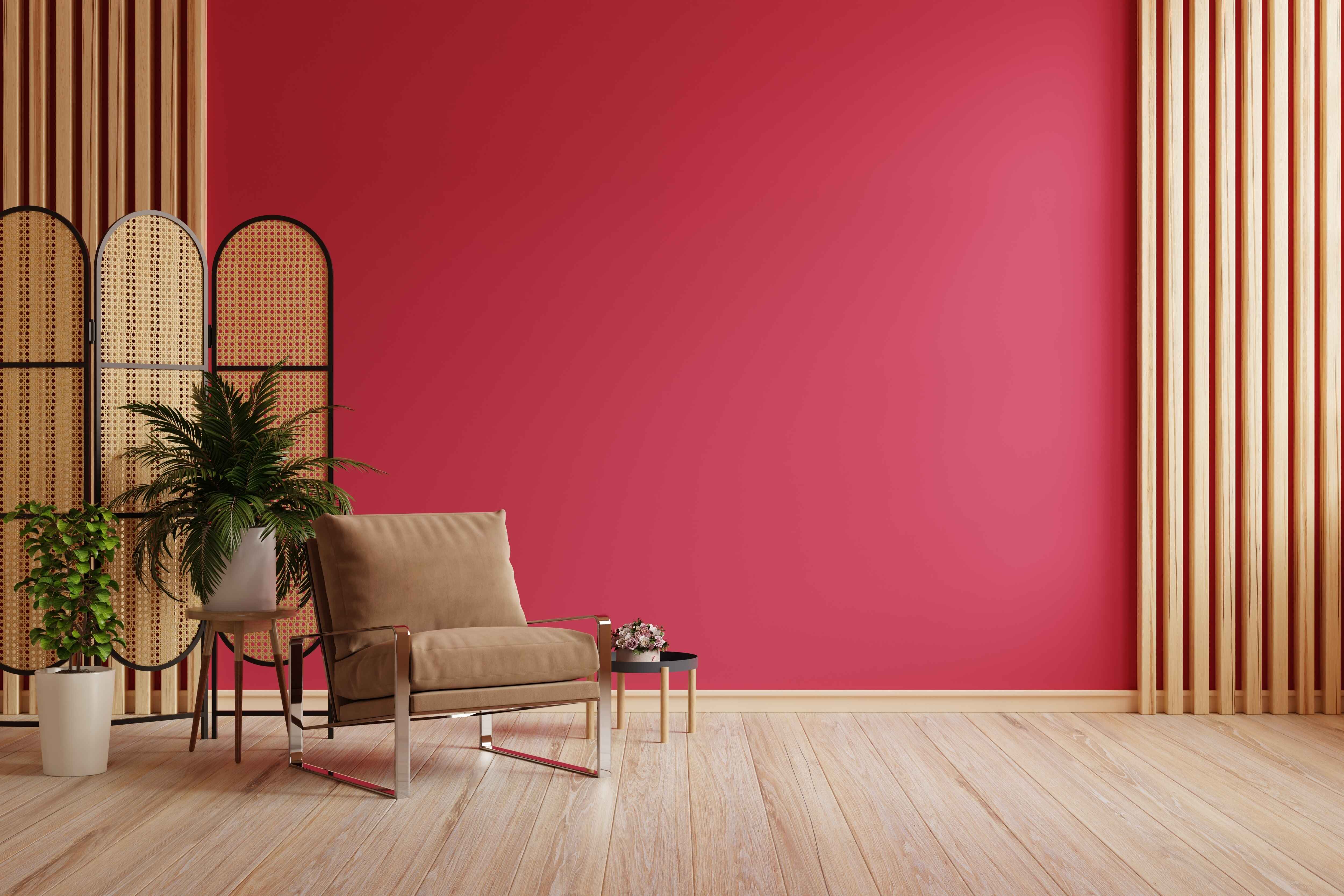
Cameraderie:
- A bold and attention-grabbing magenta colour that adds a pop of energy to any space.
- This magenta colour is the latest paint colour for living room to make a strong style statement.
- Adds energy and flair to entertainment spaces.
Old Country Roses:
- Vintage-inspired magenta colour with a classic and timeless charm.
- Adds a touch of romance to spaces.
- This magenta colour is suitable for accent walls in living rooms or bedrooms.
Tight Embrace:
- A vibrant and energetic magenta colour that demands attention.
- Part of the energetic and lively colour trends, perfect for creating a focal point in a room.
- Interior home colours that add a playful and lively atmosphere to children’s rooms or play areas.
Vibrant and cheerful tones can uplift the mood and aesthetic of any room smoothly. Here’s why you should consider these shades for your home.
- Bold and Attention-Grabbing: Magenta colour and the shades that 2024 colour trends prefer are all about grabbing the spotlight. They are the focal point of a room colour and the latest wall paint ideas usually use this colour for texture painting.
- Highly Energetic: Magenta colour is perfect for entertainment spaces or rooms that need vibrancy.
Conclusion
While it is fun to follow colour trends and bring in all the latest interior home colours, we suggest marrying trends with your personal preferences.
If certain interior home colours speak to you but aren’t part of 2024’s colour trends, we suggest going for the interior home colours regardless. Because at the end of the day, that is your home. It is important to listen to the latest wall paint ideas but going with your heart is of utmost importance.
FAQs
Are pastel tones suitable for creating a minimalist look?
Pastel tones like blue colour are excellent for achieving a minimalist look.
Their soft and muted nature creates a serene and uncluttered aesthetic, aligning perfectly with minimalist design principles. If the colour trends are anything to go by, they will soon be seen in most minimalist homes within a few short months.
What are some popular accent wall colours for 2024?
2024 colour trends for accent wall colours are all about making bold choices.
A dark blue colour, vibrant magenta colour, and nature-inspired greens are among the popular and stylish accent wall colours.
Are there paint colours that promote a calming atmosphere in bedrooms?
Yes, certain colours like soft lavender, calming blue colour, and neutral greys are known to promote a calming atmosphere in bedrooms.
These interior home colours create a tranquil atmosphere that is conducive to relaxation and restful sleep.
What should I consider when selecting paint colours for a home office?
If your home office is slowing down your work, it might not be all your fault.
Did you know certain interior home colours can increase your productivity?
Productivity Palette:
- Consider the nature of your work and personal preferences.
- Go for colours that boost focus, such as neutral tones, like light blue colour or shades of green.
- Strike a balance between a calming atmosphere and ripples of energy.
Can I combine different wall paint colours in the same room?
Yes, combining different wall paint colours in the same room is a popular design choice. You just need to make sure that the interior home colours have a cohesive look. Do this by selecting colours that complement each other or belong to the same colour palette.
Experiment with accent walls, contrasting tones, or a subtle gradient effect for added visual interest.
 Get in Touch