Open Plan Decor And Colour Schemes: How To Use Colour To Define Zones

 Nov , 2025
- Berger Speaks
- 4 Min Read
Open-plan living has become a favourite in modern homes because it brings people together, lets light travel farther, and makes everyday life feel more relaxed. Without walls, though, spaces can blur into one another. Colour becomes the quiet organiser that guides the eye and creates definition without closing anything off.
In this article, you will explore the practical open plan colour ideas, with ready-to-use palettes, zoning strategies, and decor tips that work for Indian homes.
Why Colour Matters In Open Floor Plans
An open layout is about flow, yet the mind still looks for cues. Colour provides those cues. A calm base sets unity across the living, dining and kitchen, while targeted shifts signal where one activity ends and another begins. When planned well, an open floor plan decor feels coherent, not crowded, and each area earns its own identity.
Good schemes also help with proportion. Deeper tones bring intimacy to a lounge, mid tones bring warmth to dining, and lighter notes keep circulation routes airy. Colour can soften acoustics through textiles, frame views, and link flooring, cabinetry and furniture into one thoughtful picture.
Start With A Unified Base Colour
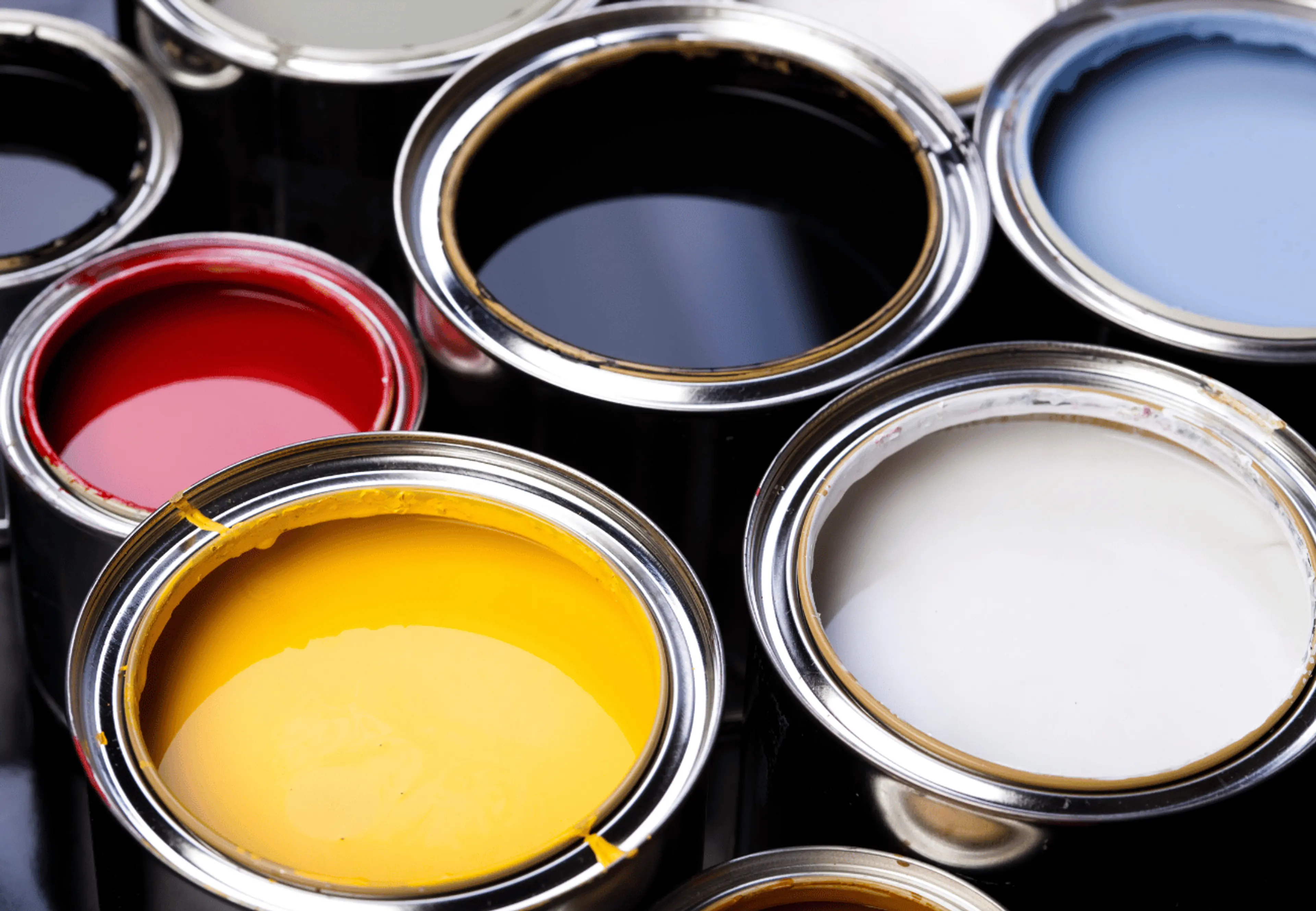
Begin with one restful base that runs through your largest continuous walls. This anchors the whole plan and avoids patchwork. Choose a neutral with a gentle undertone that suits your light and flooring. In most Indian cities with strong daylight, a warm white, pale greige, or soft grey keeps glare low yet fresh. If you prefer warmth, try muted beige with a touch of cream.
Consider finishing as well as shading. Matte hides minor surface waviness in big walls. Eggshell offers a subtle sheen that resists marks in dining and corridors. Satin suits kitchen walls near cooking zones. This unified base sets the standard for open floor colour, making later accents feel intentional rather than random.
Use Accent Colours To Highlight Different Zones
With the base in place, introduce accents to define function. Use them with purpose rather than everywhere. Think of accent colour as a highlight that repeats across two or three touches in the same zone, such as a feature wall, a rug border and cushions.
If you often search for colors for open floor plans, you will see a wide range of suggestions. The best approach is to choose accents that sit one or two steps richer than your base on the same undertone path. A cool base like green, blue or charcoal. A warm base like terracotta, rust or olive. Repeat the accent in small amounts so the zone reads clearly from any angle.
Soft Grey Base And Sage Green Colour Combination
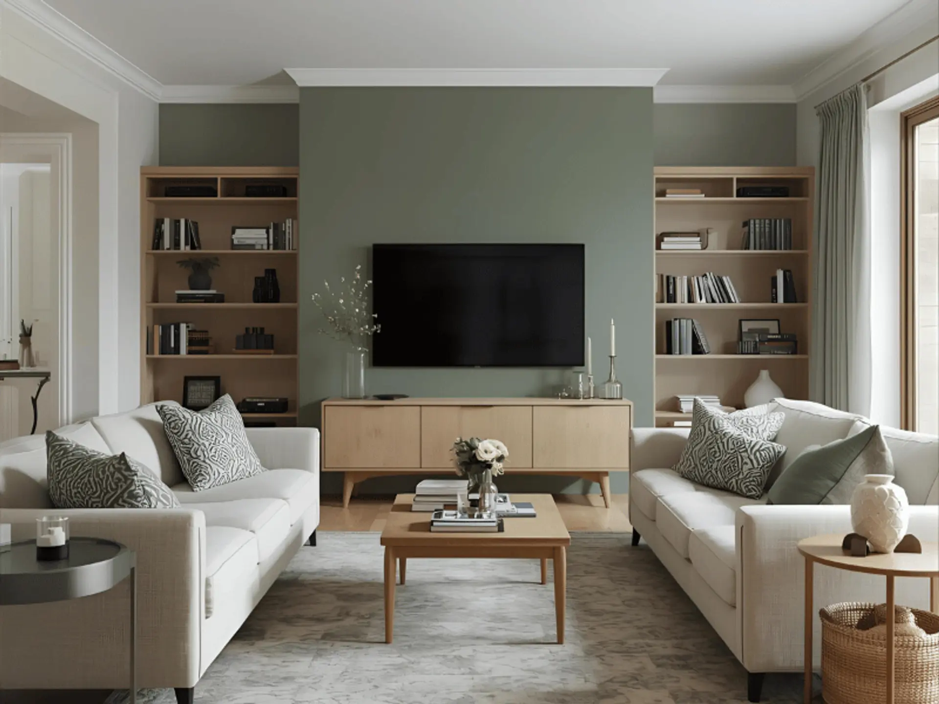
A soft grey base gives a calm canvas for a lounge or family area. Introduce sage green on the media wall or a low bookcase. Add eucalyptus-hued cushions and a patterned rug with a hint of green. Natural oak, rattan and brushed nickel complete the look. The result feels restful, ideal for reading or evening television.
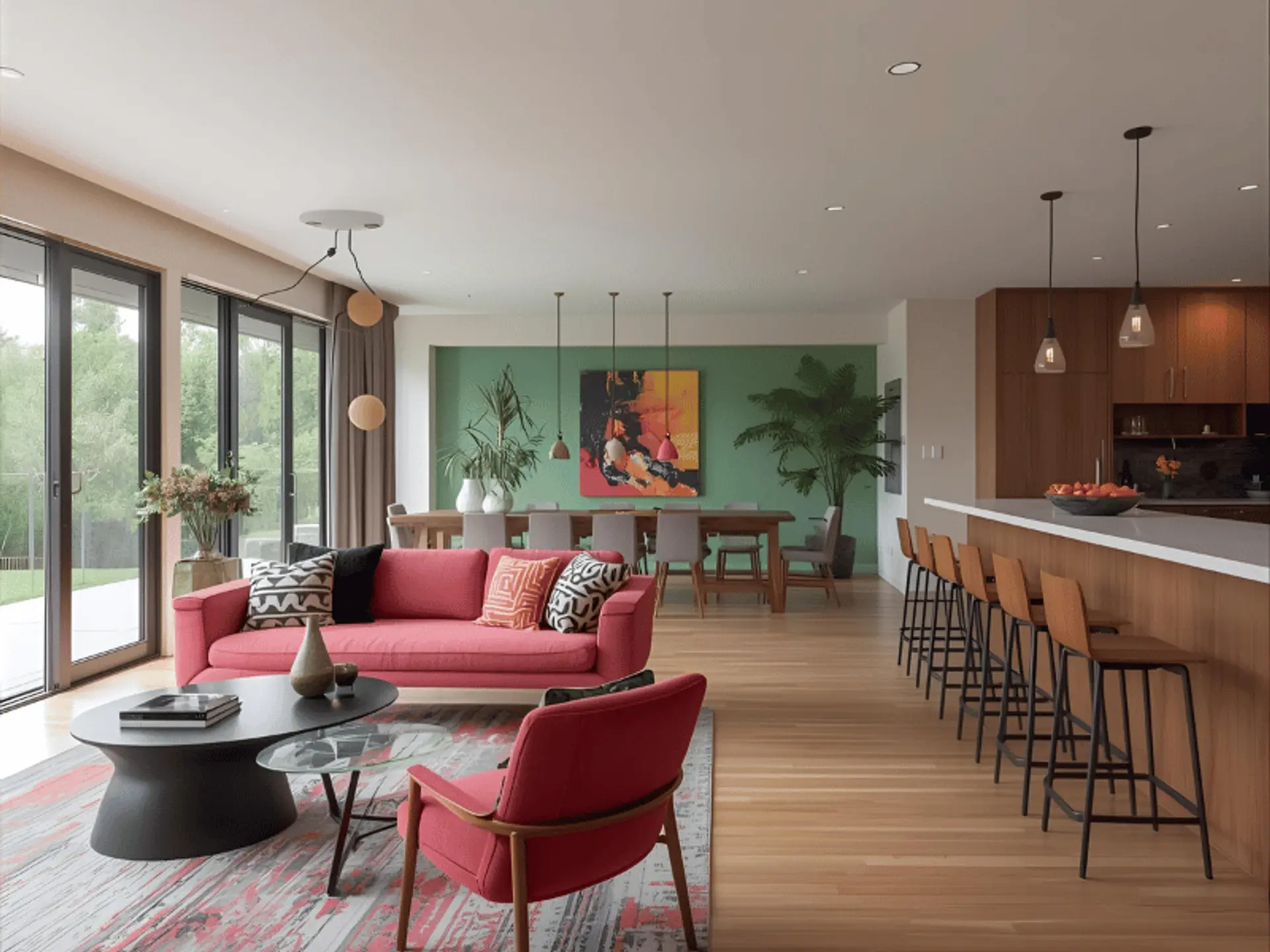
Warm White Base With Deep Blue
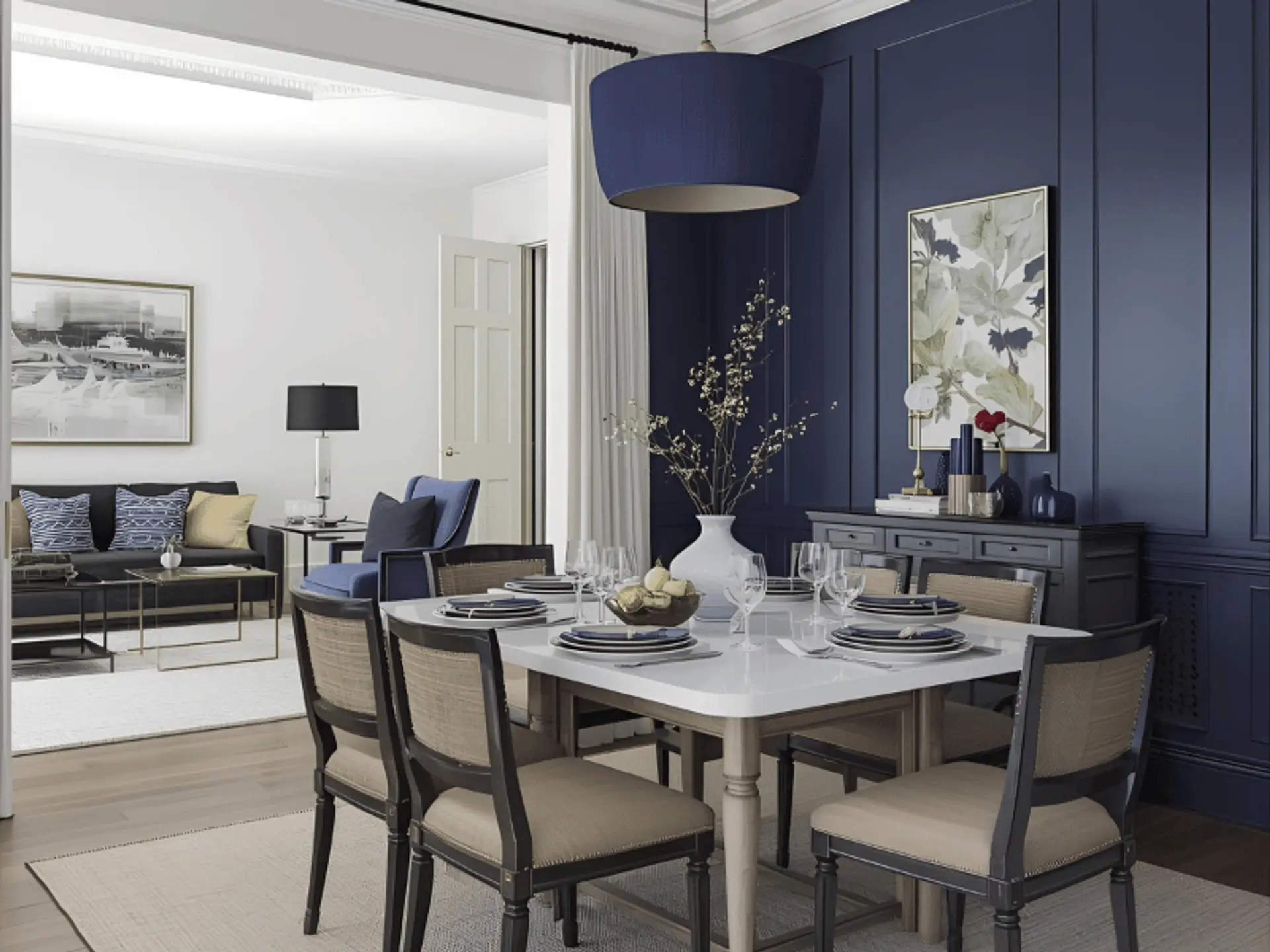
Warm white keeps the plan open while deep blue grounds the dining zone. Paint only the wall behind the table or use deep blue panelling up to chair rail height. Tie it together with indigo napkins, ceramic plates with blue rims and a pendant with a midnight shade. This pairing supports open floor plan living room decor where the lounge stays light but dining feels composed.
Beige Base And Terracotta Colour Combination
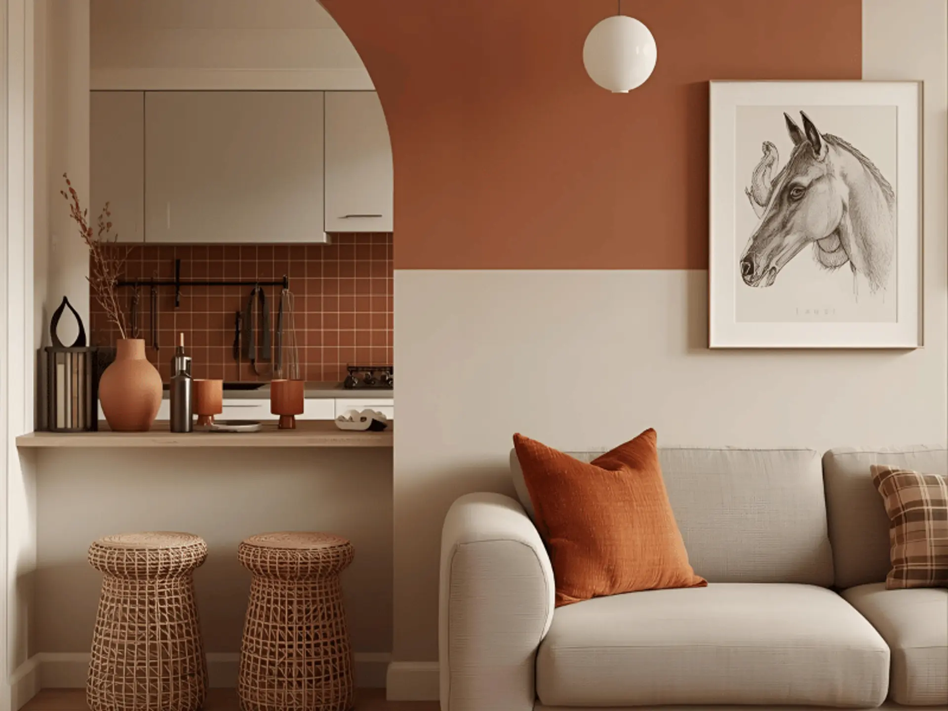
Beige brings easy warmth, while terracotta adds character. Use terracotta on a half-wall behind a breakfast counter or across a kitchen splashback tile. Layer with burnt orange textiles, pottery and cane stools. This mix is excellent for open-plan apartment decor where compact footprints benefit from cosy definition without heavy contrast.
Colour Blocking For Visual Separation
Colour blocking uses clear shapes to carve out areas within one envelope. It is precise and playful at the same time.
- Mark a home office niche with a painted rectangle that frames the desk.
- Create a head height band around the dining area that wraps the corners.
- Paint a ceiling canopy above the island to signal the kitchen hub.
- Use a vertical colour strip to mark the shift from lounge to passage.
Keep edges crisp with tape and a good, angled brush. Repeat the block colour in at least two small accessories in the same zone. If you explore open concept wall colors, you will find many bold examples. In homes with strong light, mid-depth colours often work better than very dark blocks for daily comfort.
Use Textures And Finishes To Add Character
Colour does not work alone. Texture adds depth and brings the scheme to life.
- Paint finishes: Matte for broad walls, eggshell for doors and trims, satin for kitchen splash zones.
- Special effects: Limewash or soft cloud finishes in one key area add movement without a strong pattern.
- Natural materials: Cane, wicker, raw wood and jute introduce tactile warmth that complements open floor colour schemes without adding clutter.
- Metals: Choose one primary metal per zone, such as brass in dining, black in the kitchen, and keep it consistent across handles and lighting.
Combine Colour With Furniture and Decor
Furniture has as much zoning power as paint. A charcoal sofa sets the lounge, while a walnut dining table anchors mealtimes. Rugs are the easiest dividers. Place a larger neutral rug in the lounge and a slightly smaller patterned rug under the table. Curtains, art and cushions echo your chosen accents so the zones speak the same language.
This is where open plan decor earns its name. Keep sightlines open with lower storage, choose slim-framed shelves, and repeat a single wood tone across pieces to tie everything together.
Light and Colour: Work With Natural Light
Sunlight in India can be intense. Test swatches on multiple walls and view them in the morning, afternoon and evening. North-facing rooms tend to look cooler, so they often suit warmer neutrals. South-facing spaces receive stronger light, so colours can appear lighter than the sample card.
Layer artificial light to support colour. Use warm white for dining, neutral white for kitchen tasks, and soft table lamps for the lounge. Dimmers add flexibility for family routines and entertaining. Subtle lighting choices lift decor for open floor plan schemes without adding new colours.
Tips on Decor For Open Floor Plans
Here you will explore the tips on decor for open floor plans:
- Start with the floor: Keep one continuous material or two closely related tones across the plan.
- Limit the palette: One base, two accents and one metal finish per zone is a good rule.
- Repeat on purpose: Echo the accent from wall to fabric to accessory for clarity.
- Use rugs to map boundaries: Match size to furniture footprint.
- Keep tall storage to the sides: Let the middle remain open for flow.
- Balance solids and pattern: If the rug is patterned, keep the cushions simpler.
Add indoor plants to soften transitions and bring a natural link between areas.
Common Mistakes To Avoid For Open Floor Decor And Colour Schemes
Here you will explore common mistakes to avoid for open floor decor and colour schemes:
- Too many accent colours that compete rather than guide.
- Random feature walls with no link to furniture or art.
- Ignoring undertones, which can make neutrals clash with flooring or stone.
- Using the same strong shade across every zone, removing hierarchy.
- Picking paint from a phone screen without testing real samples.
- Forgetting maintenance in high-use areas like kitchen backsplashes and corridors.
Example Colour Palettes (Ready To Use) For Your Open Floor Plan
Use these as starting points. Test on your walls before deciding.
- Calm Contemporary
- Base: Soft Grey
- Lounge Accent: Sage Green
- Dining Accent: Dusty Blue
- Kitchen Accent: Charcoal
- Metal and Wood: Brushed Nickel, Light Oak
- Warm Modern
- Base: Warm White
- Lounge Accent: Taupe
- Dining Accent: Deep Blue
- Kitchen Accent: Graphite
- Metal and Wood: Black, Walnut
- Earthy Minimal
- Base: Pale Greige
- Lounge Accent: Olive
- Dining Accent: Terracotta
- Kitchen Accent: Clay
- Metal and Wood: Aged Brass, Teak
- Light and Airy
- Base: Off White
- Lounge Accent: Misty Green
- Dining Accent: Stone Grey
- Kitchen Accent: Slate
- Metal and Wood: Chrome, Ash
- Sunlit Urban
- Base: Beige
- Lounge Accent: Burnt Orange
- Dining Accent: Cinnamon
- Kitchen Accent: Coffee Brown
- Metal and Wood: Bronze, Acacia
- Soft Coastal
- Base: Cream
- Lounge Accent: Sea Green
- Dining Accent: Sky Blue
- Kitchen Accent: Navy
- Metal and Wood: Brushed Steel, White Oak
Each palette sticks to a unifying base with clear accent placement, so open floor plan decor remains consistent from entry to balcony.
Final Thoughts On Open Plan Colours And Decor
Open layouts work best with balance. A unified base creates harmony, while selective accents define zones for living, dining and study. Colour blocking, texture and layered lighting add clarity without walls. With a measured palette and repeated cues, planning becomes simple and pleasant. Blend European inspired touches with Indian practicality by pairing calm foundations with accents suited to climate and taste. For an efficient upgrade, consider Berger Express Painting to achieve crisp lines and finishes across flowing, multi use spaces.
check for any query you have about the blog
Frequently Asked Questions
For a cohesive look, keep one calm base across both areas and vary accents to mark function. For example, use warm white throughout, a deeper blue or charcoal accent in the dining or island zone, and a softer green or taupe in the lounge. Add matching textiles and a rug to repeat the chosen accent in each area. Testing samples on both sides of the room is essential because light differs across the space.
Begin with the flooring tone and natural light. Pick a base neutral that flatters both. Shortlist two or three accent families that relate to the base undertone. Assign one accent to each zone and repeat it in two or three touches. Keep metals and wood tones consistent to avoid visual noise. If in doubt, choose mid-strength accents that are easy on the eye during bright afternoons and evening lamp light.
Yes, as long as they are placed with intent. Use bold tones in smaller measured areas like a dining wall, a study niche or a ceiling inset, then repeat the colour in art or textiles. Balance them with a calm base so the plan still breathes. Glossy or very dark finishes can be striking, but test first to ensure comfort in strong daylight.