Transform Your Home With Stunning Orange Wall Colour Combinations
 Dec , 2025
- Berger Speaks
- 4 Min Read
Orange wall colour combinations can instantly transform your home by adding warmth, vibrancy, and character to your interiors. When paired with the right complementary shades and lighting, orange creates visually striking yet balanced spaces that feel inviting, stylish, and full of personality. Check these orange wall colour combinations to find the perfect look for your home.
Why Choose Orange Wall Colour for Your Home
Orange wall colour can give a welcoming feel to your home. It creates a lively atmosphere, complements both modern and traditional décor, and works well as an accent or feature wall when paired with balanced colour combinations and proper lighting.
In Indian homes, especially, orange feels familiar and festive without being too loud when it’s handled well. Another reason orange works so well is its flexibility. You can go earthy with terracotta, rust, and clay for a grounded look, or choose brighter tangerine and coral for a more energetic vibe. The key is to balance orange with a second shade. This is where the right orange wall colour combination makes all the difference. Pair it with white for freshness, beige for warmth, blue for contrast, or green for a nature-inspired palette.
Best Orange Wall Colour Combinations
Here are some of the most used orange wall colour combinations:
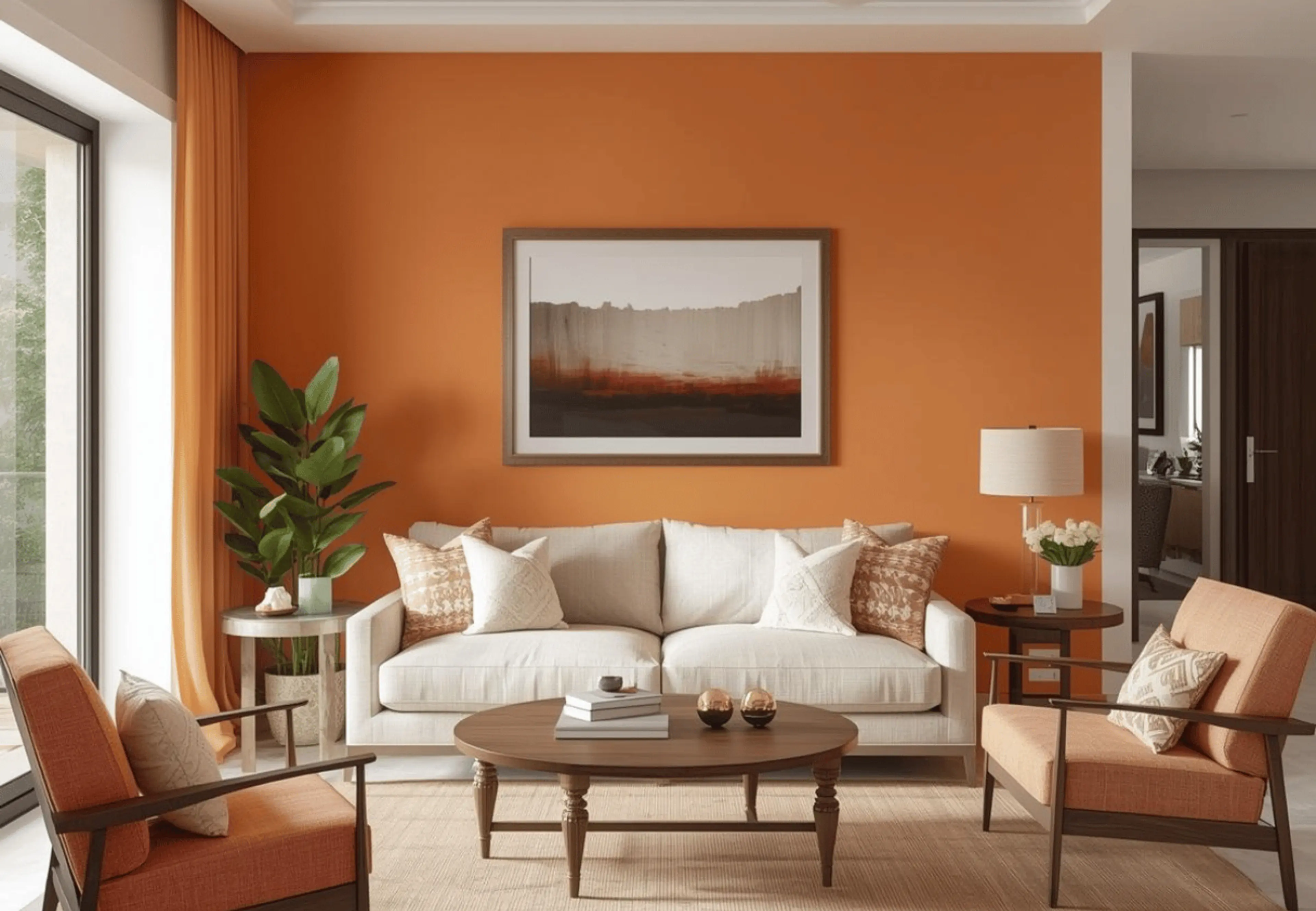
1. Orange and White Wall Colour Combination

A classic and timeless pairing, orange and white create a bright, balanced look that keeps the space fresh while highlighting the warmth of orange.
If you want an orange colour combination for a wall that suits almost every home style, this is it. White visually reduces the intensity of orange, so the room feels open rather than heavy. This combination works beautifully for living rooms where you want energy but still need comfort, especially if the space hosts guests often. Add light wood furniture, cane elements, or minimal décor.
2. Orange and Beige Wall Colour Combination
Beige is the quiet partner that lets orange shine without competing. If you want warmth but prefer a calmer home aesthetic, orange and beige is a strong choice. It’s also one of the safest colour combinations with orange wall options for homes where multiple family members share the same space, and everyone wants something different.
This pairing suits dining rooms and bedrooms particularly well. Beige supports natural textures like linen, rattan, jute rugs, and wooden wardrobes, giving your room a soft, lived-in elegance. If you’re thinking about an orange colour combination paint plan for a full-home refresh, orange plus beige can move from room to room without feeling repetitive.
3. Orange and Brown Wall Colour Combination
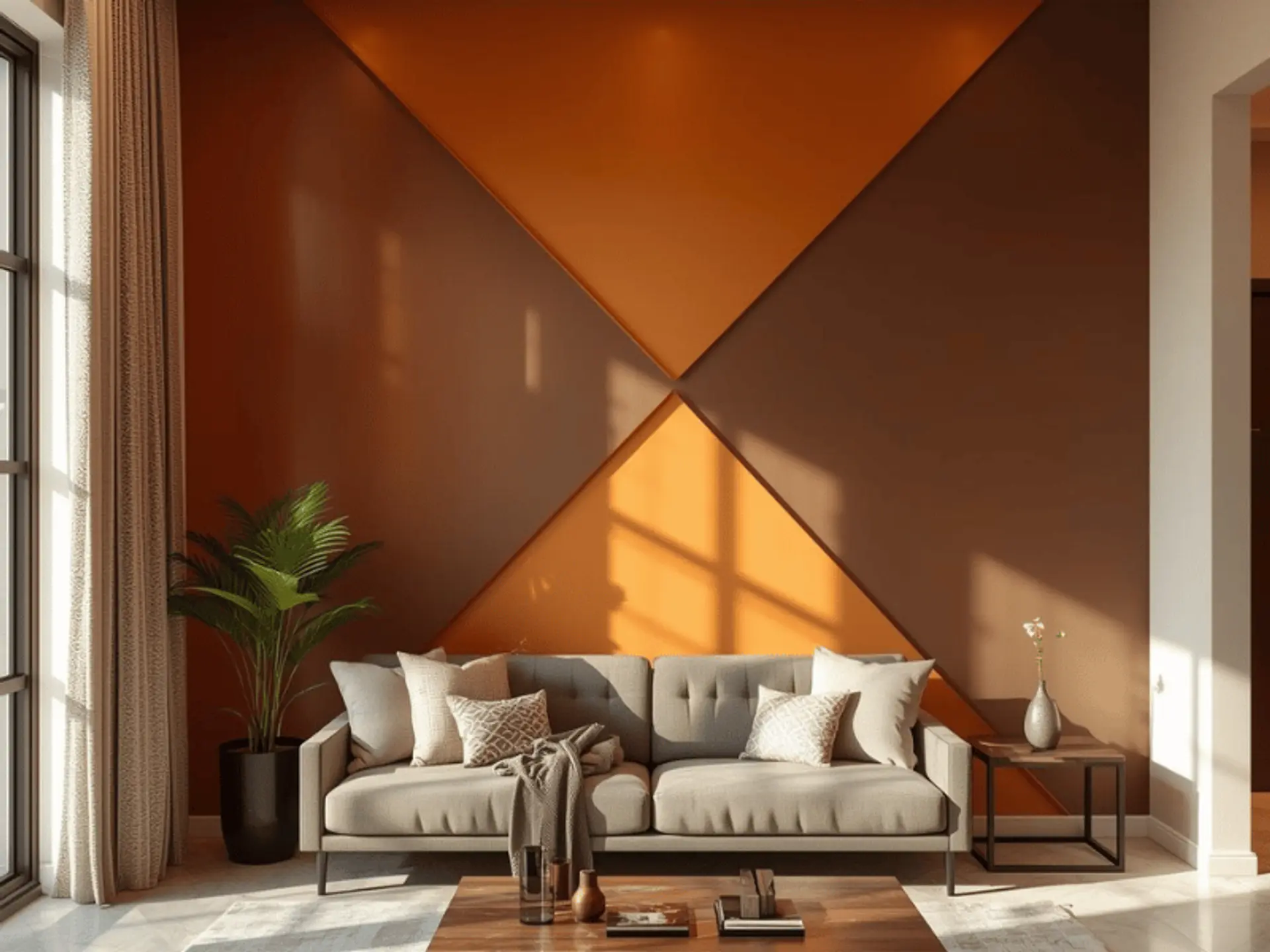
Earthy and cozy, this pairing works well with wooden furniture and creates a rich, grounded look for traditional and modern homes.
Orange and brown are the colours that feel instantly homely. It reminds many people of clay, wood, and autumn tones. Comforting, stable, and welcoming. If your home already has wooden doors, walnut cabinets, or darker furniture, this room colour combination, the orange approach, can look very intentional.
To keep it stylish, avoid going too dark on all walls. A better idea is to use orange as the highlight shade, and bring brown through furniture, panelling, accent niches, or a textured wall paint finish. This also works well in studies and TV rooms, where you want depth and warmth without harsh brightness.
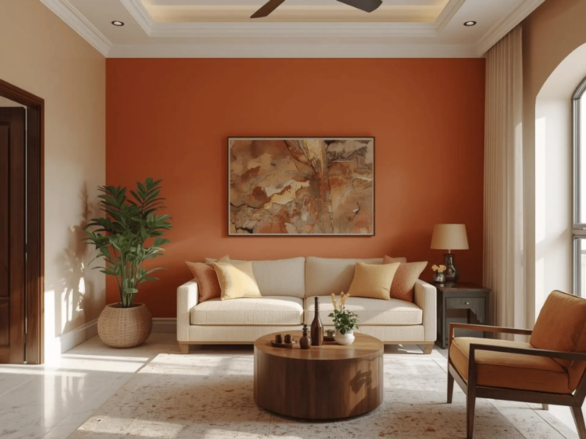
4. Orange and Cream Wall Colour Combination
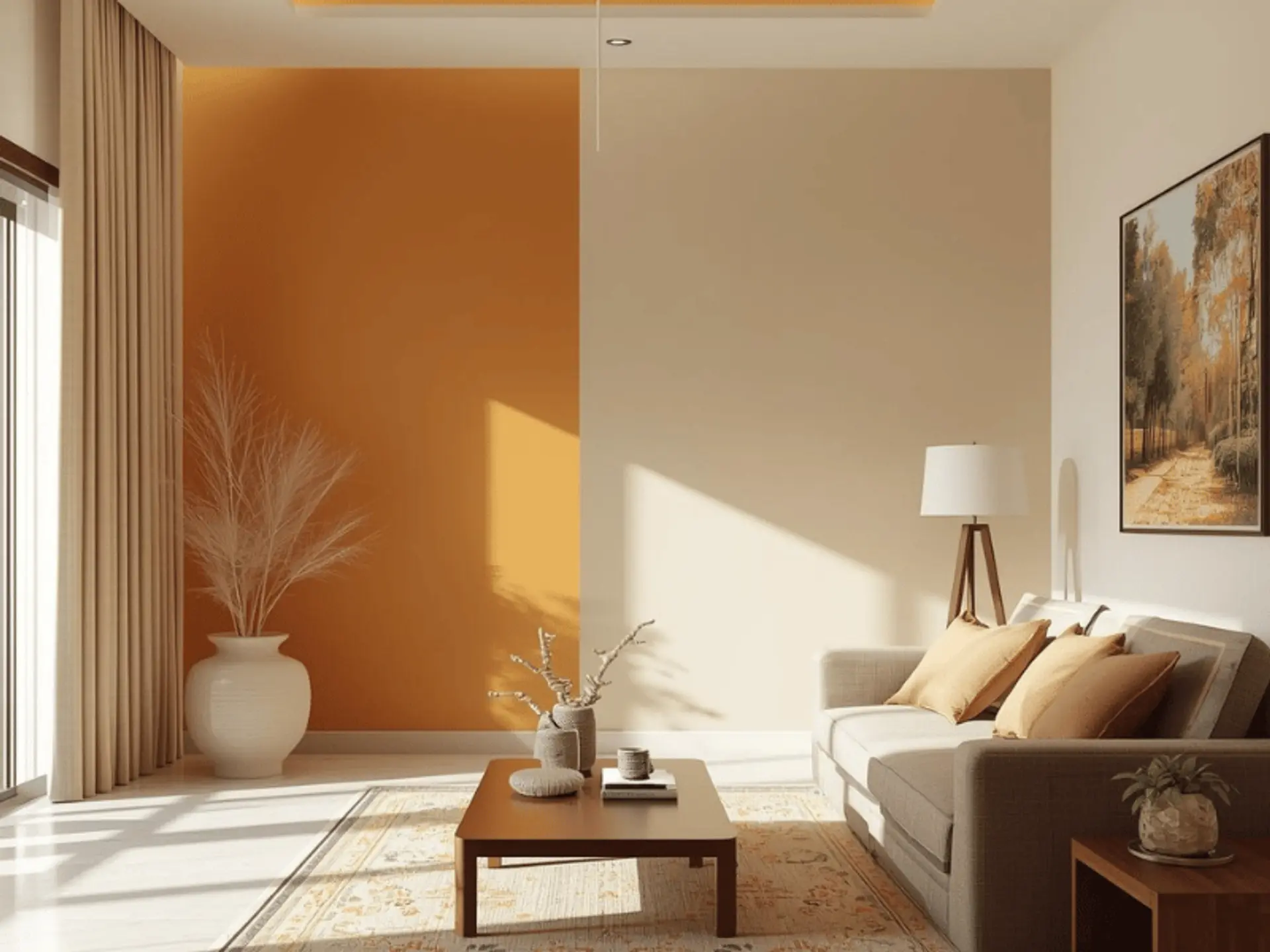
Cream tones soften the brightness of orange, creating a calm and harmonious interior colour combination that feels light and spacious.
Cream is slightly warmer than white, which makes it a natural match for orange. If white feels too stark for your taste, cream gives you the same space-opening effect but with a softer finish. This orange wall combination colour choice is ideal for smaller rooms because it prevents orange from dominating the space.
For homes with limited daylight, cream also helps because it reflects warm light beautifully. Try an orange feature wall in a living room,and use cream on the other three walls. Pair it with gold-toned frames, warm wood furniture, and neutral upholstery. This is one of the easiest room colour combinations with orange options to live with long-term because it doesn’t feel trendy. It feels timeless.
5. Orange and Blue Wall Colour Combination
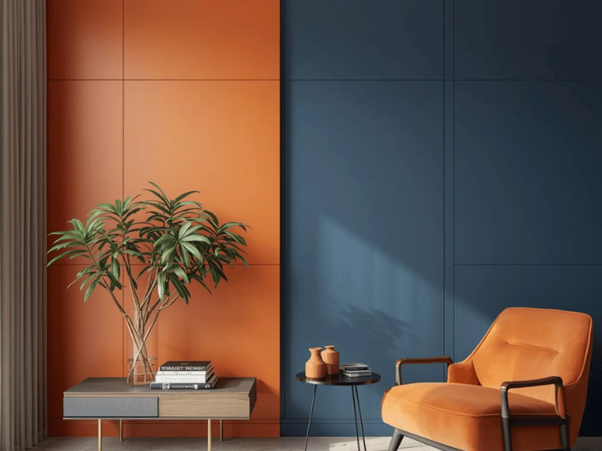
This bold yet stylish contrast adds energy and depth to a room, making it suitable for accent walls and creative living spaces.
Orange and blue sit opposite each other on the colour wheel, so they naturally create contrast. Done right, it looks designer-level. Done without balance, it can feel overwhelming. The trick is to decide which shade is the lead and which is the support.
6. Orange and Green Wall Colour Combination
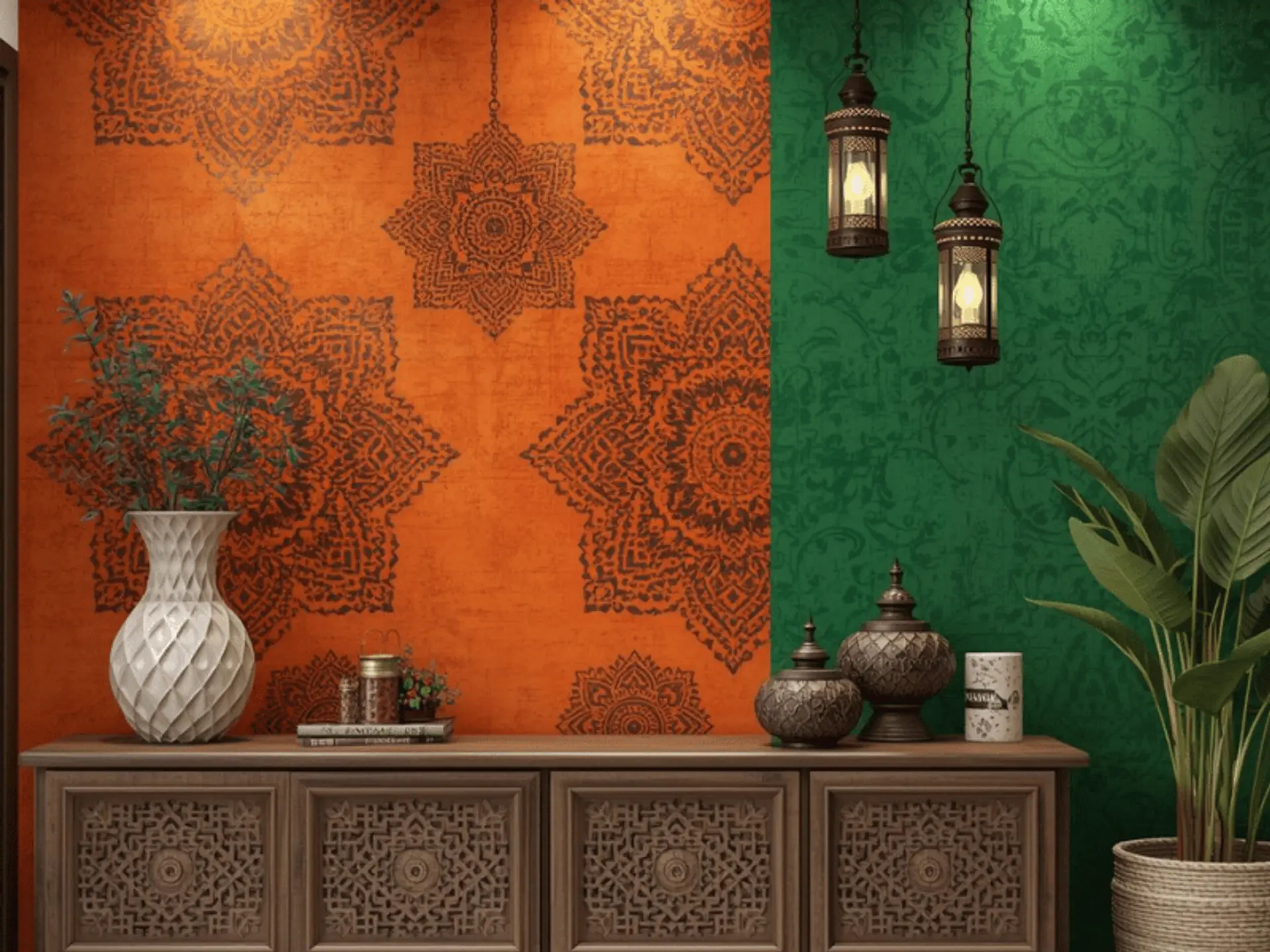
Inspired by nature, orange and green bring warmth and freshness together, ideal for homes with indoor plants and natural décor elements.
If you love plants, natural textures, and earthy décor, this is the combination that will feel most like you. The orange and green wall combination can look fresh, playful, and surprisingly elegant, especially when the green is toned down like sage, olive, or pistachio rather than neon.
To keep it refined, choose one wall in terracotta or burnt orange, and bring green through one supporting wall, a painted console area, or décor like planters, curtains, and artwork. This is also a smart option for families because it hides minor wall scuffs better than plain white walls.
7. Orange and Black Wall Colour Combination
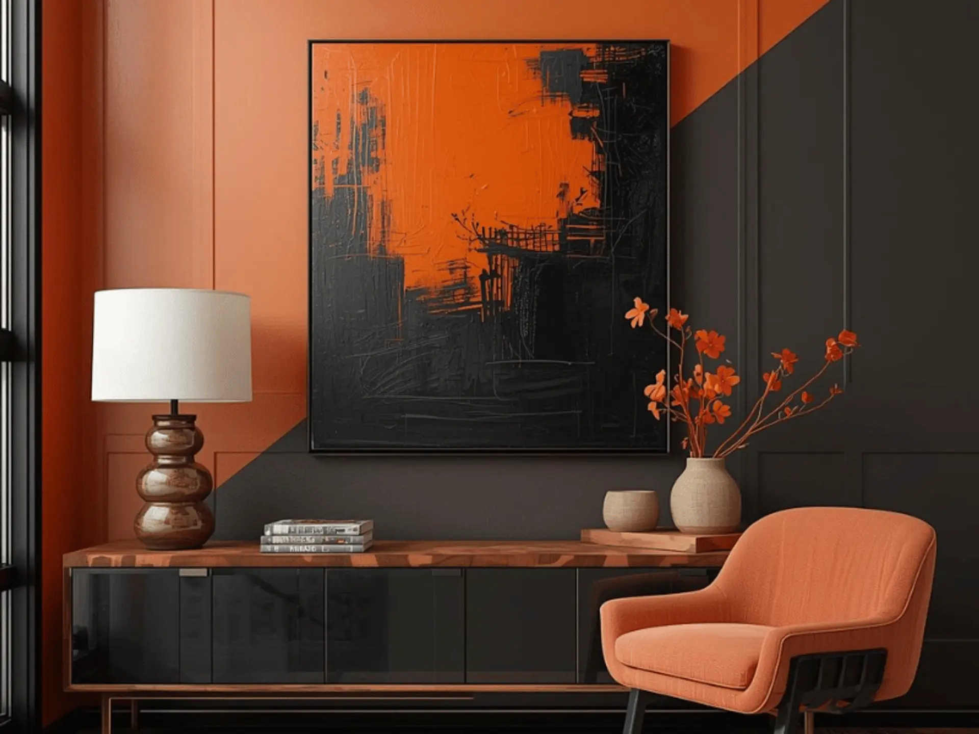
For a dramatic and modern look, orange paired with black creates a striking feature wall that adds depth and character to the space. Orange and black are high-impact. It’s bold, modern, and best suited for homes that already lean contemporary. Think metal accents, monochrome furniture, or minimal décor. If you want a dramatic feature wall behind the TV unit or bed back wall, this combination can look incredibly sharp.
Lighting Tips for Orange Wall Colour Combination
Lighting plays a vital role in enhancing orange wall colours. Warm lighting highlights the richness of orange shades and creates a cozy, inviting ambience, while natural light keeps the colour vibrant and balanced. Before finalising any orange wall colour combinations, it’s worth checking the shade card in the actual room in daytime and at night so the result matches what you’re imagining.
1. Warm Lighting for Cozy Ambience
Warm lighting, such as yellow or soft white lights, enhances the richness of orange wall colours and brings out their warm undertones. This type of lighting creates a cozy, welcoming ambience, making the space feel comfortable and visually pleasing, especially in living rooms and dining areas.
If you’re designing a living room with an orange feature wall, choose warm LED bulbs often labelled warm white. Wall washers and picture lights also look beautiful with orange because they create soft gradients instead of harsh shadows. This matters a lot when you’re using textured finishes or deeper orange wall shades like rust and terracotta.
2. Natural Light With Orange Walls
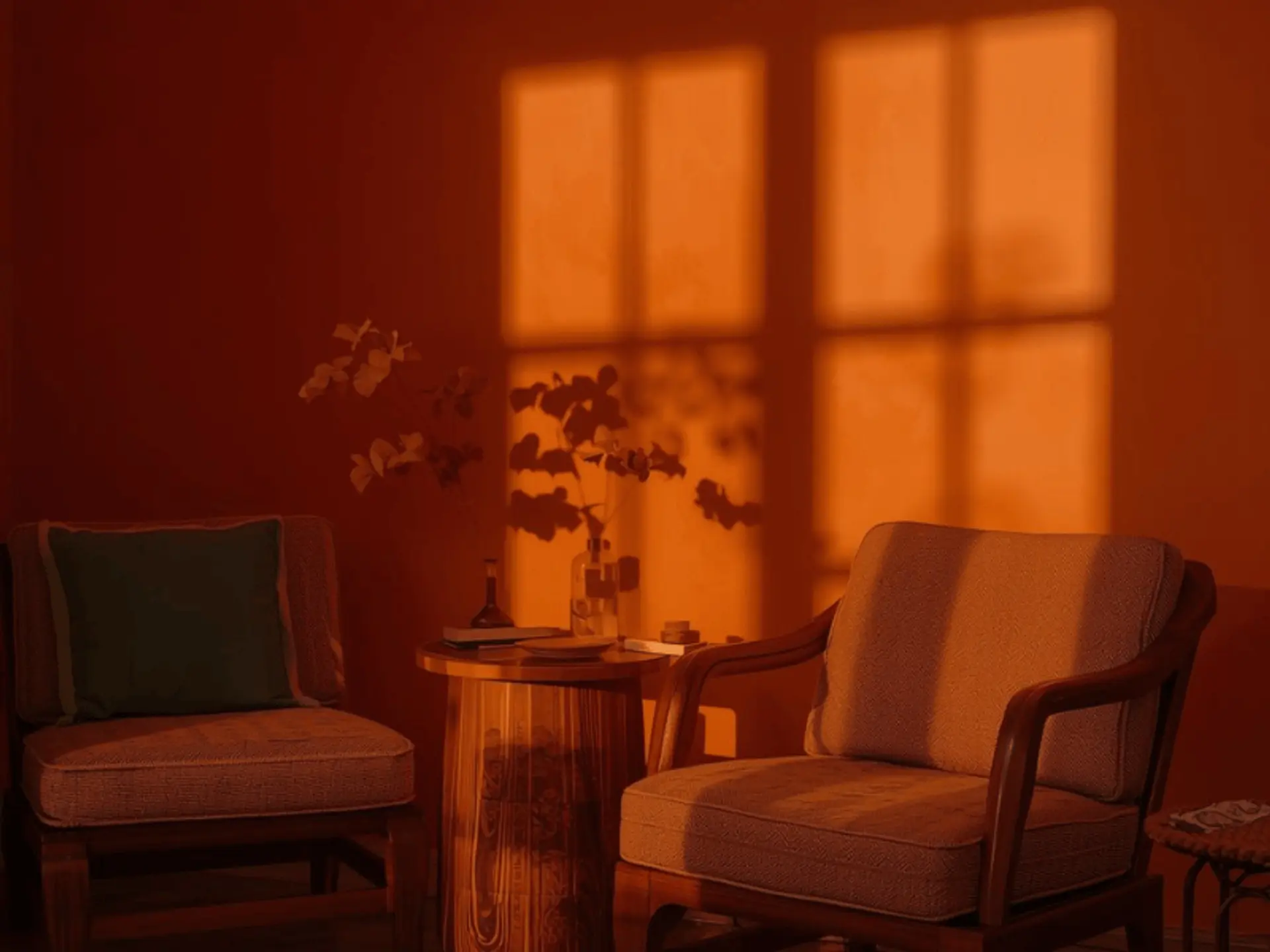
Natural light helps orange walls appear bright and lively throughout the day. It balances the intensity of the colour, keeping the room vibrant while preventing the walls from looking heavy or overpowering. Spaces with good daylight benefit most from orange wall colour combinations.
Also consider where the light enters. A wall directly facing a window will appear brighter, while side walls may look deeper. This is especially important when planning an orange colour combination for a bedroom or any room where you want a softer mood.
Conclusion
Orange wall colour combinations can add warmth, energy, and style to any space when balanced with the right shades and lighting. Choosing the correct finish and execution is key to achieving a polished look. Berger Express Painting offers expert colour guidance and hassle-free painting services to bring your orange wall design ideas to life perfectly.
And remember: great results don’t come only from colour choice. They also come from clean surface preparation, proper primer use, neat edges, and the right finish. If you want a smooth, professional outcome without the usual painting stress, a reliable painting service can make the entire experience simpler, faster, and far more satisfying, right from shade selection to the final coat of wall paint.
check for any query you have about the blog
Frequently Asked Questions
White, cream, beige, and soft grey are the easiest matches because they balance orange without competing with it. If you like bolder styling, navy or teal from the blue family creates a strong contrast, while sage or olive from the green family gives a nature-inspired look. The best colour depends on whether you want your orange walls to feel bright and playful or warm and sophisticated.
Wooden furniture pairs beautifully with orange. Light oak creates a modern, airy vibe, and darker walnut or teak creates a richer, traditional feel. Neutral sofas in beige, cream, tan, or grey are safe choices. If you want a stronger design statement, black metal accents, cane furniture, and brass details also work well with orange walls.
Yes. Orange is a popular choice for living room colour combination themes because it feels welcoming and social. The best approach is to use orange as an accent or feature wall, then balance it with lighter shades like white, cream, or beige. Good lighting, especially warm lighting, helps the living room feel cosy rather than overpowering.
Terracotta, rust, burnt orange, and muted tangerine are widely loved because they suit Indian lighting conditions, wooden furniture, and traditional décor elements. If your home gets less daylight, go for softer peach or apricot tones. If you have strong natural light, deeper orange wall shades can look very premium.
Many people associate orange and saffron-toned shades with positivity and warmth, and it’s often used in spiritual or energising areas of the home. That said, Vastu interpretations can vary by home layout and room purpose. If you’re strictly following Vastu, it’s best to match the shade and placement to your room’s direction and function, and consult a Vastu expert if needed.