Pantone Colour Of the Year 2026: How It Can Transform Your Home Décor

 Dec , 2025
- Berger Speaks
- 4 Min Read
Each year, the Pantone colour of the year 2026 sets the tone for design, fashion, and interiors. For Indian homes, it helps refresh rooms without a full makeover.
Used thoughtfully, the colour of the year ties together furniture, soft furnishings, and lighting. Berger Paints translates the Pantone colour of the year into easy-to-use shades and finishes for Indian conditions. Here is how it can reshape your home décor.
What Is the Pantone Colour of the Year 2026?
Pantone is a global colour authority that studies culture, design, and lifestyle shifts before announcing its annual shade. The Pantone colour of the year 2026 will be chosen to reflect what people are seeking at that moment – comfort, optimism, or renewed energy.
If you enjoyed working with the Pantone colour of the year 2025, you already know how one shade can inspire everything from a feature wall to a cushion cover. Berger’s shade decks and digital tools help convert that inspiration into a painted room by offering close matches and supporting tones that carry the same mood as the Pantone swatch.
How Pantone Selects the Colour of the Year
Pantone’s experts track influences from films, art, fashion, technology, and global events. They look for colours that appear repeatedly and for tones people respond to emotionally.
For homeowners, this means the chosen shade arrives with a clear design story. Berger’s trend-based interior collections interpret it into emulsions that work well on Indian walls. You get the emotion of the Pantone colour of the year with the durability of Berger Silk or Easy Clean interior ranges.
Why the 2026 Colour of the Year Matters for Indian Homes
Indian homes host work, worship, celebrations, and everyday family life in the same rooms. The 2026 colour of the year can help define different zones so each area has a distinct mood. A deeper version may suit a formal living room, while a softer tint can keep bedrooms restful.
Lighting varies widely across Indian apartments, from bright balconies to shaded corridors. The Pantone-inspired shade, when chosen through Berger’s catalogue, is tested across finishes so that it looks pleasing in natural daylight as well as under warm artificial light.
Psychological Impact of the 2026 Colour Palette
Colour affects how we feel in a space. The palette around the 2026 colour of the year usually includes deeper accents and lighter tints. When you use Berger Silk or Easy Clean on your walls, these shades can subtly shift the mood of a room.
You can:
- Create a welcoming first impression in the foyer or drawing room.
- Add focus in a study or work-from-home corner.
- Encourage rest in bedrooms by softening the shade with pastel tints.
Smooth, stain-resistant finishes help these effects stand out rather than being disturbed by patchy walls or frequent repainting.
How to Use the Pantone Colour of the Year 2026 in Home Décor
The simplest way to bring the trend home is through Pantone paint recommendations created by Berger’s colour experts. These shades are tuned to Indian preferences so that what looked inspiring on a small card still feels comfortable on a full wall.
Treat the 2026 colour of the year as the anchor of your palette. Then pick a lighter tint, a deeper accent, and a versatile neutral, and repeat them in different rooms. Even repainting one or two walls can make “this year's colour” visible throughout the home.
For best results, consult Berger’s Express Painting team on surface preparation and the right interior emulsion. Professional application ensures that the colour looks rich and stays fresh for longer.
Accent Walls Using Berger Paints Matching the 2026 Shade
Accent walls are a safe way to try a strong trend without committing to every surface. With Berger shade cards, you can find a match to the Pantone swatch and explore neighbouring tones that suit your room’s light and furniture.
Berger interior wall paints in Silk or Easy Clean give accent walls a refined, washable finish. Consider:
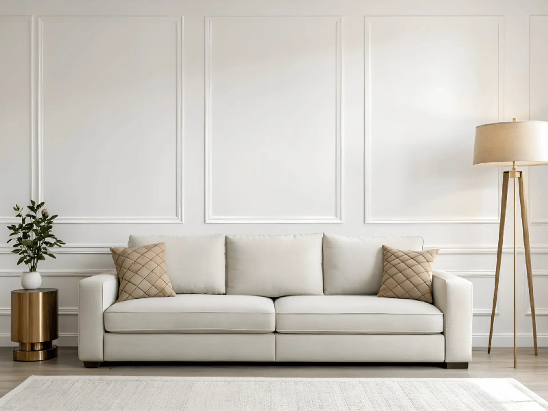
- In the living room, paint the wall behind the sofa in the trend shade and keep the rest in a softer neutral.
- In the bedroom, highlight the headboard wall and repeat the colour in cushions or a bed throw.
Because accent walls draw the eye, they are ideal for showcasing a bold colour while keeping the room balanced.
Decorative Textures Inspired by Pantone 2026
If you enjoy tactile surfaces, Berger Silk GlamArt textures let you interpret the Pantone story in a more artistic way. Techniques such as spatula, fabric, metallic, sandstone, or stucco can be tinted close to the Pantone colour of the year 2026, giving walls depth and movement.
Textures work well on feature walls behind TV units, in double-height spaces, or around arches and niches. They catch light differently through the day, gently shifting the mood.
Soft Furnishings & Colour Pops
Not everyone wants to repaint immediately. You can still embrace the trend through soft furnishings and décor pieces. Use the central shade on cushions, rugs, throws, lampshades, and artwork, and let Berger’s recommended neutrals appear on skirting, trims, or smaller wall sections.
This approach suits rented homes and people who like frequent updates, because you can swap textiles while keeping core wall colours timeless.
Berger Paint Shades That Complement the Pantone 2026 Colour
The magic of Pantone paint lies in pairing it with the right companions. Berger’s Colour Catalogue and visualiser tools show combinations so you do not have to experiment blindly.
You might pair the trend shade with warm grey or beige for a polished city home, or with muted terracotta and mustard for a more earthy style. Berger’s colour consultants consider flooring, furniture, and light, so the trend feels tailored to your space.
Home Colour Combinations for the 2026 Shade
When planning a full-house repaint, think about how rooms flow into one another. Some reliable combinations for Indian conditions include:
- The trend shade on the living room accent wall, with soft neutrals in passages and adjoining spaces.
- Gentle tints of the same hue in bedrooms, eased with off-whites or pale greys.
- A playful, stronger version of the shade in children’s rooms or entertainment zones.
Berger’s digital tools help you compare different colour shades for wall surfaces before you decide, which is especially helpful when several family members need to agree on a final palette.
Expert Styling Tips by Berger for Using Trend Colours
Berger’s colour experts and Express Painting teams often share styling advice that works well in Indian homes:
- Limit bold trend shades to one or two key walls per room.
- Repeat the colour in smaller accents like cushions, vases, or planters so the room feels tied together.
- Mix the trend shade with reliable neutrals, including white colour shades for wall, to keep rooms bright even in warm climates.
- Choose washable emulsions such as Easy Clean in high-traffic areas.
These choices decide whether a trend feels elegant or overpowering.
They also advise on sheen levels, maintenance routines, and repainting cycles so your investment in trend colours feels secure and worthwhile, for every room, from compact city flats to larger, multi-generational family homes across India.
Final Thoughts: Why Berger Makes the 2026 Colour Trend Easier to Use
Trends can seem risky, but with Berger, the Pantone colour of the year 2026 becomes an accessible way to refresh your home. From shade matching and digital previews to guidance on surfaces and finishes, Berger supports every stage of your painting journey.
Durable, low-odour products and smooth application mean your home not only looks current but also stays comfortable to live in. Whether you adopt the trend through a single feature wall or a full makeover, Berger’s range of wall paints ensures results that are long-lasting and family-friendly.
Thoughtful shade choices keep your home stylish, yet comfortable for everyday Indian living standards.
With a clear palette and expert support, the 2026 colour of the year can make your home feel renewed, welcoming, and truly yours.
check for any query you have about the blog
Frequently Asked Questions
Yes. Because the shade comes with lighter and deeper versions, Berger’s experts can help you adapt it to your home’s size, light, and furnishings so it feels natural.
Visit a Berger dealer or website and explore the Colour Catalogue and shade cards. The team can suggest close matches, neutrals, and accent shades that reflect the Pantone selection.
Yes. Use softer tints on most walls and reserve the deeper tone for a single accent or accessories. Pairing it with light neutrals and good lighting keeps the room feeling open.
Not if you choose the right products. Washable interior emulsions from Berger handle stains, dust, and frequent cleaning, so deeper shades remain fresh with minimal effort.


