Ultimate Guide To Exterior House Colour Combinations

 Dec , 2025
- Berger Speaks
- 3 Min Read
Your home’s street view says a lot before anyone even steps inside. The shades you choose for exterior home colours, trims, and doors decide whether your space looks fresh and welcoming or dull and dated. Thoughtful exterior paint colours also protect your walls from harsh sun, rain, and pollution, which is essential in Indian weather. Whether you favour calm neutrals or bold regional hues, the aim is a facade that feels personal and welcoming.
In this guide, we will walk through how to plan an exterior wall paint colour combination that suits your architecture, climate, and lifestyle. You will also find easy ideas for outside house colours that work beautifully for Indian villas, apartments, bungalows, and simple independent homes.
Why Exterior Colour Combinations Matter
Your exterior house colour is the first thing guests, neighbours, and even potential buyers notice. When the shades work well together, your home looks complete and well cared for; when they clash, even the best design feels unfinished. A considered scheme is the best colour combination for house exterior because it looks cohesive from the gate to the terrace.
A balanced palette can:
- Boost curb appeal and future resale value.
- Tie in with the neighbourhood and your home’s architectural style.
- Draw attention to strong features while playing down flaws.
- Reflect more or less sunlight, which affects indoor comfort and cooling bills.
For Indian homes, colour also has an emotional side. Earthy tones can make a family house feel grounded, while fresh blues or greens feel breezy in coastal cities. When you are choosing the right exterior colour, think of how you want your home to feel in every season, not just how it will look on the day of painting.
The 3-Colour Rule For Exterior Painting
One reliable way to plan house painting colours outside is the simple three-colour rule. You select a dominant shade, a supporting shade, and a highlight. This keeps your outdoor colours for home coordinated while still giving enough contrast to avoid a flat, boxy look.
Field Colour (60%)
The field colour covers most of the wall surface - plaster, brick, or cladding. This is usually a calm, mid-light shade that forms the visual foundation of your home. Beige, cream, off-white, or pale grey are common choices because they stay easy on the eyes and let other details stand out. When browsing a colour catalogue, shortlist two or three options and view them in natural daylight before finalising.
Accent Colour (30%)
The accent shade is for architectural elements such as trims, mouldings, balconies, and railings. Its job is to give structure and depth. A deeper tone of the field colour, or a contrasting shade like charcoal, bottle green, or navy, can frame windows and balconies beautifully. Thoughtful accents keep the Indian simple house colour combination outside looking sophisticated rather than busy.
Highlight Colour (10%)
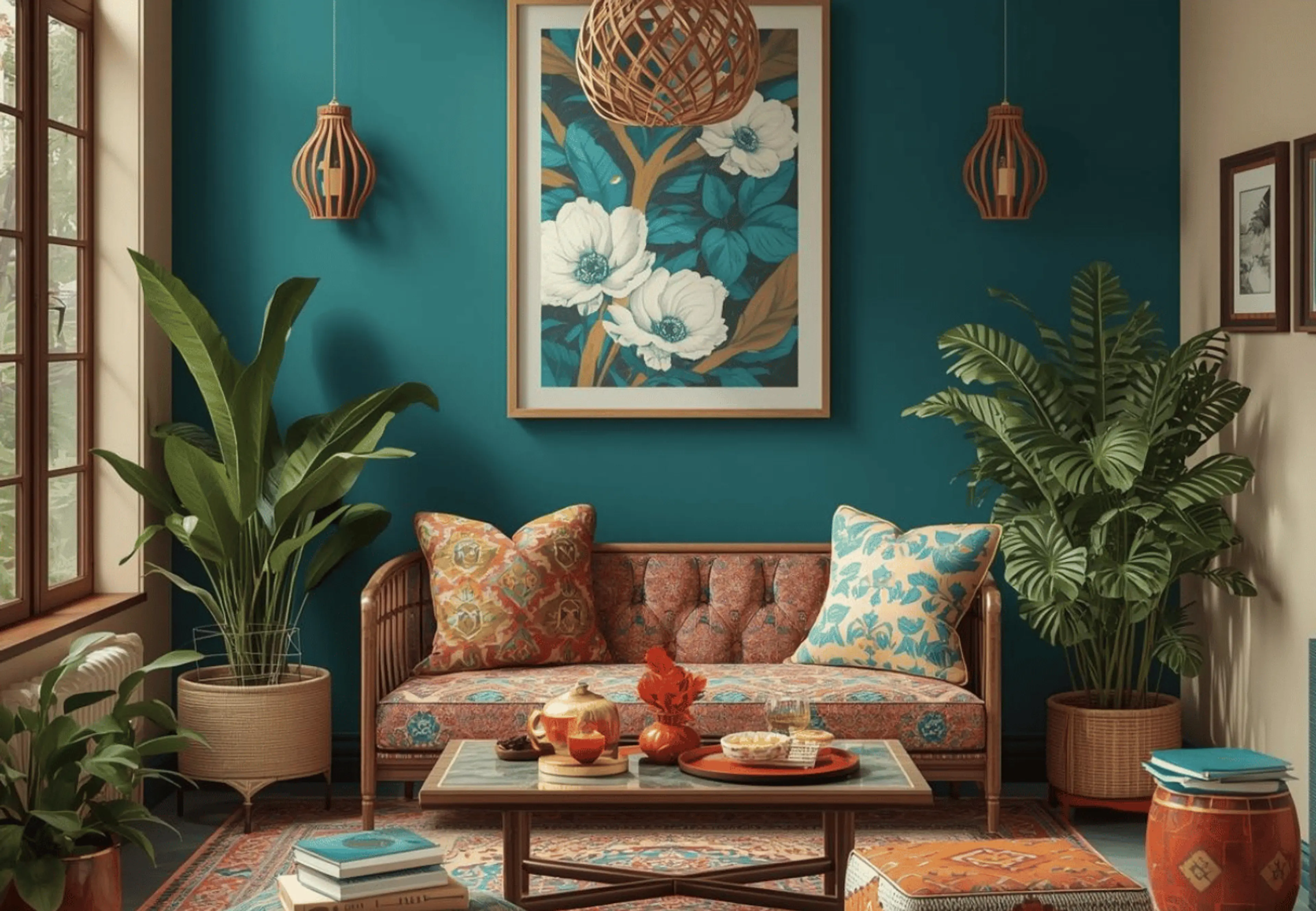
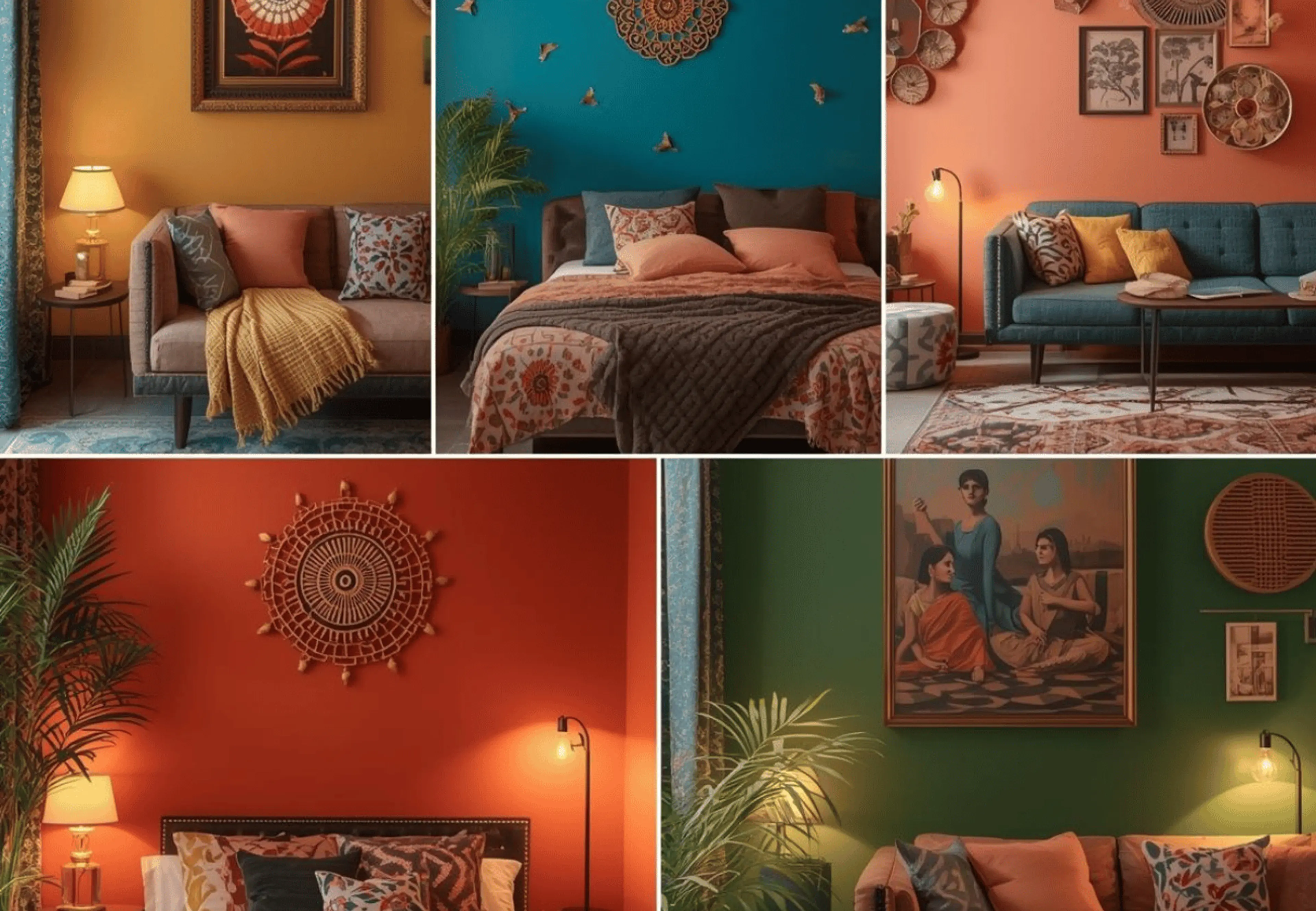
The highlight shade is for focal points like the main door, window grills, or small feature walls. Because it is used sparingly, you can experiment with richer tones such as mustard, terracotta, or teal. This is also where you can align with décor elements like planters, nameplates, and lighting. Even a compact home feels designed when its highlights tie together outdoor décor and outdoor wall painting ideas.
Top Trending House Colour Combinations For Outside Walls
Modern Indian homeowners are moving towards cleaner lines, earthy materials, and well-thought outside house painting colour combinations. Below are seven tried-and-tested schemes that work across different regions and building styles. Use them as ready references when discussing exterior paint combinations with your painter or contractor.
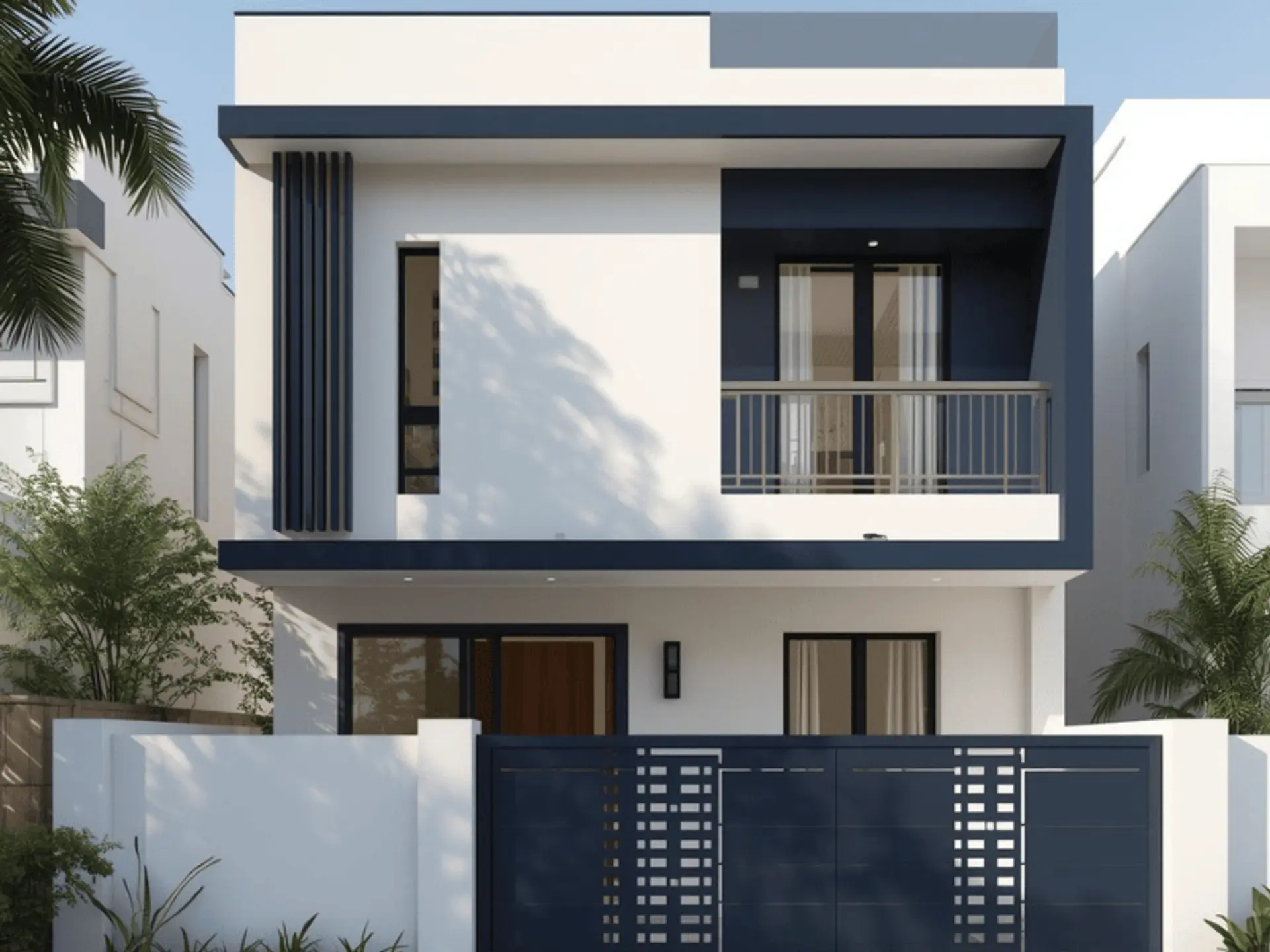
1. White + Charcoal Grey
This pairing gives a sleek, architectural look that suits villas, duplexes, and contemporary apartments. Crisp white walls reflect heat, while charcoal frames, railings, and bands make the structure look sharp.
- Main wall: Pure or soft white.
- Borders and frames: Charcoal grey.
- Doors and gates: Dark wood brown for warmth.
If you prefer minimal styling, this scheme keeps exterior colour for home timeless, and it pairs well with glass, steel, and stone finishes.
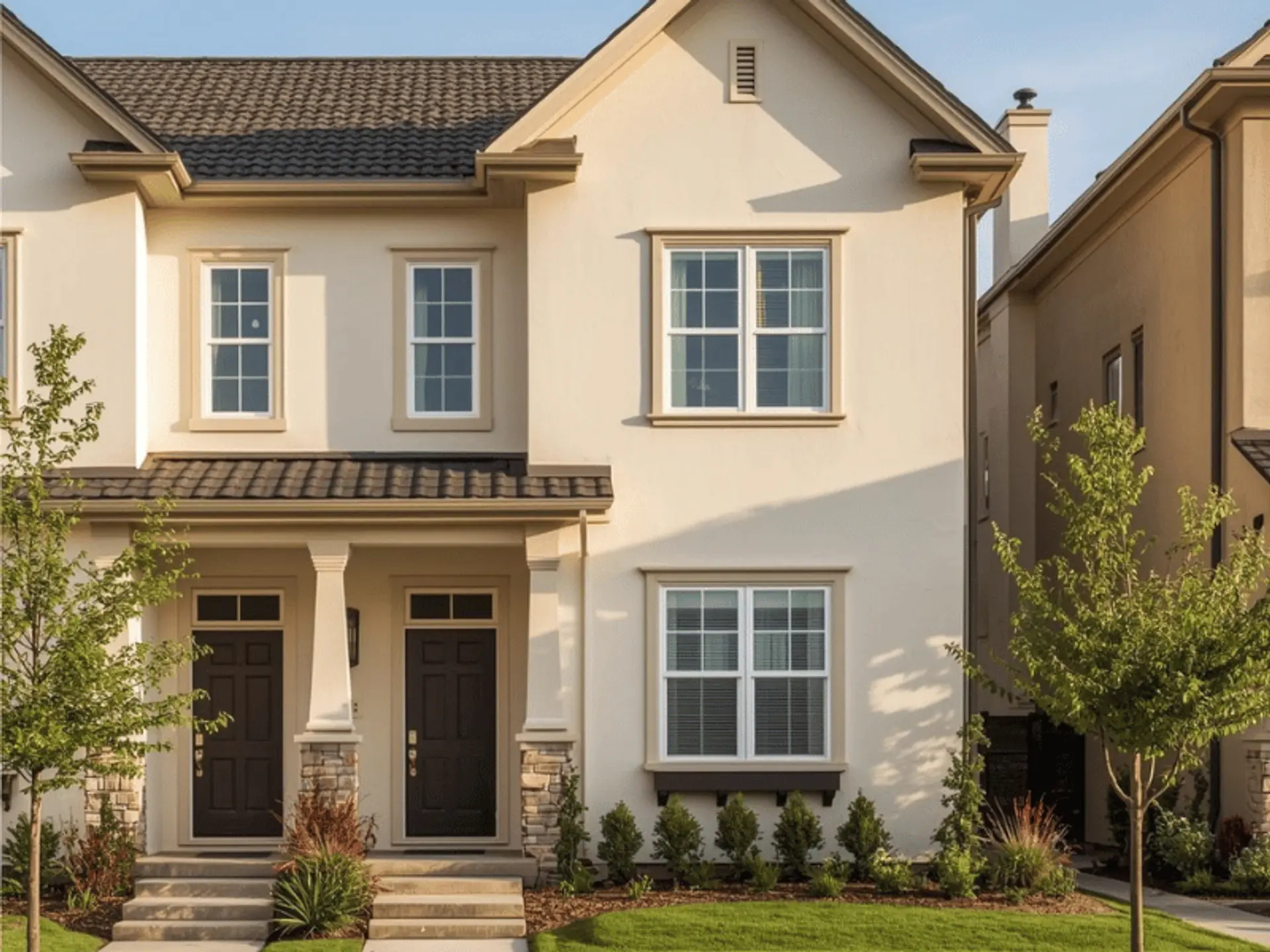
2. Cream + Coffee Brown
Cream and coffee are a classic combination for independent houses and row homes. Warm cream walls feel inviting and stay forgiving to dust, which is helpful on busy Indian streets.
- Main wall: Warm cream or ivory cream.
- Borders and highlights: Coffee brown.
- Doors and gates: Dark brown or wooden finish.
The deeper brown grounds the elevation and works well with tiled roofs, grills, and balcony planters, giving your outdoor paint colours a homely, settled feel.
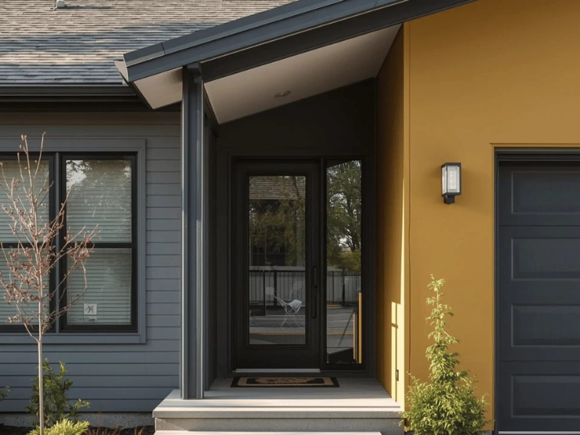
3. Grey + Mustard Yellow
For homeowners who enjoy a bold yet balanced facade, grey and mustard are a smart choice. Light grey walls create a neutral canvas, while mustard panels or niches bring energy without overwhelming the eye.
- Main wall: Light grey.
- Borders and design bands: Mustard yellow.
- Doors and gates: Matte black or deep grey.
This scheme suits city houses that want a modern edge. It is also a good pick when you want outdoor paint colours that stand out in a lane of mostly beige buildings.
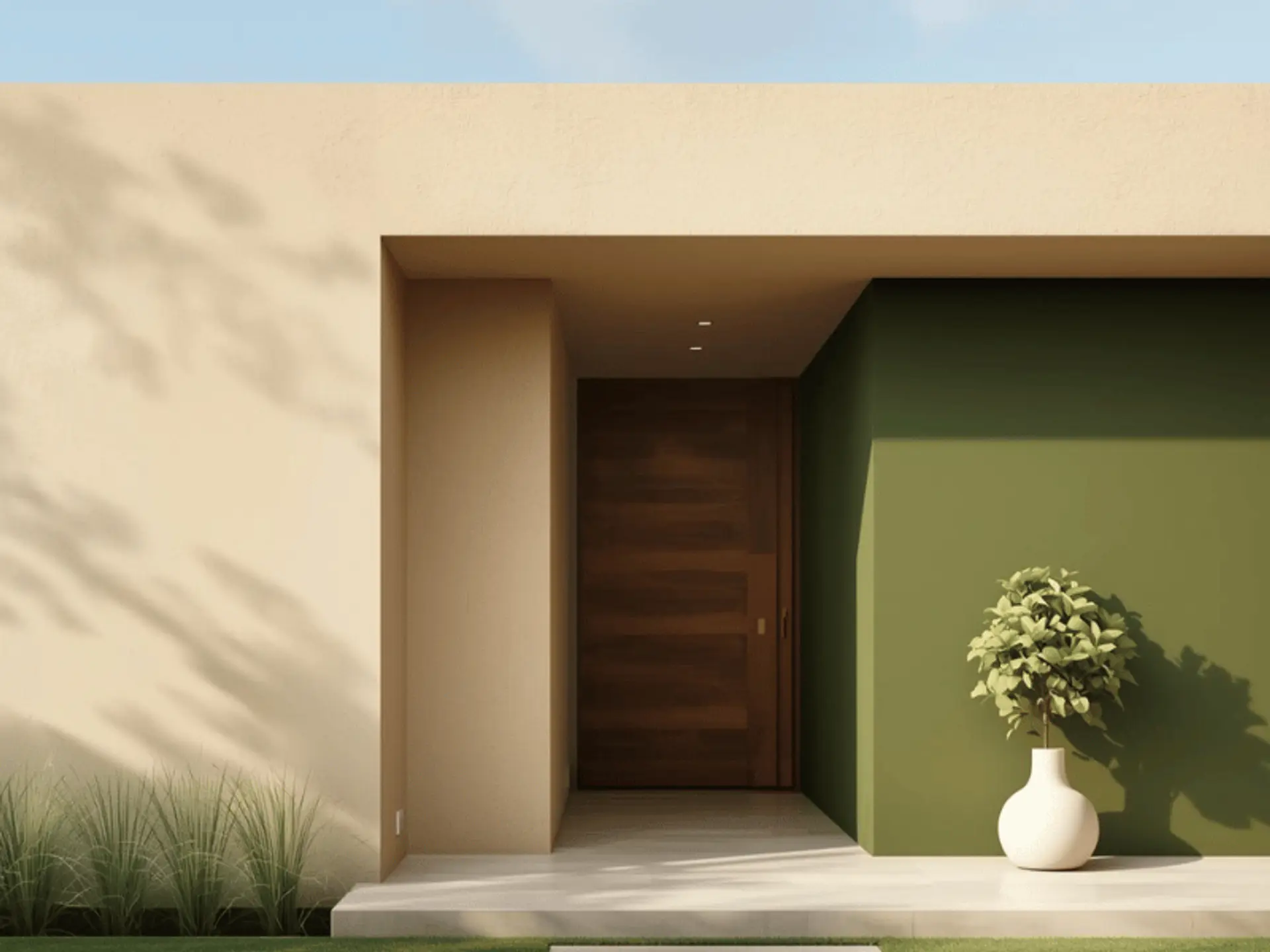
4. Beige + Olive Green
Beige and olive green echo the colours of soil and foliage, which blend beautifully with gardens and landscaped compounds.
- Main wall: Soft beige or sand beige.
- Borders and columns: Olive green.
- Doors and gates: Teak-toned wood.
This combination is ideal for homes with front lawns, courtyards, or potted plants along the boundary. It keeps the outside house colours calm while allowing greenery to be the hero.
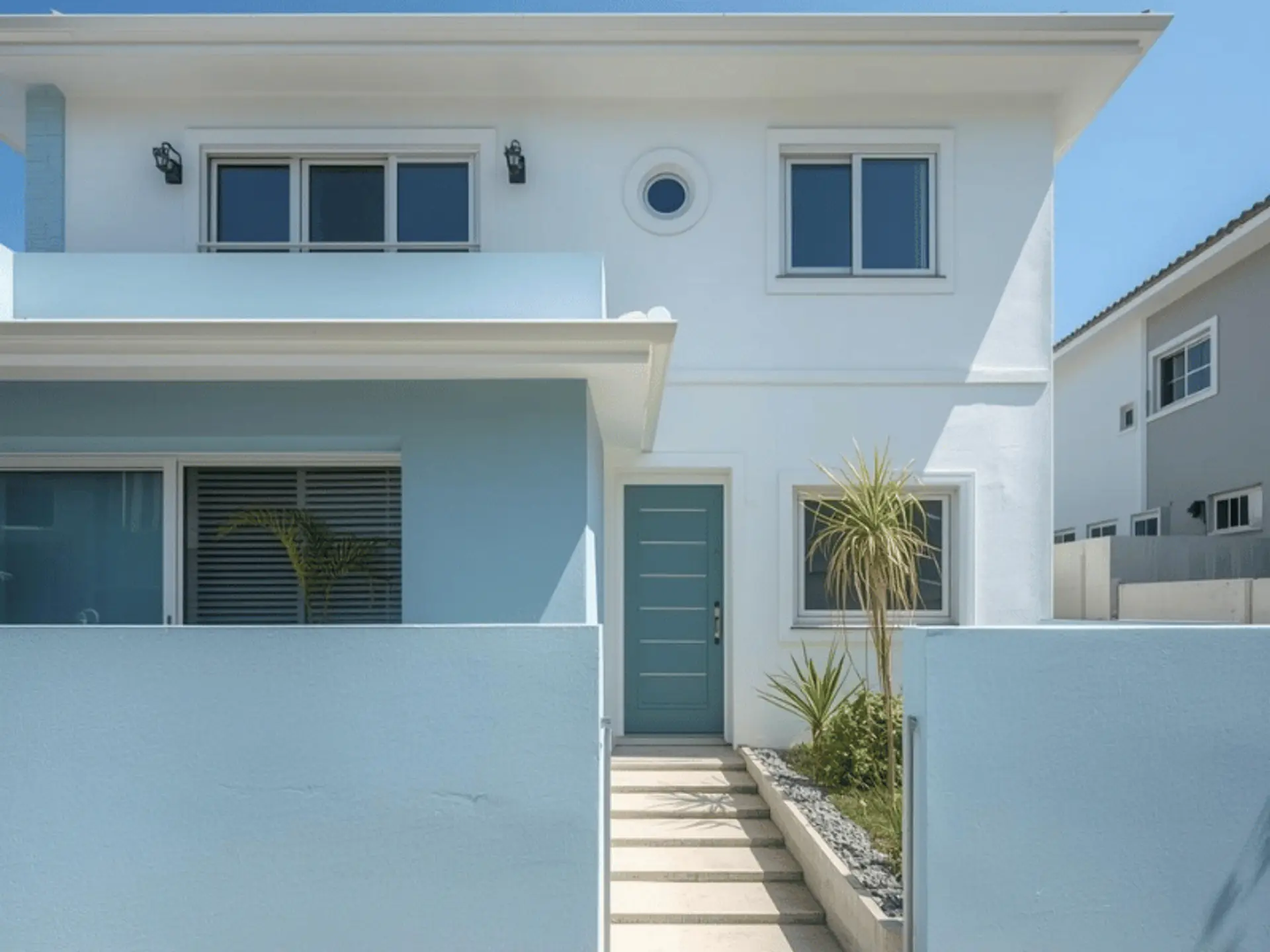
5. Sky Blue + White (Fresh And Bright)
Sky blue with white trims instantly feels cool and breezy, which is why it works so well in hot and coastal regions.
- Main wall: Sky blue or ice blue.
- Borders and window frames: Bright white.
- Doors and gates: Slate grey or navy.
On humid days, this scheme makes a building look airy and light. It is perfect if you want house painting colours outside that echo beachside homes without going too loud.
6. Ivory + Navy Blue
Ivory and navy create a polished, slightly formal look. The light base keeps the facade open, while navy details add depth and a touch of luxury.
- Main wall: Ivory or off-white.
- Borders, panels, or balcony bands: Navy blue.
- Doors and gates: Dark rosewood or black.
This pairing sits well on multi-storey houses, corner plots, and premium apartments. When combined with a high-quality exterior wall coating, it can make even a simple structure look upscale.
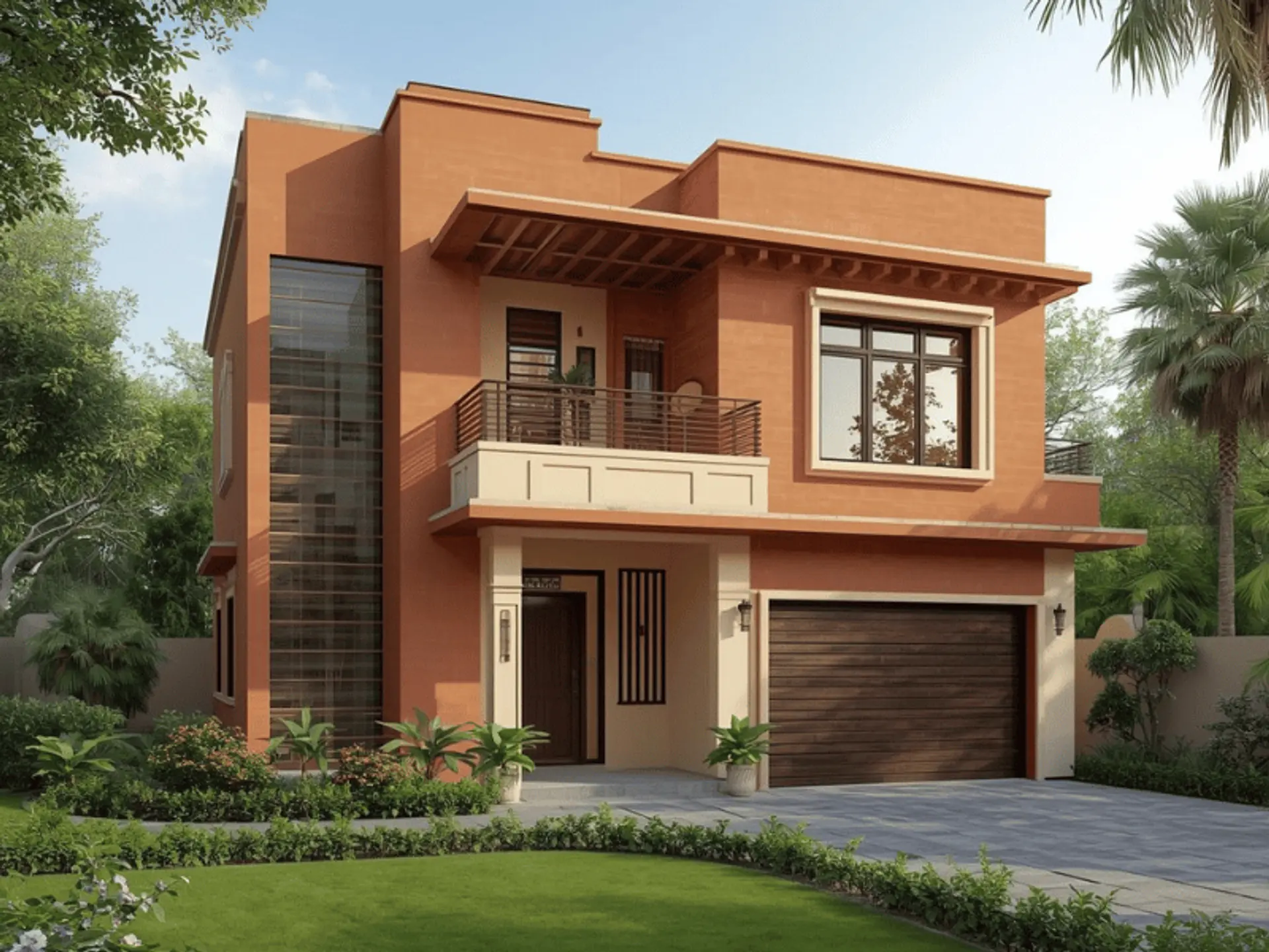
7. Terracotta + Cream
Terracotta tones are inspired by clay tiles and old courtyard houses, making them ideal for rustic, farmhouse, or Mediterranean-style facades.
- Main wall: Terracotta or clay red.
- Borders and frames: Cream or off-white.
- Doors and gates: Dark wood or rustic brown.
Soft cream details stop the terracotta from feeling heavy, while wood finishes complete the earthy mood. This is a natural fit if you are drawn to outdoor wall painting ideas rooted in traditional Indian architecture.
Conclusion
The right exterior wall paint colour combination does more than make your home look pretty. It protects walls from heat, rain, and dust, supports your architectural style, and even influences how spacious or compact your home appears from the outside. When you explore different types of exterior paints and shades, think about maintenance, climate, and how often you realistically want to repaint. Investing in a high-grade, long-lasting paint means fewer touch-ups and better value over the years.
Before final approval, view sample swatches at different times of the day, and talk to your contractor about finishes that suit local weather. A thoughtful choice of exterior paint colours can keep your home looking fresh and welcoming for a decade.
check for any query you have about the blog
Frequently Asked Questions
In Indian conditions, a good quality exterior system typically lasts five to seven years, sometimes longer on shaded elevations. Darker shades tend to absorb more heat and may fade faster, especially on west-facing walls. Lighter tones stay cooler and can look fresh for longer, particularly when combined with durable primers and topcoats. Surface preparation, including cleaning, repairs, and proper priming, is just as important as the shade itself. If you live in a coastal or highly polluted area, discuss extra protective layers and specialised coatings with your painter for better performance.
Never rely only on tiny shade cards. First, shortlist a few options that match your surroundings and neighbours’ homes. Then ask for sample pots and paint small patches on different walls - front, side, and terrace parapet. Observe these patches in morning, afternoon, and evening light before choosing the final scheme. This simple step helps you see how exterior paint combinations behave in real conditions and ensures your final exterior home colours feel right once the entire house is painted.