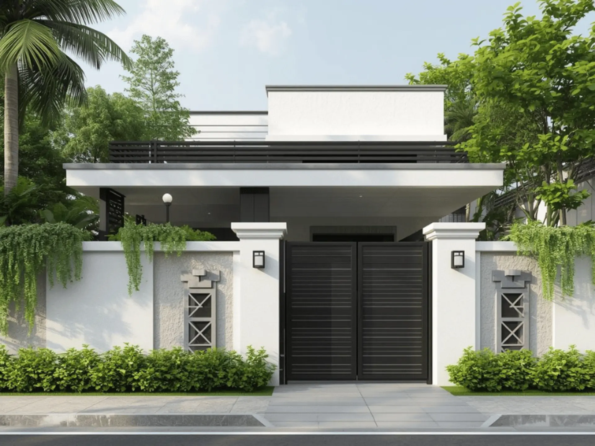
Introduction To Compound Wall Colour Combination For Your Home

 Dec , 2025
- Berger Speaks
- 4 Min Read
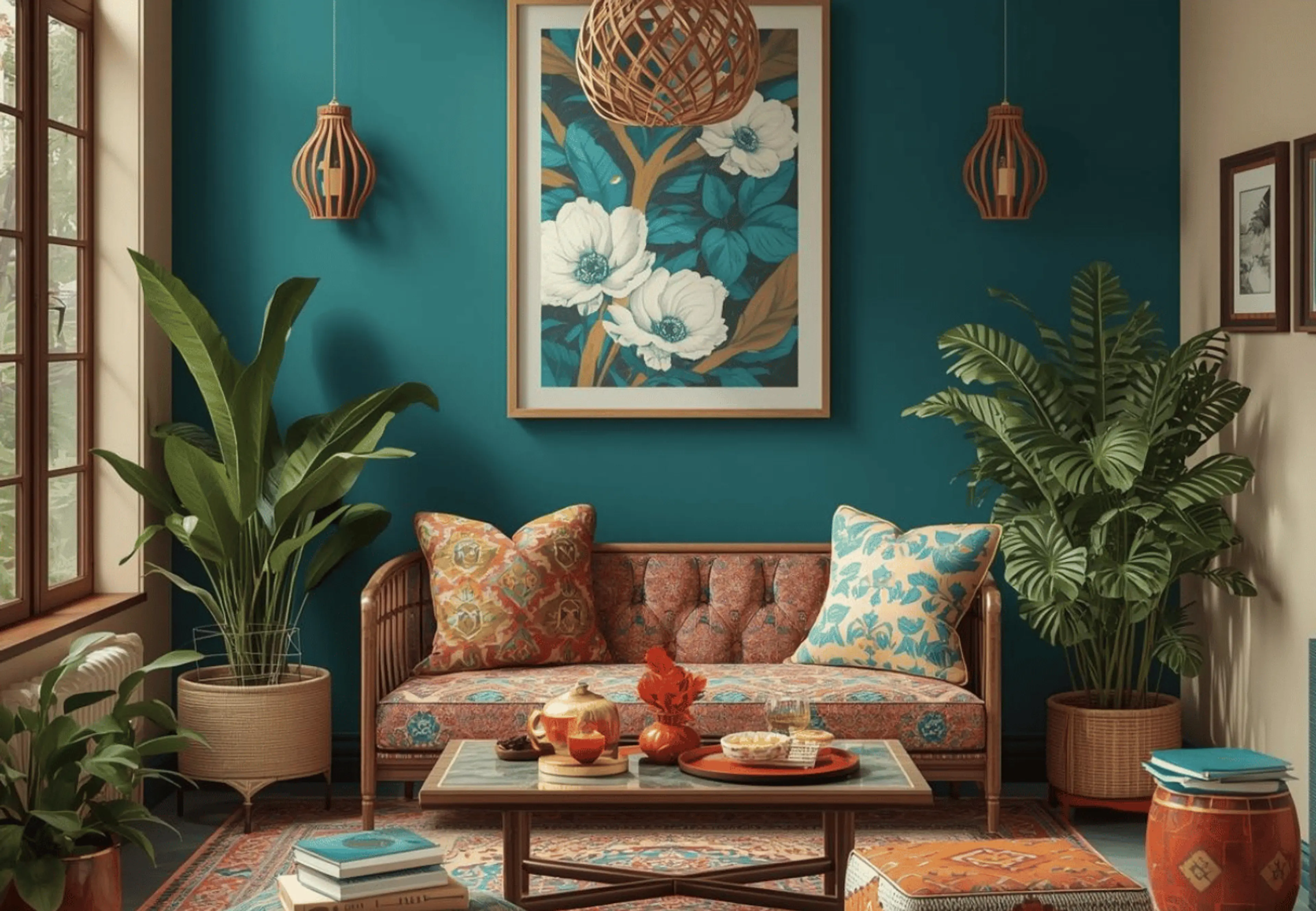
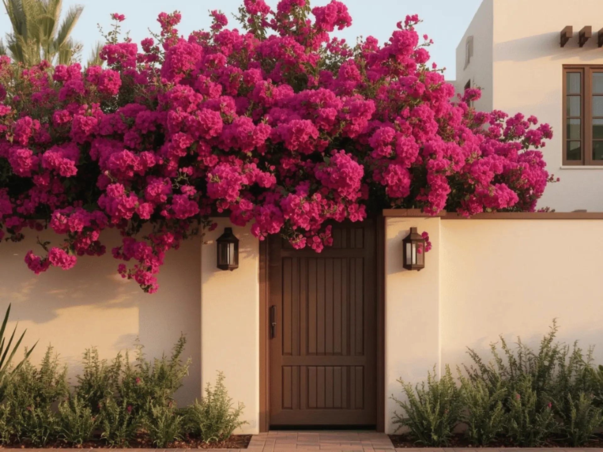
A compound wall does more than mark a boundary. It frames the gate, sets the mood of the frontage, and shapes the first impression long before anyone steps inside. In India, it also has to cope with heat, dust, rain splash, and the odd scuff from a two-wheeler. That is why choosing a compound wall colour combination deserves the same attention you give to the living room walls.
This guide brings together compound wall colours for common Indian home styles – independent houses, duplexes, and villas, along with clear tips to help you pick shades that stay good-looking for longer. If you are already comparing exterior wall paints, keep reading; a few smart choices now can save you repeated touch-ups later.
Why Compound Wall Colour Matters
A well-chosen boundary wall colour combination improves your exterior in simple, practical ways:
- It highlights pillars, coping, grooves, and grills, making the wall look designed rather than purely functional.
- It improves curb appeal by coordinating the wall with the gate and façade.
- It reduces how obvious small repairs and patchwork look over time.
- It makes maintenance easier when the shades suit your local dust and rain patterns.
The shade you pick becomes the everyday backdrop of your home. A very dark wall compound colour can show dust and water streaks quickly, while a very light shade can show muddy splashes near the base during the monsoon. Before finalising, check colour samples in bright daylight and warm evening light, and make sure they sit comfortably with your home’s elevation shades.
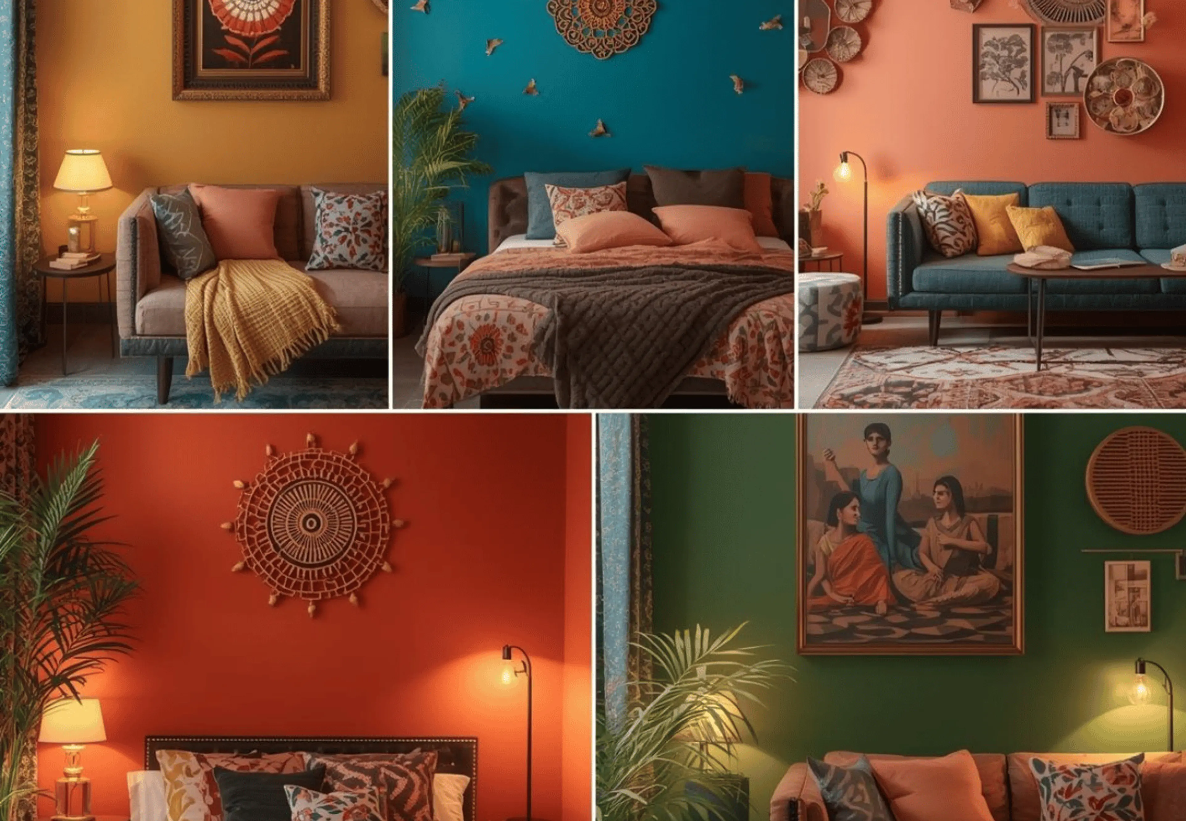
Best Compound Wall Colour Combinations
1. White & Grey
White and grey are a modern pairing that suits most gates and elevations. Use white as the main shade to keep the wall bright, and use grey for trims, pillar borders, coping, or the lower band where splash stains collect. Grey also works well inside grooves, giving depth without overdoing the design. This is a safe choice if you want a clean compound wall paint design with sharp, straight lines.
2. Cream & Brown
Cream and brown feel warm and grounded, especially with wooden or faux-wood gates. Cream keeps long stretches from looking heavy, while brown adds a sturdy base that hides dust better. Pick an earthy brown rather than a very dark chocolate tone, which can look harsh in peak summer sun. If you want a richer finish, a matte exterior-grade look often makes the wall appear more premium.
3. Yellow & White
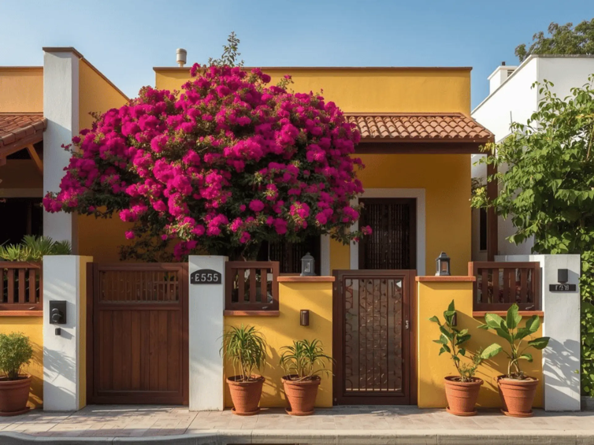
Yellow and white look cheerful and welcoming when the yellow is kept soft. Choose a muted yellow so it feels pleasant, not loud. Use white for pillars, capstones, and edge lines, and use yellow on the main panels. On long walls, a thin white stripe between the two shades can add structure. This combination is especially nice if your frontage has greenery, because yellow lifts plants and makes the entry look brighter.
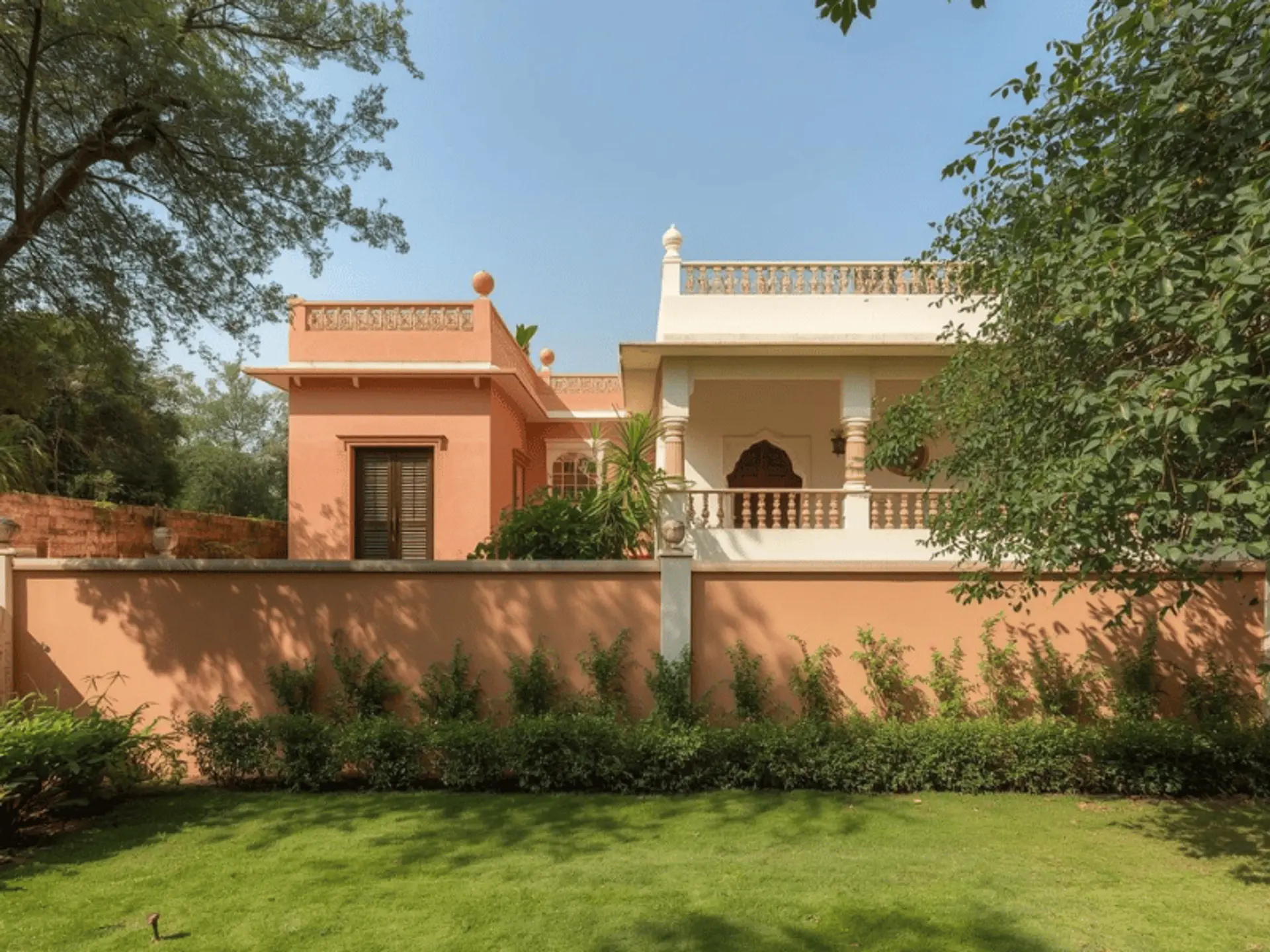
4. Terracotta & Beige
Terracotta and beige give an earthy, traditional feel that still looks refined. Terracotta adds character, while beige keeps the wall light and comfortable to look at. This palette works well with tiled roofs, stone cladding, and rustic paving. Because warm pigments can fade if the paint system is weak, choose a compound wall paint colour with good UV resistance for sun-facing stretches.
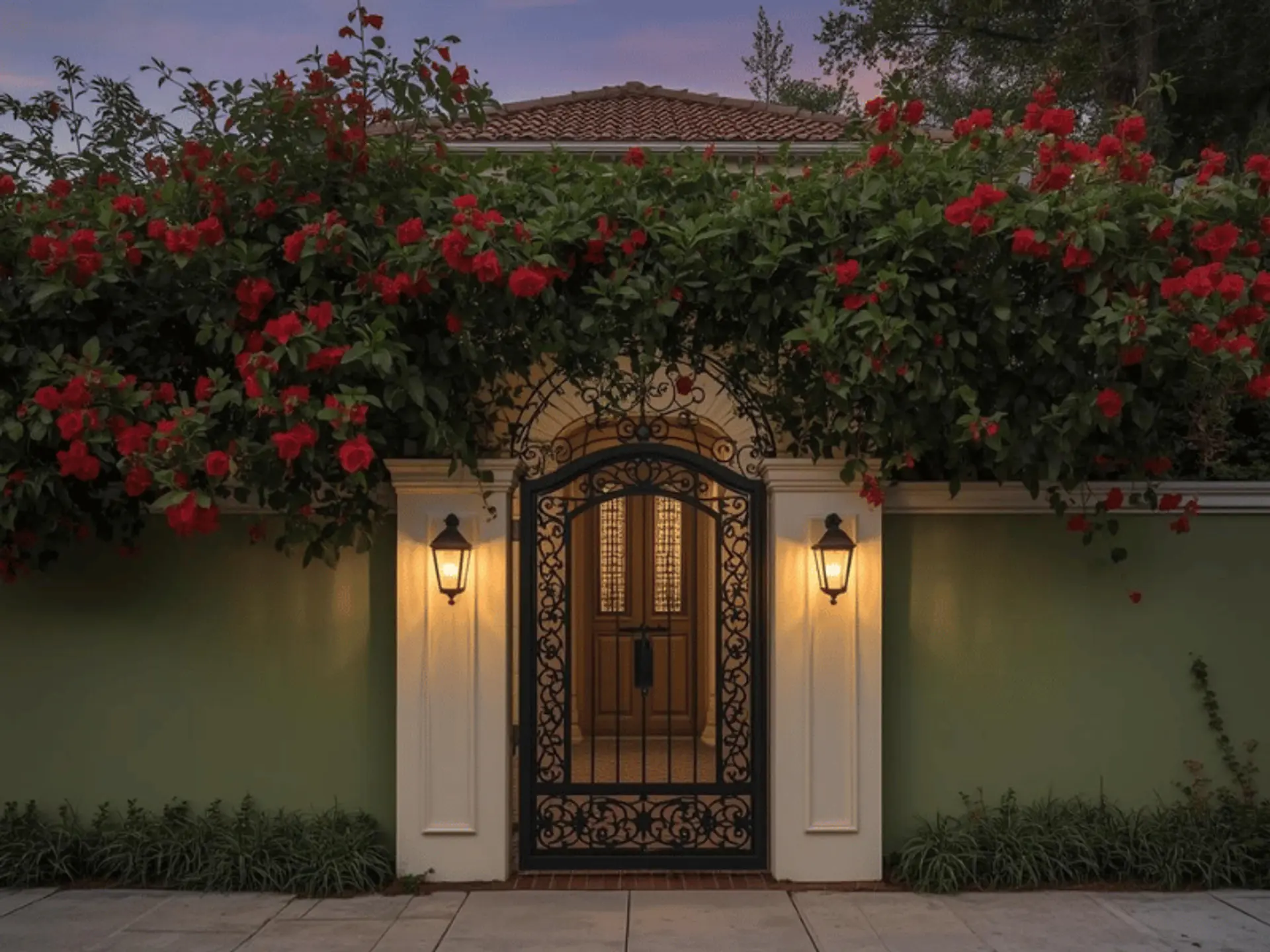
5. Blue & White
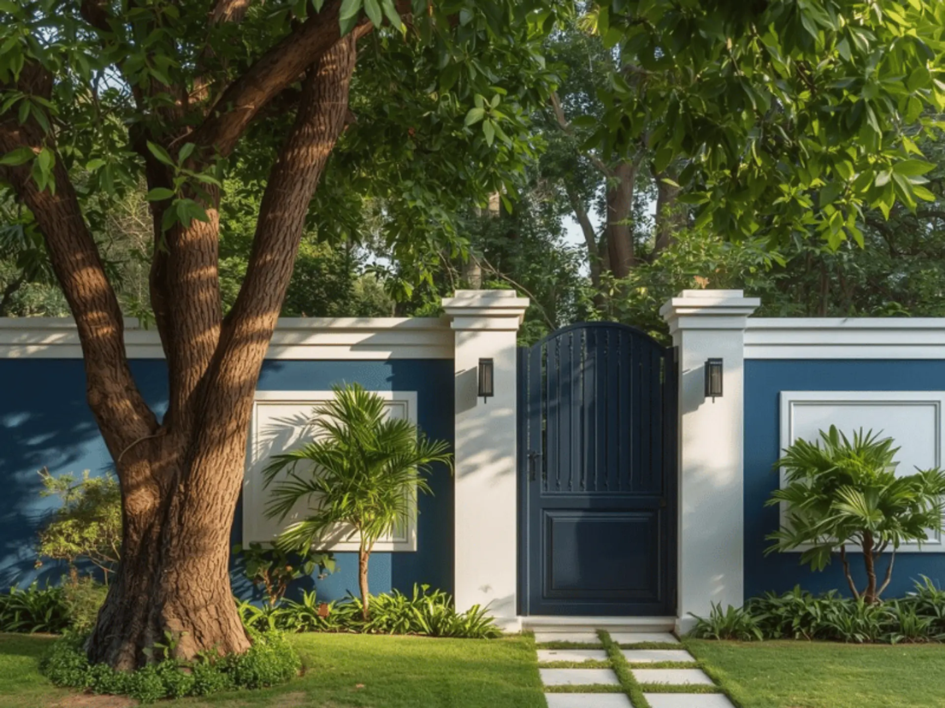
Blue and white can look crisp and calming, particularly for modern elevations and coastal towns. Keep white dominant and use blue as an accent – on pillar faces, a gate-side feature panel, or a neat band. Avoid extremely deep blues if your area has hard water staining, as streaks show more. Planned well, this colour pair can make the house compound wall painting look fresh without appearing flashy.
6. Olive Green & Cream
Olive green and cream blends naturally with gardens and shaded streets. Olive looks richer than light green and usually hides dust better, while cream keeps the wall welcoming. For tall walls, olive on the lower half and cream above creates balance and reduces visual heaviness. This is a good pick if you want a calm, nature-led boundary that does not depend on trendy shades.
7. Maroon & Grey
Maroon and grey look premium when used with control. Keep grey on larger surfaces and use maroon near the gate – on a feature panel, pillar border, or nameplate zone. Choose a slightly muted maroon so it stays elegant in daylight. Clean masking matters here: straight edges and consistent bands make the wall look intentional and well finished.
8. Light Grey & Mustard Yellow
Light grey and mustard yellow add personality while staying modern. Light grey keeps the base neutral and works with most gate colours. Use mustard as a highlight – on a thin stripe, pillar inset, or small panel near the entry, so it feels like a design detail. This combination suits mixed elevations in a layout because grey creates uniformity and mustard brings warmth.
9. Peach & Off-White
Peach and off-white feel soft, family-friendly, and pleasant in most Indian climates. Peach adds warmth, while off-white keeps the wall bright. For stain control, use peach closer to the base and off-white above. This pair also suits warm outdoor lighting and simple planters. With a tidy finish, it keeps compound wall painting colours looking fresh even when streets are dusty.
Tips For Choosing The Best Compound Wall Colour Combination
1. Consider Your Home’s Exterior Wall Colours
Start with what you already have: the façade shade, roof tiles, balcony railings, and the gate finish. Your compound wall colour combination should either match these tones or support them. Warm houses (cream, beige, sandstone) look best with warm boundaries, while cool houses (white, grey, blue) look best with cool boundaries. A simple rule is one main neutral plus one accent. Test both exterior wall colours on a small patch and view it from the road in morning and evening light before you commit.
2. Consider Climate and Weather Conditions
Indian weather is demanding, so shade choice must go hand in hand with performance. In hot regions, lighter shades feel calmer and reflect more light. In humid or rainy regions, algae and damp marks can appear, so pick paints with anti-fungal protection and good washability. If your wall gets harsh afternoon sun, select a compound wall paint colour with strong UV resistance. For extreme summers, heat-reflective paint for exterior walls on sun-facing stretches can reduce surface heating and help the finish last longer.
3. Consider Your Surroundings
Look at what your wall sits against – trees, dust, sea air, or dense traffic. In green surroundings, earthy tones like olive, terracotta, and cream blend naturally. In dusty areas, avoid very light shades near the ground; a mid-tone skirting band hides marks better. In urban lanes with concrete and metal, neutrals like white and grey look clean and suit most gates. Also, think about height: a tall wall feels lighter with a pale top section and a slightly deeper base shade.
Conclusion
A boundary wall is seen every day, so it is worth choosing colours that look balanced in Indian light and are easy to maintain. Pick a tidy boundary wall colour combination, keep accents controlled, and use a paint system made for outdoor exposure. A reliable compound wall paint colour, plus a quality, durableexterior wall paint finish, can reduce frequent touch-ups and keep the entry looking cared for longer overall. If you are unsure where to start, choose a neutral base and one accent near the gate, then keep the rest of the wall simple and clean.
check for any query you have about the blog
Frequently Asked Questions
Yes, but use bold shades with restraint. Keep the main wall neutral, and add the bold colour only on a feature panel near the gate, on pillar faces, or as a narrow stripe. This keeps the boundary from looking busy and makes the accent feel premium. Always check the shade under daylight and under your exterior lights before finalising.
Many homeowners prefer light, soothing tones on the boundary, such as white, cream, light yellow, and light green. These are often chosen to keep the entrance welcoming and calm. If Vastu matters to you, combine those preferences with your home palette and the climate in your city, so the colour remains both comfortable to live with and easy to maintain.
Begin with surface preparation: remove loose paint, clean dust and algae, repair cracks, and apply an exterior-grade primer. Choose washable paints with anti-fungal protection for monsoon regions and strong UV resistance for hotter regions. Keep your compound wall paint design simple if your lane is dusty, because deep textures trap grime. Plan house compound wall painting during a dry spell so the coating cures properly, and stick to one consistent compound wall paint colour for future touch-ups.