Captured in Colour! For September 2016

 Sep , 2016
- Colour Magazine
- 4 Min Read
Colour Stories
A picture may be worth a thousand words. But it’s the coloured ones that bring us a step closer to reality. Read on to know the fascinating story of colour photography…
When photographing the world around us, the property of colour is something most people tend to take for granted. We expect our cameras to portray the visible light spectrum with precision. In a world so obsessed with colour, we sometimes forget that it took a long time to get to this point in time and how many scientists and photographers looked at it as a fantasy!
Few of the first experiments began in the middle of the 19th century. The original approach was to find a material that could directly share the colour properties of the light that fell upon it. The ability to capture colour came in 1851 from a minister called Levi Hill living in upstate New York. He declared that he had discovered a process to make natural colour photographs which he named hillotypes. This was an astonishing claim from someone with no formal training at a time when the world's greatest scientific minds were competing to come up with just such a process. But it was his refusal to share the process that ignited both mystery and controversy for another 50 years as inventors were still dreaming to find a way to make colour photographs. Among those dreamers were the French filmmakers, the Lumiere Brothers - Augusta and Louis. They both were fascinated by photography since their childhood.
The key insight was to create a colour negative by combining three images - one red-orange, one green and one violet. These colours came from fine, microscopic grains of dyed potato starch which the Lumieres called an autochrome. A fine mixture of this powder, a layer thick, was applied to a glass plate. The spaces in between the starch grains were stuffed with lampblack and then the entire plate was subjected to tremendous pressure. A light sensitive silver bromide emulsion was applied after that. Each grain acted as a tiny filter allowing the corresponding coloured light to pass through and expose the emulsion. Once processed, the result was a glass transparency. Until the advent of colour films in 1930s, this was the method of colour processing. This is how the Lumiere Brothers are credited with inventing the first commercially viable colour photograph. The autochrome remained the preferred method for creating colour images and was later replaced by other techniques like Kodachrome and Agfacolour.
Many of these images have been lost over time owing to the inherent fragility of the plate. Few carefully protected archives remain today, leaving behind a rich heritage of autochrome imagery for us to appreciate!
Colour Trivia
Colour Facts For September 2016
- Astrologers determine the size of stars by their colour. The bluer the star, the bigger it is. The warmer (reddish-orange) the star the smaller it appears to be.
- Ever wondered how soap bubbles or inside of the shells have the ability to change colour when viewed from different angles? It is because of Iridescence – a property of certain surfaces that allow this to happen.
- We often use words like Tint & Shade to describe colours. But do you know the difference between both? Tint is a colour derived by adding white to the base colour whereas Shade is the colour derived by adding black to the base colour.
Colour Quotes For September 2016
Painting is silent poetry and poetry is painting that speaks.
- Plutarch
Dream in colours never seen before. Be creative.
- Anonymous
When you reduce life to black and white, you never see rainbows.
- Rachel Houston
Colour Tips For September 2016
- Shabby-chic décor is a viable option for you if you love pastels but like the interiors to look artfully worn out and distressed. To achieve the look, paint your walls in hues of sea-foam green, teal, petal pink and select furniture made from light wood or paint it in shades of white. The style emphasizes bright colours but in a muted, elegant style.
- Grey is an unconventional choice when it comes to painting rooms but don't let that stop you. Grey is a versatile colour so if your home has a lot of wooden furniture, pick a shade of grey with warm undertones and if your home is an eclectic mix of various materials, artwork and gets lot of natural light, choose a shade which has rosy undertones. Light tints of grey can look sterile so pair it with bright artwork and inviting upholstery to make it cozier.
- Blue by itself is a vivid, strong colour and thus it is usually paired with neutrals and not with other shades of blue. But one combination which works great is pairing turquoise blue with cobalt blue and offsetting it with white. This gives a beautiful Mediterranean feel to the room and invites in natural light while maintaining the balance between upbeat and peacefulness.
World Of Colours
Colours & Emotion For September 2016
- Every politician tries their best to get votes and win the election and this leads to extensive use of colour-psychology added to every other tactic in the book. The first thing you notice about a person is his/her clothes and that's why you'll see most politicians wearing darker tones of blue during public addresses. Blue gives a trustworthy, calm, respectable vibe. Black is a colour not chosen for ties because that lends a wild look to the attire, in fact mostly, black is avoided altogether since it is deemed unapproachable. What really are preferred are dark tones of grey or blue.
- It is not just the colour of your tie that matters, but the particular shade too. This bit of advice seems to be followed by most male figures of authority since maximum men like wearing dark suits, light shirts and a dark red/burgundy tie. This is because the darker tones of red are associated with strength and passion. Over-bright ties are distracting while pink has taken on a very political implication in recent times. Even the texture of the tie matters when it comes to conveying emotion. Glossy ties depict ambition and matte ties suggest subdues power.
Colours & Fashion For September 2016
The Oscars' red carpet this year was ruled by cool shades of blue and purple by everyone- the stalwarts to the newbie nominees. The preferred tones of blue were the more royal, deeper shades like Prussian blue, electric blue, vivid indigo, purple, violet etc. The red-carpet staple is mostly hues of red and black but this time the ladies and gentlemen, from Tina Fey to Mindy Kaling seem to have given convention a toss and opted to appear serene, exotic, sophisticated, tranquil, slightly aloof and very, very mysterious.
Colours & Gems For September 2016
- Aventurine is often called the Gambler's Stone. It is known to bring the wearer good fortune. It is derived from the Italian word 'a ventura' which means "by chance". In the 1700's, an Italian glass-maker accidentally discovered it when he dropped copper filings into some molten glass. Green aventurine was used to adorn statues in ancient Tibet. The Tibetans would affix aventurine gemstones to the statue's eyes, thinking the green quartz would improve the visionary powers of the statues. This belief remains at the heart of the meaning of aventurine. They also wore jewelry made from it to help fix nearsightedness and boost creativity.
- Hessonite is derived from the Greek word,'hesson' meaning inferior. It is known as Gomedhaka in Sanskrit and is believed to be the fingernails of the God Vala as per Indian mythology. It is known to increase creativity and power of imagination. It is also believed to increase the level of self-confidence and to help avert disasters and protect against evil spirits. It can also increase ambition and increase the awareness of a person's subtle senses. Physically, it is said to help cure nervous disorders and degenerative diseases like cancer, of which Rahu can be the reason.
Colours & Nature For September 2016
- Fly Geyser is nestled on a patch of land in Nevada's Black Rock Desert. It was formed by boiling underground water leaking into a well and spews water about five feet high. It is covered with thermophilic algae, which flourishes in moist, hot conditions, resulting in the multiple hues of red and green that adds to its stunning appearance. The attractions is situated on a private land and not open to tourists. Tourists who make prior arrangements with the owners are able to get a closer look of this natural beauty for a fee.
- Gouldian Finch is one of the most amazingly coloured birds found in Australia. In 1841, John Gould, an English ornithologist named this bird after his late wife, Lady Elizabeth Gould. It is also referred to as the Lady Gouldian finch or Rainbow finch. It has a grass-green upper body from the lower nape to the back and wings, a purple breast and a pale blue rump. It has a bright yellow belly and a whitish bill with a red or yellow tip. There are three distinct colour variations in the Gouldian Finch, with either a black, yellow or red head.
Decor
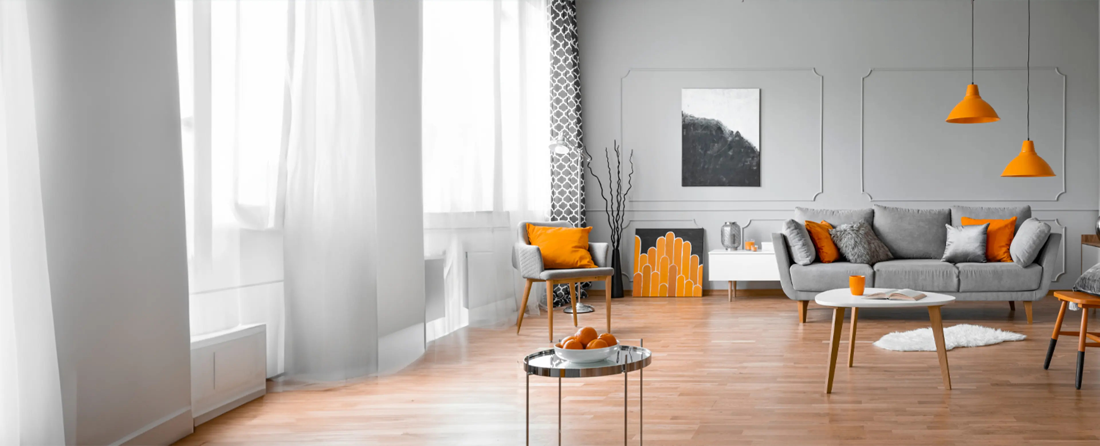
Get It Right The First Time
New phases of life are always exciting, but the feeling of being able to finally have your own space is right up there with being gifted a million rupees. First apartments are associated with adulthood, responsibilities and the freedom to do what you want. We're here to tell you how you can nail the decor just right for all the days yet to come...
- Your main focus must be your sanctum sanctorum, i.e., the bedroom. Invest in good bedding, research what kind of mattress will be best for you, and buy sheets and duvets from a store of repute to avoid easy wear and tear. Your bed is where you're likely to be lounging at least 30% of the times, and this calls for good pillows too, not to mention a light with high wattage right above. If you're doing up the room in your favourite colour, go for a complementary or a triad colour scheme so you have more options for accents and other decor.
- Since your first apartment might be a rental, it is best to avoid heavy pieces of furniture. Buy a standalone couch and learn how to mix and match seating arrangements. Pay for a sturdy coffee table which can double up as a study table or workplace is necessary. Try and get one which has shelves built in to the sides so you can probably keep your magazines and newspapers there. Another bit of furniture is a TV stand or entertainment unit which can be extended at will. An area rug is also important to give the room more structure and differentiate it from the dining area/kitchen. Lastly, buy at least one lamp apart from the overhead lighting and place it in the corner to create a cozy section.
- Coming to the kitchen, stock up on the basic utensils. Buy sets of cutlery and plates. It is better to pick sets of disposable utensils too, for all the parties you're sure to host. A marble countertop is easiest to clean, so see if you can pitch for one. Ensure the kitchen has enough shelves and cabinets for all the food and condiments. You'll also need a storage unit to keep things like kitchen towels, napkins etc. and things like serving trays which won't be used regularly.
- Lastly, miscellaneous. Be sure to buy a laundry basket, waste-paper baskets, cleaning equipment, blinds - if curtains are too much of a hassle, keep a cabinet wherein you can store the daily essentials, and a shoe-rack is honestly helpful too.
- Whatever look you're going for, it is crucial to have storage spaces for all your gadgets and other expensive items. It is also equally important to have a few extras of everything handy, for unexpected guests or other situations. Don't forget to leave a couple of walls bare to hang all the framed pictures of your new life next to memories of the old!
Colours & Ancient Sciences
Feng Shui For September 2016
Paintings play a very important role in Feng Shui design of your living space. Read further to choose art according to the Feng Shui energy you need…
Paintings to Feng Shui Your Home!
An ideal Feng Shui space is not the picture-perfect abode of Zen that we imagine. It refers to a space that has the best Feng Shui energy to support a particular activity meant for that living space.
In a situation where you cannot change the colour of the wall, you can hang a painting in a special shape and colour to balance your room. There are 5 elements in Feng Shui paintings- water, metal, earth, wood and fire that you can choose from.
Place paintings that have seas, oceans, rivers and fountains in the Northern sector for harmony in life, money and career. If you place these water paintings in the East, it would help accentuate the Wood energy and suppress the excess Fire energy as well.
Metal is a symbol of money and materialism. The use of metal paintings can invoke the energies around. Install a painting of a bowl full of oranges, or a circle of silver, white, gray and gold in the North-west or the West to bring in an inflow of gold. Such paintings accentuate the cash inflow energies and leadership qualities as well.
A painting that depicts a beautiful mountain top, or a painting which has tones of yellow, cream and brown in them is perfect for relationships, family, business and loved ones. These earth paintings should be placed in the South-west part of the house for harmony in relationships at home or at work. For wisdom and knowledge, placing the painting in the North East sector would be ideal.
Place wood paintings depicting natural energies, freshness and greenery in the South-east or the East for fortune, abundant growth and wealth.
Paintings of the symbol of Fire, Phoenix or a red triangle are ideal for those looking for recognition and success. Place the painting in the South to activate the energy. Put up the right kind of art to maximise on the flow of positive energy.
Reiki For September 2016
In life, we deal with a variety of unforeseeable circumstances almost every month or so and sometimes, they seem to pile up all at once till you're completely devoid of any energy whatsoever. What combating these problems does is not only decrease your physical energy but drain you mentally, emotionally and spiritually too.
Reiki to Restore Balance
We often give our body time to rest after any physical setback like an accident or injury, but we do not realize that our energies need an equal if not more amount of time to replenish themselves. Reiki; the ancient technique of complete relaxation by releasing stress and toxic tension comes to our rescue in a scenario such as this. It involves the transferring of the subtle 'life force energy" into the body through the hands. It helps release all the pent-up stress and restores the body's chakras.
One method to use Reiki to relieve stress is crystal healing. One of the simplest ways to carry this method through is by placing a crystal or stone of a particular colour on each area required. Practitioners believe that the interaction between the stone and the chakras will go a long way in restoring the balance lost. While it is not necessary, it is best to consult the reiki advisor if your stone does not feel comfortable when first placed on your body. The stone might change its feeling once the energy has been absorbed. There are also crystal bowls available that can be tuned to sharps, flats or pure tones.
Another method usable is the drumming method. As children, we use sound, especially sounds that we create to feel comfortable, to give way to expression and it is this elemental phenomenon that Reiki tries to tap into and use to heal us.
One has to first focus upon the intention of Reiki and ensure which issue you want healed. All the healing Reiki symbols need to be drawn on the drum so that energy is channelled into it. The Reiki practitioner must draw the Usui power symbol on himself/herself and the client and also proceed with the intention that all the chakras are aligned. The healing sound is said to go a long way in restoring the required balance to the client's life.
Vaastu For September 2016
Plants play a pivotal role in energizing our surroundings. If you believe in Vaastu, then read on to know how to keep plants in the right direction to bring happiness, prosperity, good luck and wealth in your life…
Plants for Positivity!
Plants should be picked with care and planted in the proper Vaastu-compliant direction to draw great results. It purifies the air in and around the house, bringing prosperity and good health.
Tulsi is the most common plant found in every household in India. It is grown not only for its religious importance but also for its medicinal properties. As per Vaastu, Tulsi should be grown in the North, East and North-east direction of the house. It may also be planted in the front or back side of the house.
As per Vaastu, flowering plants such as Marigold, Rose and Jasmine are good to be grown around the house as they emit positive energy. These should be planted in the South-west part of the house.
Fruit-bearing plants should be grown in the East of the house. Thorny plants like Cactus should not be grown inside the house as they spread negative energy. Bonsai plants should also be avoided inside the house.
Bamboo plant and Money plant are also one of the most common plants that are known to bring good luck and prosperity to the inhabitants of the house. Creepers should be grown near the entrance but should not rise on the boundary wall.
Tall, big trees should be grown in the South, West and South-west direction of the house. It should not be grown in front of the house. Care should be taken that the big trees be grown sufficiently away from the home or its roots may cause damage to the foundation.
Sacred trees such as Peepal and Banyan and Peepal tree should not be grown near the house. These should be grown in close proximity to a temple or any other place of worship.
Small trees can be grown in the East and North direction of the house but never in the North-east side.
Raise the positive energy levels of your home by beautifying it with plants and don't forget to take good care of them, as on the long term they take good care of you.