The Oldest Colour Revealed! For February 2019

 Feb , 2019
- Colour Magazine
- 4 Min Read
Colour Stories
Have you ever wondered what the world’s oldest colour is? Read all about it here…
Did you know that the scientists have discovered the world's oldest colour? It is none other than bright pink! Apart from being the oldest colour in existence, these bright pink molecules also shed light on the evolution of life.
Although the Earth is 4.6 billion years old, it is proven that large complex creatures only appeared about 600 million years ago and this 1.1 billion-year-old pigments were made by microscopic creatures. Interesting, isn’t it?
This insight was shared by researcher, Dr. Nur Gueneli, who discovered the pigments as part of her PhD studies at Australia National University. Her team discovered this colour in 1.1-billion-year-old rocks deep beneath the Sahara Desert in the Taoudeni Basin of Mauritania, West Africa. Fascinating, isn’t it? The researchers crushed these billion-year-old rocks into powder, extracted and analyzed the molecules of ancient organisms within them and discovered this colour.
It is also stated by Nur that these bright pink pigments are the molecular fossils of chlorophyll that were produced by ancient photosynthetic organisms inhabiting an ancient ocean that has long since vanished. This insight also sheds light on why larger creatures developed relatively slowly.
Dr. Gueneli stated that her first reaction was of sheer amazement when she saw the pink colouring in the crushed rocks. She said that her team thought that the rock powder would turn black when they were doing their experiments on it, however they turned pink. The rocks could contain other colours, from a blood red to a deep purple too. Gueneli explained how important this discovery was.
In her words, “Imagine you could find a fossilized dinosaur skin that still has its original colour - green or blue. That is exactly the type of discovery that we've made." Isn’t that exciting?
In words of senior researcher Jochen Brocks, “When held against the sunlight, they are actually neon pink.” “At first I thought it had been contaminated. It is just amazing that something with a biological colour can survive for such a long time.”
So, next time you see a bubble gum, a flamingo or a cotton candy in bright pink, don’t forget that it is the world's oldest colour!
Also, if you are inspired now, adding pink in a small space, like on the wall of a foyer can make a stunning statement without too much investment. You can use this gorgeous shade to spruce up a lackluster space as well.
Colour Trivia
Colour Facts For February 2019
- Goodbye violet and hello coral. Pantone has named “Living Coral” its Colour of the Year for 2019. ‘Living coral’ is an animating and life-affirming coral hue with a golden undertone that energizes and enlivens with a softer edge. In the natural world, coral is a calcium-carbonate skeleton that is formed by tiny undersea polyp that cluster together to form reefs. However, naturally-occurring coral is not always orangish-pink loving coral edition. Sometimes it’s gold, pink, or even black. Lying at the center of our naturally vivid ecosystem, Living Coral is symbolic of how coral reefs provide shelter to a diverse kaleidoscope of colour.
- Heard of synesthesia? Around 4 percent of humans can hear colours. This condition is called synesthesia. Synesthesia happens when someone's senses are blended. Scans proved that the brain’s regions for sight and sound are activated when somebody experiences this phenomenon. A sound or word can automatically trigger a colour in the mind’s eye. A 2018 study decided to search for answers inside DNA. This was not a bad idea because synesthesia often runs in families. Synesthetes can not only smell colours but also see scents and taste sounds. Research proves that these people experience reality in a different way.
- Colours are responsible for 62-90% of our first impressions of one another. If you prefer a particular colour, you may be subconsciously drawn to other individuals who are wearing that colour. Certain colours trigger an emotional response. That means that if you prefer black and neutrals to violets and oranges, it might be time to add a little colour to a bland wardrobe to make a better overall impression. Learning which colour gives the best impression will help you in meeting new people, landing a job or an interesting potential partner.
Colour Quotes For February 2019
"Life is like a rainbow. You need both rain and sun to make its colours appear."
- Unknown
"If everyone would look for that uniqueness, then we would have a very colourful world."
- Michael Schenker
"Colour is the least expensive thing to put in a house."
- Ruthie Sommers
Colour Tips For February 2019
- A beautifully decorated hallway sets the tone for the rest of the house. When it comes to paint colour, you can either go for bold statement hues or choose a welcoming and soothing palette. Neutrals will obviously ensure that your hallway feels light and airy, but also consider light and mid-tone shades of yellow, green, pink and blue or go for pastel colours for a cheery and uplifting feel. When in doubt, there’s always the perfect timeless grey. Don’t be reserved on the colour choices and step outside of your comfort zone by choosing a bold hue for a hallway.
- Never settle on one look for your house. Allow your space to continuously change just as your life does. Remember that your home needs to evolve just like you. As and when you can , try to spruce the décor with a collectible or a treasure from your recent travel or go for a DIY. You could even switch or mix and match things you own currently. Your nest should always be a place of comfort and inspiration, and it's a constant work in progress. Also remember that matching all the rooms in the house is a myth. If you decide you want a contemporary bedroom décor but a modern living room decor, go for it! Switch ‘em, when you feel like.
- A transitional style goes with every home. The look is a hybrid of modern and traditional — perfect for updating older home styles like Colonial or Victorian, or warming up a new-construction home. In short, transitional home decor is the combination of various design styles brought together simultaneously to create a cohesive design in one room. The transitional home decorating style involves the use of dark woods, stone, neutral colours and earthy reds, sages and olive greens as accent colours. Transitional style is great for those who aren’t interested in freezing their homes interior design to one design style.
World Of Colours
Colours & Emotion For February 2019
- Do you have a brainstorming session to attend? Picking blue clothing could be a good idea as the colour is believed to induce relaxation and tranquility. People feel the most comfortable in blue clothing and this works perfectly for creativity. Research done at the University of British Columbia has found that since people associate blue with openness and peace, they feel safer exploring their ideas when they are surrounded by the calming colour. Isn’t that an interesting observation?
- Opt for green colour clothing if you want to exude trustworthiness and positive emotional health. Green is subtle and fresh, and it represents nature and ecology. It is also the colour of money and wealth. A recent study published in the Personality and Social Psychology Bulletin found out that green can also stimulate a creative mood. When researchers exposed participants to this shade for a short duration before they engaged in a creative task, their creative performance improved greatly. Fascinating, isn’t it?
Colours & Fashion For February 2019
Animal print is associated with a particular animal, such as the fierceness of a tiger or a cheetah. It is believed to make a statement and exude confidence. It expresses the desire to be noticed. These attention-catching prints come in multiple colours and irregular patterns. Its reputation ranges from classic and sophisticated in high fashion to trashy in popular fashion, making it a tricky look to pull off. From cheetah spots to tiger stripes, the patterns of the world's big cats have always stayed in fashion, no matter what time of the year. This animal motif is easily found on scarves, blazers, blouses and accessories. Fascinating, isn’t it?
Colours & Gems For February 2019
- Sphene is the gemstone name of the mineral Titanite. The dispersion of Sphene surpasses even that of diamond. However, the relatively low hardness of Sphene reduces its use as a mainstream gemstone. It is a minor gemstone and used mainly by collectors. Since Sphene gemstone has a low hardness and can get easily scratched, it is not used as pendants or earrings. However, it is believed to have a calming effect and is known to dispel negative energy. It also aids in clear thinking and creativity. It is thought to help alleviate muscle strain, tissue inflammation and fever.
- Named after the Italian geologist and mineralogist Federico Pezzotta, Pezzottaite was first thought to be either red beryl or a new variety of beryl ("caesium beryl"). Unlike actual beryl, however, Pezzottaite contains lithium and crystallizes in the trigonal crystal system rather than the hexagonal system. Most specimens are well under 1 carat and are cut as cabochons owing to its many inclusions. Pezzottaite has a very intense and distinctive pink colour. It is one of the most rare and beautiful gems in the market. Since Pezzottaite is so rare, it is mainly a collector's gem.
Colours & Nature For February 2019
- Cobalt Blue Tarantula
This is the cobalt blue tarantula. Its original name is Haplopelma lividum. It is a medium-sized tarantula with a leg span around 13 cm. It is famous for its iridescent blue legs. Males and females look similar until the last molt of the males. It is a fossorial species, spending nearly all of its time in deep burrows that it makes on its own and leaving it only when in search of food. It can mostly be found in Myanmar and Thailand. Isn’t it fascinating to look at? - Bush Viper
This is Atheris, a genus of venomous vipers known as bush viper. It is found only in tropical Sub-Saharan Africa and many species have isolated due to its confinement to rain forests. The species is remarkably polymorphic, occurring also in various colours such as yellows, grays, reds, oranges, black, blues, olive and shades of brown, green, all with or without darker or lighter crossbands. It has a yellow or pale olive belly. Its body ends with ivory-white tail. Brightly coloured spiny bush vipers (yellow, red or grey) are hardly seen in the wild.
Décor
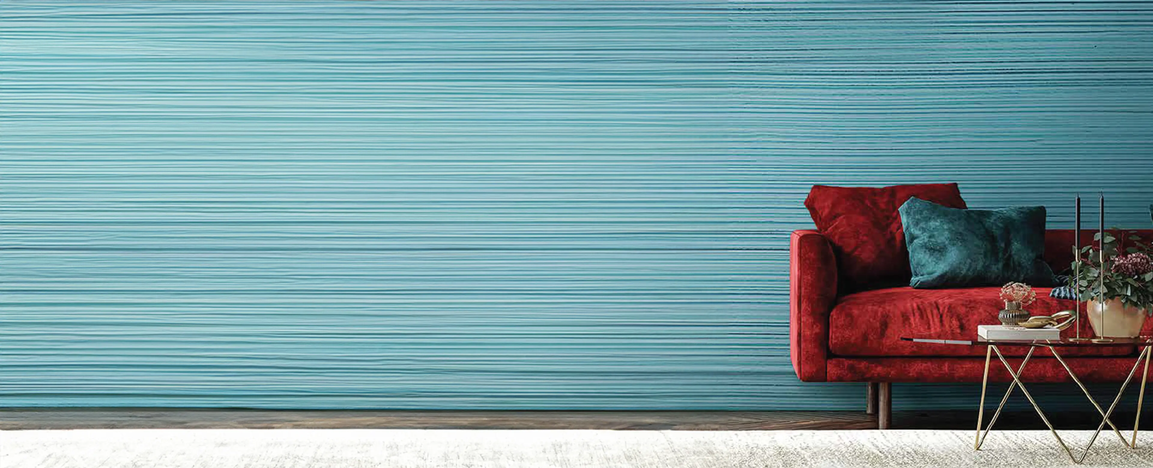
How To Choose Wall Colours For Interior Wall?
If you are thinking how to choose wall colours for the interior walls of your home, look no further. No matter what shade or aesthetic you're looking for, we've got tons of ideas. Read on…
Draw inspiration from what’s around you: It’s a great idea to pull out a colour of something else that is going to be in the room that you wish to paint. It could be the colour from the fabrics such as cushion covers, curtains or décor pieces. If you're thinking of having an accent wall, look at the boldest colours around.
Spend some time with the colour wheel: A good rule of thumb is to use the colour wheel. Colours that lie near each other on the colour wheel such as blue and purple are analogous to each other and will allow one colour to stand out more than the other. Colours opposite each other on the colour wheel like red and green are complementary to one another and will work well. If you wish to achieve a soothing look, you can try to remain within the same shade.
Make colour relationships your guide: If you’re keen on painting and want to make a small room appear airy and larger, you can opt for colours like purples, greens and blues. For a vibrant appearance, pick shades like oranges, yellows and reds. If you find it difficult to choose between two colours, try swatches on the wall. You can try the various shades you like on sample boards or you can even try a handy tool such as Berger’s Virtual Painter, which lets you paint the walls of your home virtually, helping you get an idea of how the colour will look on your walls.
Don’t forget to take a look at your paint sample in the morning, at noon and at night. Also keep in mind that the colour changes as the light quality changes.
Now, that you know how to go about wall painting, what you thinking? Explore all your options and slather on the best colours on the walls of your home! Happy Painting.
Techniques For Decorative Wall Painting
You've decided on your paint colour but don’t have any clue about the techniques to do decorative wall painting in your home...
in your home. Don’t worry; follow this guide to achieve great results in any room of your home.
To start off, move aside all the furniture, artwork and accessories from the room. Don't cover the floors with plastic as it can get slippery. Make use of old sheets and drop cloths to protect them from drips and splatters.
Next, the holes on the walls will need to be fixed using a five-in-one tool or wide blade and caulk wherever necessary. Sand dry spackle smooth, and prime each spot on the wall.
It is a good idea to remove the outlet covers for a cleaner and hassle-free paint job. Use a bristle brush or a paintbrush to get rid of the dust on trims, crown moulding and baseboards. Overlap seams by at least an inch so that seepage does not occur between pieces. Once done, seal the tape to the surface with fingers. The last step before wall painting is to base-coat the walls.
These simple tips will make sure that you get great results, whether you're simply adding a new colour to the wall or trying a cool decorative paint technique for an accent wall.
If you’re wondering where to pick these decorative wall paints from, fret not. There are many decorative wall paints in the market for you to choose from. Berger Paints India has a vibrant portfolio of paints and decor services.
You can get the beauty of a particular texture on the wall now with decorative paints and wall stencils. There are specific tools available in the paint store that shows its magic when used with paint on the walls to bring out the desired effect. It’s extremely easy to completely transform the look of your living space with decorative wall painting without encroaching on its area.
Wall stencilling is a simple and easy way to bring life to your home. And if you’re stuck for ideas, browse through the website of Berger Paints India for some stencil inspiration! Choose a decorative stencil depending on which area of your home you wish to revamp. The design will instantly add movement to your room design.
Now that you are aware of the availability of interior wall painting design, get started. Schedule an appointment with Berger Paints India and let the experts take over!
How To Select Colour For Interior Painting - Colour Trends 2019
Every year, we are bombarded with predictions about which colour palettes will dominate the future of design. Join us to learn how to select the best wall painting designs for hall this year…
We all know how much colour can make or break the overall look and feel of a living space. Choosing the right shade can take a room from uninspired to unbelievable in a jiffy. The right shade has the power to set the mood of a room, which is why when selecting a colour palette, you can use the handy colour wheel to decide on the best shade for you. The colour wheel can be used in three ways in helping you choose a wall colour for your home.
Complementary: Choose one colour and then look across the colour wheel. Sometimes opposite just works! You could try a complementary colour scheme such as orange and blue.
Analogous: Pick the colour that you fancy, then select the colours right next to it. This can create harmony in your living space. An example of an analogous colour scheme is yellow and green.
Triadic: Try a contrasting colour palette such as orange, purple and yellow for a striking impact. They are evenly spaced out on the colour wheel.
With each of these colour combinations, keep in mind that tones and shades add another level of complexity. So, pick your colour shades for hall and other rooms in your home wisely.
When it comes to trends for 2019, the year is all about taking a mindful approach. Pantone's 2019 Colour of the Year - Living Coral is an interesting shade to work with. It has the ability to instantly uplift the mood of the space and infuse energy.
However, if you are still unsure how to work with the vibrancy of this gorgeous shade, you can try Berger’s Virtual Painter, a handy tool which lets you visualize how the hue will look like on your favourite walls even before you touch the paint brush to your walls. What you waiting for? Get started with picking a home colour design now!
Colours & Ancient Sciences
Feng Shui For February 2019
Feng shui applies to both the colours you are wearing and the colours of your home interior design...
The concept of best Feng Shui colours for 2019 applies not only to clothing but also to various accessories.
While the previous year was a Yang energy year, 2019 is of a Yin energy quality. This means that compared to the active and bold (Yang) energy of 2018 expressed in the energy of the Dog zodiac sign, the year of 2019 brings a more calm, soothing and quiet (Yin) energy. It is the year of the Pig and it starts on February 5, 2019.
The Pig, which is the 12th zodiac sign from the Chinese calendar, has water element as the main agent, represented by blue colour.
As Earth Feng Shui element is nourished by the Fire element, the best colours to wear in 2019 are of the Fire element, and especially those colours that have a more Yin/relaxed quality to them. The lucky colours are related to the beneficial energies of the Fire elements; represented by Red, Pink & Orange; and the metal elements; represented by White & Golden.
Here are the best colours to wear in 2019:
- Blush Pink
- Soft Lavender
- Terracotta
- Coral Orange
- Butter Yellow
- Soft Warm Gray
What about home décor colours? Colours likes pink, red, and blue are a challenge especially for interior for decorating the house or office. They offer interesting contrasts and they are certainly contemporary colours. In 2019, these colours can be easily matched, if you know how to play with the tones.
Red can be reserved for modern décor and has a romantic spirit. Pink is ideal for sophisticated interior décor and can be used in living room and in the kitchen. Orange has a stimulating effect and hence can be used in the living room and the children’s room. A white on white room will be a bold idea too.
Reiki For February 2019
When it comes to making New Year’s resolutions, many of you'll must have started with a long list in 2018 of bigger goals you wish to achieve...
Reiki as your NY resolution!
But there’s an easier and more effective way to go about it. If you make a resolution to ramp up your Reiki practice and Reiki business, all other resolutions may seem to fall into place. It's never too late to start off again, even though we are one month down in 2019.
The motto should be to find your center. It'll be from here that you align your purpose and realize your dreams!
Fitness
Fitness resolution has always been at the top of many people’s list. Rather than struggling to stick with a diet, stick with a revamped Reiki plan. Reiki improves balance and well-being, which will make you inclined automatically to adhere to a healthy lifestyle.
Reiki may also help with weight loss by reducing stress and improving sleep patterns. Excess stress and constant fatigue can contribute to overeating.
Finances
Reiki is known for raising your levels, which makes you more aligned with your greater purpose. Since your greater purpose is to share Reiki with the world, increasing your personal Reiki practice may automatically result in an increase in Reiki business. More business results in more money, which can result in an overall improvement of finances.
Friends
As your Reiki business is booming and you’re taking on new clients, you’re going to develop new relationships along the way. Some of those relationships may naturally evolve into friendships.
Exercise
Excuses for not getting enough exercise can include being too tired, overworked or suffering aches and pains that make physical activity challenging. Reiki can help take care of all three.
Your improved sleeping patterns can help ward off fatigue, while Reiki’s ability to create balance in your life can result in an improved distribution of time between work, play – and exercise. Reiki’s potential healing effects on your physical body can reduce the pain that was limiting physical activity.
Vaastu For February 2019
Though usually every house is designed according to the principles of Vaastu, still there are a few basic Vaastu tips that we can follow in the decor of the house to bring in happiness...
7 very simple Vaastu tips that can bring good luck
- Keep your entrance well arranged, bright and well-lit, and the door should be preferably of solid wood.
- Avoid keeping shoe-rack or footwear here as it is believed to block positive energy from entering the home.
- Decorate your door with beautiful nameplates.
- If there is a wall at the entrance, don’t leave it naked. Show your creativity and decorate the wall.
- If there is a mirror in the living room, ensure it is placed on the north wall.
- Keep the bedroom well- lit with natural lights during the day. Let the fresh air flow into the room by keeping the windows open for at least 20 minutes every day.
- Paint your bedroom walls in neutral or earthy shades as it radiates positive energy. Avoid painting your walls black.
- Painting with the scenic view of river, flowing water or goldfish on the wall brings good luck and wealth to your home and life.
- Make sure your home gets ample sunlight and fresh air. It brings in wealth and prosperity to your home.
- Bring home an aquarium and with it bring home positive energy. Aquarium attracts fortune and wealth.
- Kitchen is the food factory of our home and it needs to be in perfect balance. It is important to place the sink and stove in such a way that they don’t collide with each other.
- Sparkling clean glass of windows and doors attract fresh and positive energy.
- Create a small garden outside the window and have curved pathway or pave the path with pebbles and install a fountain.