Introduction To Ombre Wall Colour Combinations For Bedrooms, Living Rooms & More

 Sep , 2026
- Berger Speaks
- 4 Min Read
Ombre walls are a simple way to bring more depth and personality into a room without making the décor feel too busy. By allowing one shade to blend gradually into another, this painting style creates a soft visual flow across the wall.
It can look calm in a bedroom, elegant in a living room, playful in a child’s room, or warm in a dining area. With the right colours, ombre can beautifully suit both modern and classic interiors with ease.
What Is an Ombre Wall Colour?
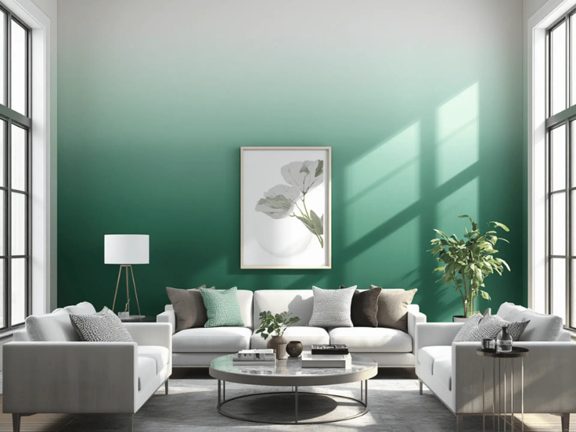
An ombre wall blends one shade into another, moving from light to dark or between related colours. Well-planned ombre paint on walls adds dimension without decorative patterns. The technique can also work beautifully alongside a concrete wall texture, where the subtle surface character adds another layer of visual depth.
The basic effect usually involves:
- Light-to-dark gradients create stronger depth.
- Similar shades give a softer, refined finish.
- Contrasting colours make the ombre wall effect more expressive.
Ombre Wall Colour Combinations for Different Rooms
Room purpose, size, natural light and existing décor should guide your palette. A combination that feels restful in a bedroom may need more contrast to work in a living area.
Ombre Wall Colour Combinations for Bedrooms
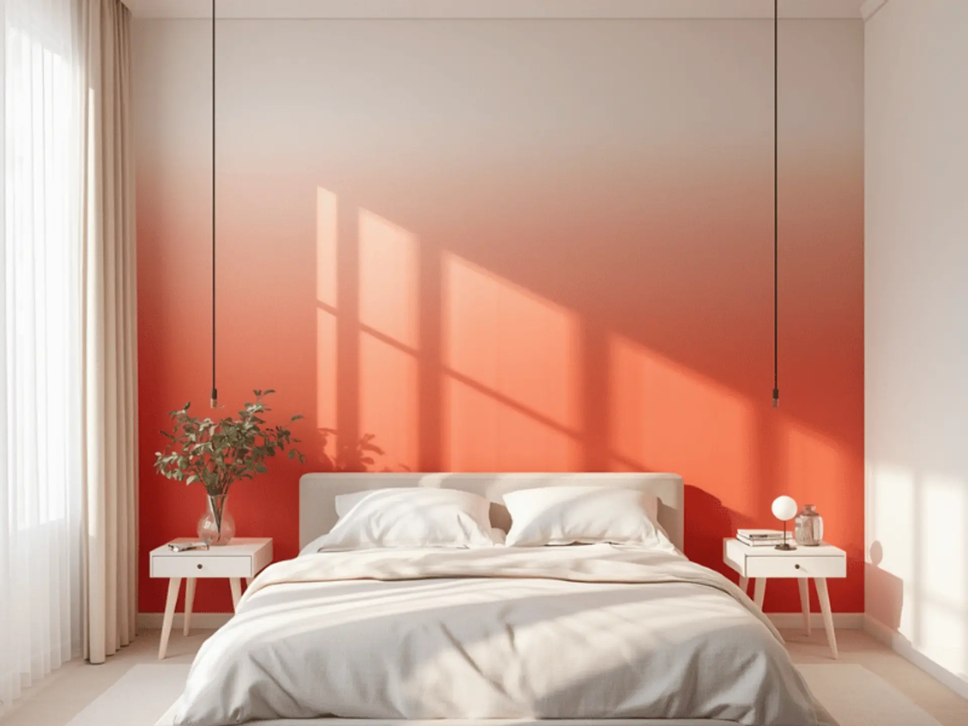
Bedrooms suit gentle transitions that keep the space restful. An ombre bedroom wall can add colour without making the room visually busy.
Some soothing combinations worth trying include:
- Blue and white feel fresh and calm.
- Lavender and pink create softness.
- Peach and cream add gentle warmth.
- Green and white bring natural character.
Ombre Wall Colour Combinations for Living Rooms
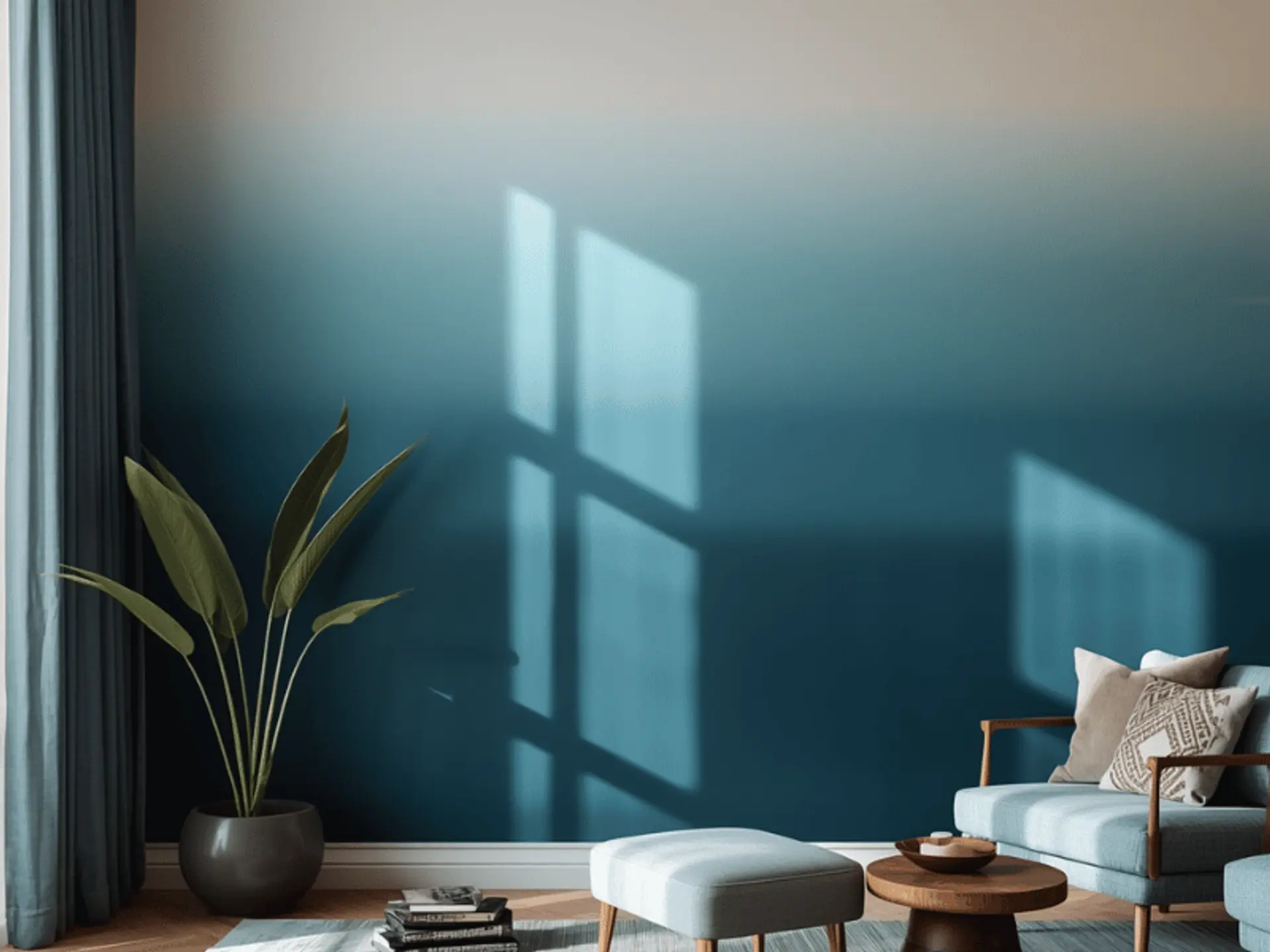
Living rooms can carry stronger combinations. Good ombre wall paint ideas can create a focal point while still supporting the furniture and décor.
A few balanced choices include these:
- Beige and cream feel understated.
- Grey and white look contemporary.
- Blue and neutral tones add relaxed depth.
- Terracotta and beige bring earthy warmth.
Ombre Wall Colours for Kids’ Rooms
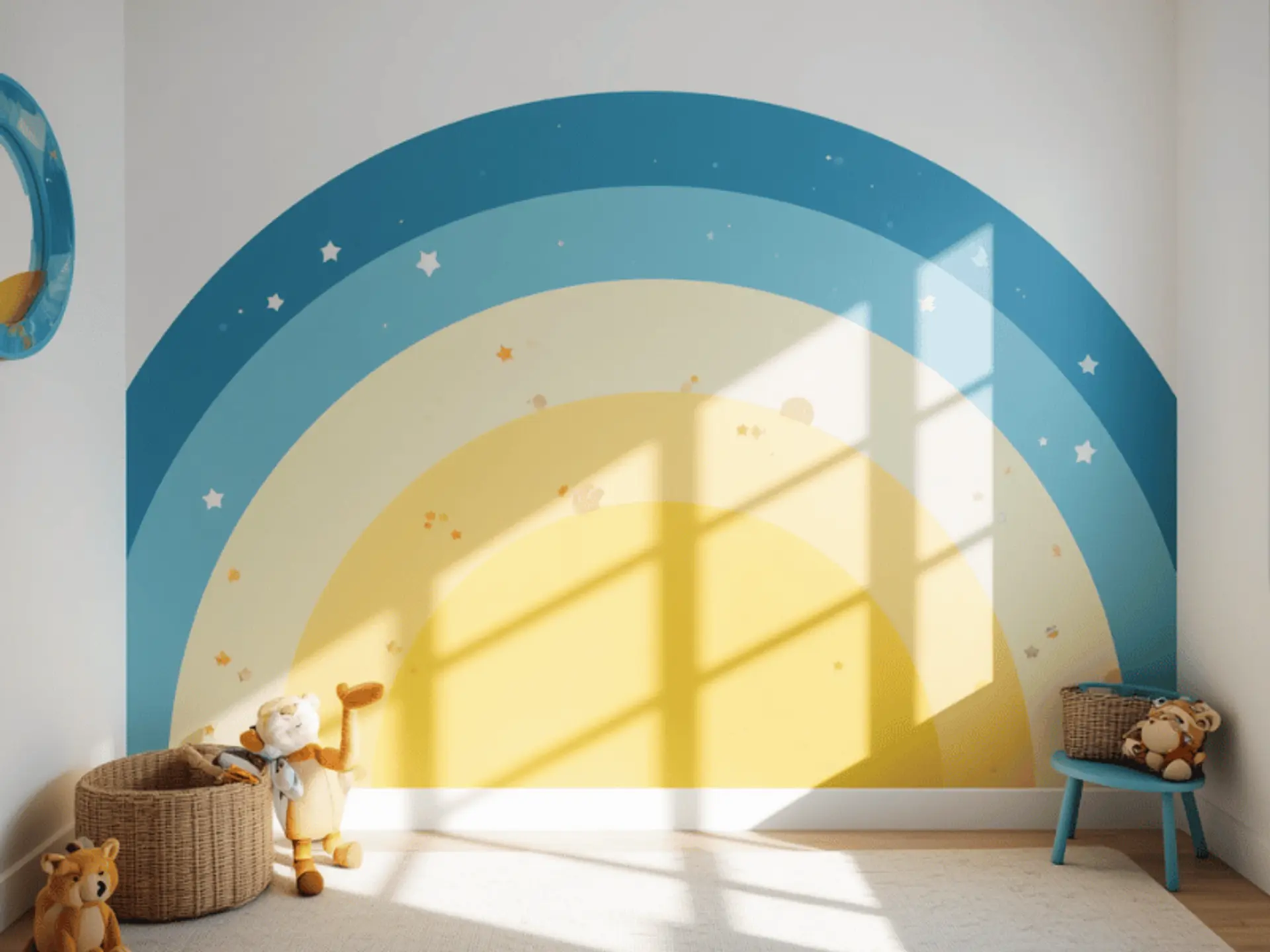
Kids’ rooms allow for playful colour choices, but softer blending helps the space stay comfortable as the décor changes.
Playful palettes can include combinations like:
- Pink and peach feel cheerful.
- Blue and aqua create freshness.
- Purple and lavender add imagination.
- Yellow and cream keep the room bright.
Ombre Wall Colour Ideas for Dining Rooms
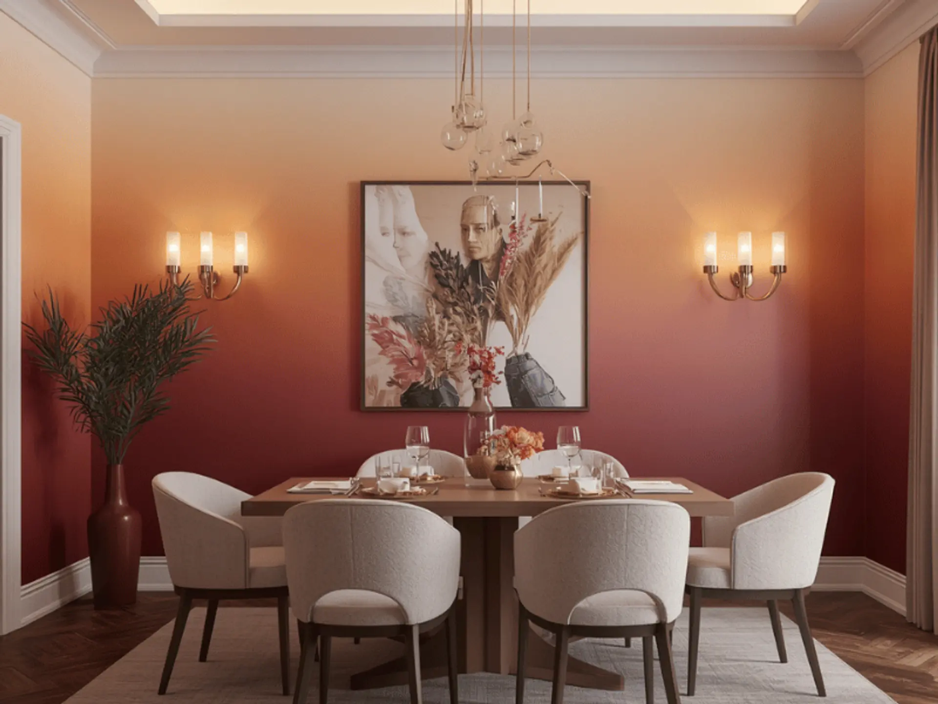
Warm gradients can make dining rooms feel welcoming, especially beside wood, cane, warm lighting or neutral upholstery.
Warm combinations that work beautifully include:
- Peach and beige feel sociable.
- Terracotta and cream add richness.
- Yellow and ivory create brightness.
Ombre Wall Colours for Hallways and Entryways
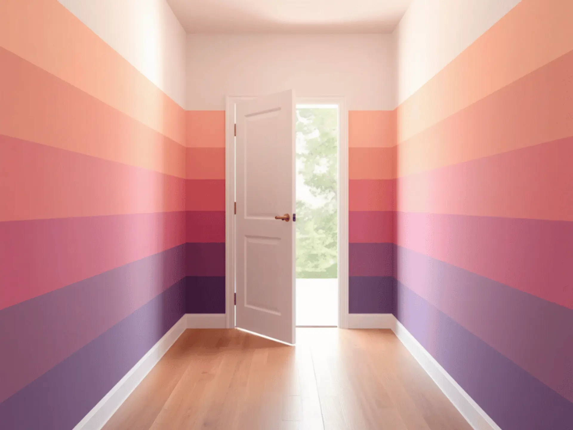
Hallways often benefit from quieter gradients because they can be narrow or less naturally lit. You can also refer to a colour catalogue to compare softer neutrals and pastels before deciding which shades work well together.
Subtle ideas for these spaces include:
- Blend cream into warm beige.
- Pair pale grey with soft white.
- A horizontal ombre wall can visually widen a passage.
Popular Ombre Colour Combinations for Walls
Some pairings work across several interior styles because their tones blend naturally. Choose a combination that supports the mood, furnishings and amount of natural light already present in the room.
Blue and White Ombre Walls
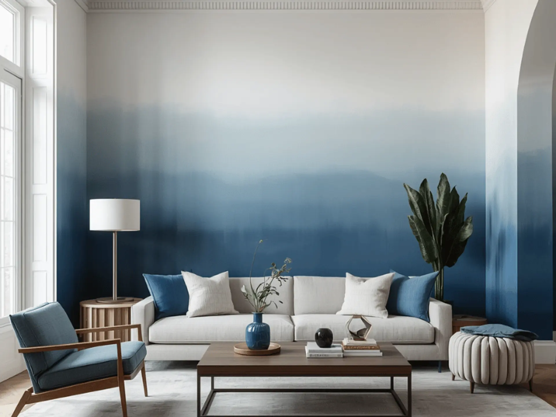
A blue ombre wall fading into white can make a room feel airy and relaxed.
This pairing works especially well because:
- A blue ombre painted wall suits bedrooms and living rooms.
- Softer blue ombre wall paint works well with light furniture.
Pink and Peach Ombre Walls
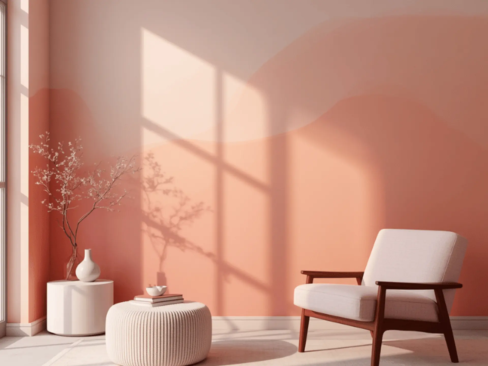
Pink and peach create a warm, gentle gradient that can bring personality to bedrooms, kids’ rooms and creative corners.
For a softer finished look, try:
- Keep both shades muted for softness.
- Balance them with cream furnishings.
Green and Cream Ombre Walls
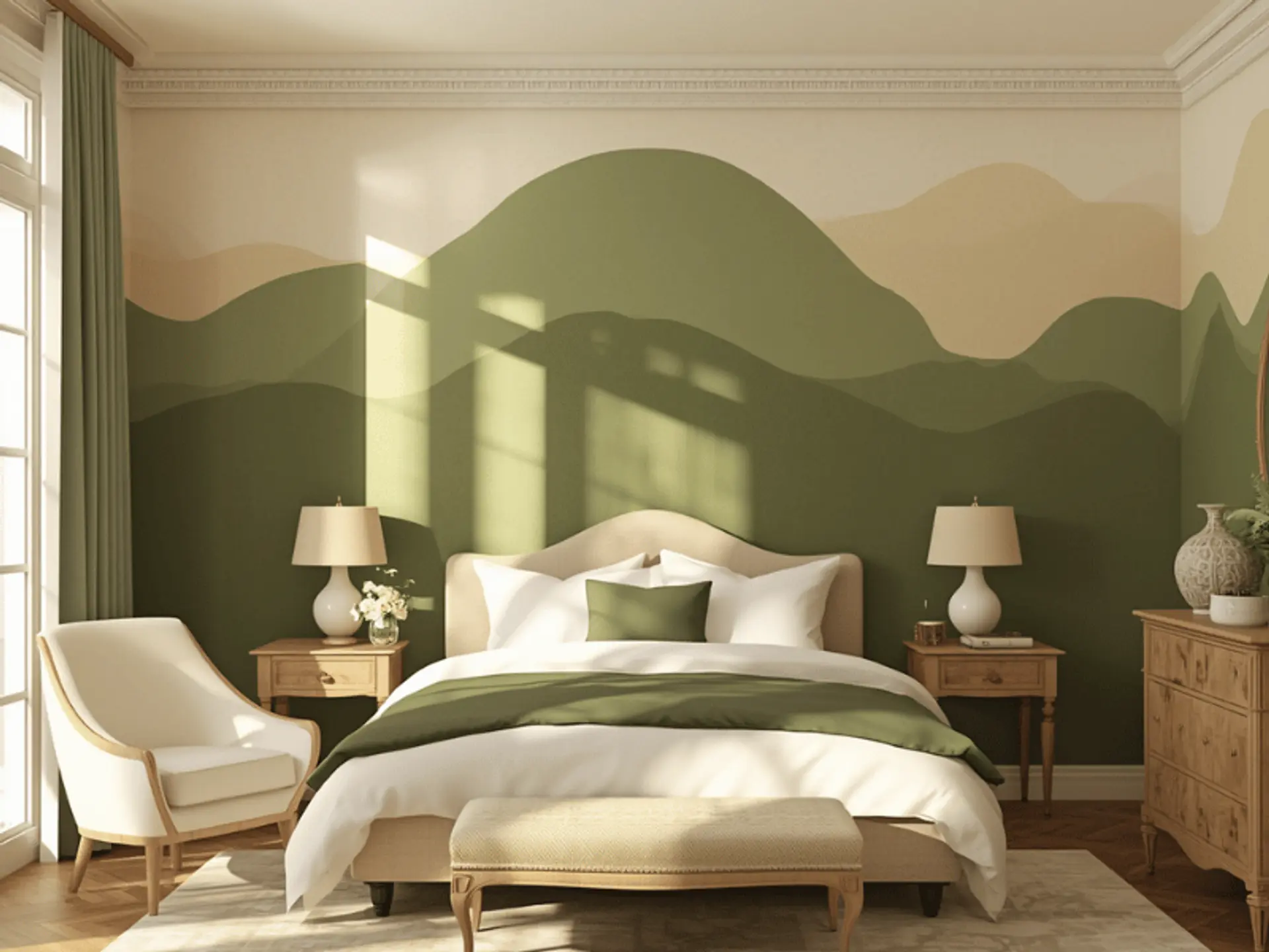
Green and cream combine freshness with warmth and work naturally beside wooden furniture, woven finishes and indoor plants.
You can shape the look through:
- Sage gives a calmer look.
- Deeper green ombre wall paint suits a feature wall.
Grey and White Ombre Walls
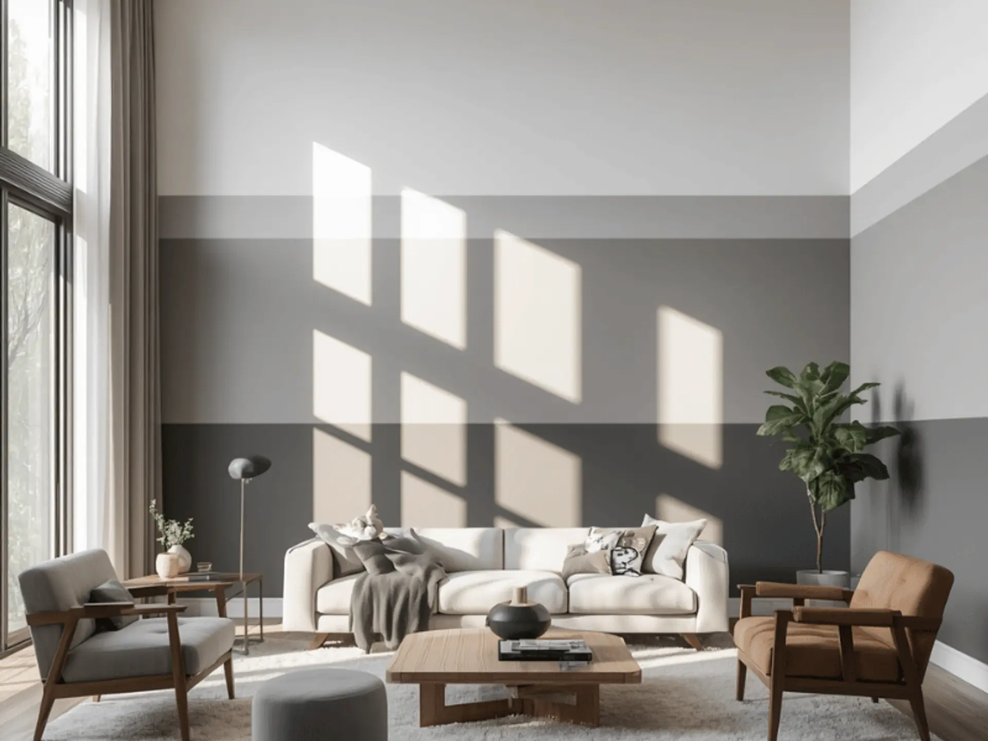
Grey fading into white feels modern. Grey ombre painted walls add depth without introducing strong colour.
A few easy styling options are:
- Warm grey suits cosy interiors.
- Cooler grey works with crisp white décor.
Purple and Lavender Ombre Walls
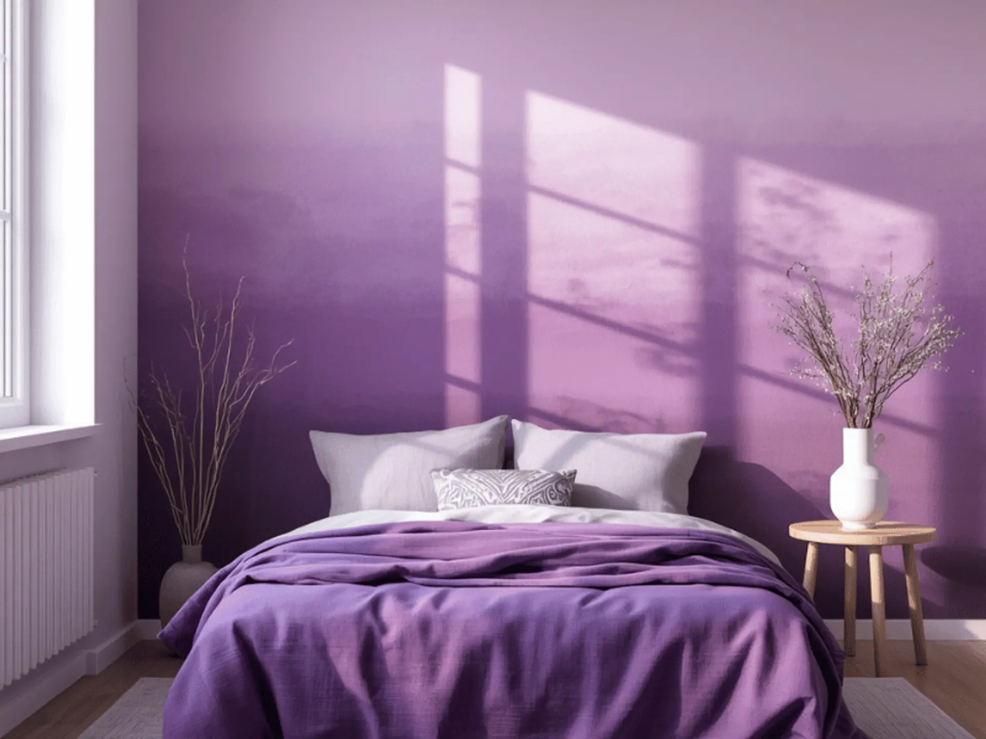
Purple and lavender create an elegant yet calming transition when the tones stay balanced.
For a well-balanced gradient, consider:
- Blend plum into lavender for contrast.
- Choose dusty purple for a softer result.
How to Choose the Right Ombre Wall Colour Combination
The best ombre palette should feel connected to the room rather than chosen only because it is fashionable. Consider scale, daylight, furniture, flooring and the atmosphere you want to create.
Consider the Room Size and Natural Light
Light changes how every shade appears, so test colour before committing. Once you have shortlisted the shades, a paint calculator can also help you estimate how much paint may be needed for the wall area.
A simple way to decide is:
- Use pale gradients in compact or darker rooms.
- Reserve stronger tones for larger, brighter walls.
Choose Colours Based on the Mood You Want
Colour temperature strongly influences atmosphere and can completely change how a room feels during the day.
Think about the mood you prefer:
- Blues and greens often feel calm.
- Peach and terracotta bring warmth.
- Grey, beige and white create a sophisticated look.
Match Ombre Colours with Furniture and Décor
A gradient should complement flooring, curtains, upholstery and furniture instead of competing with them. This becomes even more important when the room already includes a bold feature such as a geometric wall paint design or patterned furnishings.
Keep these practical styling points in mind:
- Repeat an existing undertone in the wall colours.
- Use an ombre accent wall when the room already has several colours.
How to Create an Ombre Wall Effect
Creating the effect involves preparing the wall, applying colour in broad sections and blending neighbouring shades while the paint remains workable. Planning the transition before painting helps prevent harsh lines.
Prepare the Wall before Painting

A smooth surface makes blending easier and gives the final ombre wall a cleaner, more even look.
Before bringing out the paint, remember:
- Remove dust and repair rough areas.
- Apply a suitable primer where required.
- Make sure the base looks even before painting.
Blend the Colours for a Smooth Gradient
For a DIY ombre paint wall, work in overlapping sections while adjoining colours can still be blended. Avoid allowing one section to dry completely before working beside it.
For smoother blending, keep these handy:
- Feather the meeting areas gently.
- Work across manageable sections.
- Step back often to judge the transition.
Test the Colour Combination before Painting
A diy ombre wall benefits from a test patch because colours can look noticeably different under daylight and artificial light.
A quick colour test should include:
- Test shades beside existing furniture.
- View the patch at different times.
- Adjust the colour intensity before painting the entire wall.
Give Your Walls a Stylish Ombre Makeover
An ombre finish works best when the palette suits the room. Choose a gentle fade or stronger ombre accent wall, then select a compatible finish.
For homeowners who prefer professional support, Berger Express painting services offers consultation, supervised painting, mechanised painting tools and post-painting clean-up within its service process.
- Try blue ombre wall paint for a cool, airy setting.
- Use warmer gradients when you want greater cosiness.
check for any query you have about the blog
Frequently Asked Questions
Ombre walls add depth, movement and personality without heavy décor. They can also connect related shades on one surface.
There is no fixed requirement. A simple ombre effect wall paint can use two colours, while layered designs may use more. Keep each transition natural and balanced.
Choose colours with clearer contrast and let the deeper tone cover more of the wall. Keep nearby furniture simpler so the gradient remains the focus.
Texture affects blending and how light falls across the wall. Uneven surfaces can make transitions less seamless, so preparation matters.