Modern Double Floor House Front Elevation Colour Combinations

 Jan , 2026
- Exterior
- 4 Min Read
Modern double floor homes look their best when the exterior colours feel intentional and well-balanced. The right selection improves curb appeal, expresses personal taste, and can support better resale value. It also helps key architectural lines stand out without making the elevation look busy.
This guide explains practical colour options and decisive factors so you can choose a palette that suits your layout, climate, and neighbourhood context well.
Why Colour Choice Matters for Front Elevation
Exterior colours do more than improve appearance. They create proportion, define layers between floors, and help balconies, frames, and parapets look organised instead of visually scattered. A well-planned selection also supports easier maintenance because dust, water marks, and faded marks show differently on different shades.
From a practical viewpoint, paint quality matters as much as colour. When you choose reliable exterior products and apply them correctly, the finish handles heat, humidity, and seasonal rain with fewer issues, resulting in a more stable front elevation colour scheme.
Best Modern Colour Combinations For Double Floor Homes
Before selecting specific wall paint pairs, take a moment to review how sunlight hits your facade through the day and how shadows fall near projections and balconies. Also consider whether you want the upper floor to match the lower floor closely or create a subtle contrast for better structure. These checks make it easier to settle on a house front elevation colour combination.
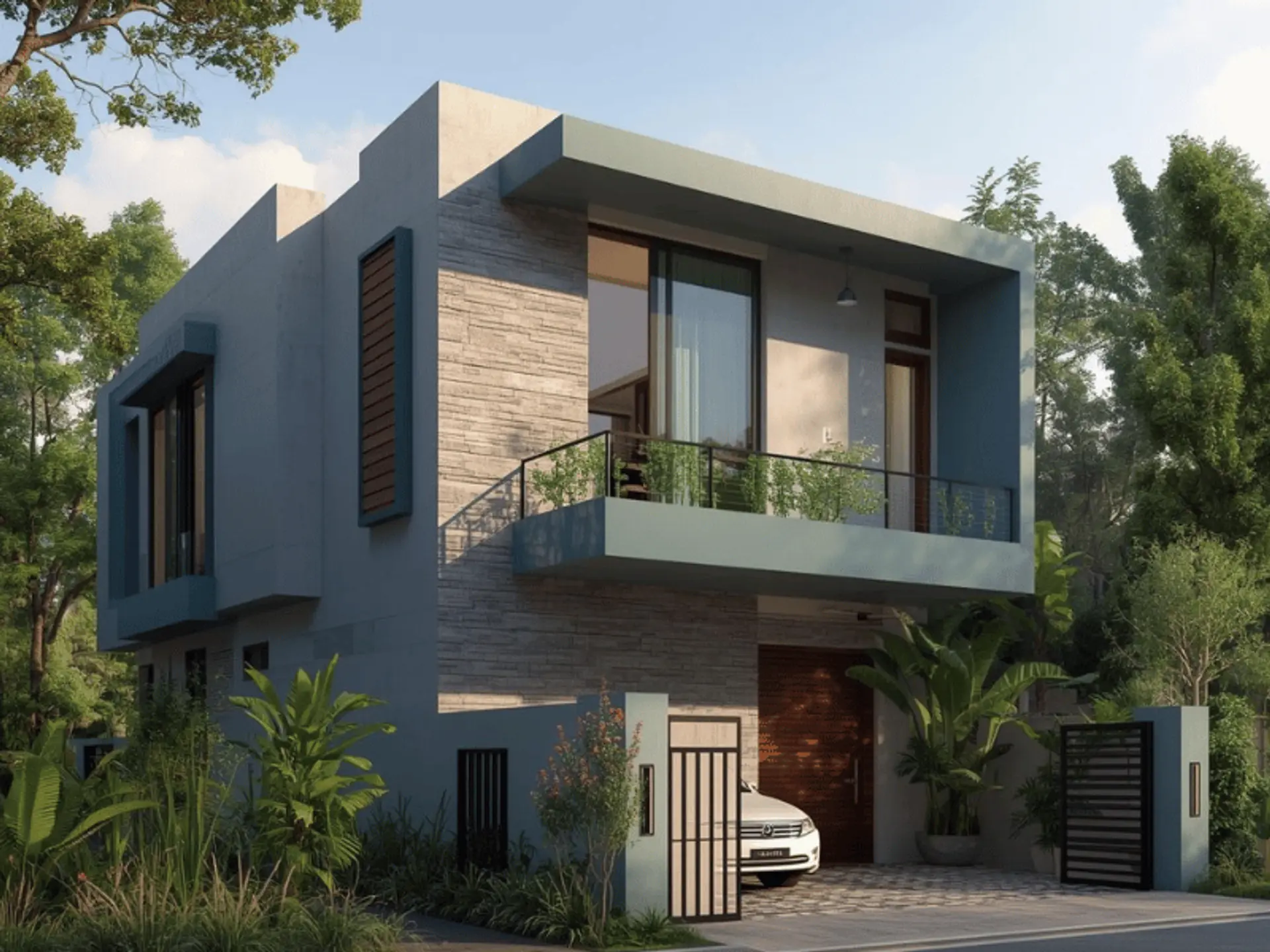
White And Grey Combination
White and grey work well for modern elevations because they keep lines sharp and reduce visual clutter. Use a clean white for larger wall sections and a medium grey for bands, balcony edges, and vertical elements. This approach suits homes that need a neat, modern house front colour combination.
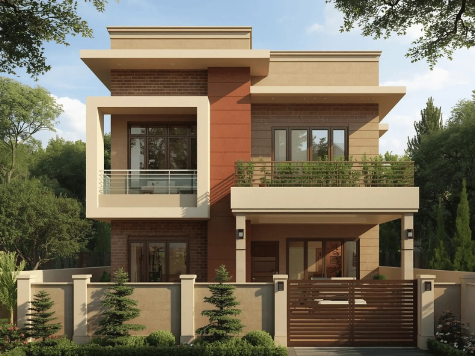
Beige And Brown Combination
Beige and brown create a warm exterior that feels calm and residential, especially for areas with strong sunlight. Keep beige as the primary shade and use brown for borders, columns, or accent panels so the elevation stays balanced. If your design includes textured finishes, choose a softer brown to avoid harsh contrast. Many homeowners prefer this as a house front elevation colour design.
Ivory And Royal Blue
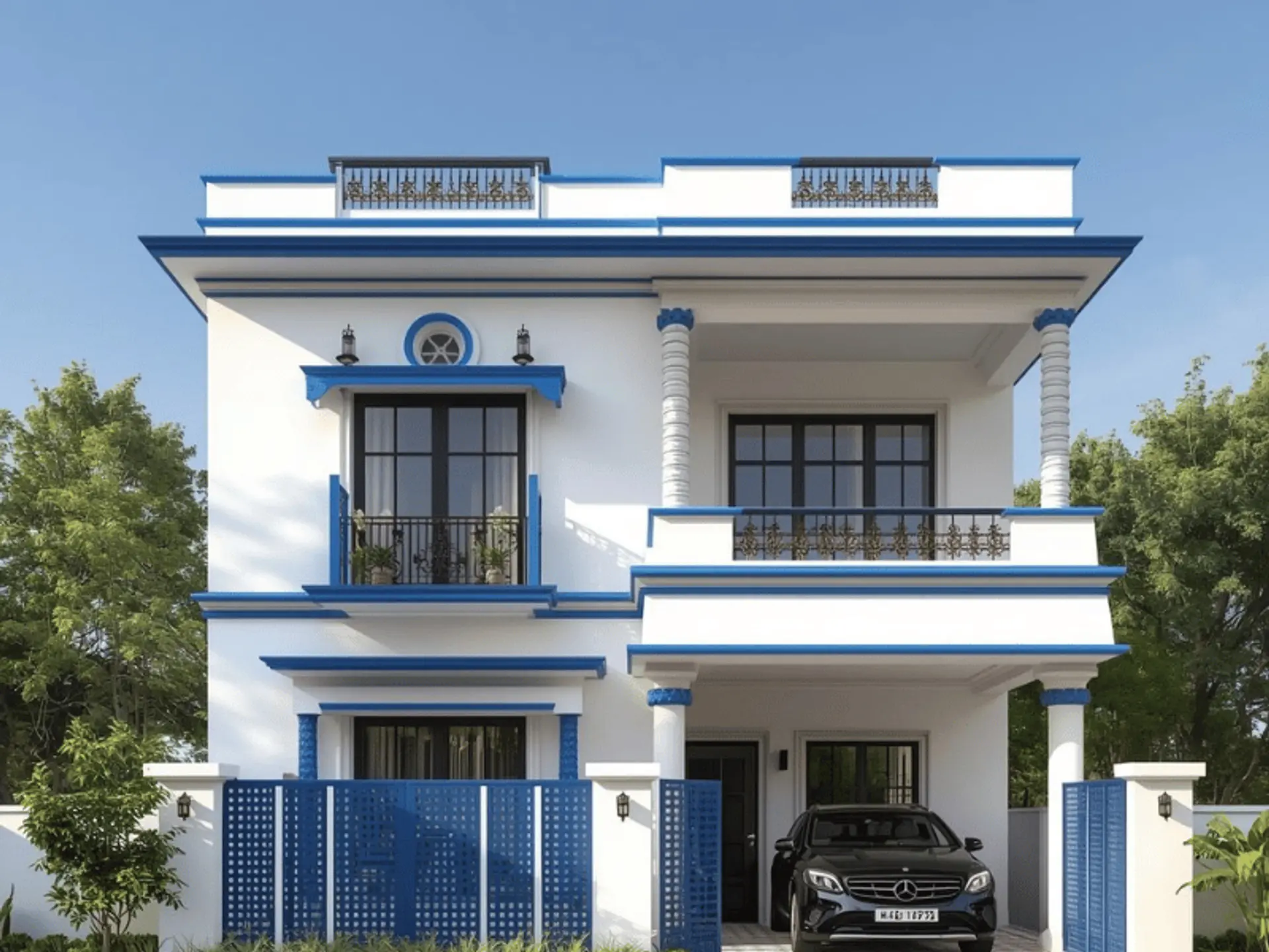
Ivory with royal blue offers a premium look when used in the perfect combination. Ivory can cover most of the facade, while royal blue fits best on feature walls, balcony faces, or a vertical strip that runs between floors. This pairing looks strongest when doors and window frames remain neutral. It is a reliable colour combination for front elevation when you want a standout element.
Light Grey And Mustard Yellow
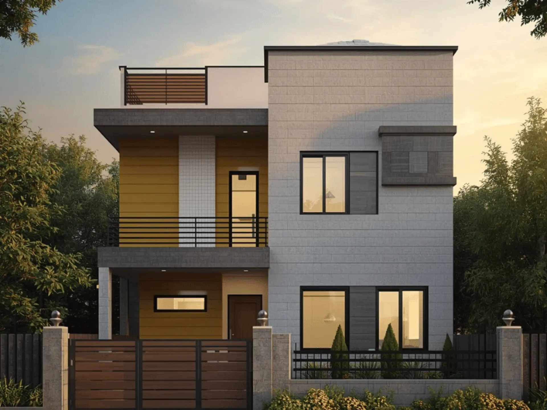
Light grey with mustard yellow is a modern choice that adds colour without making the facade look overly bright. Use grey for the main surfaces and place mustard yellow on small, defined areas such as balcony sidewalls or a narrow band under the parapet. This keeps the design contemporary while still adding a unique character. It works well as a colour combination for house front elevation in compact plots.
Cream And Olive Green
Cream and olive green suit homes that are surrounded by plants, gardens, or tree-lined streets. Cream keeps the exterior bright and clean, while olive green provides a natural-looking contrast for accents and recessed areas. Choose a muted olive rather than a very dark tone for a softer overall finish. This pairing supports a balancedhome front elevation colour combination.
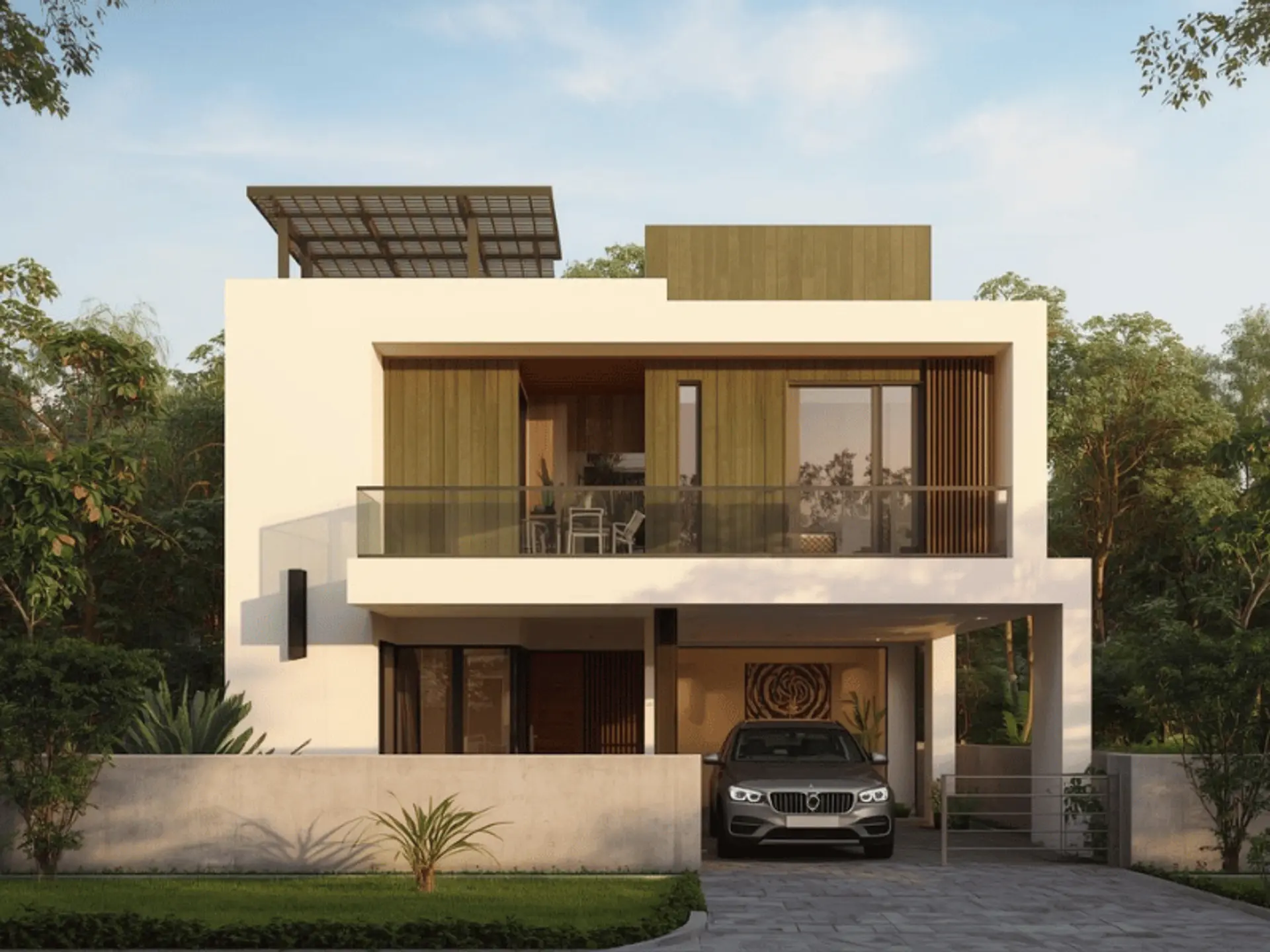
Off-White And Wooden Brown
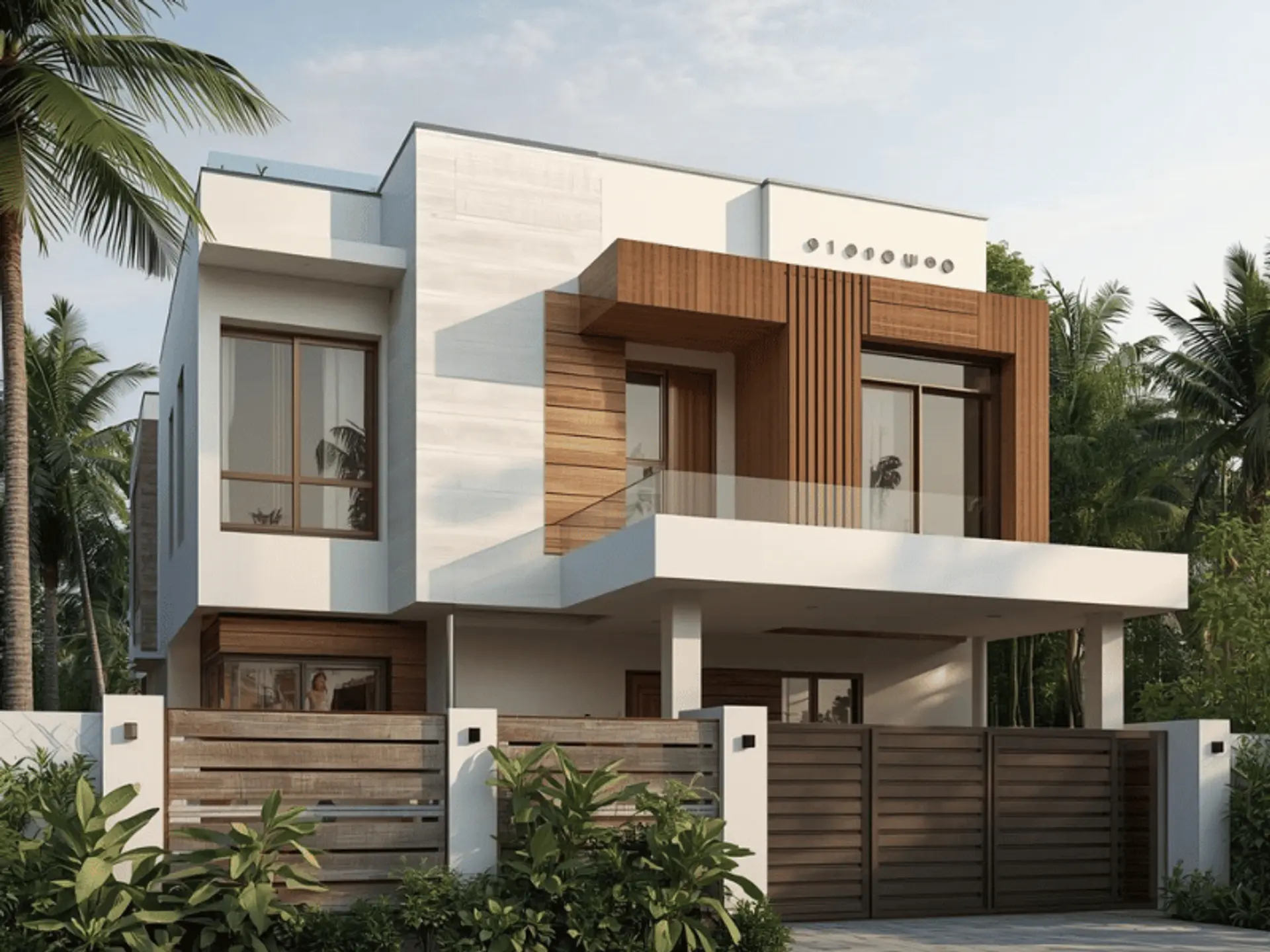
Off-white paired with wooden brown is a good option for elevations that include metal railings, wooden-look panels, or warm-toned cladding. Use off-white for the primary wall areas and reserve wooden brown for limited highlights, such as a column wrap or balcony face. This combination feels modern while still adding warmth. Many consider it the best colour combination for front elevation, where texture is part of the design.
Stone Grey And Teal Blue
Stone grey and teal blue create a bold but controlled exterior when teal is used selectively. Stone grey gives a strong base, while teal adds depth near balconies, window surrounds, or a single feature panel. To maintain a clean look, keep trim colours minimal and consistent across both floors. This style often suits a contemporary colour combination front elevation.
Sand Beige And Terracotta
Sand beige and terracotta are especially suitable for warmer regions because they feel grounded and handle dust visually better than very light shades. Sand beige can remain dominant, while terracotta works on borders, small wall sections, or architectural projections. Pair it with simple lighting to avoid a heavy appearance at night. This option is a practical paint colour combination for front elevation.
Pearl White And Navy Blue
Pearl white and navy blue look formal and high-end, particularly on double floor homes with strong geometric features. Pearl white reflects light well, while navy blue gives depth to columns, balcony faces, or a central frame that visually connects both floors. Use navy carefully so the elevation stays open and not too dark. This suits detailed house front elevation designs colour combination needs.
Ash Grey And Burgundy
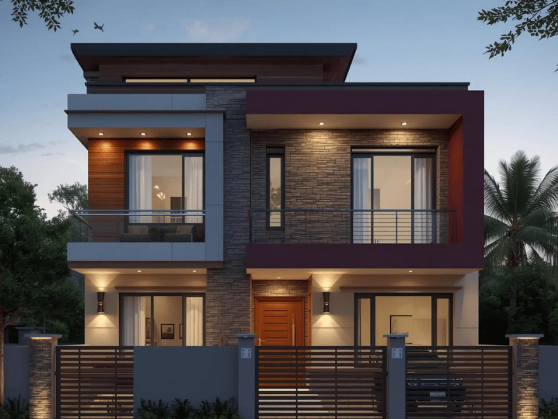
Ash grey and burgundy work when you want a rich accent without choosing very bright colours. Ash grey can cover the primary surfaces, while burgundy fits best on small, deliberate sections such as a framed panel, balcony band, or a recessed area. Keep the burgundy limited to avoid a heavy look across two floors. It is one of the more distinctive colour schemes for front elevation.
How To Choose the Right Colour Combination
Even the best-looking exterior wall colour combinations can feel wrong if it does not match the building’s structure or the surroundings. A good approach is to decide the base shade first, then select an accent colour, and finally confirm trim and metalwork tones. With this method, you can reach the best color combination for house elevation without overcomplicating the process.
1. Consider The Architectural Style
- Minimal and box-style elevations typically look best in neutrals with one controlled accent, because clean shapes carry the design.
- Traditional exteriors often suit warmer shades and softer transitions, especially when there are multiple edges, curves, or decorative elements.
- If you have many surface breaks, limit accents and keep them consistent across both floors. This step prevents an unbalanced house front colour combination.
2. Match With Surroundings
- Look at nearby homes, boundary walls, road dust levels, and local greenery before finalising colours.
- In areas with heavy dust, very bright whites may need more frequent cleaning, while mid-tones stay presentable longer.
- If the neighbourhood uses mostly neutral palettes, choose a slightly deeper accent rather than a completely different base. This approach helps your selection blend with common exterior wall colour combinations.
3. Balance With Exterior Materials
- Many modern homes use multiple materials such as stone cladding, metal railings, glass, and wooden panels. Treat these materials as fixed colour elements and choose wall shades that support them instead of competing with them.
- Also, check how the shades look next to the gate and compound wall, since these are seen together from the street. For long-term performance, align paint selection with a compatible exterior wall coating.
Tips For A Long-Lasting And Stylish Finish
A good finish depends on preparation and correct application, not only on colour selection. Plan time for cleaning, repairs, and proper drying between coats so the final look stays consistent. If the base surface is handled carefully, the top coat of wall paint performs better and maintains its appearance longer.
Use Weather-Resistant Exterior Paints
- Choose exterior products that resist fading, moisture absorption, and fungal growth, especially in humid or coastal environments.
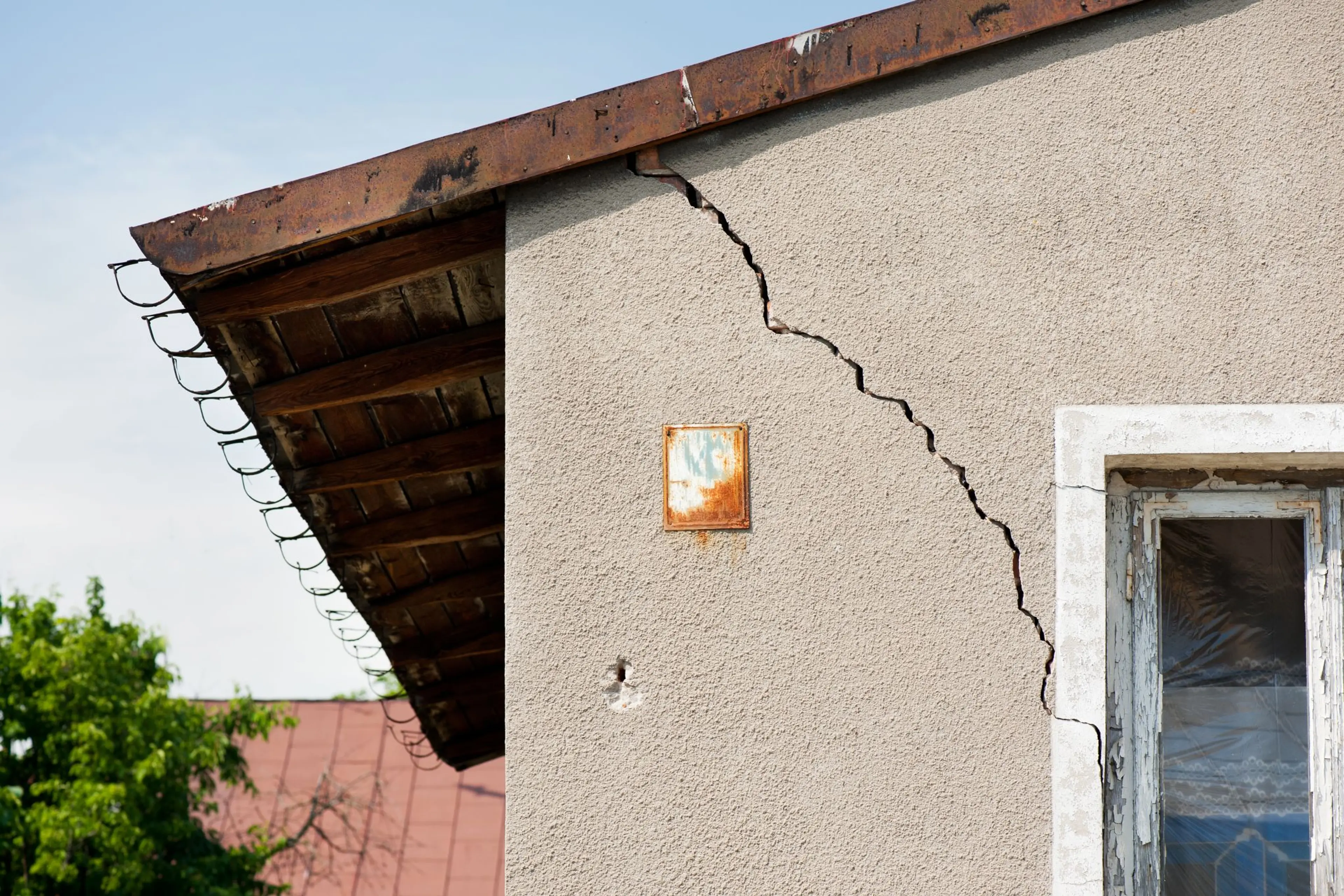
- Before painting, inspect and repair common types of exterior cracks such as hairline cracks, settlement lines, and cracks near joints.
- Proper filling, priming, and curing reduces the chance of patches showing through the final coat. A durable system also helps the colour stay stable through seasonal changes.
Highlight Architectural Features
- Use contrast in a disciplined way so the elevation looks structured rather than crowded. For example, keep the main walls neutral and highlight balcony edges, vertical frames, or pillar lines with one deeper accent.
- Maintain consistent colours on window grills and railings to avoid visual noise. This approach brings attention to design details while keeping the overall elevation clean.
Test Shades Before Finalising
- Always test sample patches on multiple sides of the house, because light conditions vary across directions and floors.
- Observe the shades in morning, afternoon, and evening light to avoid unexpected shifts in tone.
- Also check how the colour looks from the road, not only from close distance. This small step reduces the risk of repainting after full application.
Conclusion
Choosing the perfect palette for a modern double floor front elevation can refresh your home’s appearance, strengthen curb appeal, and create a clear identity. Berger Express Painting helps you achieve that result with trained painters, efficient tools, and premium Berger exterior paints. Our team manages surface checks, preparation, and careful application so the finish stays even. With reliable timelines, transparent work practices, and durable protection against sun and rain, our painting services keep the elevation attractive for years ahead, too.
check for any query you have about the blog
Frequently Asked Questions
You can use bold colours for a modern front elevation, but it is best to limit them to accent areas.
Pearl white and navy blue give a luxury look because the high-contrast pairing feels refined.
Cream is often considered a good choice as per Vastu because it is a light, calm shade.
You can use two or three colours as per Vastu, as long as the palette remains harmonious.