Corridor Colour Combination

 Apr , 2026
- Berger Speaks
- 3 Min Read
Corridors are often overlooked, yet they influence how your home feels every day. The right colours can brighten a dark passage, make a narrow area feel more open, and help the whole house look more put-together. In many Indian homes, hallways are short on sunlight and heavy on daily use. That is why choosing the right corridor shades matters.
If you are exploring corridor paint ideas or looking for fresh ways to improve your hallway, the right colour can bring warmth, flow, and a more polished look. The right wall paint can also make a corridor feel cleaner, brighter, and more visually connected to nearby rooms.
In this article, you will explore the corridor colour combinations, design tips, and ways to brighten hallways beautifully.
Why Corridor Colour Combinations Matter
A corridor does not need to be large to make an impression. Since it connects the home, it affects how the rest of the interiors are experienced. When the colour scheme feels right, the whole house feels more balanced. Whether you are comparing classic shades or modern corridor colour ideas, the right palette can make even a simple passage feel more inviting.
A well-planned wall colour for corridor areas can do several things at once:
- Help a tight space look more open
- Improve the effect of lighting
- Soften sharp lines in long passages
- Create a smoother transition between rooms
- Give the home a more complete and refined appearance
Before making your final paint decision for the corridor, reviewing a colour catalogue can help you compare tones more carefully and choose a combination that complements the rest of your interiors.
Best Corridor Colour Combinations
Here you will explore the best corridor colour combinations:
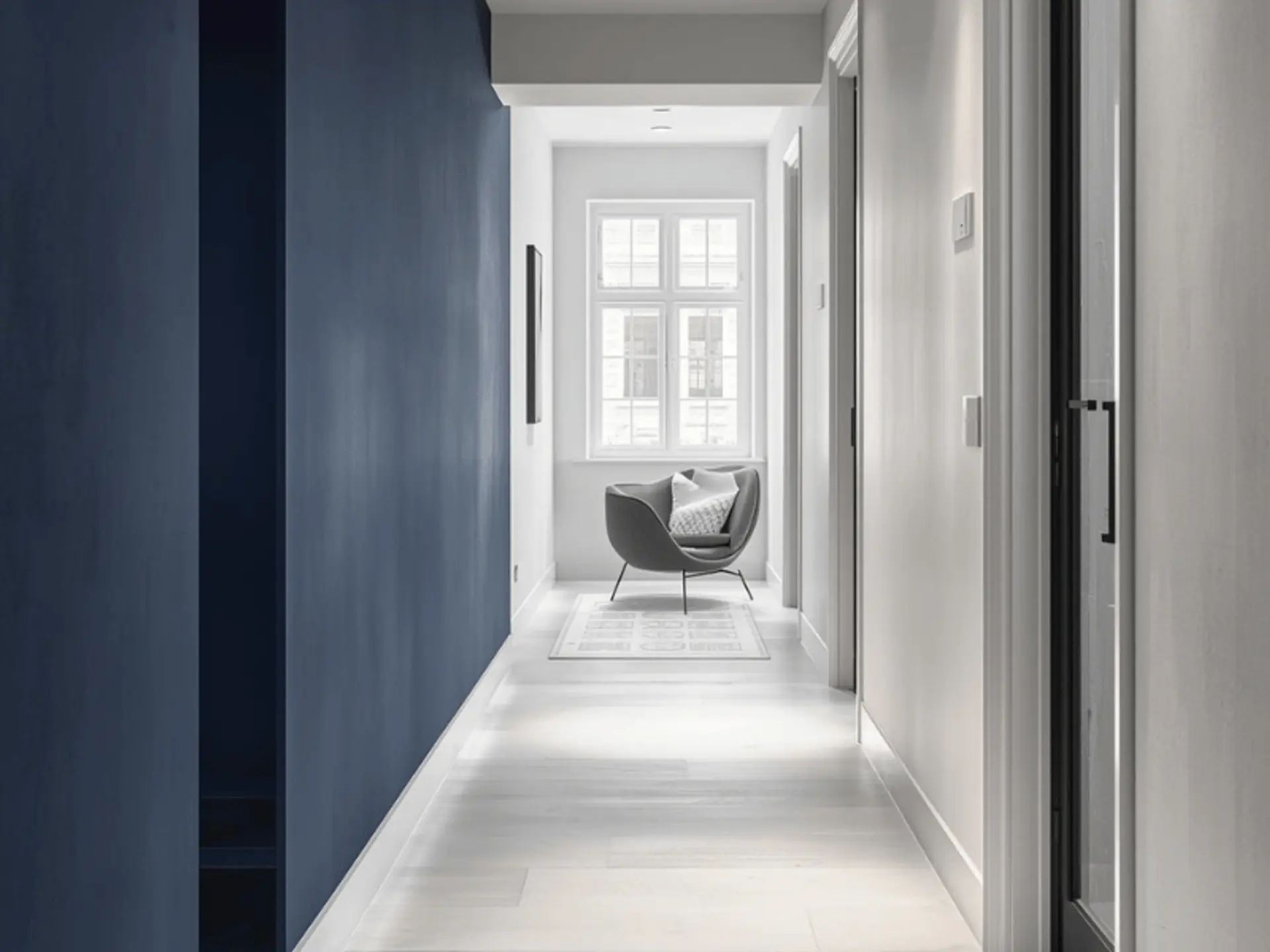
White and Soft Grey for a Modern Look
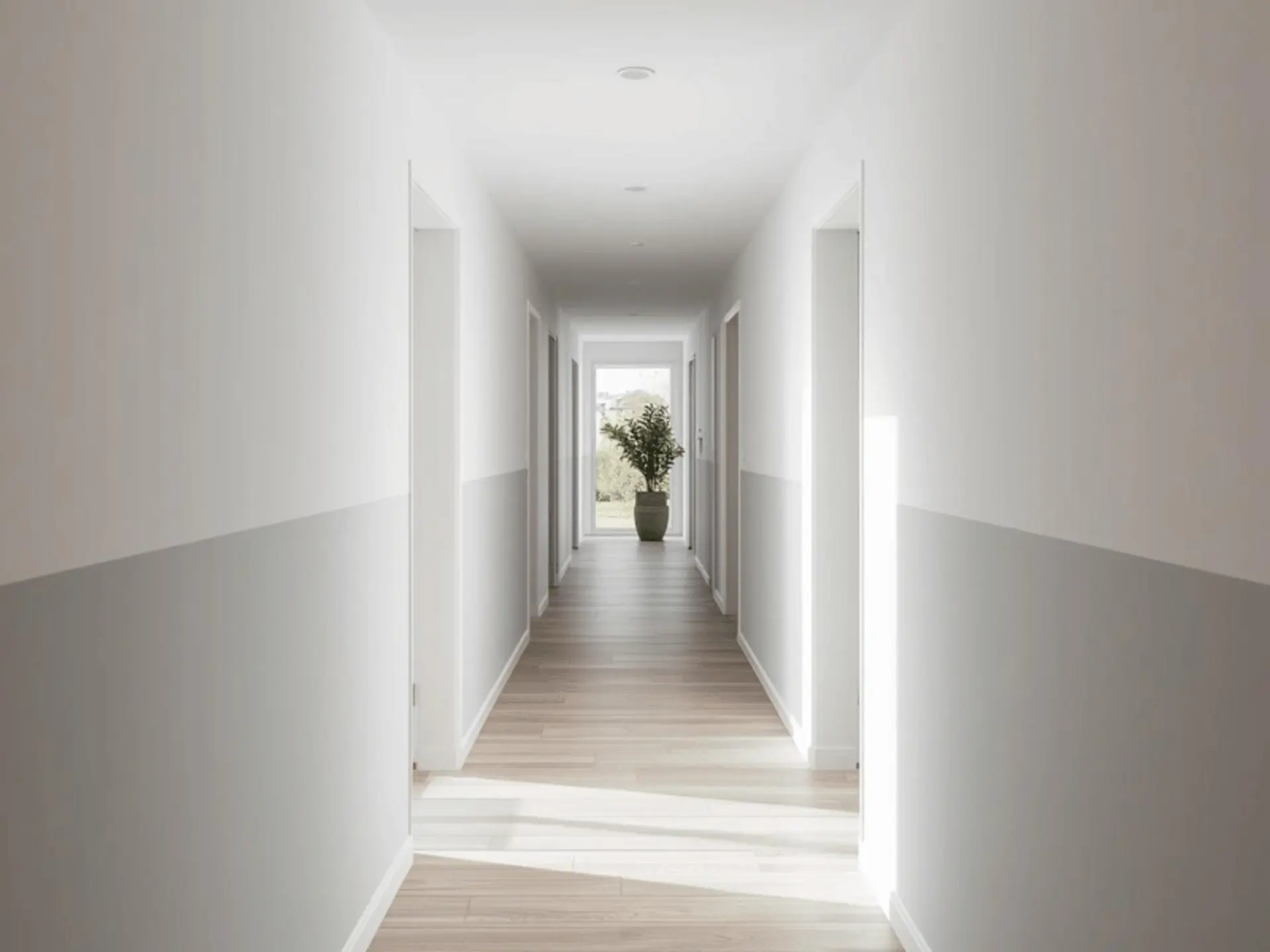
White and soft grey are dependable choices for homes that lean toward a clean, contemporary style. This pairing feels fresh without feeling cold, which is why it works so well in flats and compact homes.
Why it works:
- Reflects light well
- Helps narrow passages feel wider
- Adds a modern finish without harshness
Beige and Warm Brown for a Cosy Feel
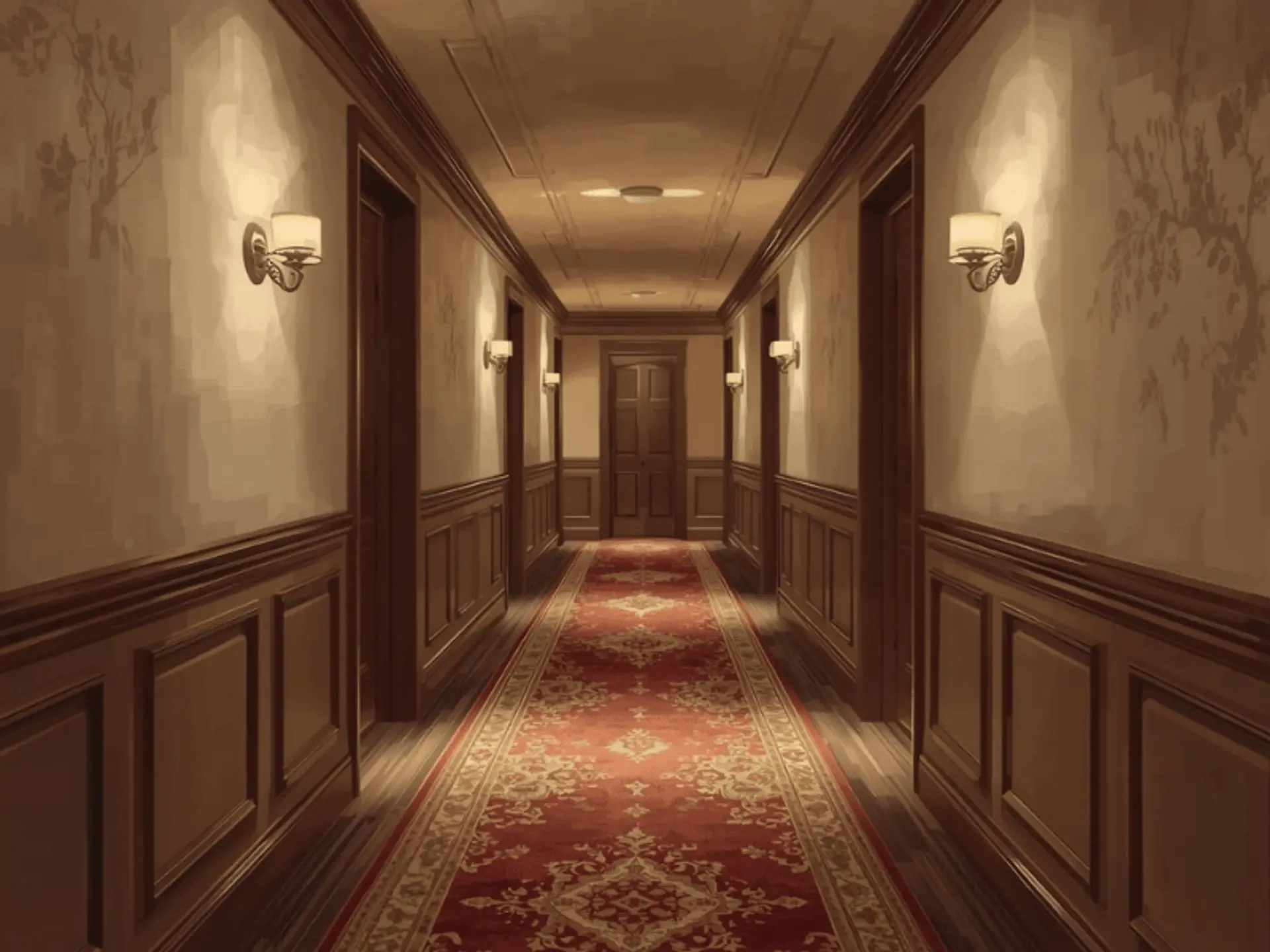
Beige and warm brown bring quiet warmth into a corridor. This pairing suits homes with wooden doors, warm flooring, or classic interior detailing. It feels easy, settled, and familiar. A brown wall paint combination can also sit well alongside softer tones in homes with warmer details, creating a more settled visual flow.
Why it works:
- Adds warmth in a gentle way
- Works beautifully with wood and earthy décor
- Suit traditional and rustic interiors
Pastel Blue and White for an Airy Vibe
Pastel blue with white creates a light, breathable feel in a corridor. It is a lovely option for homes that need softness but still want a hint of colour. This pairing can work well in passages that receive insufficient daylight.
Why it works:
- Creates a calm and airy mood
- Works well in smaller corridors
- Adds colour without making the walls feel heavy
Yellow and Cream for Bright Corridors
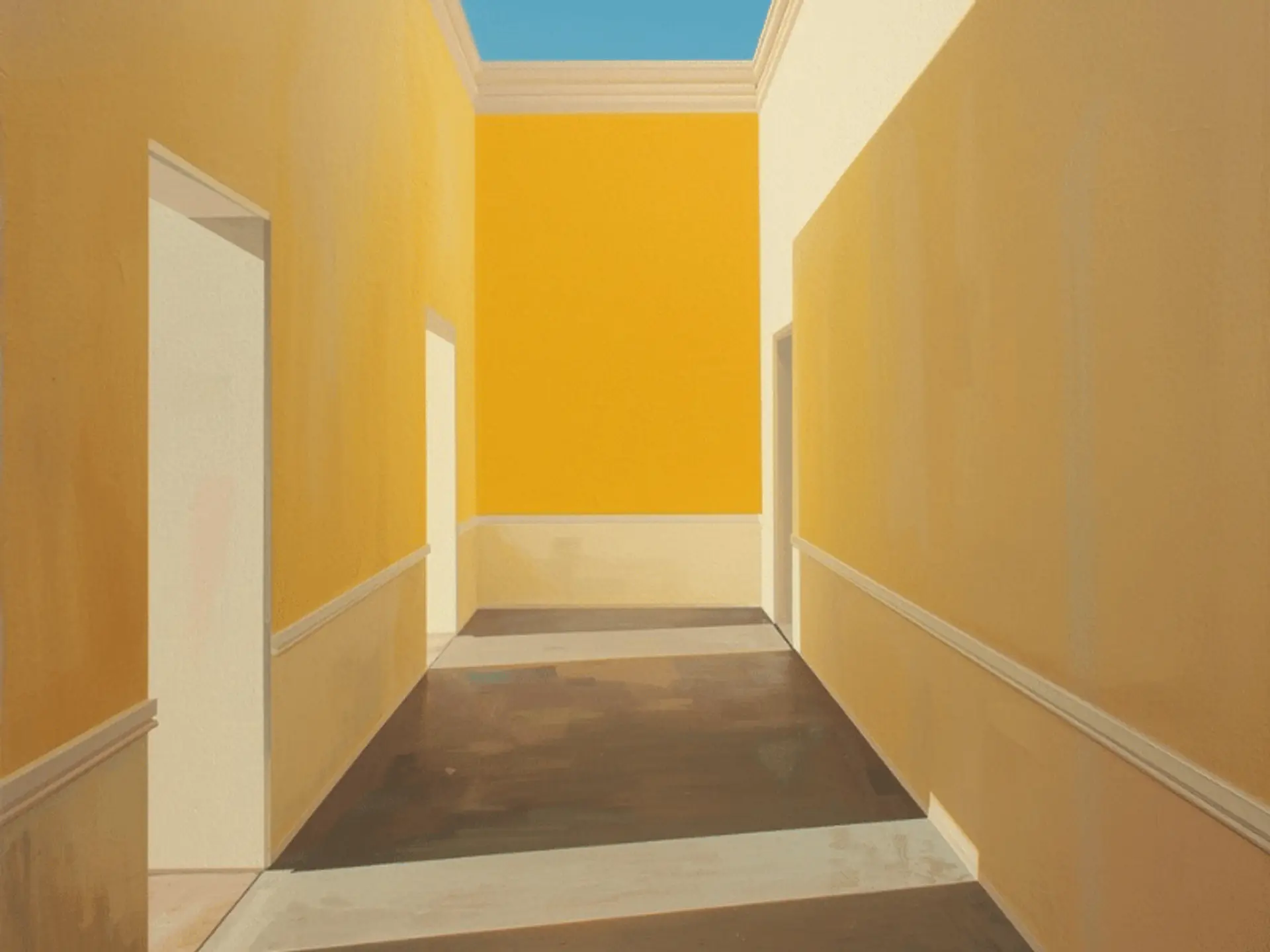
Yellow and cream can lift a dull corridor more effectively than many people expect. The key is to keep the yellow soft rather than sharp. Done well, the result feels warm, cheerful, and full of life.
Why it works:
- Brightens darker passages
- Adds warmth and freshness
- Suits compact spaces very well
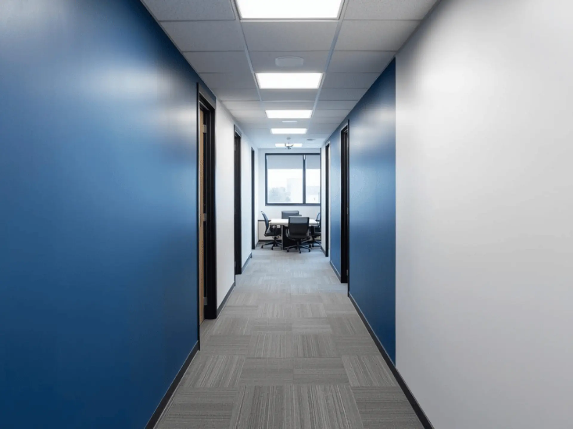
Navy Blue and White for a Bold Statement
Navy blue and white create a corridor with presence. It is a stronger choice than soft neutrals, but it can look elegant when the space has enough light to support it.
Why it works:
- Creates a sharp and stylish contrast
- Adds depth to plain walls
- Suit larger or well-lit hallways
Olive Green and Off-White for a Natural Look
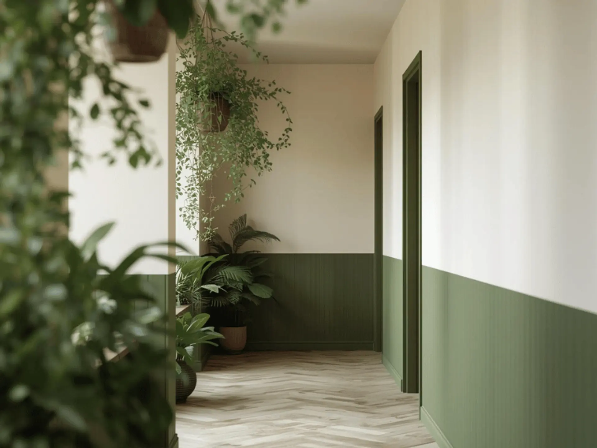
Olive green and off-white bring a grounded quality to corridor wall colours. This combination feels restful and works especially well in homes with natural textures, cane pieces, indoor plants, or wooden accents.
Green wall paint combination ideas often focus on balance, and this pairing offers a simple way to bring nature-inspired colour into the passage.
Why it works:
- Creates a soothing and earthy mood
- Pairs well with natural décor
- Gives the corridor a soft but polished identity
Charcoal Grey and Mustard for a Trendy Contrast
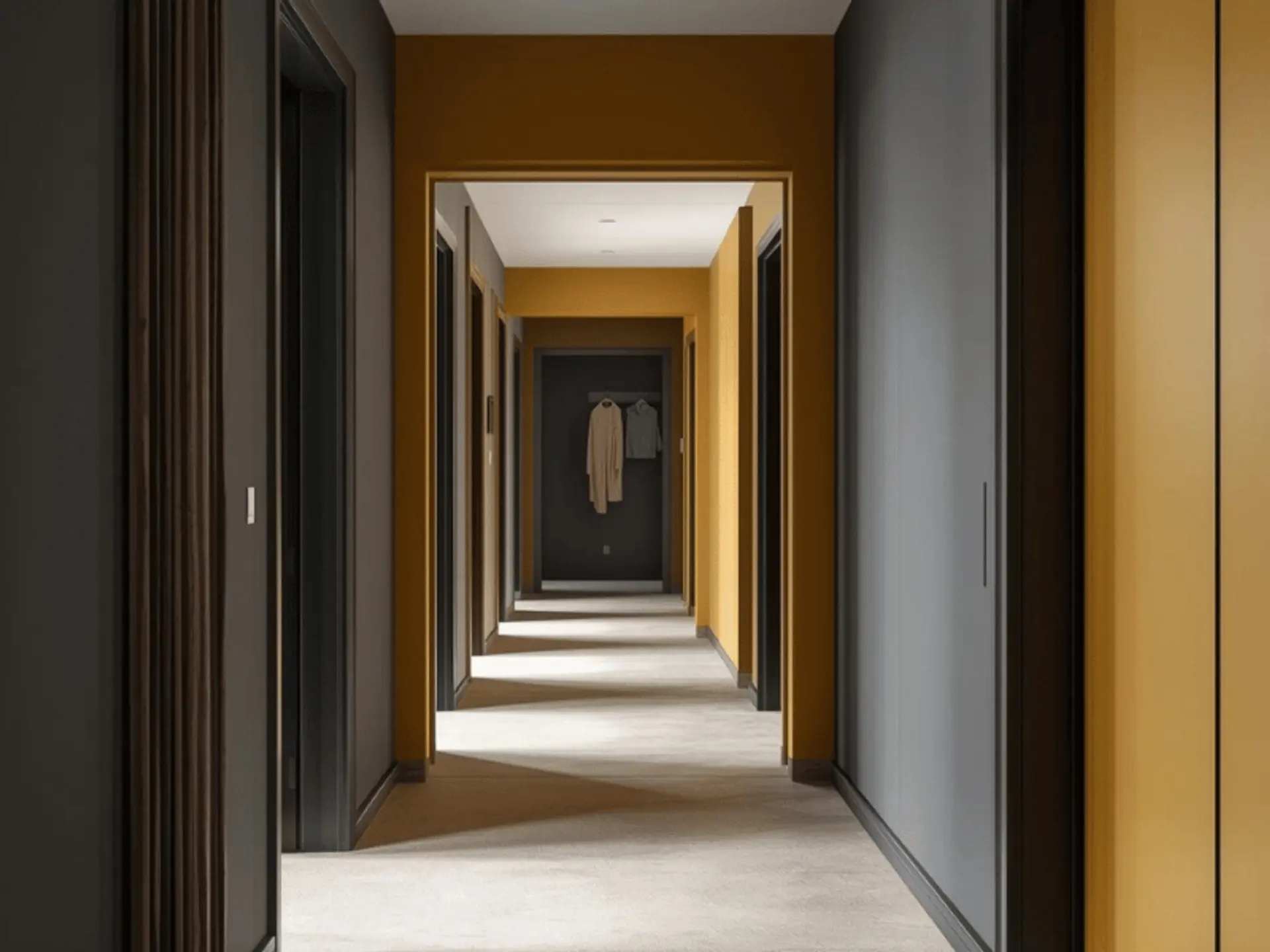
Charcoal grey and mustard are for homeowners who want the corridor to feel more expressive. This is not the quietest combination, but it can look striking when handled with balance.
Why it works:
- Creates a bold and current look
- Adds personality without clutter
- Works well in contemporary homes
Teal and Beige for a Balanced Look
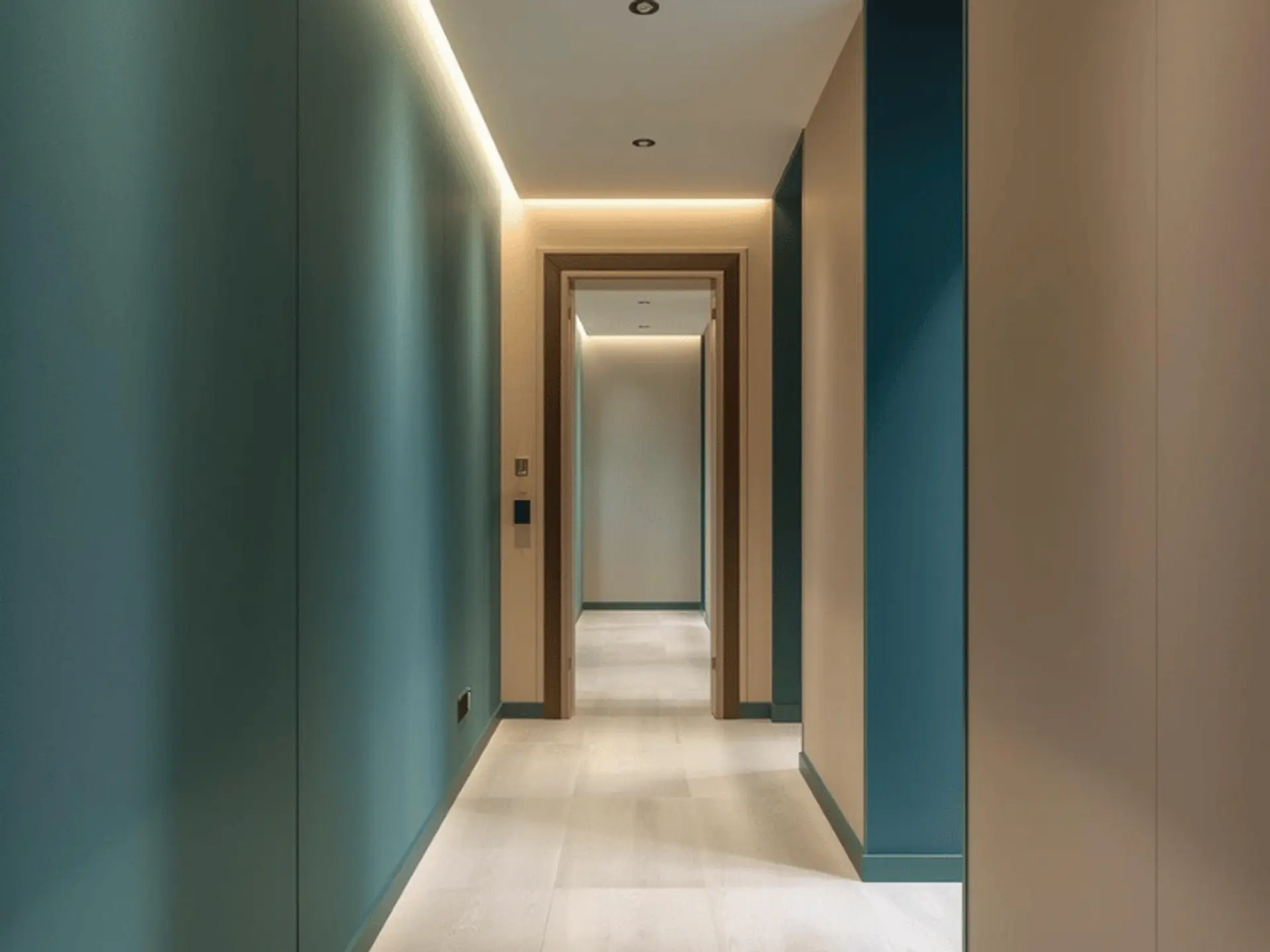
Teal and beige offer a nice middle ground between rich colour and soft neutrality. Teal brings depth and a little drama. Beige keeps the space comfortable and visually steady. A teal wall colour combination, by contrast, can suit homeowners who want a corridor that feels richer and more defined without appearing too dark.
Why it works:
- Blends colour with calmness
- Adds depth in a balanced way
- Works well in medium and larger corridors
Lavender and White for a Calm Atmosphere
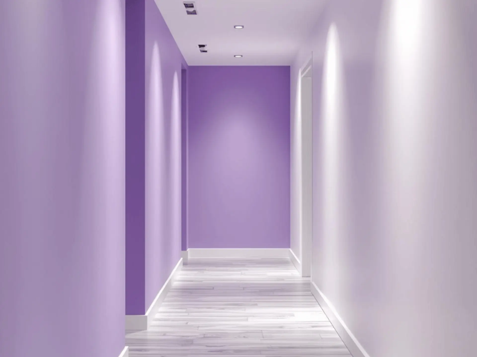
Lavender and white create a corridor that feels gentle, light, and slightly unexpected. Lavender has a quiet charm when used in the right shade, especially in homes with a softer interior palette.
Why it works:
- Supports a peaceful mood
- Keeps the corridor bright and airy
- Adds a subtle decorative touch
Pro Tips for Corridor Colour Design
Here are the pro tips for corridor colour design:
Use Two-Tone Walls
Two-tone walls can add visual structure to a corridor. A lighter shade on the upper half and a slightly deeper tone below can make the walls feel less flat. This also helps in busy homes where the lower part of the wall is more likely to pick up marks.
Add Texture
A corridor does not need to rely solely on plain paint. Subtle textures, panel details, or wallpaper can break monotony and give the passage a more finished character. When used with restraint, texture makes the area feel thoughtfully designed rather than crowded.
Use Mirrors Strategically
Mirrors are extremely effective in corridors. They reflect light, open up the view, and make a narrow passage feel less boxed in. Paired with the right corridor wall paint, a mirror can improve both brightness and scale. If you prefer softer neutrals, warm white paint colour ideas can make the space feel open while still feeling warm and welcoming.
Focus on Lighting
Lighting changes colour more than most people realise. Warm lights can make beige, cream, and yellow look richer. Cooler lights can sharpen white, blue, and grey tones. Before finalising any shade, it helps to test your home corridor colour under the actual lights used in the space.
Conclusion
The right colour combination in the right corridor can change how your home feels every day. It can brighten a dull passage, soften a narrow layout, and make the space feel more connected to the rest of your interiors.
Soft neutrals, earthy tones, or bold contrasts can all work beautifully when chosen well. With expert support like Berger Express painting services, getting a smooth, polished finish becomes much easier, saving time and giving your corridor a neat, long-lasting look for years to come.
check for any query you have about the blog
Frequently Asked Questions
Light and balanced shades are generally preferred in Vastu-led interiors. White, cream, light yellow, soft beige, and gentle green are often chosen because they create a calm and welcoming feel. The right option can also depend on the corridor's direction and the colours used in nearby rooms.
Yes, wallpaper can work very well in a corridor. It is often best used on a single section or wall to avoid the space feeling too busy. Pairing wallpaper with simple corridor wall colours usually yields a balanced, elegant result.
They do not need to be identical, but they should feel connected. Since the corridor links different spaces, the colours should support a smooth visual flow across the home rather than break it.
Corridors usually see frequent movement, so an easy-to-maintain finish is often the better choice. Low-sheen or satin-like finishes are commonly preferred because they look neat and are more suitable for everyday wear than completely flat finishes.
Not always. In many homes, a lighter ceiling works better because it helps the corridor feel more open and bright. White or off-white ceilings are often chosen for that reason.