The Golden Glee! For July 2015

 Jul , 2015
- Colour Magazine
- 4 Min Read
Colour Stories
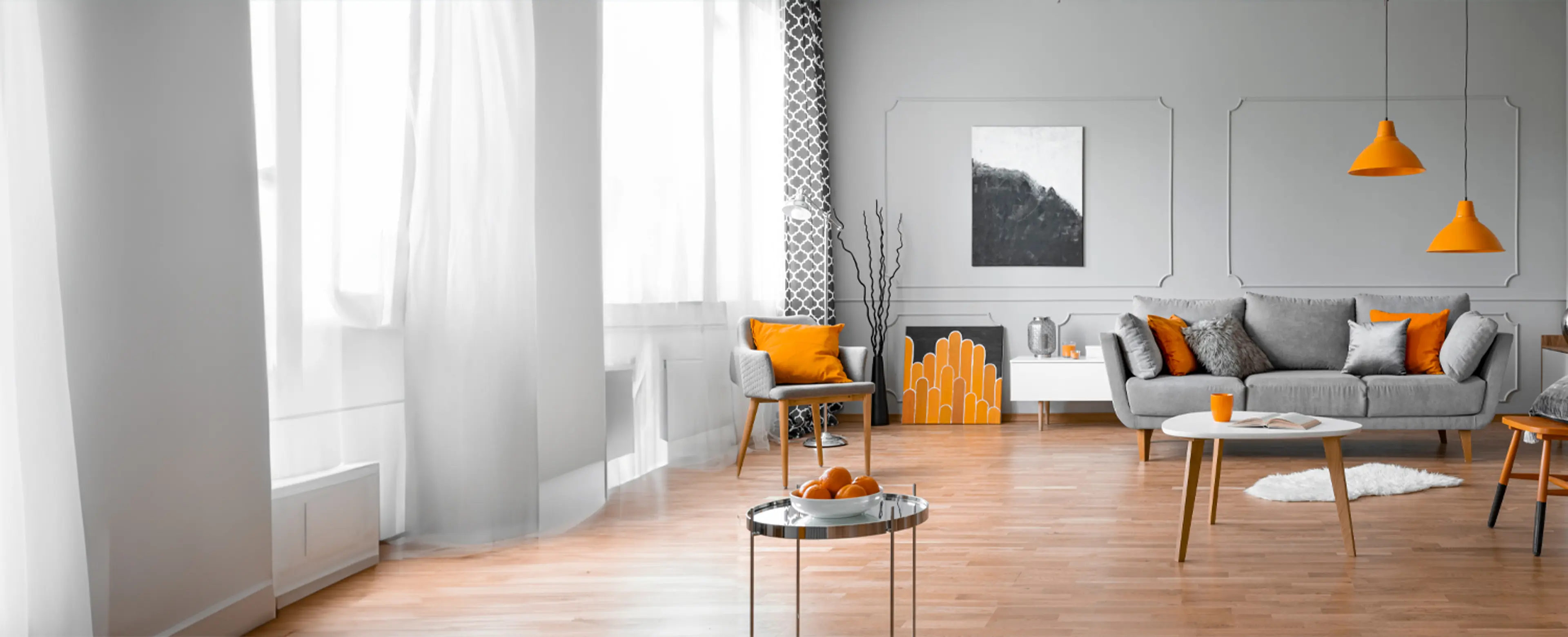
This month, we show you how versatile gold can be, both as a material and colour. Design inspiration that will surprise you in more ways than you’ve imagined!
People generally consider gold as an opulent colour and refrain from using it, unless they want to go OTT. Although some people love it, they simply can't imagine using it in everyday designs. It's been always associated with high glamour and stereotyped with high luxury. But metallics, especially the hue gold, when reimagined can look chic and stylish in any form of design. The recent advances in the way the hue has transformed will make you fall in love with gold all over again.
In design circles, "gold is the new black" and we think so too. The new types and kinds of gold are much more aesthetically alluring than ever. The modern gold is approachable, friendly, playful and provides for a new direction. It's time to embrace the colour and imbibe it into our lives.
Gold, the sound of it, instantly weaves a picture of yellow glitter in front of your eyes but in reality, gold has a wider spectrum than one expects. Different combinations of silver, gold and copper yield a gorgeous array of tones ready to be explored. Let's relook at the cooler and hipper versions of the colour.
Rose Gold: The cool-toned, appealing gold is here, the kind you will adore. It's a massive trend. This pinkish blush shade is a great shift from the traditional hue. The metallic shade has become popular accent in home design.
Black and Gold: This look spells high-fashion glamour and is dramatic. The combination looks fascinating to the eyes.
Colour and Gold: Metallics can be considered as neutrals and go great with a whole range of different hues. Gold with neon was popular in the 1980's and has now made a huge comeback. It looks smashing with blue, jewel tones, pastels and most colours.
So, bring home some gold this season and shine through!
Colour Trivia
Colour Facts For July 2015
- Plant researchers, Bill Hock, Brent McCown and Eric Zeldin of the University of Wisconsin-Madison, while studying the fall colour changes on trees, discovered that brilliant red pigments shade sensitive leaf tissue in fall and trees reabsorb these nutrients from their leaves. They explained, "Trees need to store as many of those nutrients as they can before the leaves drop." In actuality, the red pigment produced by the leaves performs much the same important function as sunscreen on human skin. Their study also explains why most native maples and oaks in the Midwest and New England turn red, while European species such as the Norway maple do not. The absence of red leaves is the result of the cloudier and warmer weather in these locations during fall. Therefore, these species don't need the protection of these pigments.
- Picture this, sky blue French fries! Heinz introduced sky blue French fries as a result of a market survey. Kids were asked what would make them eat more French fries and blue was the winner. However, they were wrong about it as the product wasn’t received too well and was pulled from the shelves. In the meantime, sales of Heinz's other crazy colours -- the green, purple, and pink ketchup – were a big hit.
- Scientists in Switzerland have created a genetically engineered strain of rice that could save millions of children's lives. Unlike white rice, golden rice produces beta carotene, an important source of Vitamin A, which is crucial for resistance to disease and healthy vision. Approximately 124 million children in the world don't get enough Vitamin A. Of these, about a half a million go blind and 1-2 million die due to lack of Vitamin A. Note: Dr. Ingo Potrykus of Germany is the inventor of golden rice. In 2005, a new variety called Golden Rice 2 was announced, it produces up to 23 times more beta-carotene than the original variety of golden rice.
Colour Quotes For July 2015
Colour is fun, colour is just plain gorgeous, a gourmet meal for the eye, the window of the soul.
- Rachel Wolf
Like emotions, colours are a reflection of life.
- Janice Glennaway
Painting is by nature a luminous language.
- Robert Delaunay
Colour Tips For July 2015
- While painting windows, take off any hardware so that the job becomes easier and you achieve a neater finish. Start with the stiles and the rails of the opening sections; make sure you use a 1 inch brush. Paint with the window open so you can easily paint both sides. Keep the window open until the paint is completely dry. Next, paint the railings of any non-opening panes. Create a mid-section line to differentiate between the frame and the wall surface.
- For professional-looking results, use painter’s tape. It helps guard areas you don’t want to paint. It works well for doors and window trims. Different adhesion levels are available for painter’s tape. They are perfect for textured surfaces, as well as fresh surfaces like newly painted areas. Check the adhesion level according to the job you are undertaking.
- Follow the “cutting in” style for prepping up. ‘Cutting in’ basically means outlining the room. It involves using a paintbrush to create 2 to 3 inch bands around the edges of the walls where they meet ceilings, other walls, doors, window frames and hinges. The 2 to 3 inch areas around the room allow you to roll the rest of the wall quickly without having to try and roll paint. It’s impossible to use a roller that close to areas you’re trying not to paint without making mistakes.
World of Colours
Colours & Emotion For July 2015
- They say you shouldn’t wear grey to work as it feels passive, plain and lacks enthusiasm. However, if you like grey, pair it with a brighter colour to balance the effect. Picking colours for your office, your clothes or your desktop should not be taken lightly as colours can directly impact moods and productivity. Nevertheless, colours are not the only factor that affects us - one can still be efficient in a grey suit or workout well in a black outfit. But, when you have a choice, always remember to pick a colour that works in your favour.
- Silver, the metallic colour, has cool properties like grey but is playful and fun. Some of the images that come to mind when you speak of silver are industrial, sleek, high-tech, and modern, as well as ornate, glamorous, graceful, sophisticated, and elegant. It also exudes feminine energy related to the moon; it is fluid, emotional, sensitive and mysterious. Soothing and purifying, silver is preferred as a neutral colour to pair up with bright colours like orange or red.
Colours & Fashion For July 2015
This year will be the time of contrast and singularity in the fashion world, and the seventies will be a major influence if the Spring/Summer 2015 collections are anything to go by. Thanks to the diverse influences, you can stock up on items ranging from transparent fabrics to khaki prints to nautical accents. This season also suggests that you pick up dresses with vintage prints and approach the mix and match formula when assimilating fabrics for your closet. The mix and match idea, in particular, seems to be delightful for all fashion lovers this season!
Colours & Gems For July 2015
- Some gemstones have unusual names as they are derived from unexpected places or have an unusual origin. "Ant hill garnets" are one such type of novelty gems. They are aptly named after their place of origin, which are margins of ant hills. The ants encounter the garnets while excavating and pull these stones to the surface and abandon them. The rain further rinses the garnets clean and moves them down the rim of the ant hill, where they settle. Their brilliant lustre and red colour contrasts strongly with the surrounding soil and looks mesmerizing.
- Cat’s Eye Actinolite is a rare translucent gemstone variety of chatoyant actinolite. The name 'actinolite' was derived from the Greek word for 'ray' or 'beam', which refers to its fibrous nature. These fine fibres are responsible for actinolite’s rare 'cat’s eye effect'. When aligned, fibrous inclusions occur and allow a concentrated line of light to appear across the surface of domed stones when properly cut, similar to a cat’s eye.
Colours & Nature For July 2015
- Monsoons are here, splashing up a lot of green in our lives. However, with the sun rarely making an appearance for days together, city life tends to get gloomy and grey. This is where you can really play with colours and make life happy and bright. It’s a general trend; most people opt for darker colours like blue, black and shades of grey for practical reasons but try something different this time. Go bright and choose happy colours like neons, pinks, yellows and other such vibrant shades. If you don’t wish to experiment with clothes, have your accessories, like umbrellas, raincoat and shoes, in these colours!
- Monsoon is the season of revival. Nature shows off its brilliant colours, from oranges, yellows and dusty pale browns to brilliant vibrant greens, rich muddy browns, deep reds and the bright yellows of flowers and trees. Imbibe these colours in your décor schemes; for example, pair a single shade of green with grey or brown. Welcome home sparkling colours like deep burgundy, gold, garnet, coral greens, olive green, indigo blue, purple red and orange. Some of the best fabrics to suit the season are pure cottons, silks, damask, velvet and leather. Use lots of fresh flowers and bright coloured paintings to increase the enthusiasm in your home.
Decor
Gear Up For The Monsoons!
Combat the downside of the monsoons with these simple tips and say goodbye to gloomy moods!
Monsoons are that perfect time of the year to sit by the window, watch the rain and enjoy a cup of your favourite drink. These are the upsides of the rains and while this is one of the most amazing times of the year, it is also that time when your home sweet home turns into a gloomy and dull place due to the lack of sunlight. So, to combat the downside of the monsoons, we have come up with a few simple and easy tips for you to make your interiors look and feel lively!
First things first, and let us start with the drapes adorning your windows. This is the time to go for flowing, lightweight and colourful fabric, which will allow more light to get in and also add some colour on a gloomy day. Another good thing about flowing drapes is that unlike heavy drapes, they keep out the musty feeling. Next up on the list are seasonal blooms placed in tall vases arranged attractively around the house to glam up the gloomy days.
If you are a greenery loving person, then you can also bring in some plants like money plants and bamboo shoots in attractive pots. Place these on window sills or shelves to give a livelier feel to your interiors. Also, do not forget to get some attractive looking mats and baskets, which can be used to store the rain gear brought in by guests. While a big entrance mat will be extremely handy to soak in the water and mud brought in by your visitors.
Last but not the least, with temperatures slightly dipping, it will be the perfect time to have cosy evenings with candle lit interiors. So, get some fragrant candles in different sizes and shapes to get a golden glow to your home. The best part is they will also keep your home smelling fresh and keep away the stuffy smell of the monsoons!
It Is Time To Go Quirky!
Maybe you’ve had enough of simple DIY tips, so we came up with a few cool and crazy tips for your interiors!
There are times when we are bored with pretty much everything, and one of the things that top this list is our own house because that is where we spend a lot of our time! So, this time, we are here with a few quick ideas to make your house look new and quirky. Since we've covered a lot of simple DIY tips, we've come up with a few cool and crazy tips for your interiors. Some of the quirky tips are as follows:
- Instead of drilling holes in the wall to hang curtain rods, use sleek looking command hooks to hang your rods.
- Get rid of all your boring curtain tiebacks and get some rhinestone necklaces from the flea markets to have your own personal bohemian curtain tiebacks.
- Bored of accent walls? Add a pop of colour by painting the sides of your door in a hot pink colour shade, or orange or whatever you like!
- Just like your doors, one way to jazz up your dresser is to paint the sides of a dresser in bright pretty colours like red, yellow and green for a fresh look!
- Have an unused fireplace at your house or something that is remotely like a fireplace? We suggest you use this space to light an array of candles and light up your place on those cosy evenings.
- This tip is an absolute stunner once you get it done. Take a lampshade and lots of glitter. Coat the inside of the lampshade with a thick layer of glitter and the next time you light up this lampshade you will be greeted with a gorgeous reflective light effect.
We will be back with more of these quirky tips. Right now, you need to go and try out these tips and glam up your interiors!
Ditch The Decorating Rules!
Create a personal space that has you coming back and more importantly, feels like home!
We hate to break this to you but the best interior designers in the world don't follow a rule book. It's just about looking inside-out for inspiration and using a bit of imagination. Yes, we all have the creativity; it's just waiting to be explored. And as for inspiration, it's all around you in the form of nature, art, colours, music, etc. Develop your own quirky style with these simple tips.
Paint can wait: We know the obvious thing that comes to mind while redecorating is to choose a paint colour. But wait, first have a good look at the space, understand the light that rooms get and then choose a colour, accordingly. What looks good in your current home might not in your new one. Also, the colour has to match your furniture, rugs, upholstery, etc. So, it's best to keep this decision for the end.
Place the art at the right height: Follow the gallery and museums rule here, they hang artwork so that the midline (centre) of each piece is 57 inches to 60 inches from the floor. (The average human eye level is 57 inches.) And you should do the same for an aesthetic look.
Don't follow themes: Popular themes very often lack individuality. This is where you put your creativity to play. Stay away from popular clichés. Close your eyes and imagine a space you would like to call your own, incorporate those elements and you will have a space you adore.
Choose a star: Having a multi-star cast works wonders for a film but the same does not hold true of interior design. Here, you need to pick a single star and allow it all the limelight. It can be a dramatic hood in the kitchen, an art piece in the living room or a headboard in the bedroom. Just pick a statement piece that stands out.
Create a personal space that has you coming back and more importantly, makes the house feel like a home. A kind of space you would like to hide in after a hard day's work. Stylish homes are instinctive, so, follow your instincts.
Colours & Ancient Sciences
Feng Shui For July 2015
Feng Shui has a few simple tips to help you improve your love life!
We have been telling you about how to improve the energy in your home and office with the help of Feng Shui but today is different. This time, the focus is not on your home but on your heart! Yes, we are talking about your love life and Feng Shui has a few simple tips to help you improve your romance. So, follow these simple pointers to have a flourishing love life:
- Get a red pen: Feng Shui believes in the idea of having a clear idea of who and what you want and also wants you to put it down on paper! Yes, you heard it right. Get a red pen and white paper and list down the qualities and attributes you want in a partner. Create your perfect partner on paper and place your list in a small silver box, along with an image of two peonies and place this in the relationship area of your bedroom for 49 days. Do this and see how the universe conspires to help you meet the partner of your dreams.
- For married couples: All the married couples who are looking at extending their family and want to welcome a new family member, Feng Shui has tips for them too. Firstly, keep the space underneath your bed clutter free. According to Feng Shui, the elephant is the symbol for babies. So, keep two wooden elephants in your room and keep your fingers crossed!
- Code red: Yes, you guessed it right, get some red bed sheets and drapes for your bedroom, and see how your love life becomes hot and happening!
- Mend a broken heart: Feng Shui says to get an orange essential oil bottle to beat the blues. Yes, literally so! It suggests that you add around 10 drops to a spray bottle filled with water and spray around your space each morning and you will feel better!
Reiki For July 2015
Anger issues? Reiki has the answers.
"He that is slow to anger is better than the mighty."
The first five Reiki principles by the founder, Usui, state "Just for today, don't get angry." Anger, though negative, helps us focus attention, gets the adrenaline going and helps us charge resolutely towards a goal.
Reiki, too, is fundamentally about pursuing a goal and trying to focus attention, however minus the ego. So, take a pause when you get angry and ask yourself a few questions; why you are angry, what does this anger have to do with anything, why you're wasting your time on it, etc. These questions will help you justify your actions and help you act in a more balanced way. This practice helps us let go of unnecessary, harsh anger.
Going by what Buddha said, "Holding on to anger is like grasping a hot coal with the intent of throwing it at someone else; you are the one who gets burned." The picture that comes to your mind is you tossing the hot burning coal persistently without dropping it to harm the other person. And while you do so, you only burn your hands as the person runs off. That's what anger does to you; it harms you in ways you cannot imagine.
If you let go of your ego for a while and keep questions like, "how dare he did that to me", "I can't take this", "who is he to hurt me" and replace these with logical reasoning, we will be living a fuller, happier life. The problems of the world like war and poverty will disappear. Of course, the world cannot change in a day. But with one person at a time, we can surely hope for a day when we won't have these issues. We can focus on more positive things like growth and peace.
Follow the founder's wisdom and stop anger when it first comes up.
Just for today, don't get angry.
Vaastu For July 2015
Let us focus on what Vaastu suggests for a brighter future of your child!
Vaastu Shastra is one of those ancient practices of India which has a cure for every possible house related problem. However, today we are going to simply focus on what Vaastu suggests for a brighter future of your child. A child's mental and physical development is of utmost importance to the parent. So, we are going to discuss the aspect of Vaastu that will help you ensure your child's overall development. Here are some guidelines to be followed when doing up your child's room:
- It is always best to make sure that your child has their room in the western part of the house. The northwest, northeast and southeast are also good but always avoid southwest for your child's room.
- If you are wondering which colour to do up your child's room, then green is your answer. Vaastu associates green with freshness, peace and growth. It is also said to increase the brain power of your child, which will help them in their studies.
- The centre of your child's room should always be empty and the centre of a child's room is a very sensitive area. So, avoid placing anything here.
- The almirahs and cabinets in your kid's room should always be placed in the south or western direction of the room. Make sure to never keep objects with sharp corners in your child's room.
- For the good health of your child, ensure that the lights are placed in the southeast corner of the room to help generate positive energy.
- Finally the most important thing, your child's study table should be placed in such a way that the child is facing the east while studying, this will help in enhancing concentration.