Painting Your Lips Red! For December 2016

 Dec , 2016
- Colour Magazine
- 4 Min Read
Colour Stories
A girl's vanity box is incomplete without at least one shade of red lipstick. The go-to cosmetic for not just the fashion world, red lipsticks possess the power to make anyone seem twice as glamorous.
Nowadays, there is no dearth of red lipsticks, as is apparent on all mainstream media. Almost all brands have developed a shade of red that they consider iconic, and have a variety of these gorgeous tints ranging from cool to warm undertones. But even the most iconic red lipstick has evolved from pretty humble beginnings, not to mention dangerous ones.
The first kinds of lip stains or lipsticks were crushed berries or fruits that women rubbed over their lips. The earliest recorded instance of people wearing lipstick was in 3500 BC by the Sumerian queen Shub-ad. The lipstick was created by blending crushed red rocks and white lead, making it quite unsafe for use. The Egyptians too heavily favoured the use of lipsticks for both men and women, although they used it to highlight social positions and class. It was in Egypt that the shade, Carmine, was discovered and lipsticks were made mostly by crushing cochineal insects, wax and animal fat.
Lipsticks closer to as we know them now were invented by the Mesopotamians. The women ground precious and semi-precious stones into a fine dust and applied that paste on to their lips. The first solid lipstick in a tube form was invented by an Arab cosmetician called Abu al-Qasim al-Zahraw; the lipsticks were perfumed sticks rolled and pressed into shape sometime in the 10th century.
While women in Asia, Africa and the Middle-East had a long standing relationship with lipsticks, the scene in Europe was vastly different. Lipsticks were banned in the medieval period for being unchristian.
In the Renaissance, Queen Elizabeth I brought wearing lipsticks back in vogue as she adored applying dark rouge on her lips. They went in and out of fashion with changing times until finally by the turn of the 20th century, makeup and lipsticks were socially acceptable for all classes.
American inventor Maurice Levy first introduced lipsticks in sliding metal tubes in 1915. The western world slowly began to warm up to red lipsticks in the face of the swing movement and cinema. It was during the World Wars and after that red lipstick achieved the iconic status it enjoys now. Marketed as a device which enables women to get in touch with their feminine side and wield their sexuality by brands like Elizabeth Arden and Revlon led women to using red lipsticks in droves.
The waves of feminism changed how lipstick was perceived yet again, but since the advent of the disco-era and the popularisation of cherry and ruby red lips by icons like Madonna and Cher, and more recently Adele; red lipsticks are here to stay and are pretty much the fashionista's key to ruling the world.
Colour Trivia
Colour Facts For December 2016
- Did you know that people associate colours and scents? A 2014 study observed that people tended to associate fruitier, floral scents with colours such as light green, pink, purple, etc. While damp, musty scents were associated with colours such as brown and orange. Previously, this tendency to correlate scent and colours was attributed to a condition known as Synesthesia. But after a study conducted with multi and cross-cultured people, it has come to light that the tendency is a global one.
- Did you know that red makes people more impatient and induces a sense of threat in people? Red colours and red lights trigger a pause in movement and perception. It also affects a participant's performance in a test if viewed immediately prior to it. A study has also found that users found it easier to wait for a download when exposed to a blue screen as compared to a red one!
- Were you aware that the colour brown is associated with tradition? While it is not a very popular colour, or even one used a lot, brown is said to denote traditional or natural values. Light shades of the colour usually are associated with affordability while darker shades signify opulence. Perhaps this is why libraries, men's dens and card rooms and other typically masculine-themed rooms are done up in the richer hues to signify grandeur!
Colour Quotes For December 2016
You have your brush, you have your colours. You paint paradise, then in you go.
- Nikos Kazantzakis
Colour in a painting is like enthusiasm in life.
- Vincent Van Gogh
Life is a blank canvas, and you need to throw all the paint on it you can.
- Danny Kaye
Colour Tips For December 2016
- Now that we've passed Thanksgiving, don't let cranberries become a distant memory till next year. Paint your walls a deep cranberry shade and you can either subdue the depth of the shade by pairing it with beige, tan, etc. or you could give it a further boost by combining it with metallic shades of silver and gold. Either way, it is a colour that looks fantastic all year round and never lets your home lose its cheery touch.
- While metallic seems passé now, it is still a beautiful idea if you want your home to look glamorous and inviting all at once. So what can you do to temper metallic hues? You could, instead of painting an entire wall gold, stick to gold accents on furniture or light fixings and paint the walls a jewel hue like burgundy or teal. You can also pick a minimalist theme, in which case neutrals like black and white are your best bet.
- Winters are all about rosy hues, cosy colours and a rich, deep comfortable setting to enjoy your hot chocolate. Keeping this in mind, you can combine the subtle and feminine shades of blush pink or dusty pink and a warm grey. This adds a beautifully balanced touch to the room. In addition to these colours, include a white trim if possible as it is the perfect finishing touch.
World Of Colours
Colours & Emotion For December 2016
- Did you know that there exists 'Zones of Regulation' according to colour psychology that helps schools to control and regulate certain impulses and emotions? This concept is the brainchild of Leah Kuypers and it is used to help individuals relate different zones to different modes of behaviours in various scenarios. The Red Zone equals a heightened state of emotion; The Green Zone equals a calm, yet alert state. The Yellow Zone is a more excitable state of alertness than green, but not as explosive as red. Finally, the Blue Zone equals a feeling of passivity and feeling low.
- If you are repainting your living room, choose warm colours such as red, orange, yellow or earthy tones like brown and beige because these shades stimulate and encourage conversation. According to experts, you are more likely to feel comfortable in a room painted in these shades if you're expected to socialise and step out of your comfort zone a bit. And the opposite applies for bedrooms - since they are a place one retires to for quiet and relaxation, it is better to paint them in cooler tones of blues and greens.
Colours & Fashion For December 2016
The last month of the year is usually the coldest and that means one has to stay bundled up all the time. But bundled up doesn't mean you need to sacrifice the style quotient! Darker colours such as ruby, burgundy, forest green, navy blue, military green, charcoal grey, etc. go amazingly well with the textures of winter.
The colours in style always reflect the world outside, and these shades reflect the winter and upcoming festive mood perfectly. You could also incorporate a Christmas theme and base outfits around those shades. Materials like wool, suede, velvet or leather are more prevalent and highlight the beauty of any of the colours mentioned above!
Colours & Gems For December 2016
- The only thing that can make a big, shiny rock prettier is a dash of vivid colour. Tourmalines are semi-precious gemstones that get their name from the Sinhalese/Tamil word 'turmali.' The stone exists in a variety of colours, from black, blue, green, rust, yellow and a few more, but in 1988, exquisitely bright tourmalines were discovered in Paraíba, Brazil. They created a stir in markets and the prices of tourmalines shot up. At present, the name Paraíba Tourmaline is used to refer to any tourmaline regardless of colour, and the blue-green tourmalines are the most expensive type.
- Garnet is known to have 6 different sub-categories of stones according to their chemical composition; these are Pyrope, Spessartine, Grossular, Uvarovite and Andradite. Out of these, Andradite species further includes two other rarely seen varieties - Topazolite and Melanite. Melanite is a completely opaque black stone which was not considered as a precious gemstone until quite recently but since the rising interest in black gemstones in general, they are now popularly used as gemstones. Till date, melanite has been found in Italy, Greenland, Russia, Ukraine, Kazakhstan, Mexico and the USA!
Colours & Nature For December 2016
- We're aware of being able to spot and enjoy hundreds of different colours in nature and each one seems to have dozens of shades. But how exactly are we able to see and understand the varying hues in nature's creations? Scientists believe that the hues on birds, animals and insects can be seen due to either their structural colour or pigments. The structural colour is produced by light interacting with microscopic patterns on the surface of the creatures such as beetles, while pigments found in the hair or skin absorb light such as in parakeets.
- Were you aware that there exists a type of frog with a multi-hued body? The Poison-Dart frogs, native to Central and South America, have brightly coloured bodies that mark them as aposematic. Aposematism refers to a concept of 'warning by colour' and is a trait developed in and adapted to by amphibians and animals marking their poisonous nature to predators. The frogs are usually bright yellow, electric blue, vivid green or orange. Some frogs also have various patterns all over their backs or simpler ones like stripes, spots, etc.
Decor
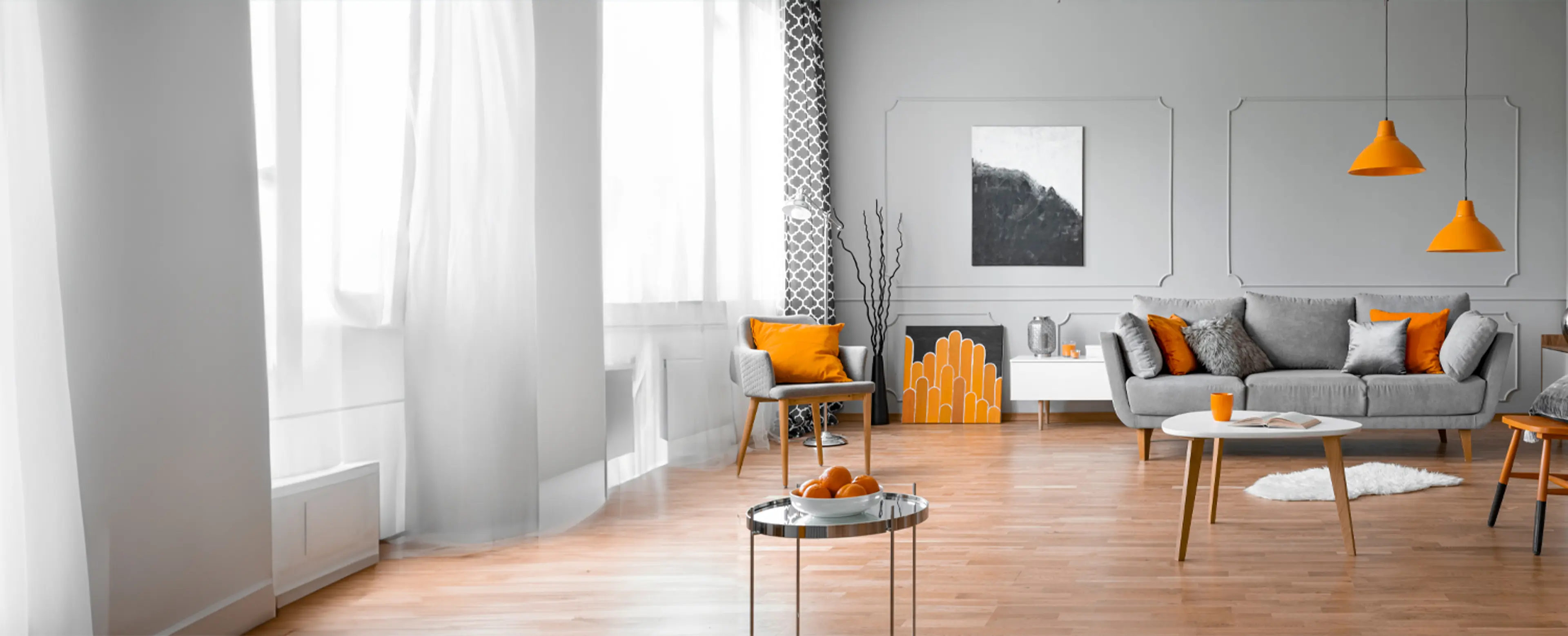
Are You Studio-Ready?
As the population in cities increase, we are learning to fit in tighter and smaller places. Find out how you can turn your studio into a cosy space…
Do you remember arguing with your parents/siblings for a room of your own? Now what would you do if I told you that as an adult; your entire living, eating and sleeping areas were in just one large room!
With the space-crunch that is inevitable due to a growing population, it is a given that houses will have to become smaller. Therein enters the world of Studio Apartments. They're an increasing trend and found in most major cities of the world. Tricky to decorate, and often found inadequate, we'll give you tips to ensure your apartment not only looks stunning but also has enough space for everything you need.
1) Separate Sections
One of the first mistakes many people make is not demarcating the apartment into separate areas according to usage. You need not work in a major change in the decor style to demarcate effectively; cues like varying area rugs, or just a large piece of furniture such as a bookcase suffice.
2) Function > Fad
While the idea of getting a short, glass coffee table seems nice enough, it is eating up precious storage space in your home. Go for a console table under which you can tuck ottomans or compact seats so they aren't cluttering the place when not required.
You can also convert an old, flat-topped trunk into a centre table which lets you store a lot inside. Try to get as much use out of each and every piece of furniture you own.
3) The Lighter the Brighter
Unless you're specifically going for a decadent, luxurious style of decor and layering the shadows, the more light you let into the apartment and the better lit it is, the nicer it will look. If you aren't allowed to change the existing light fixings, buy floor and table lamps. If you want to buy curtains, steer clear of very heavy fabrics like velvet or damask that can mute any light coming in from outside.
4) Sizing Right
People commonly assume that small pieces of furniture will help the room look bigger and large pieces will make it look cluttered but that is not really the case. For your home decor to truly look nice and not as if it is missing the cohesiveness, you need to strike a balance between smaller bits and pieces and the larger, main furniture articles.
Colours & Ancient Sciences
Feng Shui For December 2016
A wonderful way to bless our surroundings is through the use of prayer flags. Learn more about the origin and symbolism of this fascinating colourful Feng Shui piece…
Infuse Positivity with Prayer Flags!
Tibetan prayer flags are colourful rectangular pieces of fabric hung on a cord. The origin of the prayer flag goes back thousands of years to the Tibetan Bon religion, which was a predecessor to Buddhism.
These flags also have a long and continuous history in Persia, Tibet, China and India. They were used as talismans to protect the Tibetans during times of war. The Bon people used them for protection, and put symbols like the dragon, snow lion or a tiger on each flag. They were adopted into Tibetan Buddhism with prayers or messages of hope and peace written on them.
Earlier, the writing and images on these prayer flags were painted by hand, one at a time. Woodblocks were introduced from China in the 15th century, making it possible to reproduce identical prints of the very same design. Traditional designs could then be easily passed down from generation to generation.
With Buddhism being popular in India and Tibet, the flags are an amalgamation of both cultures. The Tibetan word for prayer flag is Dar Cho. 'Dar' means to increase fortune, lifespan, health and wealth. 'Cho' means all sentient beings. As per tradition, they are made in sets of five colours, each representing an element: white for metal, blue for water, red for fire, yellow for earth and green for wood.
In addition to this, the colours represent the five directions - north, south, east, west and centre. The five prayer flags also represent the five meditation (dhyani) Buddhas and the five wisdoms. The five wisdoms are compassion, harmony, wisdom of sight, kindness and perfect wisdom.
According to Feng Shui, we implement the Five Element Theory to bring harmony into an environment. It is believed that peace, strength, wisdom and compassion are invited into every area of our lives by hanging these prayer flags.
Though traditionally these prayer flags were placed outside the houses, you can keep them anywhere inside your home today. Around the frame of a doorway or near the ceiling is a lovely place to display them and the Chinese New Year season is considered the most auspicious time to hang them.
It can also be hung during times of birth, great happiness or sadness. You can invite family and friends over and hang these prayer flags together. However, these flags should be hung in the right order, starting with blue from left to right.
These flags are simple devices that, combined with the natural energy of the wind, quietly bring harmony in the environment, increasing happiness and good fortune to all. Regardless of the person's religion, coming into contact with prayer flags is a positive omen!
Reiki For December 2016
Are you suffering from disturbed or lack of sleep? Do you wish to tackle it without the help of pharmaceuticals? Learn how you can improve your sleep pattern and decrease your episodes of insomnia with Reiki.
Reiki for Sleep
Many Reiki practitioners have reported that Reiki has helped them tremendously in overcoming sleeplessness. All you need to do is follow the Reiki procedures properly. It has a relaxing impact on the mind, body and even the soul. The procedure is known to harmonise every energy centre and chakra of the body. It can be followed any time of the day for the peace of mind and relaxation you crave for.
The practitioner has to maintain four positions and should maintain each position for at least five minutes. These procedures should be followed one by one from position 1 to position 4.
In the first position, the two palms should be kept on both the closed eyes and the palms should rest on the cheek bones of either sides of the face. This position is believed to reduce mental stress and purify your thoughts. This position helps in meditating and should be maintained for five minutes.
Next, both the hands should be kept on both the sides of the chest. Fingers should touch the lower borders of the collar bones of either side. This is believed to normalise the blood pressure, the heart rate and improve the functions of the immune system and the lymphatic system in the body.
After this, one hand should be kept above the umbilicus or navel and another hand should be kept below the umbilicus or navel and the practitioner should relax himself or herself to enable the flow of healing energy throughout the body. This procedure is helpful to restore the energy and the vital physiological functions of the body. This procedure heals the solar plexus and is helpful in treating the digestive organs including stomach. This position is also helpful in cases of shock, fear and mental depression.
Finally in the last position, both the hands should be kept on the lower abdomen in the shape of "V". The finger tips should touch each other above the pubic area. This position is helpful to treat the coupling organs and excretory organs like bladder and urethra. It enhances the level of trust and self-confidence.
We hope this article helps you discover the power in your hands to solve the issue of insomnia.
Vaastu For December 2016
With the New Year just around the corner, here are some tips you can follow in your home or office to ensure you begin the 2017 on a positive note!…
Vaastu for the New Year!
The beginning of the New Year is always a good time to focus on new beginnings brought about by a clean slate and fresh chances. The basic Vaastu Shastra rules revolve around the directions and elements of nature. There are eight primary directions in Vaastu Shastra and they stand for eight particular things in life. The science of Vaastu is used to harness the cosmic energy and positive vibes in nature for a better life and definite mental, emotional and physical benefits.
Here are some tips you can follow in your home or office to ensure you begin the new year on a positive note!
LIVING ROOM
It is ideal to have the drawing room in Northern and Eastern directions. North, east and north-east are best kept light and open while the south and west is where the heavy objects/items of the room can be kept.
The main door must be bigger and wider than the other internal doors. It can be in any direction except the south-west.
To avoid tension and illness in the house, it is better to avoid keeping rubber plants, bonsai, cactus or milk-producing plants in the house.
Sitting or sleeping under an exposed beam can cause depression, headaches or illness.
Exposed marble tiles, and especially broken ones in the house could be the reason for tensions in relations, cover it up with a carpet and replace the broken tile as soon as possible for immediate results.
Having the name and number plate of your house on the door or beside the main entrance will help good opportunities in finding you easily.
Keep your mirrors clean since dust and dirt decrease their effectiveness.
OFFICE
It is very good for work if the conference room or board room in your office is in the eastern direction. Not only is it productive for decision making, but it also invites positive vibes and good energy into the room. The western direction is good for post-meeting or project analysis and regrouping.
If you work from home, it is evident you'll spend a lot of time at your workspace. For positivity and increased efficiency, your home office must face the south-east direction. The east, north, or north-west are also good directions.
See you in the New Year!