12 Colour Combinations To Guarantee A Bold And Bright Interior
 Dec , 2022
- Colour
- 4 Min Read
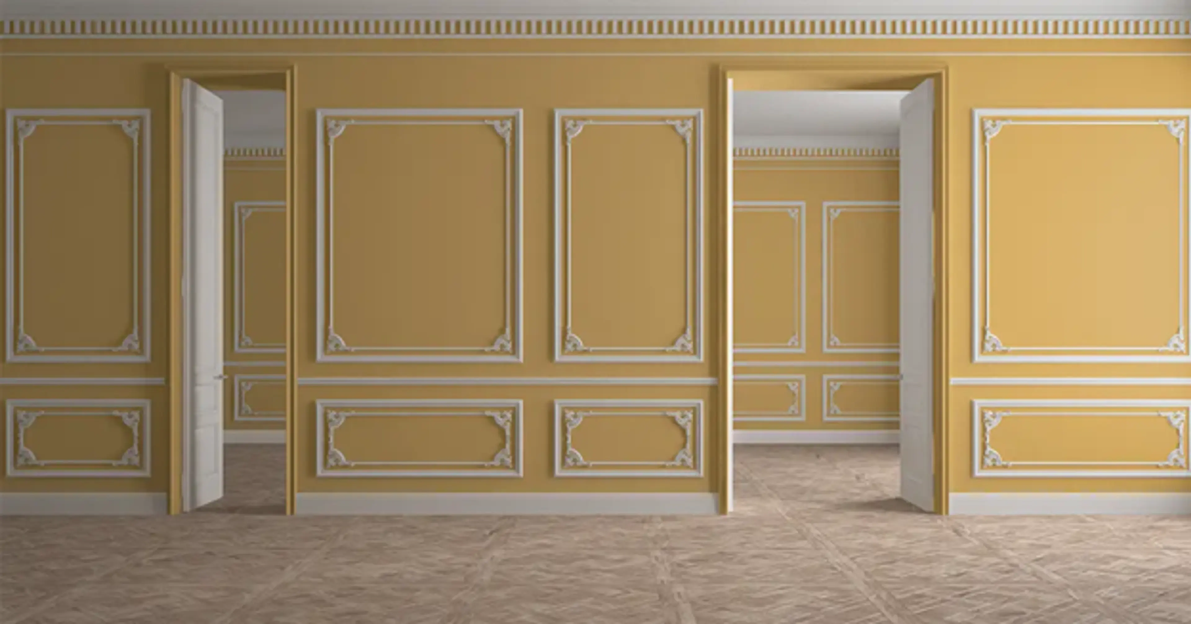
Not everyone will be comfortable exploring wall combination colours that do not fall in the category of muted and neutral tones, but here’s what we think – try playing with unusual colour combinations for the most fascinating looks – sure to pay off in spades!
This blog post offers a peak into some of the bold colour combinations that may not be everyone’s cup of tea, but what’s wrong in stepping outside the comfort zone for a refreshing interior? We will help you understand how bold and bright wall combination colours can change your home décor, and the best way to balance out these darker tints so that it doesn’t seem overwhelming.
Why You Should Have Bright Wall Colour Combination In Your Home?
Painting your home with jewel tones makes a bold statement, but the trick to prevent it from appearing garish is to combine these with muted tones. You can create a cheery space merely with interior wall paints in a bold shade and adding pops of contrast for a visual effect. Wondering how bold wall combination colours play their magic at home?

It brings positivity – A bold colour palette introduces a sense of positivity, an exuberant mood and a youthful ambience. Try adding a splash of bright shade to your neutral colours.
It makes your house stand out – Bright interior colours inject a hint of extraordinary! Get the right combination, since playing with bold shades can sometimes be tricky.
An elegant finish – Adding in metallic or wooden accents enhances the look of your home. Statement shades give the home a well-maintained, elegant appearance
10 Bright And Bold Wall Colour Combinations For Your Home
Venturing onto the darker side may not be everyone’s cup of tea, but it is not as risky as it seems. Bold wall combination colours introduce a uniqueness when rightly balanced with neutral tones. Here are 10 really cool room colour combinations that you can choose for your home.
1. Dark And Light Blue
Bold and saturated, with muted tones of the blue palette are an airy combination – the monochrome magic plays well. Add neutral accents of wood or metallic accessories to find the right balance.

2. Classic Orange And Blue
An unusual colour combination that combines an orange palette with brilliant shades of blue to inject just the right amount of zing to keep the room from appearing dark. Try this house painting colour combination to do up your space.
3. Lime Green
Energize your space with this super cheerful combination that is brilliantly bright. For that punch of exuberance, this combination is the perfect one. Tone it down with hints of white and blue upholstery or even dark wooden furniture.
4. Red And Orange
A riot of colours! Be sure to paint your happy with this combination during the day while the night brings in a warm sensation. You can neutralize these colours for a harmonious appearance that is too hard to miss.

5. Teal And white
There’s a reason this is a favourite wall colour combination for hall – the colours are so calming, and when matched with wooden furniture, it transforms into a tranquil cocoon.
6. Indigo And Brown
A judicious use of bright blue tones with the earthy brown introduces modern flair to the interiors. The indigo blue can be uplifting when used as an accent colour, and matched with wooden furniture can be a fantastic living room colour combination.
7. Red And white
The red and white combination lends the perfect contrast, courtesy the neutral that is displays pops of red. Whether a statement wall with texture or red accents, these hues are sure to inject a cosy vibe.

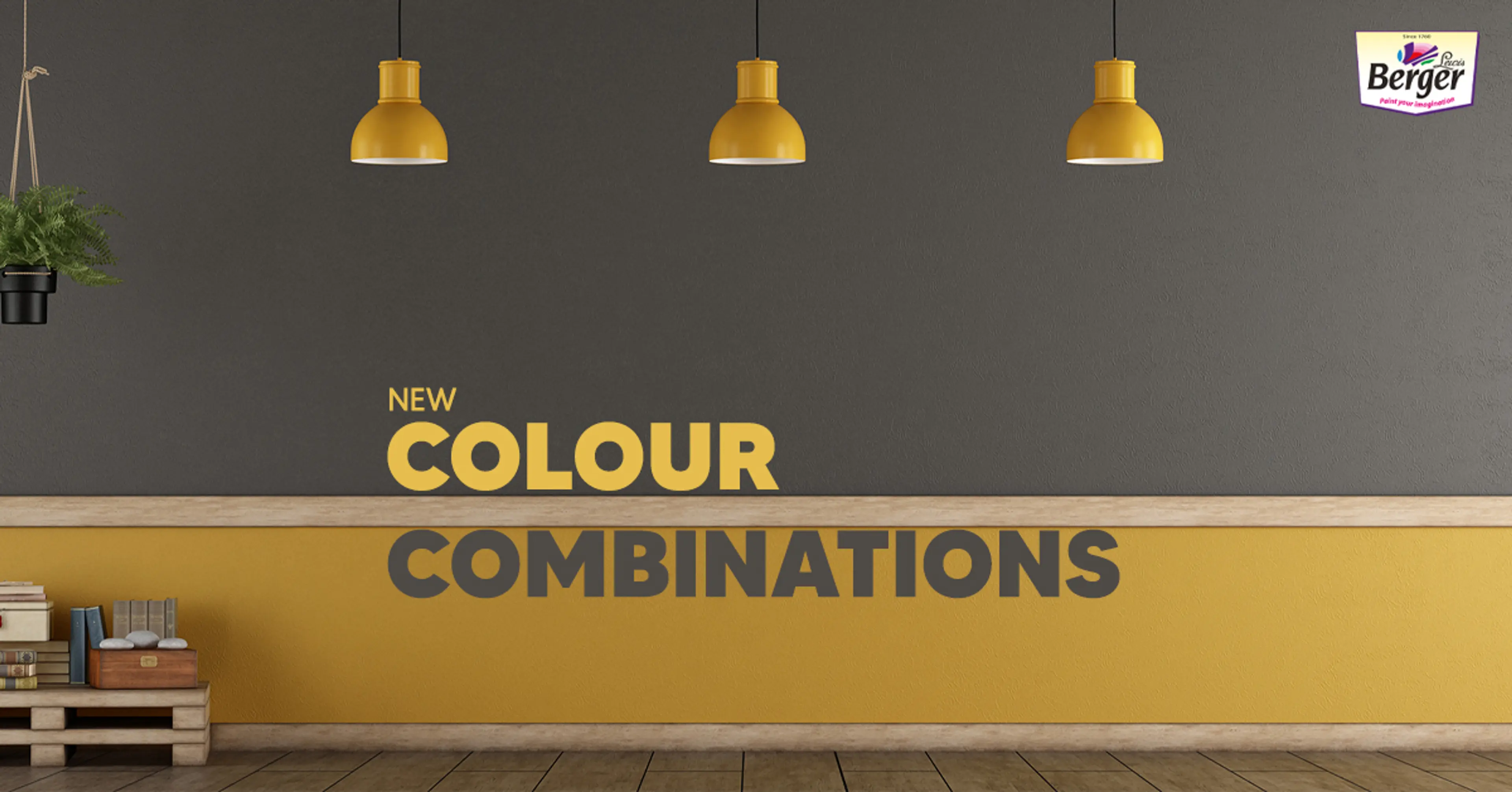
8. Yellow And Cream
This, although quite a common combination, could turn saccharine for some. But, amp it up with metal fixtures and patterned cushions for a happy space. These summery hues will work around the year for you! For a youthful excitement, this is one of the cool wall colour combination for hall.
9. Cool Blue And Green
A punch of colour is all you need to inject a quirky and youthful touch, without compromising the elegance of an otherwise neutral palette. The calming shades of blue and green – think mint, turquoise can beautifully refresh your space, and is one of the best wall colour combination.
10. Pink And Blue
The hint of pink amidst bright blues read as neutrals! Whether a statement wall of blue or an accent chair, mixing blue and pink lends a surreal finish to the room. Soft pops of a beige or white in this room can playfully contrast the rich blue shades.

How To Balance Bold Colours In Your Home Interior?
Wall combination colours are aplenty; when choosing a bold colour, pale tones are an essential part to bring a harmonious relationship between the colours. The neutral house painting colour combinations bring out the best of the bright shades, more so when they are a ceiling paint.
- Start with the colour your love – vibrant pink, turquoise blue or the sunset orange. While this remains the dominant one, go for a neutral colour along with some muted accents around the room.
- Choose darker tints from the colour wheel and muted tones; you can also add a few touches of neon shades for a trendy look.
- Do not use too many colours, and remember to add quite a few neutral accents.
- Opt for a pattern of bold colours to bring the design together, inserting touches of the soft palette for a cohesive application.
- Use complementary colours to lend a visual appeal – one dominant colour with the other directly opposite it.
- You can also pick adjacent colours like yellow, red and orange, or shades of blue and green.
The most dramatic backdrop for anything you wish to display, like art, is provided by bold colours. Include a few more accent colours with pouffes, cushions, a statement lamp, or a magnificent rug with. Bold colours are exactly what you need to give your home’s interior a personality and sheer delight. Get an estimate with our paint calculator to understand the varied shades and combinations.

check for any query you have about the blog
Frequently Asked Questions
White is one of the most reflective colours, a favourite in house painting colour combinations, and one that complements most other darker tones for a neutral effect.
As against popular belief that light colours make a room look bigger, some bright colours when used in the right combination of accessories and furniture.
Red and green is one combination to avoid. Never mix warm and cool colours as these two set different moods that make a room look stark when combined together.
Teal, yellow, green, lilac are some colours that lend a cheery, peaceful ambience while exuding positive energy.