Best Interior Colour Combinations for Indian Homes by Berger Paints
 Feb , 2026
- Berger Speaks
- 4 Min Read
If you want to renovate your house on a budget, it might be challenging and important to find the ideal wall colour combination. Therefore, choosing a wall paint colour combination requires careful planning and execution. When choosing the colours for the interior paint, one should consider all possible perspectives. In this article, we’d like to provide you a few suggestions for choosing the best interior colour combination for Indian homes.
Getting the Vastu Right For Your Home’s Interiors
Vastu Shastra guidelines are crucial for both the interior design of a finished house and the building and placement of the different rooms in a house. It is said that arranging the furniture, decor, and interiors in accordance with the Vastu Shastra will bring prosperity, health, and welfare into the home. It is important to know how to design the interiors so that they adhere to Vastu principles.So, Vastu for interiors plays a vital role in home decor.
Setting the Vibe For Your Interiors
Being at home all the time is challenging. However, becoming entrenched in a place that has been specifically designed for positive vibes can be easy. The sight of your favourite piece of wall art, the feel of your bare feet on a soft rug, lovely house plants or flowers can all serve as a gentle reminder of why your home is such a special place.
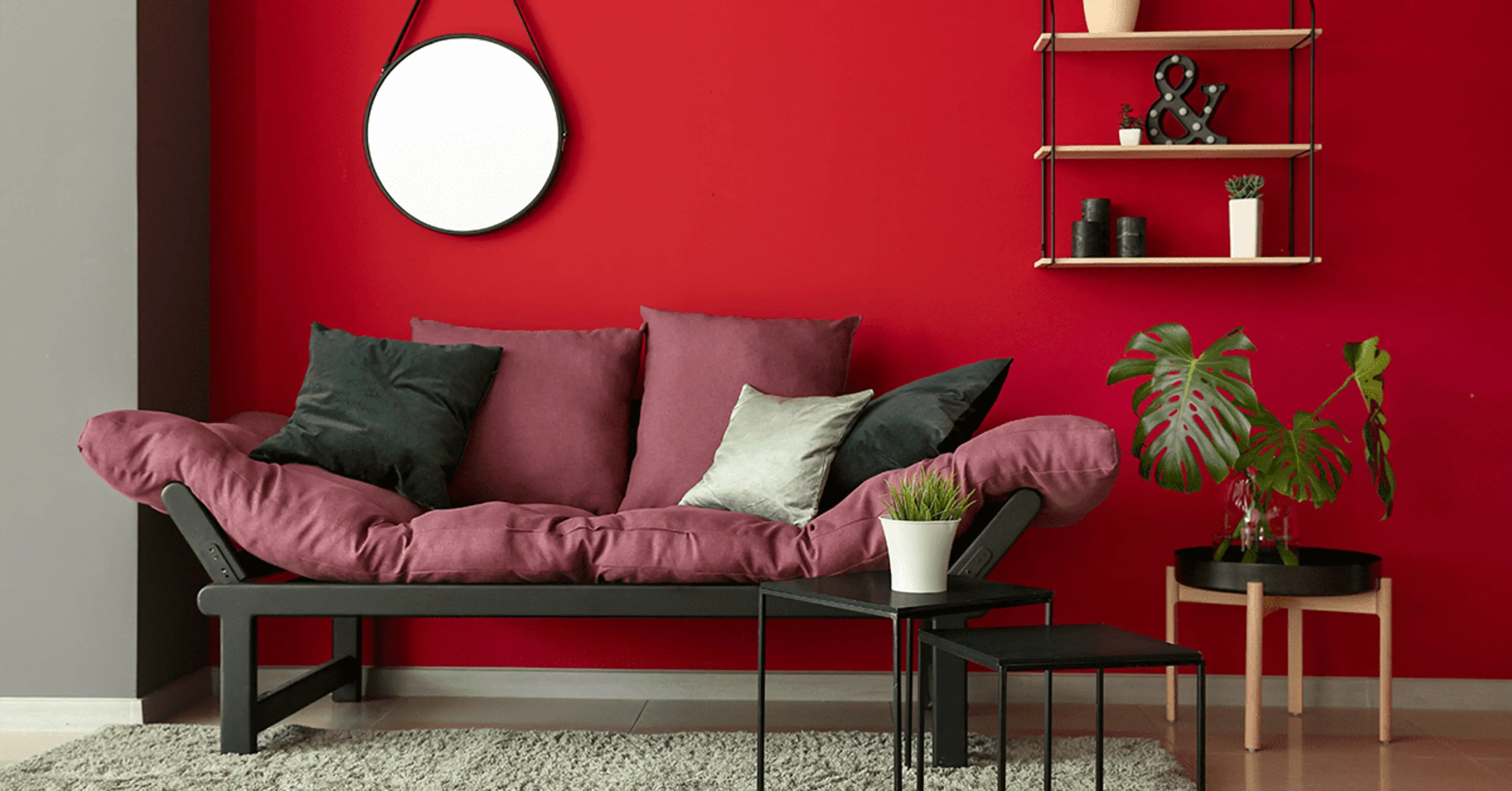
The Right Proportions – Raging Red 1A0374 and Tiramisu 3P0064
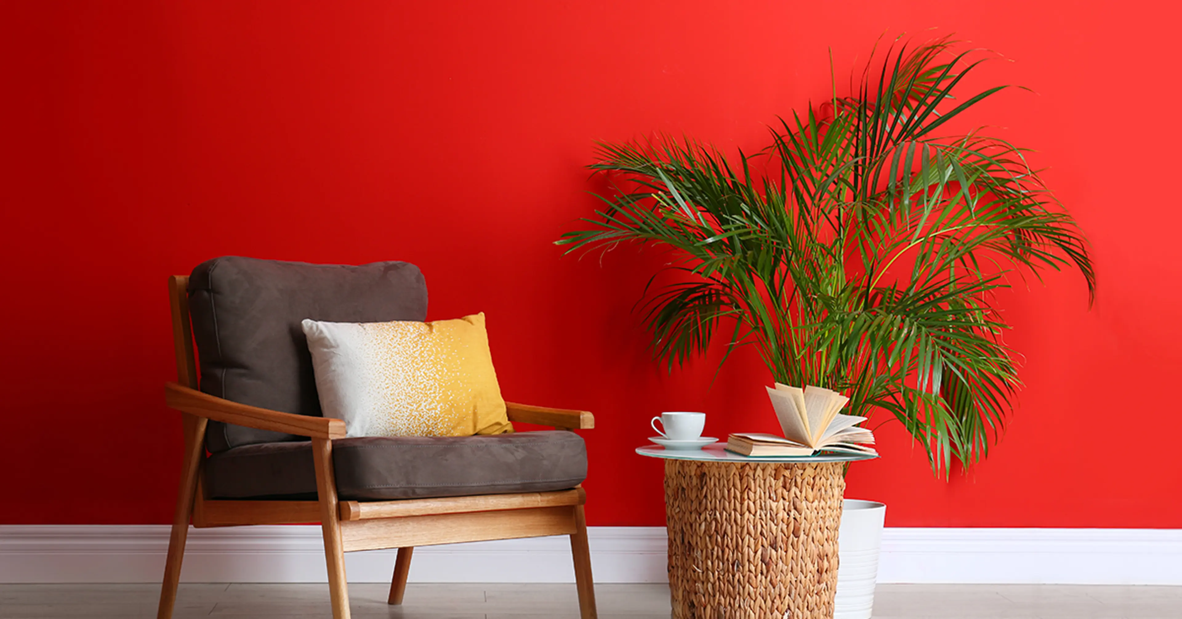
When designing a regal and opulent atmosphere for your guest room, the Raging Red 1A0374 and Tiramisu 3P0064 work nicely together. The Tiramisu’s neutral tone offers a more sombre effect than the Raging Red’s powerful impact. This interior colour combination is the epitome of refinement in fashion.
Traditional and Modern – Cream Allure 2P0047 and Aqua Flip 5P012
Aqua Flip 5P0128 and Cream Allure 2P0047 provide a lovely, traditional and contemporary interior colour combination. The Cream Allure, an orange hue, is a regal, conventional, and mature tone to foster confidence. Aqua Flip, on the other hand, has a positive, vivacious, and contemporary tone that has the opposite impact.
Minimalistic yet Grand – Lemon Organza 3P0069 and Fairy Garden Green 4T0931
This interior colour combination has the potential to revolutionise the interior game. While the Fairy Garden Green 4T0931 adds a touch of minimalism, Lemon Organza 3P0069 gives the décor a majestic air. Green promotes harmony by representing prosperity and a fresh start. Because of this, living rooms and dining areas frequently have various shades of green.
Impactful – Deep-Sea Treasure 5A1056 and Bike Ride 4T2100
We’re going to show you one of the best interior colour combinations for homes if you like impactful décor. Bike Ride 4T2100 and Deep Sea Treasure 5A1056 might give your space a sense of adventure and a more restrained exotic air. All you need to give your kitchen or bedroom a modern spin is this classic colour scheme.
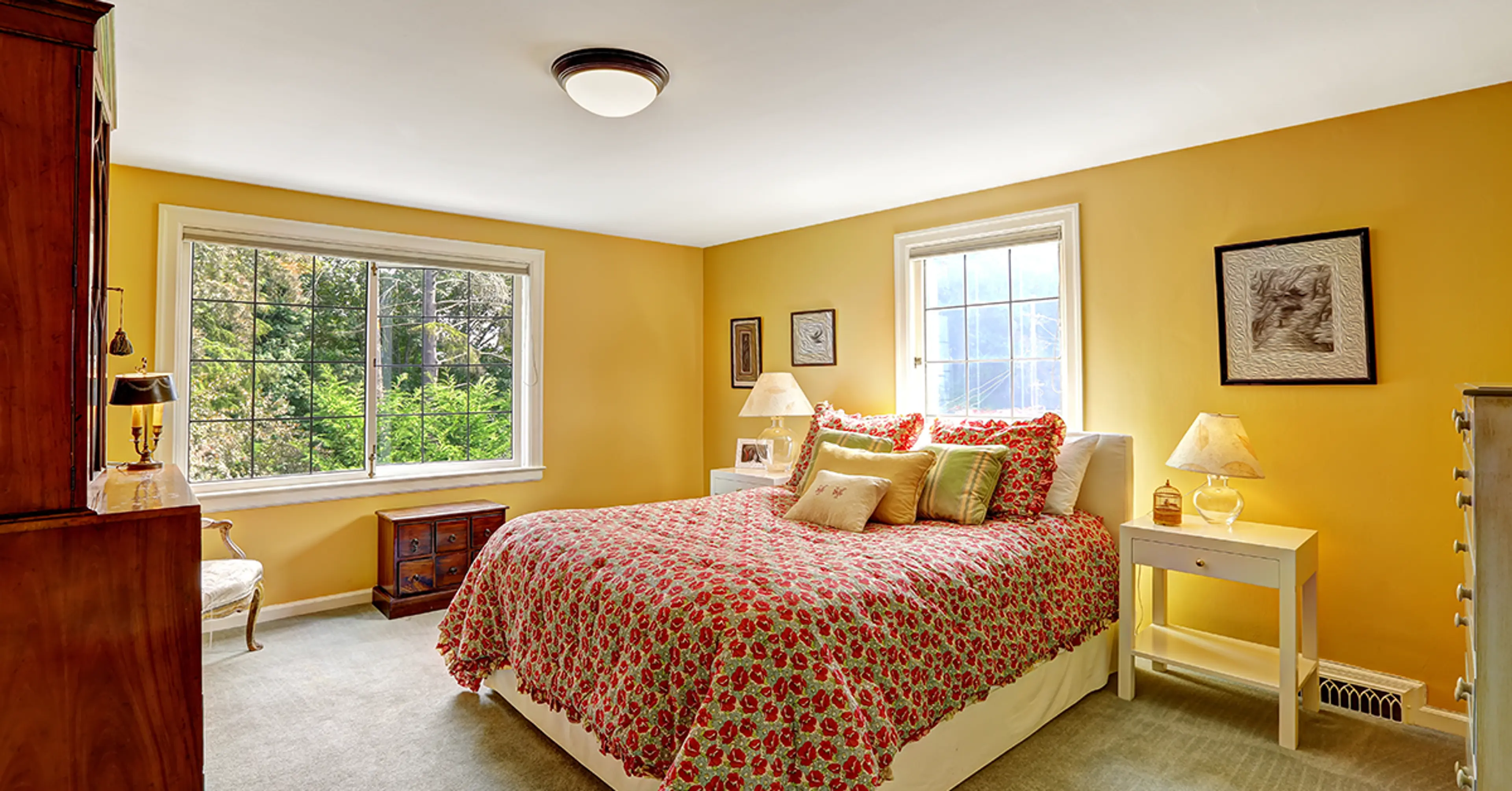
Cheerful and Vibrant – ORANGE SPICE (2A0664) and YELLOW CREAM (2P0665)
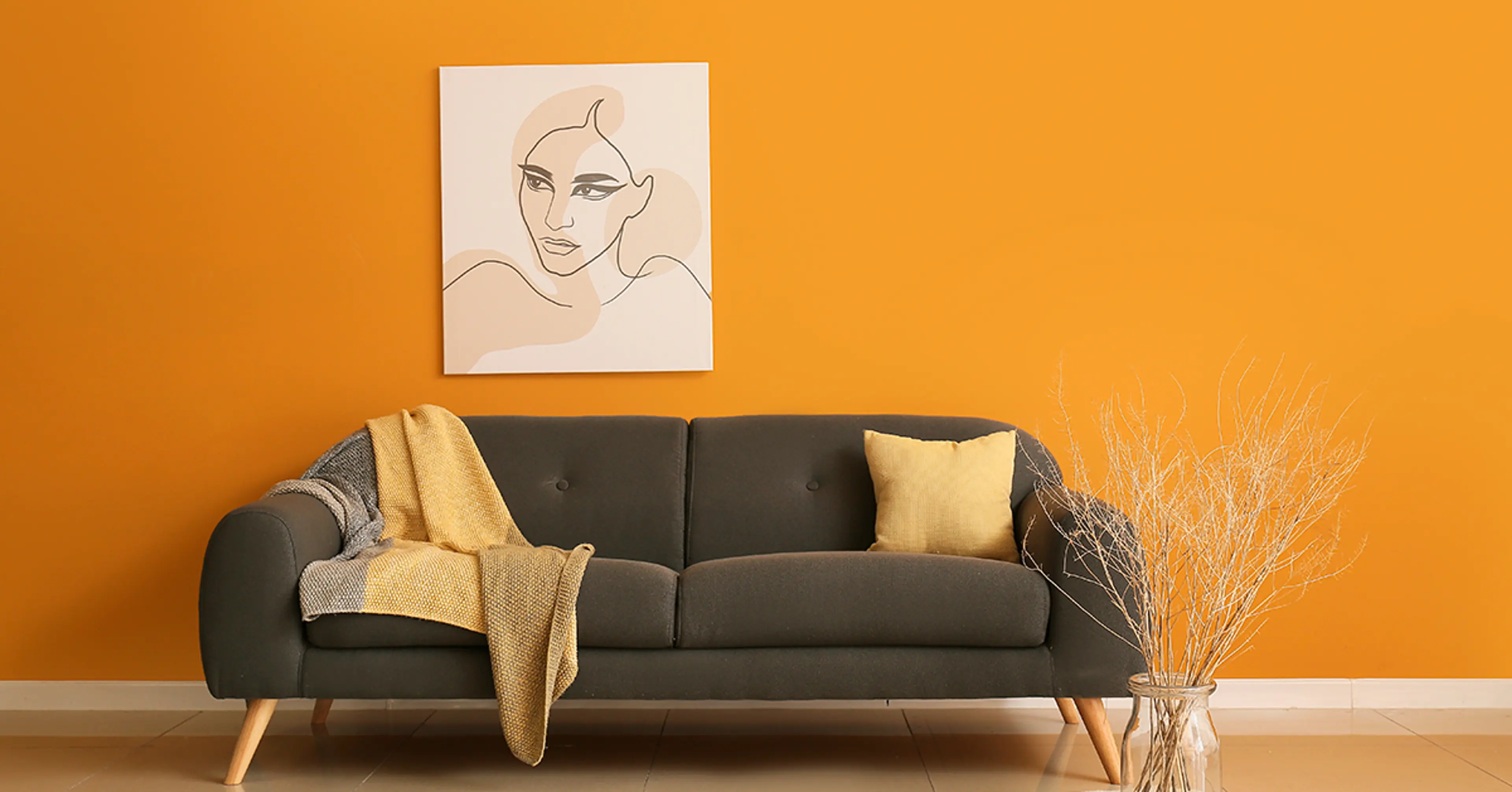
Your home will feel cheerful and vibrant when ORANGE SPICE (2A0664) and YELLOW CREAM (2P0665) are combined. These complementary warm colours can make any home feel warm and inviting when used together. When utilised as a colour combination for clothing, the set emanates happiness and excitement!
Elegant Colours – Petite Lavender 5D0299 and Lustre Beige 7T0334
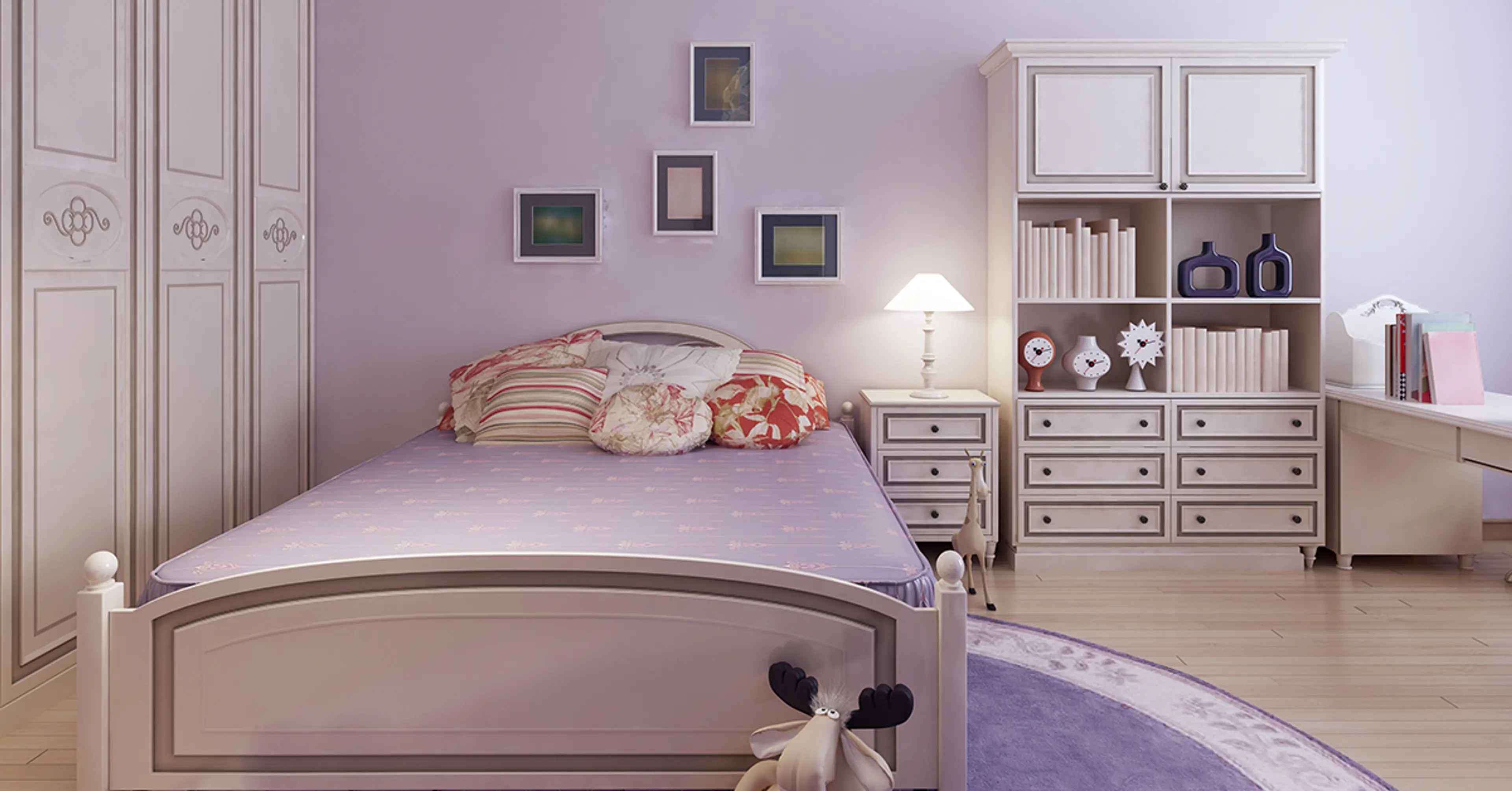
Petite Lavender 5D0299 and Lustre Beige 7T0334 make an appealing interior colour combination. It is the ideal choice for your brand-new, sleek modern residences. Lavender ups the romantic element and is flirtatious and enjoyable. The appealing freshness of the combination will keep your romance reviving and smelling wonderful for the rest of your life.
The Sea & Calm – Sailing Party 5T1132 and Dogwood Leaf 4T0924
With these two soothing colours, you may create a haven away from the chaos outside. After a long day at work, you may rest with the soothing hue of blue Sailing Party 5T1132. Dogwood Leaf 4T0924, a literal metaphor of nature to produce the calming effect, balances out the colour palette.
Bold and Decent – LOG JAM (8A1728) and YOUNG AT HEART (1D0494)
Young at Heart’s (1D0494) strong tones and LOG Jam’s (8A1728) neutral tones contrast one another in a nice way. When the vibrant YOUNG AT HEART colour is combined with LOG JAM, which stands for decency, warmth, healing, and stability, a cosy feeling is created.
Green Vibes – Lawn and Garden 4A0920 and Green Vision 4T0915
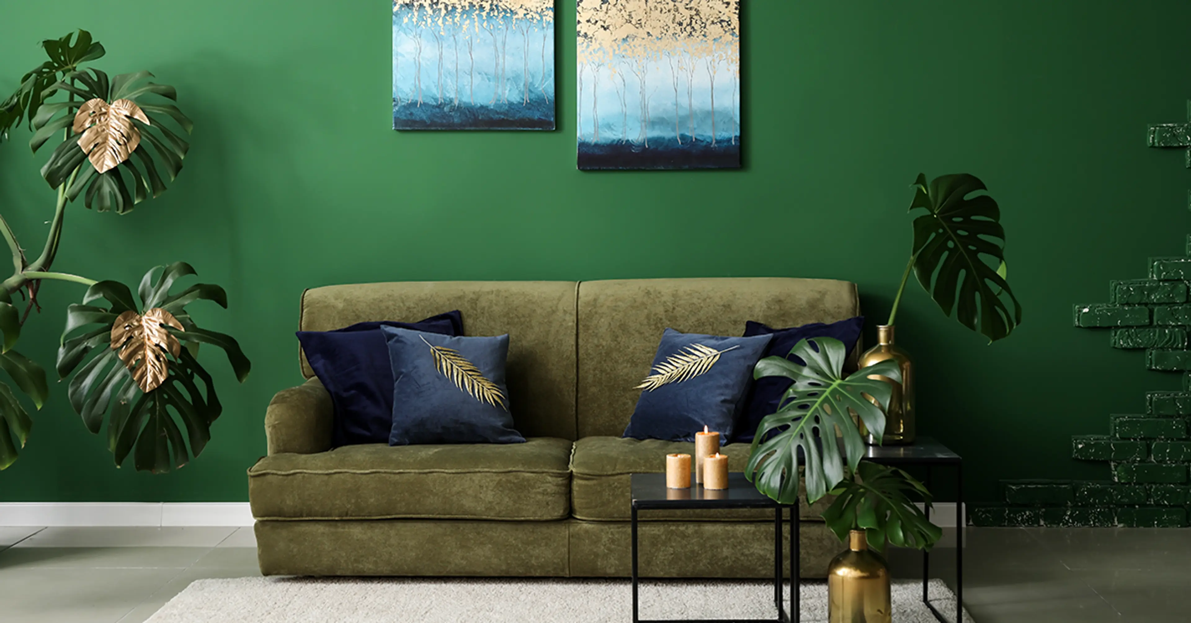
There’s no reason not to consider an accent wall, especially in a neutral colour like Green Vision 4T0915. For a striking appearance, choose the Lawn and Garden 4A0920 shade for your accent wall. In order to give a space a modern and stark appearance, you may also use Essence Teal 4P0266 or Fresh Dew 8P0212 to highlight one wall.
An Optimal Combination – TALL PRAIRIE GRASS (3D0830) and ANGORA WHITE (3P0074)
The interior colour combination of ANGORA WHITE and TALL PRAIRIE GRASS exudes elegance. Because they both enhance one another for a natural appearance, ANGORA WHITE and TALL PRAIRIE GRASS make ideal colour combinations. Together, they provide a wonderful balance since ANGORA WHITE lacks the vibrancy that TALL PRAIRIE GRASS brings to the arrangement.
Conclusion ( Express Painting)
We really hope you found these interior colour combinations for Indian homes beneficial. There is no need to search further if you want lovely décor for your house. To get Express Painting with high-quality Interior Wall Paints that may transform your apartment into the home of your dreams, book a consultation online with Berger now!
check for any query you have about the blog
Frequently Asked Questions
- Use complementary hues whenever possible.
- Avoid using Christmas hues.
- Please follow the 60-30-10 rule.
- A maximum of three colours should be used.
- Do take use of the sun’s rays.
- Don’t overlook lighting while making colour selections.
Consulting the colour wheel is the best approach to determine what colours work well together. ‘By observing which colours are directly opposite one another on a color wheel, you may determine which colours are complementary to one another.
Some paint colours not advised for indoor use are-
- Red.
- Deep purple
- Dark brown
- Black.
- Orange.
Few Indian simple house colour combinations for interiors are-
- Brown and cream.
- Blue and white.
- Brown and yellow.
- White with light green.