Best Vastu Colours for Living Room: A Complete Guide for Positive Energy and Harmony

 Jun , 2026
- Berger Speaks
- 3 Min Read
A living room should feel calm, open, and welcoming from the moment someone enters the home. Since this space is used for family time, guests, and daily comfort, its colours matter more than many people realise. As per Vastu Shastra, the right shades are believed to support peace, balance, and positive energy. Choosing a suitable colour for the living room according to Vastu can also improve the look and feel of the space.
Why Are Living Room Colours Important in Vastu Shastra?
Colours affect how a room looks and how people feel in it. Soft shades can make a space feel peaceful, while very dark colours may make it feel heavy. Vastu Shastra connects colours with direction, light, and energy flow. This is why choosing a Vastu colour for living room walls should be done with care.
A living room is often the centre of the home. It is where people sit together, relax, and welcome visitors. A balanced Vastu shastra hall colour can make the room feel pleasant without making it too plain or too bright. Before choosing wall paint, it is helpful to check the room size, sunlight, direction, and furniture.
Benefits of Choosing Vastu-Friendly Living Room Colours
Vastu-friendly colours are usually light, soft, and easy on the eyes. These shades can help the room feel fresh and comfortable for daily use.
They may help in the following ways:
- Make the room look brighter and more open
- Create a calm and welcoming mood
- Support a neat interior style
- Improve the effect of natural light
- Make furniture and decor look connected
A thoughtful living room colour combination as per Vastu, can bring beauty and comfort together.
Best Vastu Colours for Living Room
The best colour for the living room as per Vastu, depends on direction, light, and comfort. Still, some soft colours are often preferred because they suit many interiors.
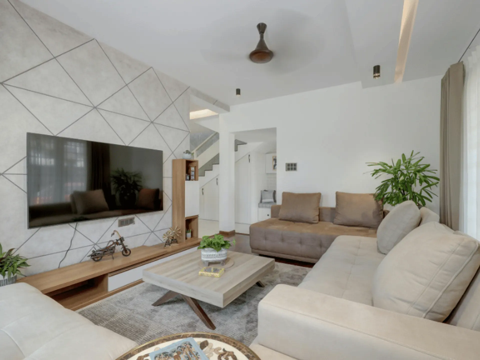
White: The Colour of Purity and Peace
White is one of the most suitable Vastu Shastra colours for living room walls because it symbolises cleanliness, peace, and positivity. It reflects light beautifully, which helps the living room appear more spacious, bright, and elegant. This shade also supports a calm and balanced environment, making it a suitable choice for a peaceful and welcoming living room.
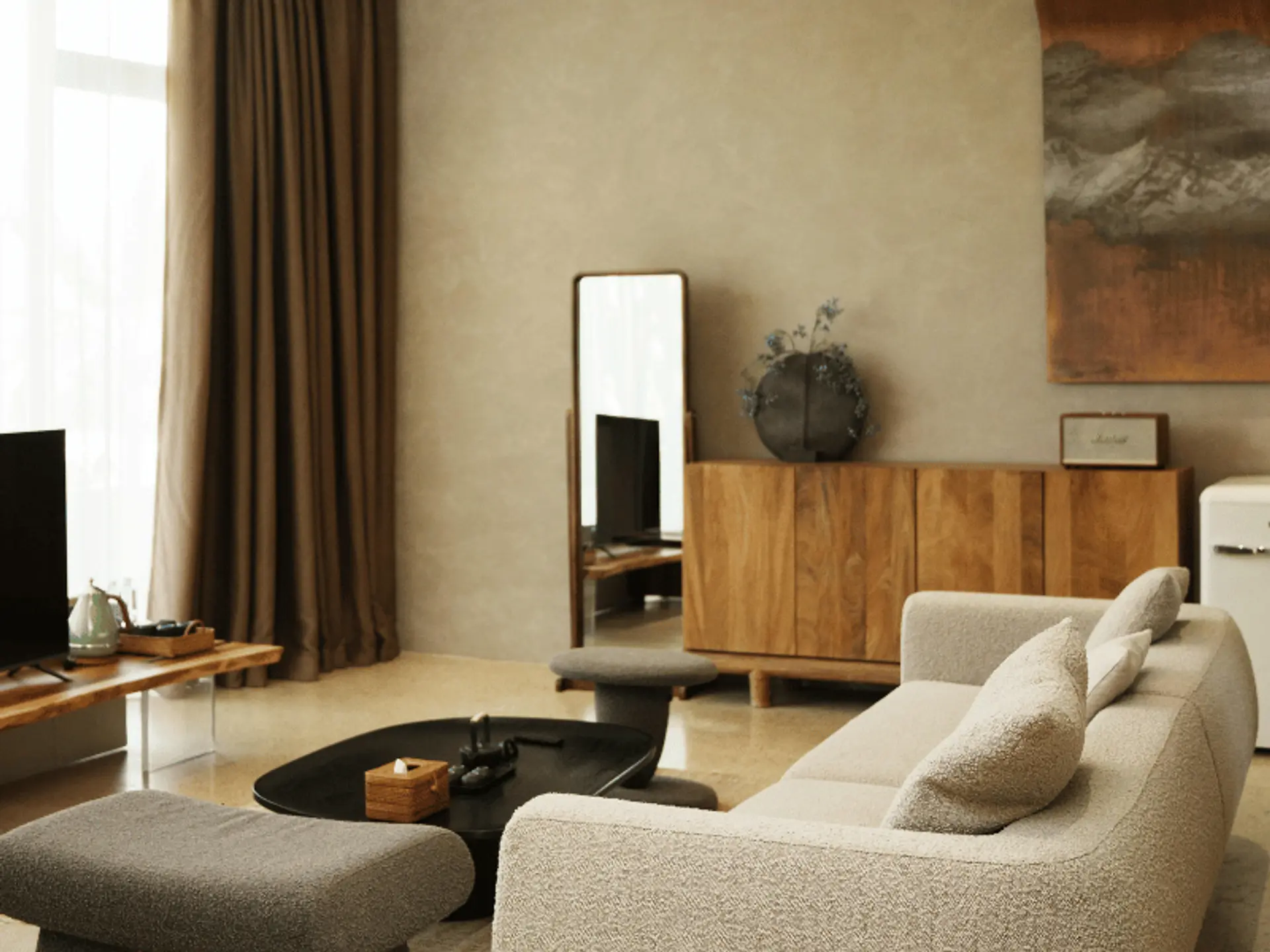
Cream and Beige: Warm and Inviting Neutrals
Cream and beige are gentle neutral shades. They add warmth without making the room look dark and are useful when the living room needs a soft, homely feel. A colour catalogue can help compare cream, beige, ivory, and off-white tones before making the final choice.
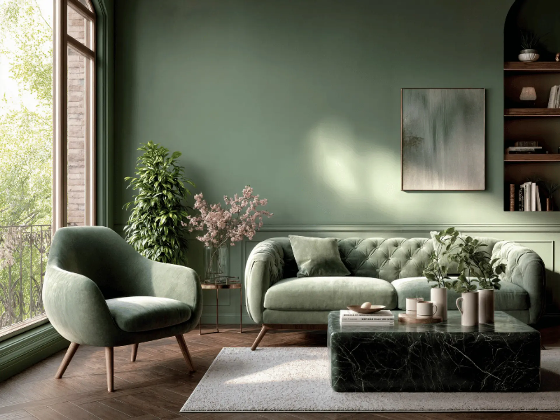
Light Green: Freshness and Growth
Light green represents nature, growth, and renewal. It brings a fresh and calm feel to the living room while creating a rejuvenating atmosphere. As per Vastu, this shade is a suitable choice for a space where comfort, balance, and positive energy are important.
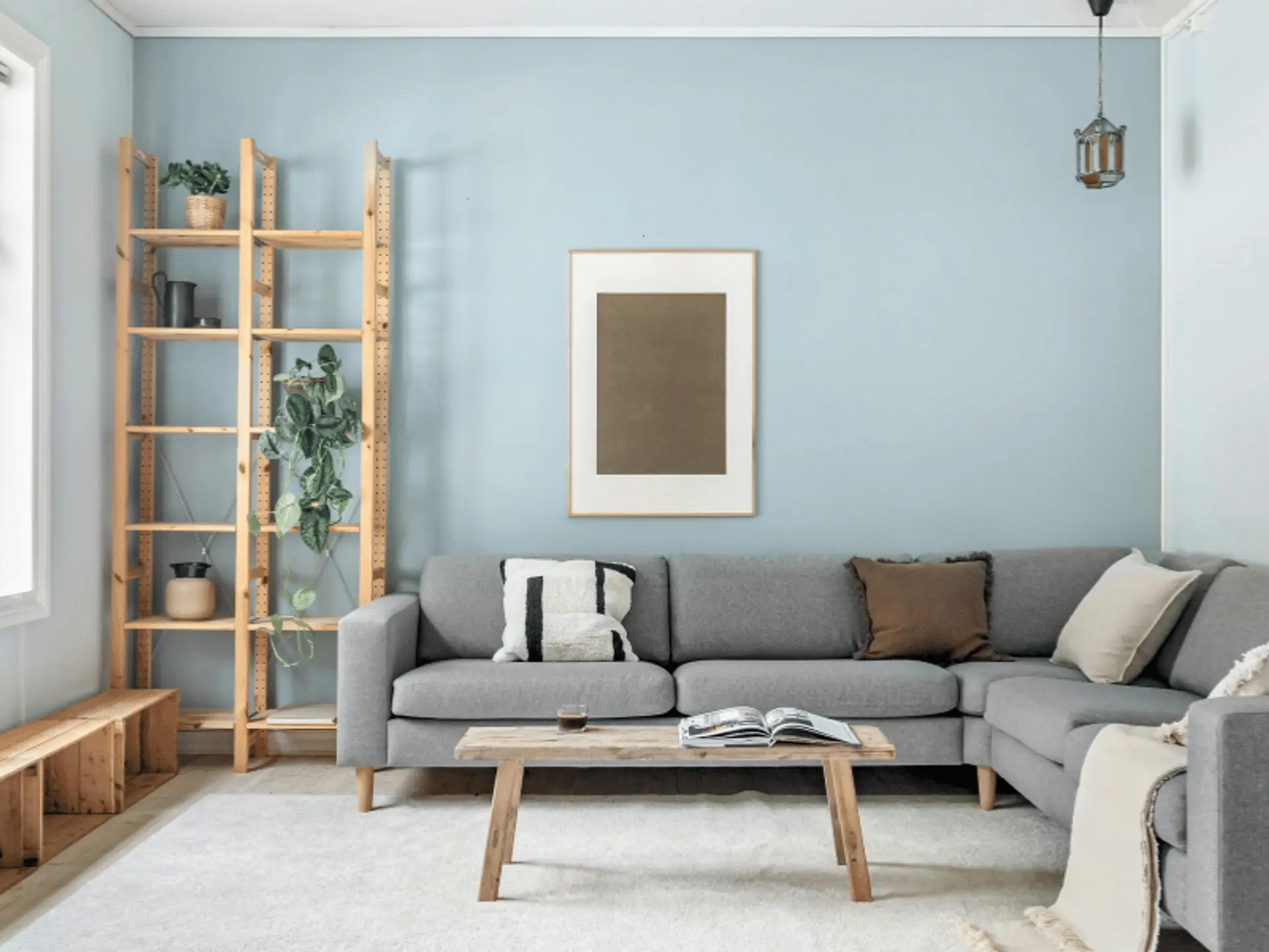
Light Blue: Calmness and Serenity
Light blue can make the living room feel airy and relaxed. In Vastu, light blue is believed to support a balanced atmosphere. People who prefer calm bedroom paint colours may also like light blue for the living room because it offers a similar soft effect.
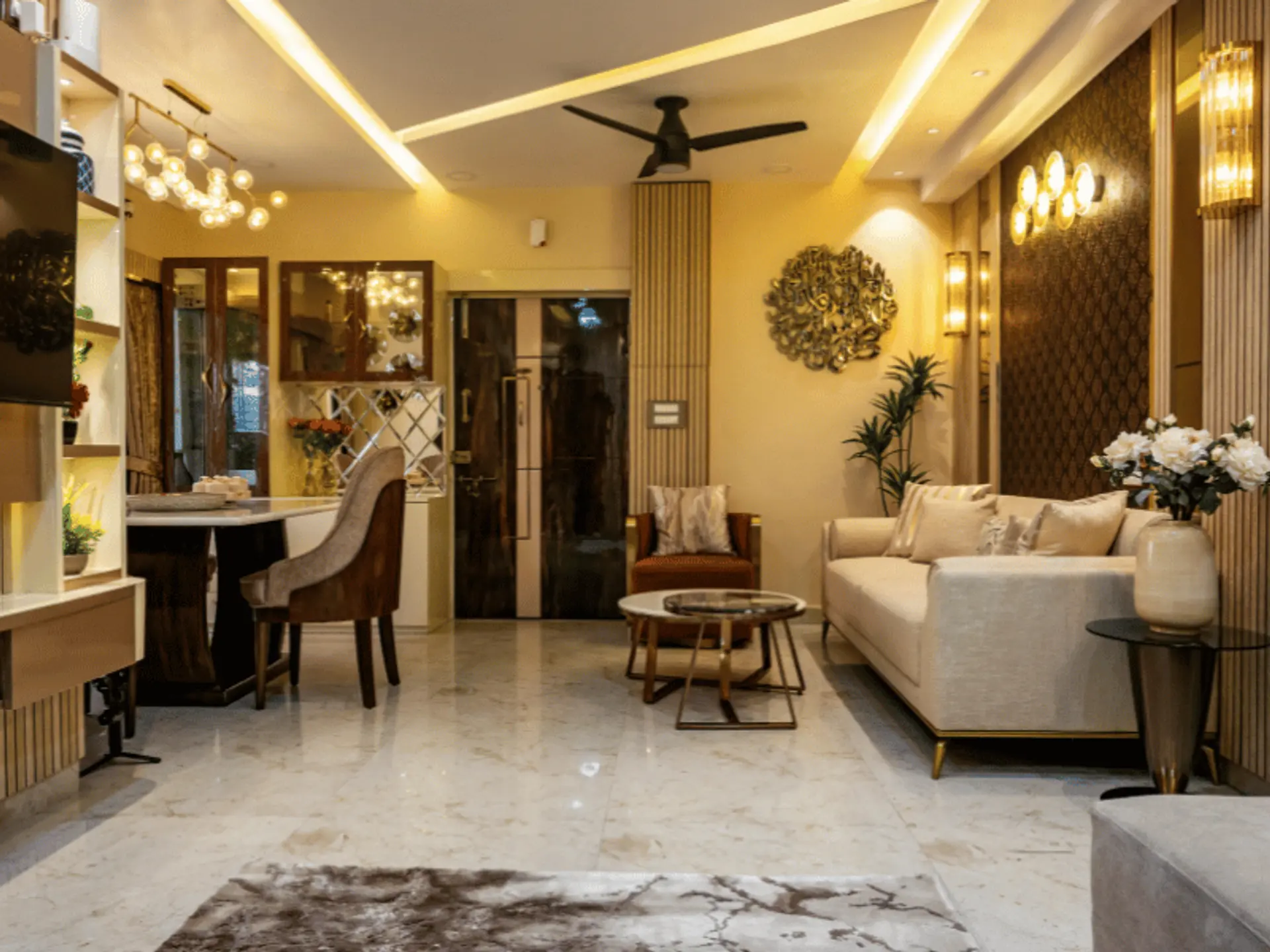
Soft Yellow: Positivity and Happiness
Soft yellow brings light, warmth, and cheerful energy into the living room. It is easier to use than bright yellow and can make the room look lively yet comfortable.
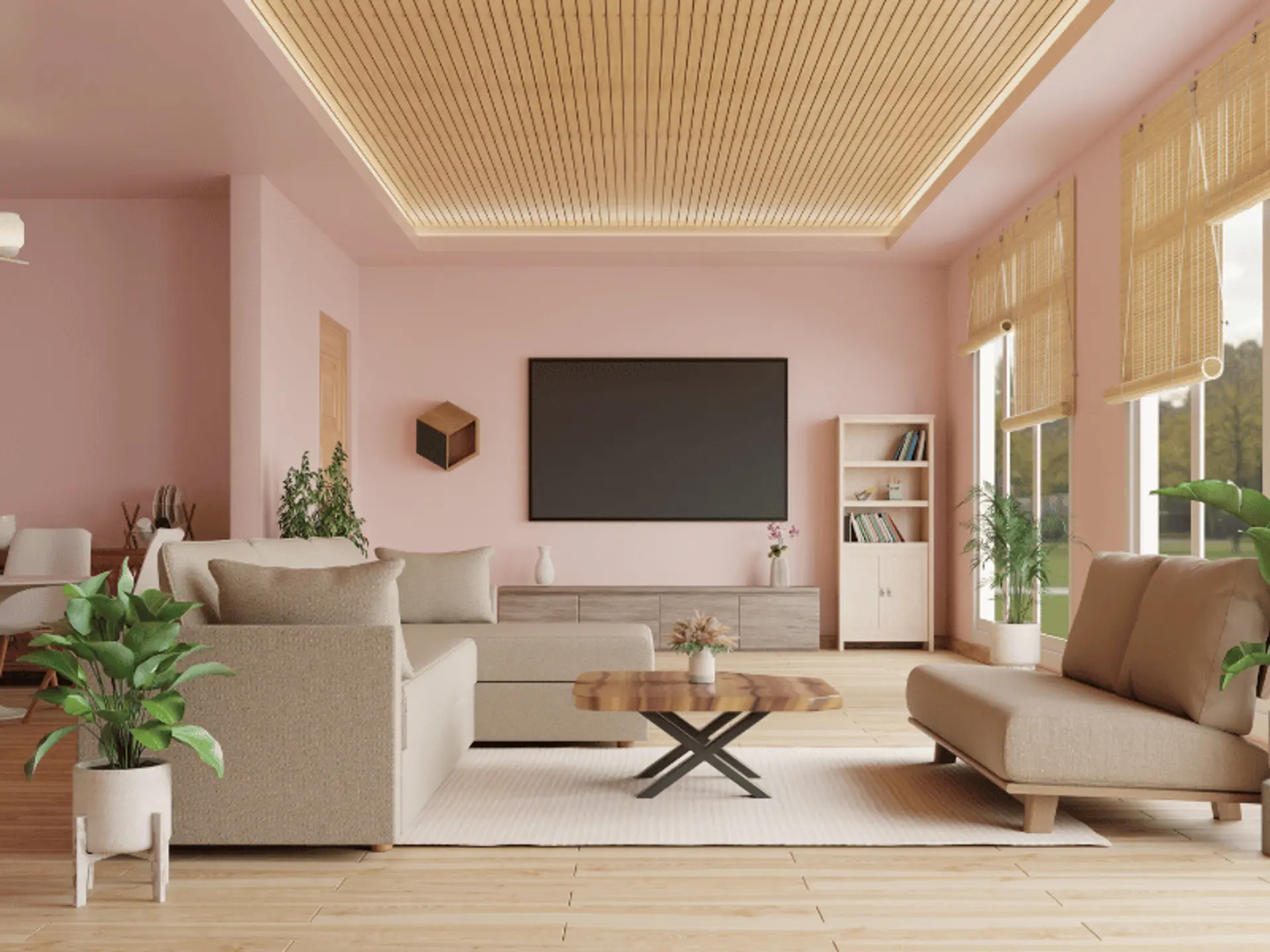
Peach and Light Pink: Comfort and Warmth
Peach and light pink are soft colours that bring warmth and comfort. In Vastu, they are often linked with emotional balance and peace.
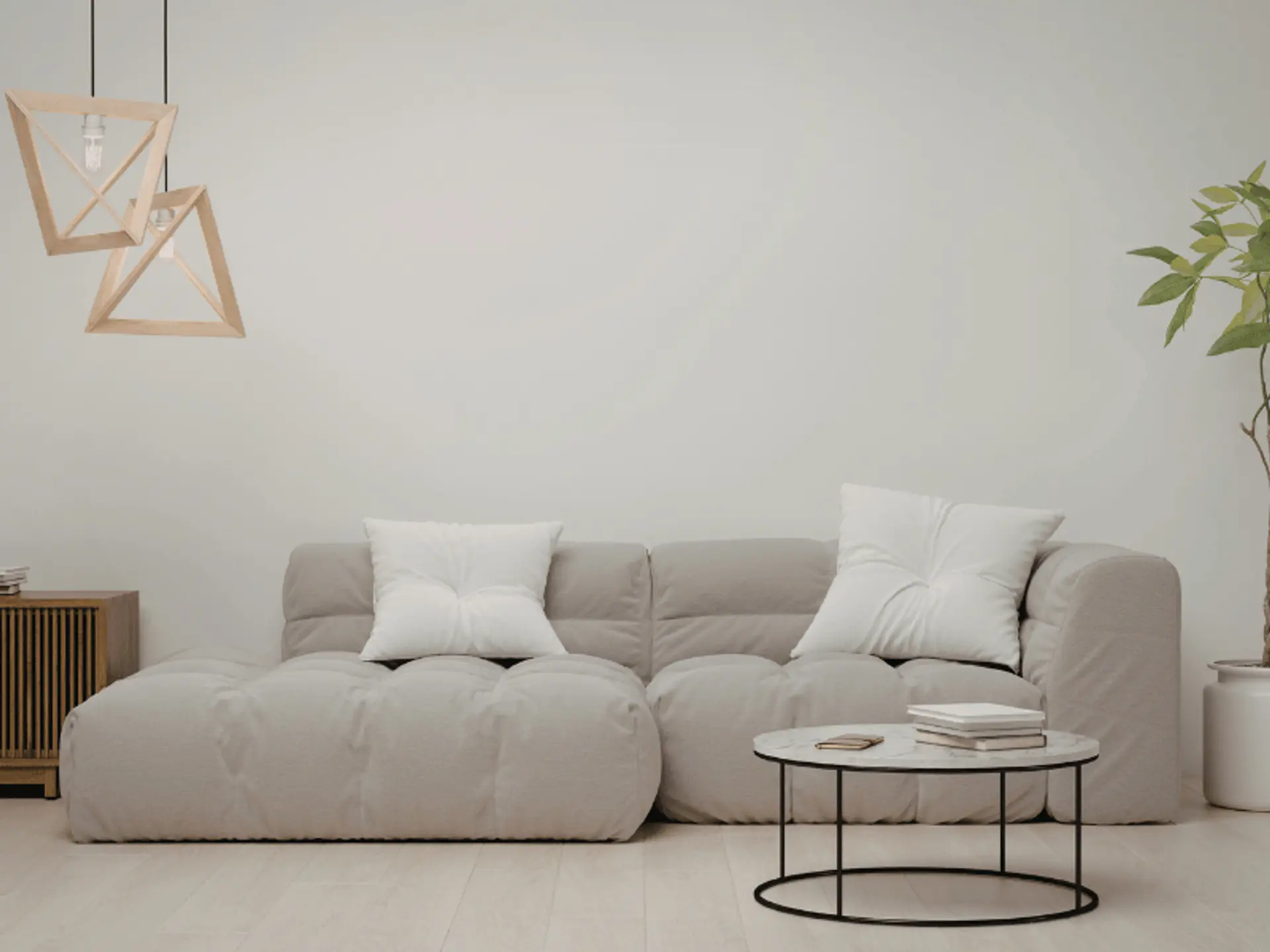
Light Grey: Balance and Sophistication
Light grey is a modern and versatile Vastu-friendly colour that symbolises balance, neutrality, and stability. It gives the living room a sophisticated look while maintaining a calm and harmonious atmosphere. Pairing light grey with white, beige, or wooden accents can enhance the overall elegance of the space.
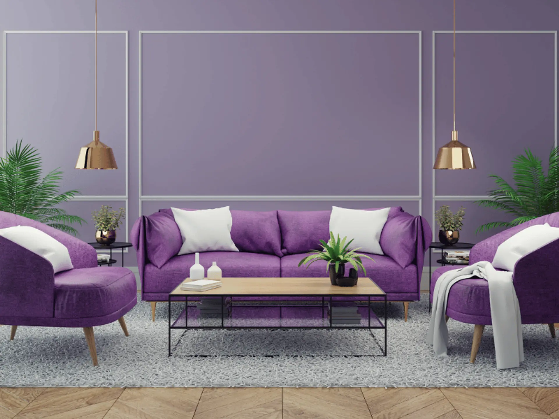
Lavender: Peace and Positive Energy
Lavender is a gentle shade that can make the living room feel peaceful and relaxed. In Vastu principles, lighter lavender tones are suitable for creating a balanced and welcoming space. This colour can also add a soft touch to the room, making it feel comfortable for family members and guests.
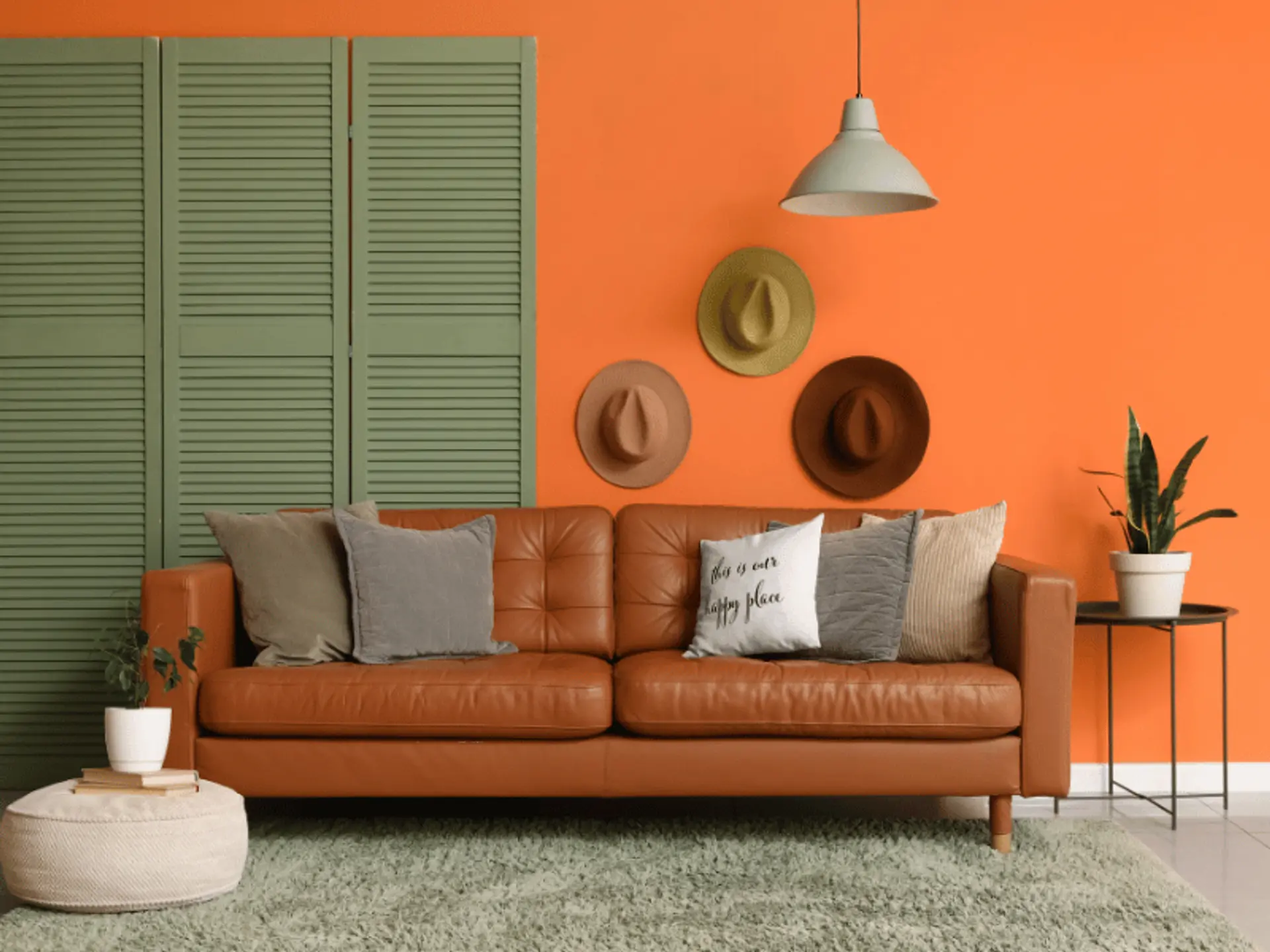
Light Orange: Warmth and Enthusiasm
Light orange is a warm and positive shade that can make the living room feel active without looking too loud. In Vastu, this colour is linked with energy, happiness, and enthusiasm. When used in a softer tone, it helps create a lively yet balanced space. It also pairs well with neutral shades like cream and beige.
Direction-Wise Vastu Colours for Living Rooms
Direction plays an important role in Vastu. Colour may look different in each room because of sunlight and layout. Direction-based guidance can help choose the right colour combinations for living room walls.
Living Room Direction | Recommended Colours | Vastu Benefit |
North-Facing Living Room | Light blue, white, light green | Supports calmness, freshness, and positive vibrations |
East-Facing Living Room | Soft yellow, cream, light green | Works well with natural sunlight and promotes positivity |
South-Facing Living Room | Beige, peach, light pink | Helps balance the strong energy of this direction |
West-Facing Living Room | White, cream, light grey | Maintains harmony and visual balance |
Colours to Avoid in the Living Room According to Vastu
Some colours may not be suitable when used too much on living room walls. They can make the room feel dull, intense, or less welcoming.
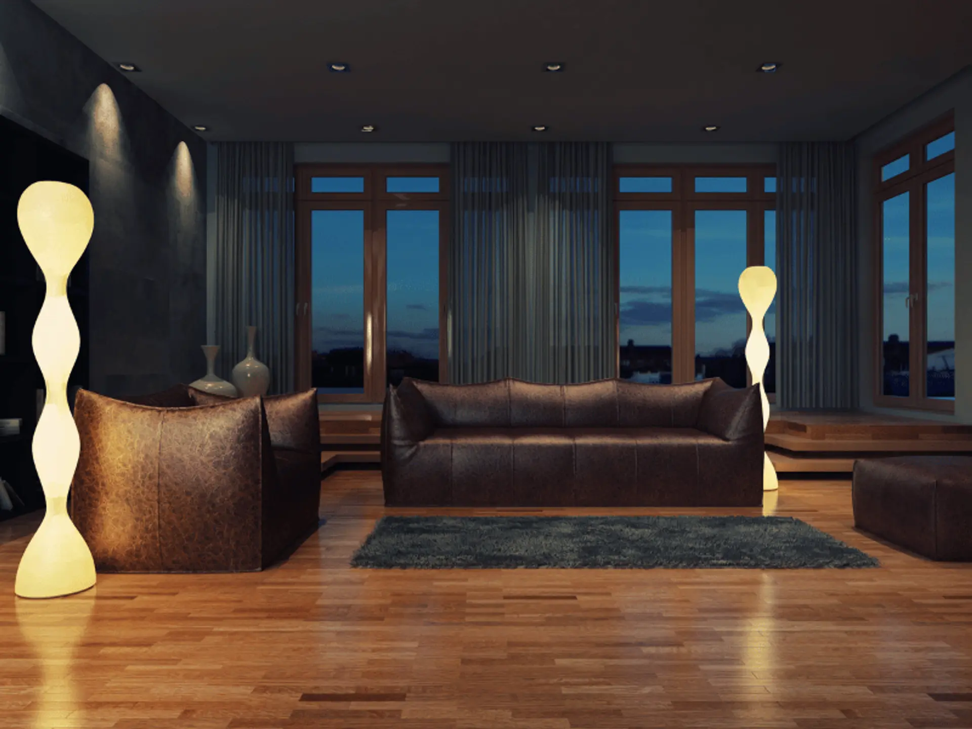
Dark Black
Black can look stylish in small details, but too much black may make the room feel closed and heavy.
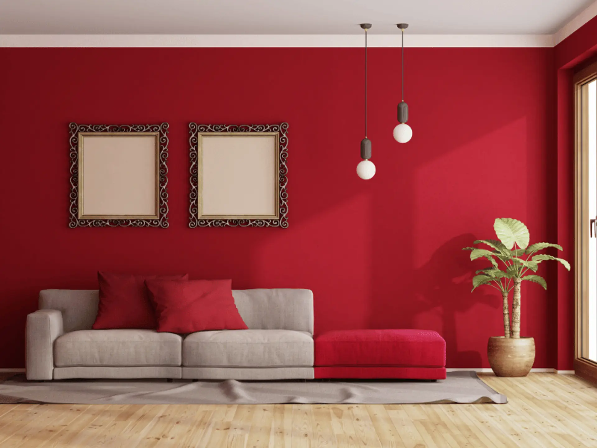
Deep Red
Deep red is a strong colour. When used on large wall areas, it may create too much intensity in the room.
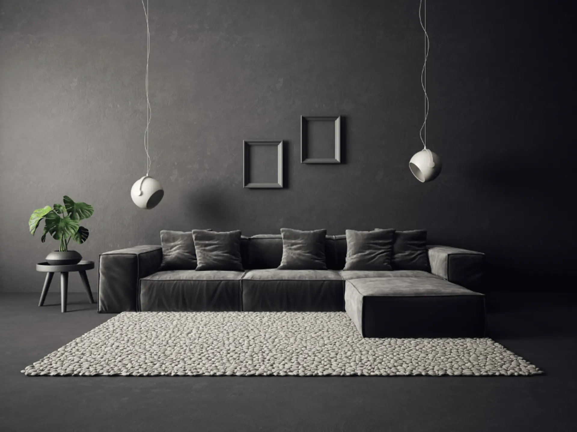
Dark Grey
Dark grey can make the living room appear dull, cramped, and less energetic when used too much.
Best Vastu Colour Combinations for Living Rooms
A good living room colour plan should feel balanced. The base shade should be soft, while the second shade can add warmth or freshness. This is different from choosing a colour combination for the kitchen, where the focus may be more on utility and surface finishes.
White and Beige
White and beige create a clean, warm, and timeless look. This combination keeps the living room bright while adding comfort.
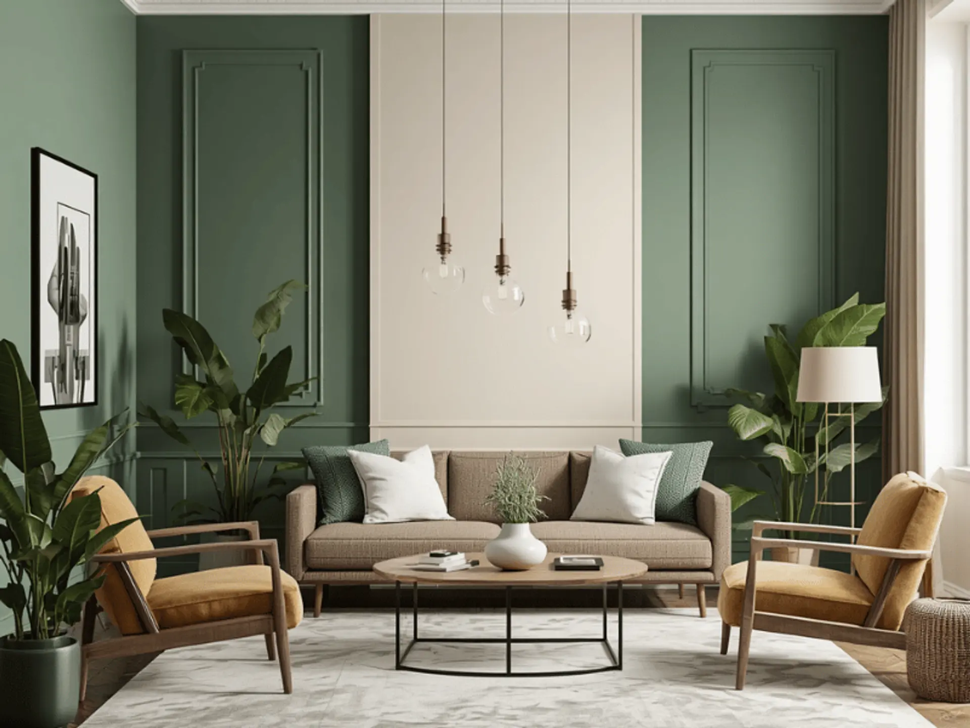
Light Green and Cream
Light green and cream create a fresh and soft look. This pairing is useful when the room needs a calm and natural feel.
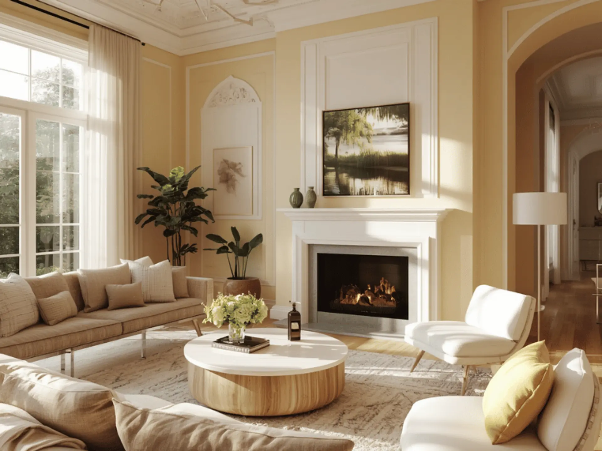
Soft Yellow and White
Soft yellow and white make the living room look cheerful and open. This combination is useful for spaces that need more light.
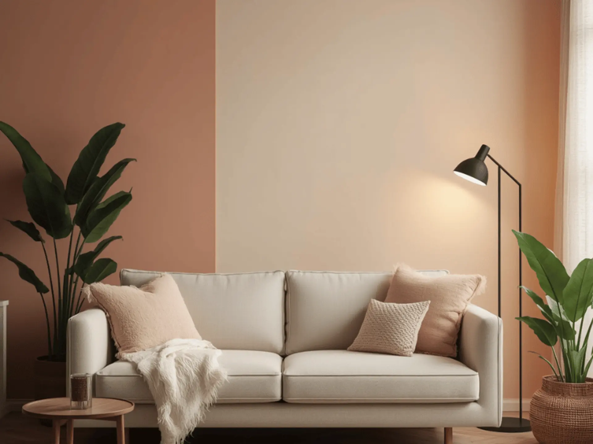
Peach and Cream
Peach and cream create a warm and graceful look. This pairing is suitable for a living room that should feel cosy yet elegant. If the hall opens towards the cooking area, modular kitchen design choices should be planned separately so both spaces look neat without using the same colours everywhere.
Conclusion
The best Vastu colours for a living room include white, cream, beige, light green, light blue, soft yellow, peach, light pink, lavender, light grey, and light orange. These shades are soft, practical, and easy to match with different interiors. The right colour choice can make the living room feel peaceful, bright, and welcoming. For a neat final finish, professional painting services can help achieve smooth and lasting results.
check for any query you have about the blog
Frequently Asked Questions
White, off-white, cream, or very light pastel shades are considered suitable ceiling colours as per Vastu.
As per Vastu, the east or north wall is generally suitable for an accent colour in the living room.
Yes, pastel colours like light green, light blue, peach, cream, lavender, and soft yellow are good for living rooms according to Vastu
There is no fixed rule for updating living room colours according to Vastu. Colours can be refreshed when the walls look dull, the decor changes, or the room no longer feels bright and balanced.