Terracotta Wall Trends: Why Earth Tones are Taking Over

 Nov , 2025
- Berger Speaks
- 3 Min Read
Cool grey rooms feel distant in busy homes. India is leaning into clay-rich hues that look relaxed, grounded, and full of character. A single terracotta wall can steady a space, soften sharp lines, and make everyday materials look richer without shouting for attention.
This article explains where the look came from, why it suits modern lifestyles, and which pairings work best in Indian light. It also outlines practical steps to plan colour, finish, and texture so you can build a thoughtful terracotta colour palette for any room.
The Rise Of Terracotta And Earthy Interiors
Terracotta travelled from pottery studios and courtyard tiles to contemporary living rooms as interest in craft returned. Designers highlighted subtle variations, soft texture, and the way clay tones sit kindly beside timber and cane. As homeowners searched for natural warmth, many turned to a dependable earthy terracotta colour that felt calm yet distinctive.
Fashion helped the shift. Rust, clay pink, and toasted orange appeared in textiles and furnishings, then moved to walls and cabinetry. People who first tried cushions and rugs later sought a measured terracotta paint colour for long surfaces. The result was a look that felt less polished and more human.
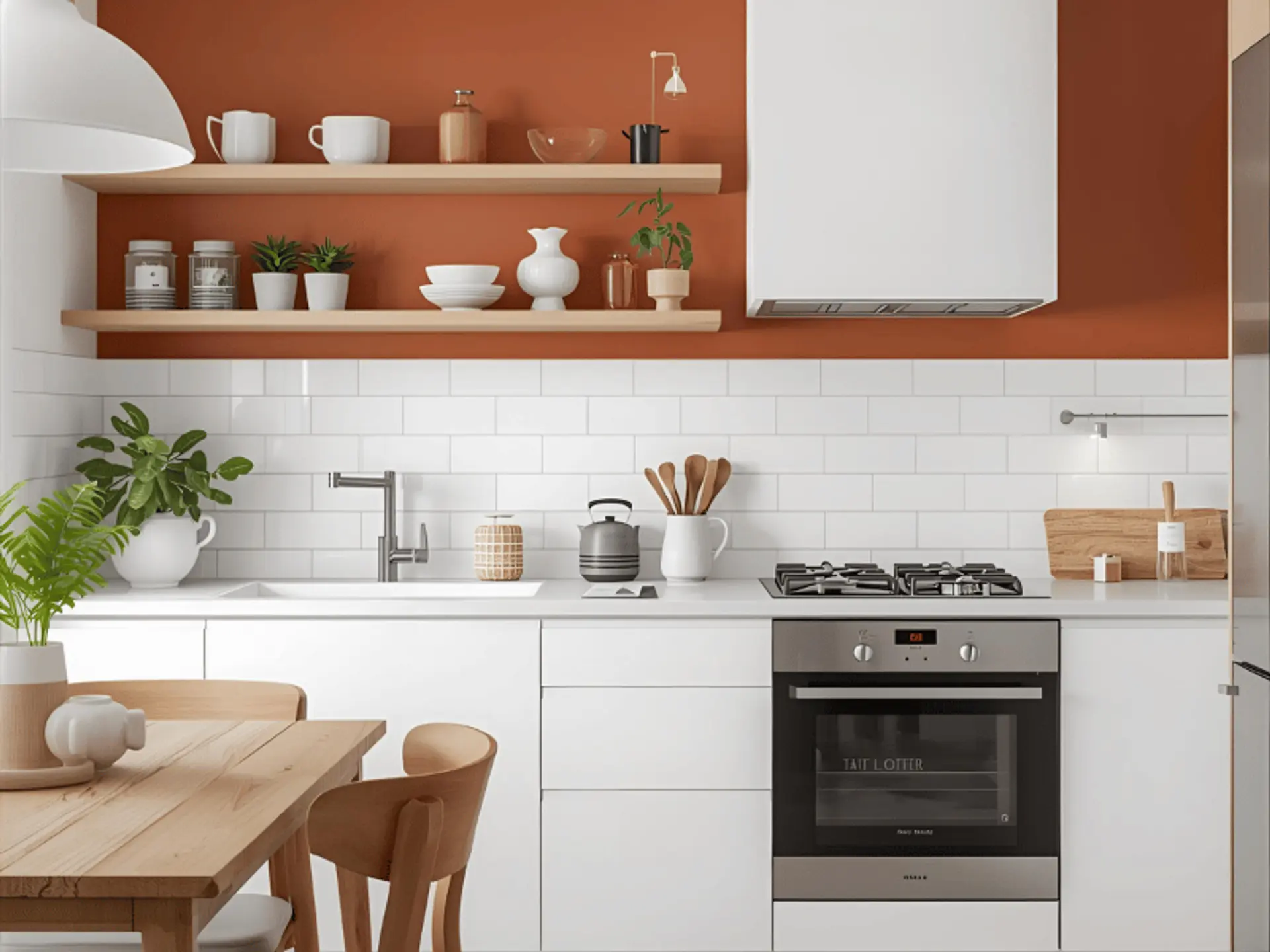
Architecture added momentum. Brick, lime plaster, and handmade tile continue to feature in Indian builds for climate and comfort. Indoors, carefully tuned terracotta interior paint delivers that same ease while keeping maintenance practical. With a broad choice of terracotta paint shades, the tone now suits compact flats as much as airy bungalows.
Why Earth Tones Are Dominating Modern Spaces
Rooms that echo nature help residents decompress after long days. Clay hues suggest soil, pottery, and warm stone, all of which feel familiar. In living areas, a balanced warm terracotta paint makes an open-plan space less stark and draws the eye to seating or shelving.
Earth tones are workable across ages and seasons. They tolerate daily wear and dust better than pure white, especially in busy corridors. A carefully chosen terracotta wall colour reads composed in daylight and stays welcoming under evening lamps. For those building a restful corner, a small terracotta room with soft textiles can be enough.
Sustainability also influences choices. Many households prefer finishes that age gracefully rather than looking brand-new every year. A muted accent wall, applied with quality terracotta paint for walls, can be refreshed without full-scale redecoration and still feel timeless.
Top 8 Terracotta Colour Combinations
Thoughtful pairing matters more than drama. Test swatches on the actual wall, check them throughout the day, and keep furniture finishes in mind. Selecting one anchor, one supporting neutral, and a single accent usually produces a cohesive terracotta colour combination.
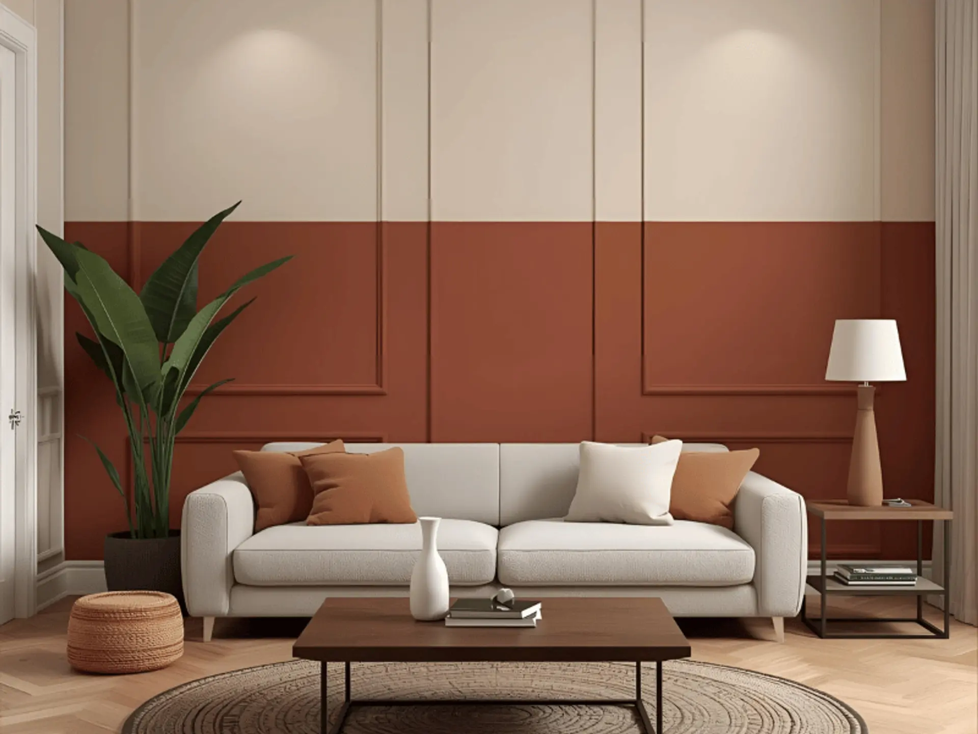
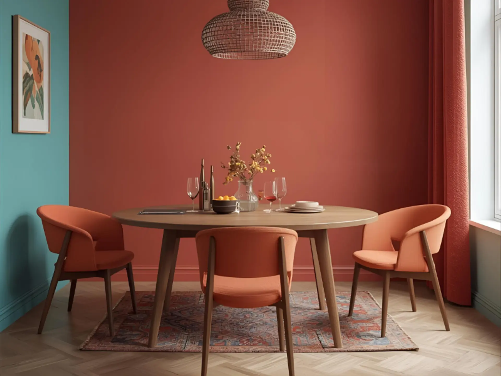
1. Terracotta And Cream – Warm Minimalist Elegance
Why it works: Cream cools the clay tone just enough, creating a calm, breathable backdrop.
Best for: Living rooms, bedrooms, and open plans.
Style Tip: Linen, rattan, and light oak add quiet texture.
For easy upkeep on family walls, washable terracotta wall paint makes routine cleaning easier.
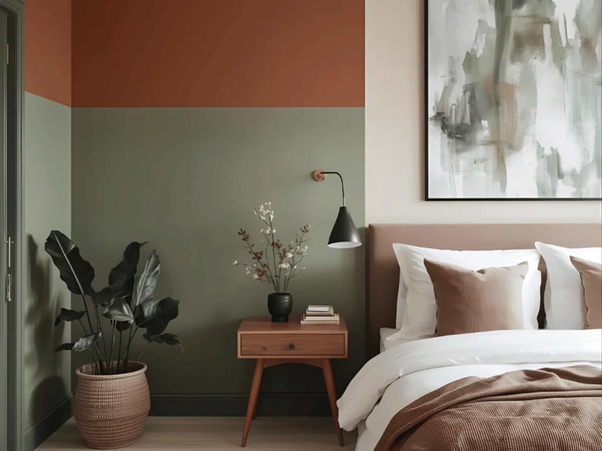
2. Terracotta And Sage Green – Nature-Inspired Harmony
Why it works: Sage brings a leafy counterpoint that keeps the palette fresh.
Best for: Bedrooms, kitchens, and nature-led schemes.
Style Tip: Indoor plants, woven baskets, and matte ceramics echo garden calm.
Those who enjoy botanical depth sometimes add a cushion or vase in terracotta and olive green to extend the colour palette as a gentle link.
3. Terracotta And White – Classic Mediterranean Simplicity
Why it works: White lifts the clay shade, which suits compact rooms that need brightness.
Best for: Kitchens, hallways, and sun-lit corners.
Style Tip: Rustic wood and handmade tiles offer texture without clutter.
A slim thread of contrast, such as trims in terracotta and grey, can sharpen lines where required.
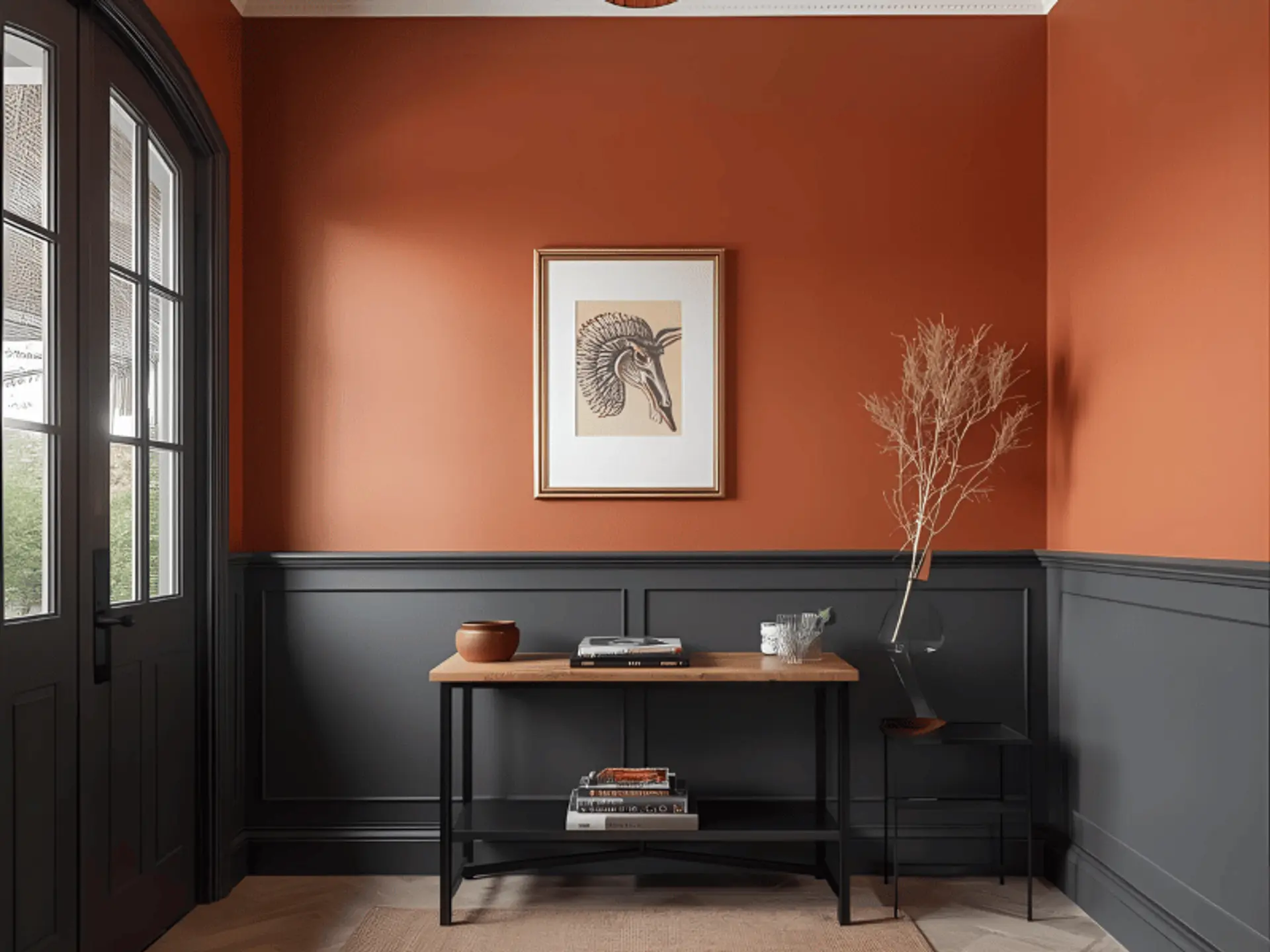
4. Terracotta And Charcoal Grey – Modern Sophistication
Why it works: Charcoal delivers definition and a city-smart edge.
Best for: Accent walls, study zones, or entry foyers.
Style Tip: Black matte hardware and brushed metal lighting feel tailored.
Deep notes like dark terracotta or a restrained terracotta red paint add theatre without overpowering the space.
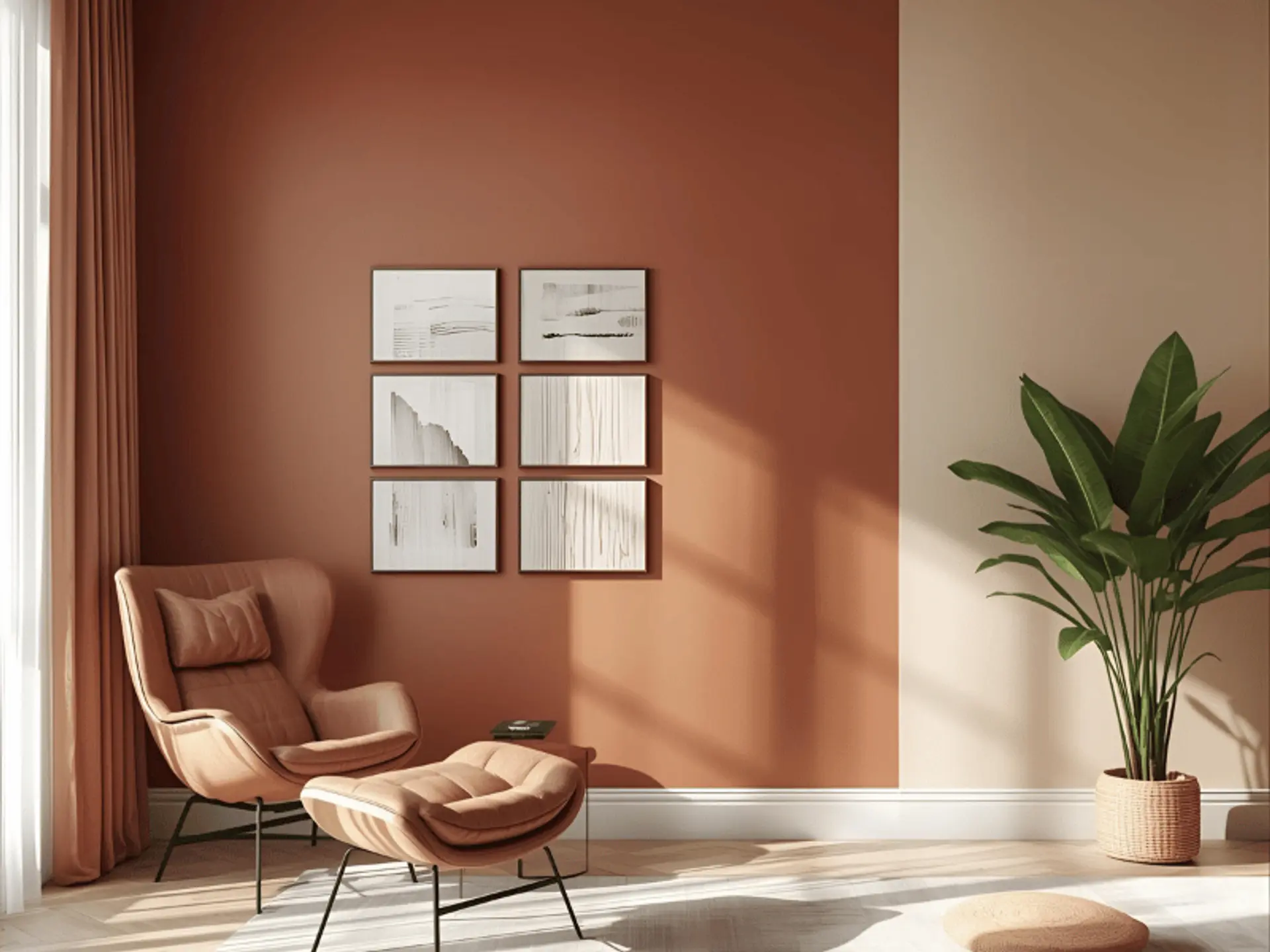
5. Terracotta And Beige – Subtle And Timeless
Why it works: A tonal approach looks composed and easy to live with.
Best for: Minimalist homes and restful lounges.
Style Tip: Cotton throws, warm lamps, and pale stone complete the quiet mood.
Unsure about the depth of a shaded room? Try a sample of pale terracotta paint first, then refine.
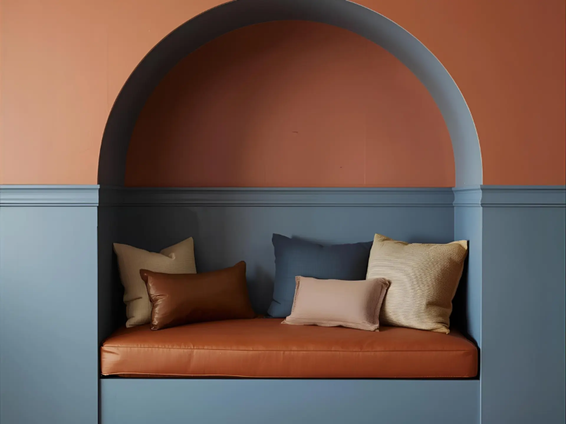
6. Terracotta And Dusty Blue – Calm And Balanced
Why it works: Dusty blue steadies warmth and suggests coastal clarity.
Best for: Bedrooms and reading nooks.
Style Tip: Soft-sheen metals like pewter bridge both colours.
A sun-washed wall in gentle terracotta orange can make this pairing feel cheerful without glare.
7. Terracotta And Teal – Modern Bohemian Energy
Why it works: Teal offers rich contrast that still feels cultured.
Best for: Dining rooms, creative studios, and features.
Style Tip: Block-printed textiles and dhurries add pattern with purpose.
Those who want more depth experiment with a touch of red terracotta paint or even terracotta brown paint on small details.
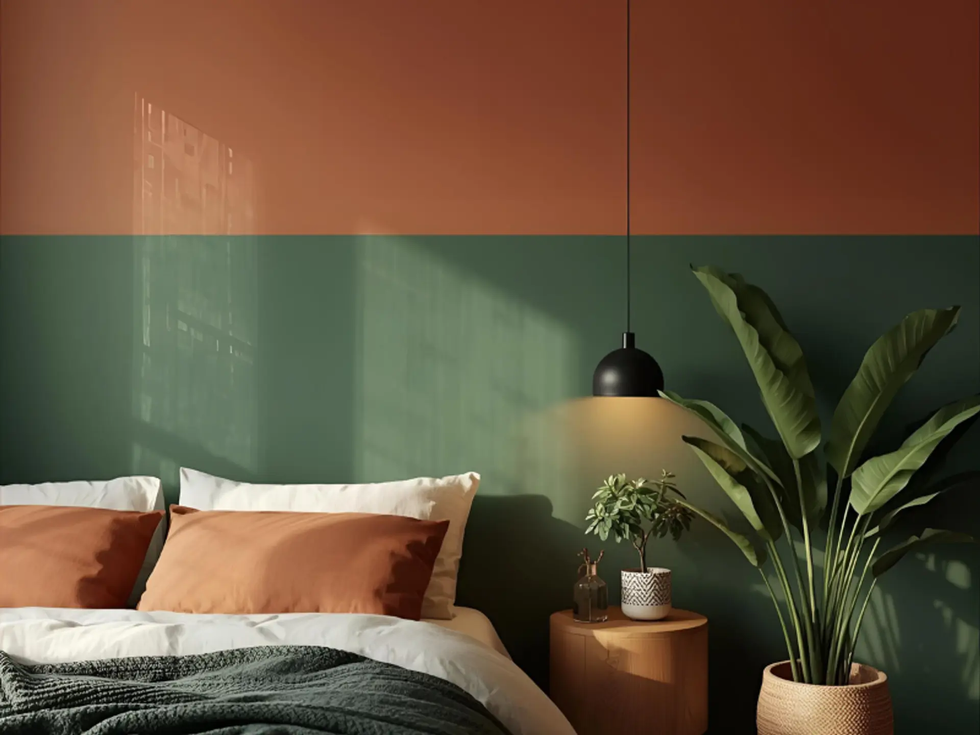
8. Terracotta And Forest Green – Earthy Sophistication
Why it works: Forest green grounds the scheme and reads luxurious in evening light.
Best for: Bedrooms and formal dining.
Style Tip: Brass lamps and mid-tone timber bring warmth.
This combination suits terracotta bedroom walls where quiet focus is important. For continuity across the suite, select a coordinating terracotta bedroom paint for wardrobes or a headboard niche.
Create Your Own Terracotta Wall This Year
Plan with light in mind. Track sun paths and shortlist shades that stay steady. North rooms favour softer tints, such as light terracotta paint color; bright south rooms can take bolder tones. Label swatches and settle on the best terracotta paint colour for each zone. Layer materials for warmth: cane, jute, cotton, and unpolished wood. In kitchens, terracotta kitchen walls give colour blocking. Choose weather-ready terracotta exterior paint or terracotta house paint.
Bedrooms suit calm schemes; a terracotta bedroom and a terracotta wall niche guide the eye. Accents of terracotta pink paint, terracotta brown paint, or red terracotta paint subtly add character. When precision and cleanliness are priorities, some homeowners turn to experienced applicators. Berger Express Painting provides professional execution for those who want efficient surface preparation and an organised process.
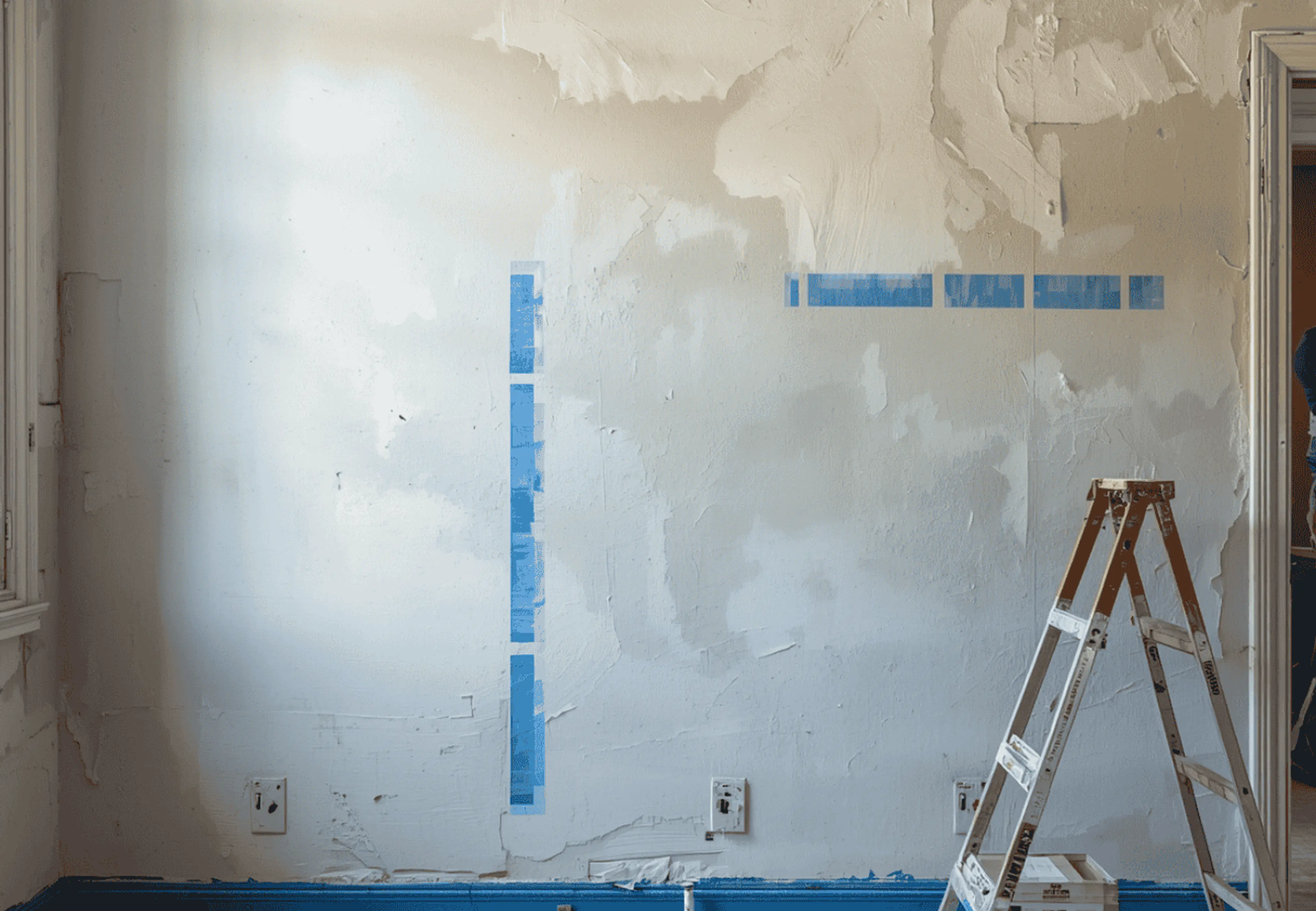
Practical Notes On Finish, Preparation, And Maintenance
Here you will explore the practical notes on finishing, preparation, and maintenance:
- Finish: Low sheen hides minor wall undulations and feels calm. Eggshell or satin can be easier to wipe in high-use zones.
- Surface prep: Clean, fill, and sand before painting. Good preparation helps every shade read richer and more even.
- Lighting: Warm LEDs complement clay hues at night. In strong daylight, slightly muted tints help avoid glare.
- Sampling: Paint swatches directly on the wall, not just on cards. Compare at different times of day before finalising terracotta paint for walls.
- Co-ordination: Pair the flooring and furniture first, then lock the colour. A simple bench test with tiles and fabrics can prevent clashes.