You know the feeling when you first time walk into a house and something isn’t right? The curtains and furniture match, ceiling and flooring is just classy, but the overall appearance feels chaotic or piecemeal? Mostly, the feeling is due to the inappropriate colour scheme. When constructing a new home or remodeling the existing one, without a colour palette plan to work from, your home can wind up feeling haphazard.
Colour palette is a very essential part of interiors. A well-thought colour scheme is the reason that we are so much attracted towards the interiors of the restaurants and hotels. The designers know there is nothing quite like colour combination for creating a mood.
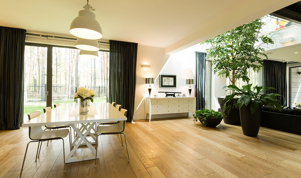
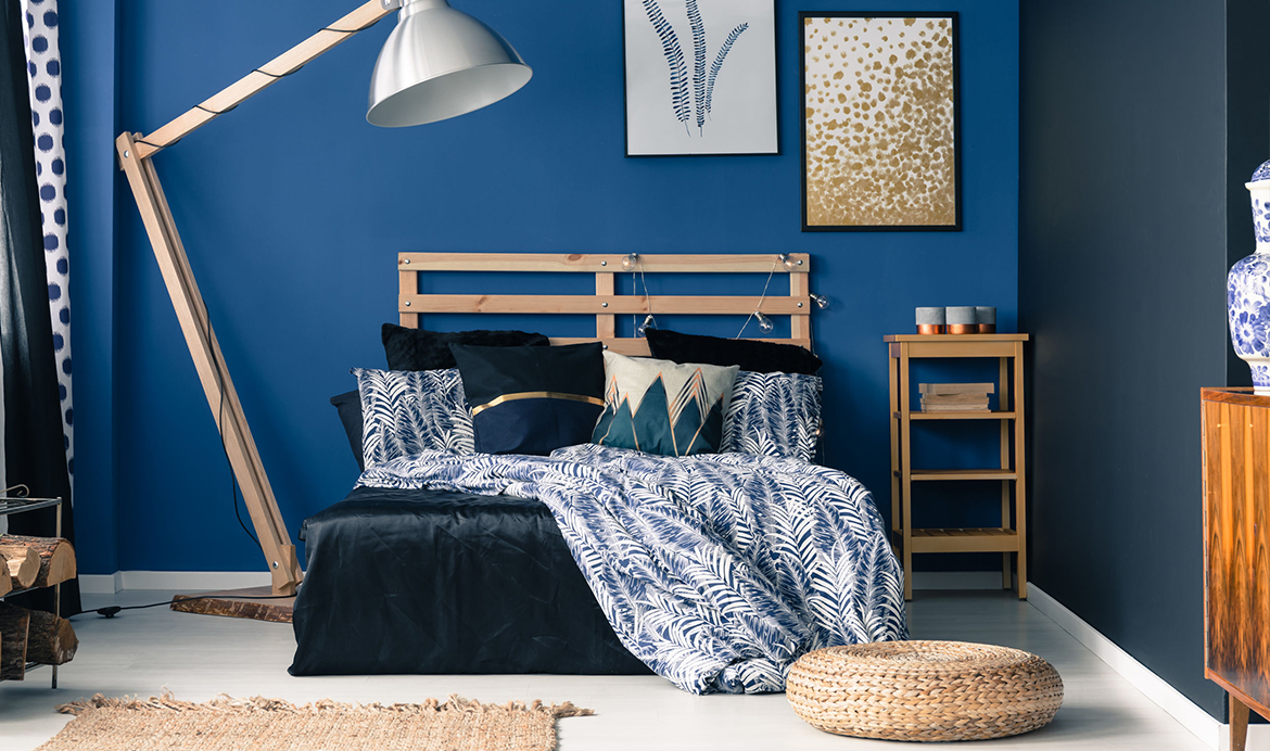
The trend of matchy-matchy rooms with just a few strict shades are long gone. A colour palette for home design lets you feel comfortable and make the rooms feel warmer or cooler. It lets you create the perfect balance and harmony. So, where to start? It all begins with inspiration, just like any other form of art, creating a wall colour palette also needs some inspiration.
Why not consider one of the following:
Get Inspired
Instead of making a choice from the paint brochures, it’s always good to rely upon your inspiration. Look into your own soul or outside the window. Almost every painter or designer has a starting point, which is of course the inspiration.
The inspiration can come from virtually anywhere – a flower, your favourite photo or even a sweater that is associated with some special memories. Even it can be a feeling you want your home to have. Whether you want your rooms to be bright, cheery, dramatic, cozy or anything else that feels right to you. Narrow your inspiration down to a few of your favourite colours (2-3) from your inspirational sources.
Choose Your Neutrals Carefully
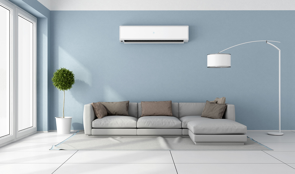
Include at least a few neutral shades in your overall colour scheme for your whole home or room paint. It makes everything easier, making your eyes feel relaxed and the space a bit larger. The ratio should be 50:50 when creating a colour palette for your dream home, which means you must include 50% neutral shades in your selection. There are three choice you can make with default neutral.
Warm Neutral – It is anything from warm white to beige and brown. It goes well with warm undertones, like red, orange, or yellow.
Cool Neutral – Colours like cool white, blue, green and gray will complement undertones like yellow, red and orange.
Greige Colours – The mix of beige and grey, greige colours work extremely well with warm or cool wall colours.
Repeat Colours From Room To Room
Most designers follow this idea of coordinating the look of a whole-house palette through repetition. It is, therefore, suggested to use any colour at least twice on your house walls. You don’t need to use the particular shade in the same way, but change the style. For example, the dominant colour in one room may be used as accent in the next.
You don’t just need to jiggle with colours into every room in equal measure or fill each room with a single shade. With this, you will end-up making the rooms looking unattractive for sure.
Use A Colour Shade Card
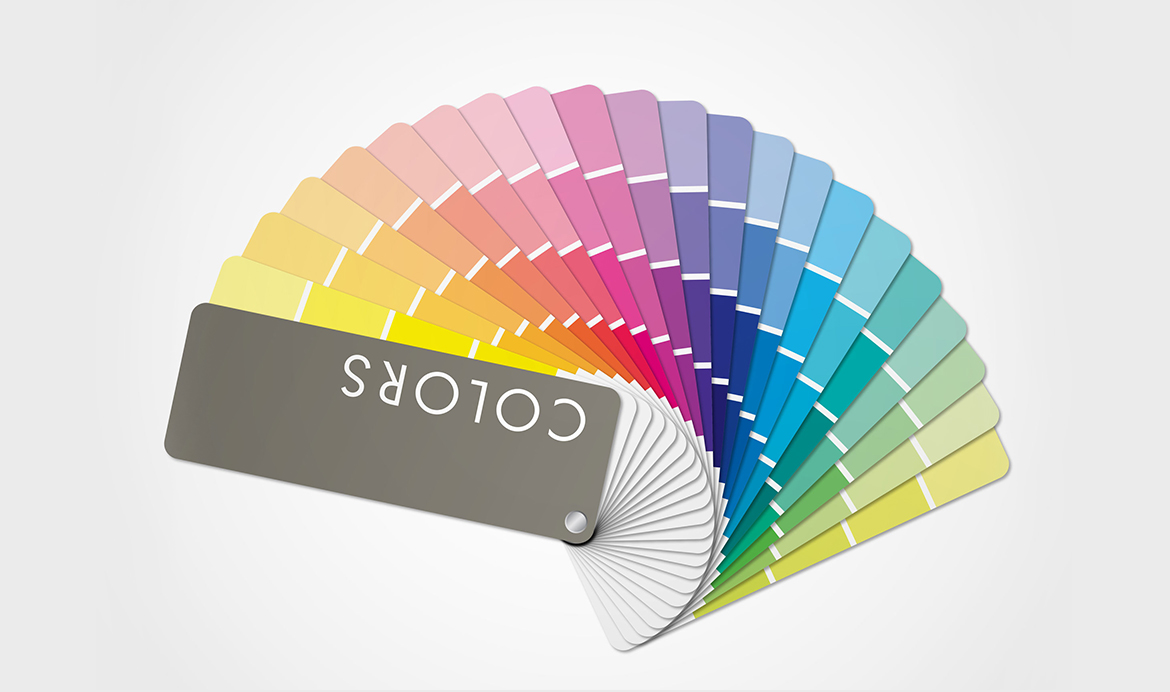
As a homeowner, you don’t have to be an expert at choosing the right hues that perfectly to create a soothing and relaxed environment. This is where the colour shade card may be helpful to you. In the shade cards, you will also get suggestion of colours that you can choose with a particular wall paint shade to create a harmonious, casual and relaxing atmosphere. Of course, you have the freedom to pick that fit your mood and home design idea.
Pick Your Textile

Now that you have the inspiration and the suitable combination for house wall colours, it’s the time to go shopping! Look for the most suitable curtains, upholstery, new wares, etc.
But before you step-out for shopping, figure out what upholstery, curtains, and rugs will fit best in the rooms. You’ll want to get the fabric swatches of those items. It will not just help you identify the best fits, but also to purge items that don’t fit into your new style or colour palette. For the brighter, larger rooms, pick out a lighter colour for the textiles. For the darker and cocooned feeling, go with something dark.
Phew! Did You Make it?
Creating a colour palette isn’t as easy as it sounds. There are no obvious rules, of course. After all, your imagination is much stronger than any of the existing laws of the selection. But I promise that the above-mentioned tips will get the best results. With the right combination and perfect colour contrast, you will enjoy living in your dream home like never before. Wouldn’t that be nice?
 Get in Touch