Top 5 Reasons Your Wall Paint Colour Looks Wrong
 Apr , 2020
- Berger Speaks
- 4 Min Read
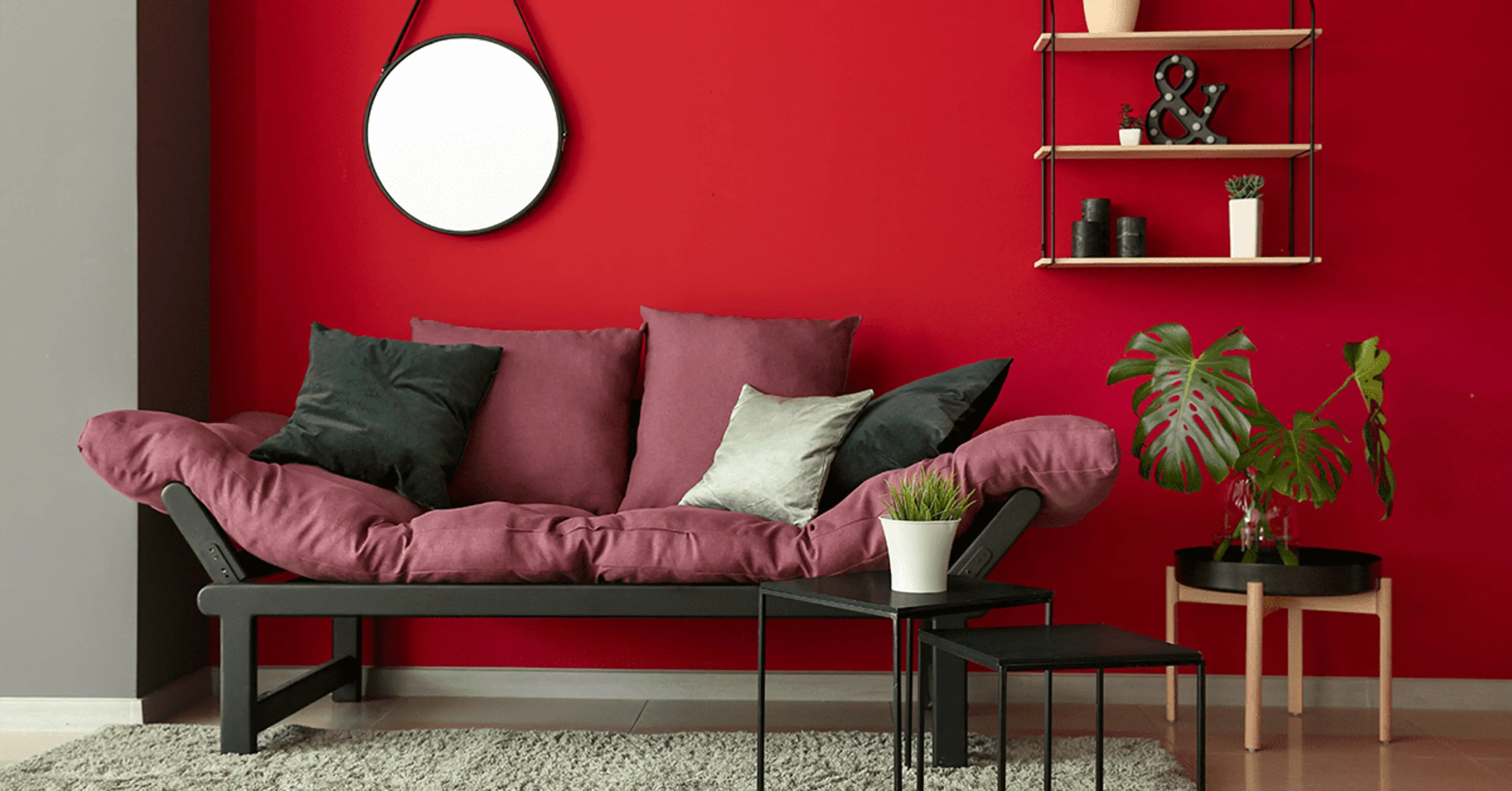
A colour is a powerful tool that can change your mood and impact how your favourite piece of furniture looks. Imagine yourself walking into your newly painted room and it looks terrible. You are disappointed and you think to yourself, “This cannot be the colour I chose and gave to the painters!” But yet it is a reality staring right at your face. What could have possibly gone wrong?
We have top 5 reasons why your chosen paint colour could end up looking bad. Hold your horses! The lighting of the house may not always be the culprit. Read on find out the other possible reasons for a wall colour gone wrong.
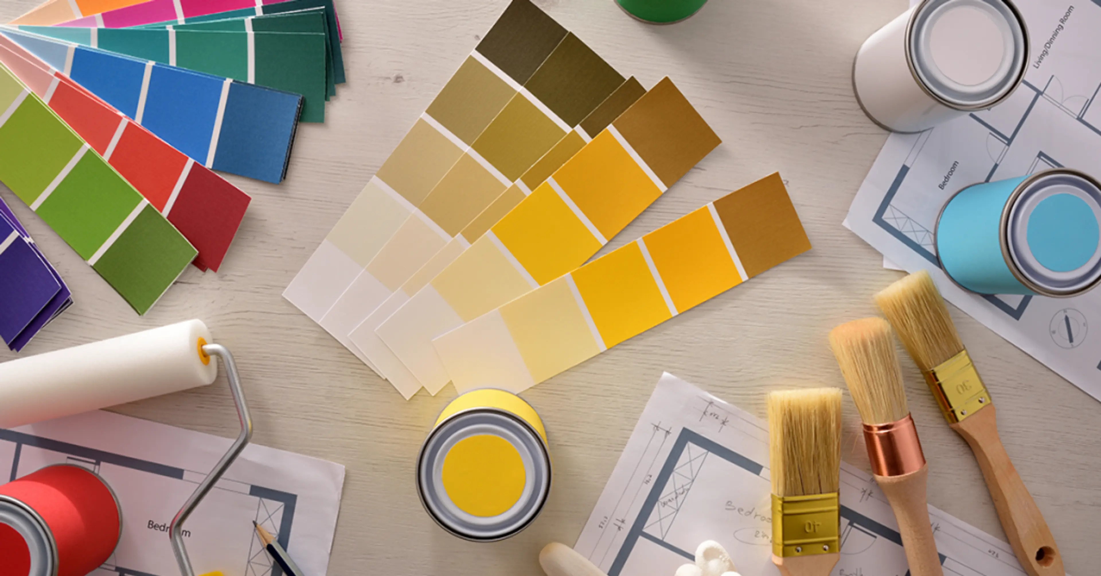
Reason #1: Choosing The Wrong Undertone
Understanding how to pick the correct colour is important, but choosing the exact colour that also has the right undertone is even more crucial. Here’s why. If you ever see or create a scheme or design that should work but doesn’t, it is probably the undertones that are off rather than the colours themselves.
Wondering what exactly is an undertone? Let us simplify this for you. The dominant colour also known as the mass tone or overtone is the colour you perceive. The colour you don’t see is the undertone. Undertone is the result of blending more than one colour together. An undertone is the colour that makes grey turn blue or beige turn red. A wrong undertone can make even a gorgeous shade of emerald an absolute eyesore!
So next time you see a wall colour looking terrible, you will know that the chosen colour may have undertones that were fighting each other instead of working together. Always remember that the mass tone and the undertone of the colours you choose should work together to create a harmonious colour scheme. Nothing can ruin a good design more than clashing undertones.
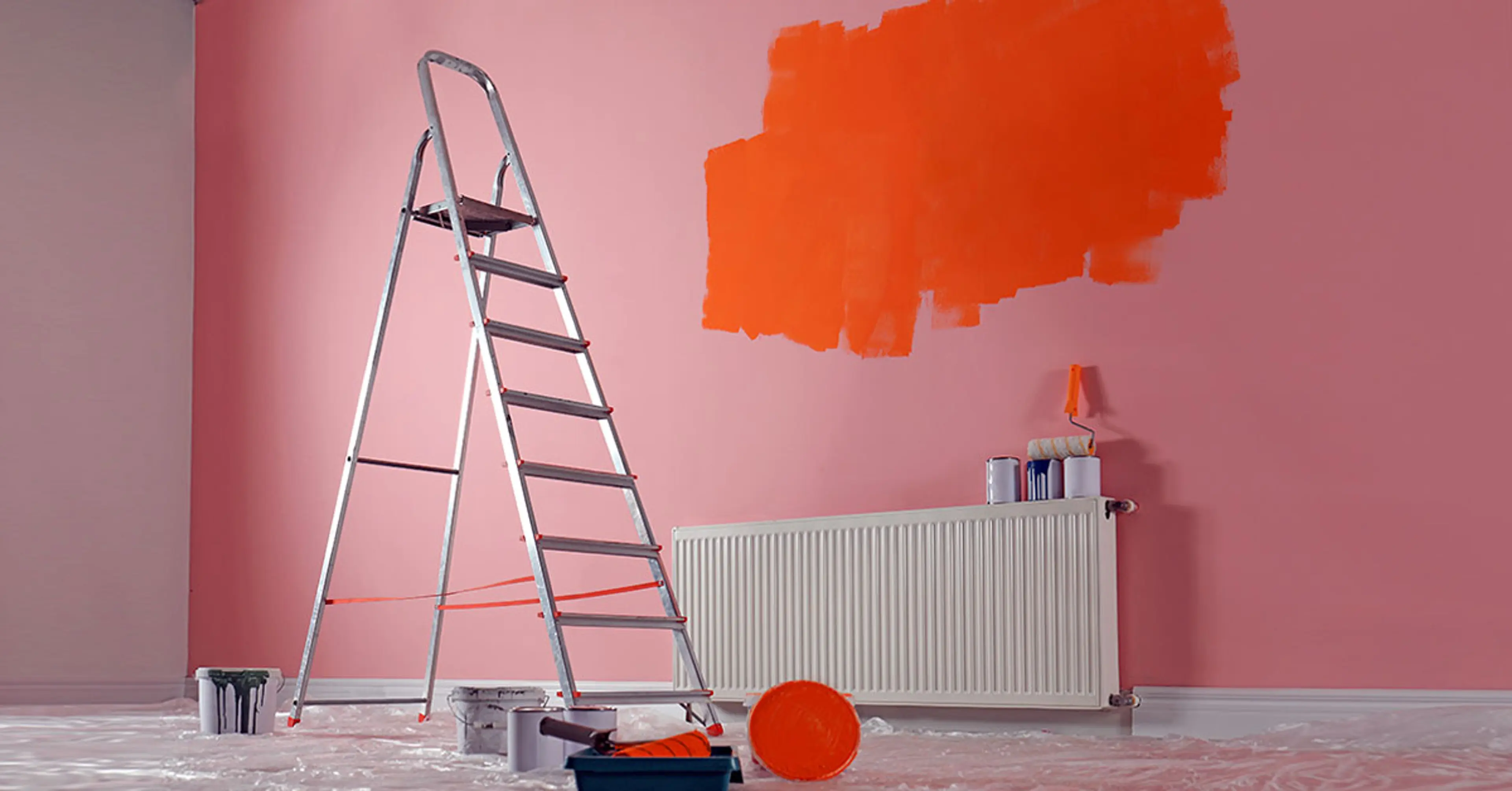
Reason #2: Deciding When The Paint Is Wet

We know that it can be hard to be patient when it comes to seeing your favourite colour on the wall but a few hours of drying time is absolutely worth the wait. Trust us. Some paint colours look astonishingly similar when wet, but some can take on a much different look after they have dried. After you have gone through the effort of putting up your big swatches, this is no time to rush. Go grab a cuppa tea or your favourite coffee before you come back. Pick your preference of paint colour only once the paint has thoroughly dried up on the walls. Never skip the wait if you wish to get a real sense of the colour applied on the walls.
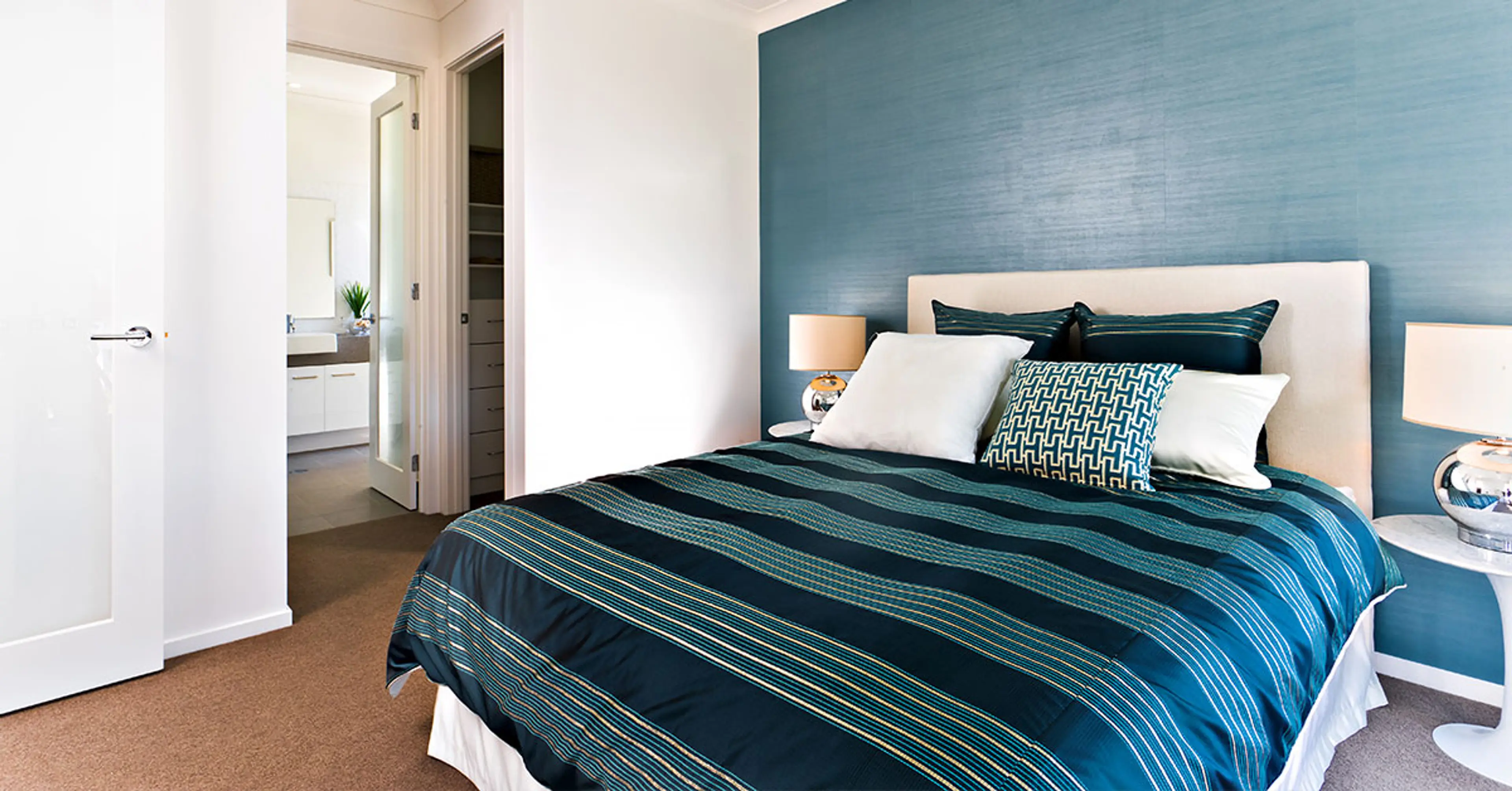
Reason #3: The Colour Is Too Muted Or Too Bright For The Floors Or Furnishings

We know that choosing paint colours for your home interiors is no walk in the park. In fact, there is a mind-boggling universe of different shades, hues and tints out there. However, it is all about personal preference. What you should pay attention to is to avoid making the most common paint colour mistakes that all of us are most likely to make.
When choosing a colour for your walls, you need to first figure out what look you are going for. If your floor is white or off white, choose a colour to complement the floors. Look for something with more hue.
The rule of the thumb is to avoid muted and saturated colours. A cobalt blue paint colour on the wall can come across really strong as opposed to it as a lamp colour or a cushion cover, so choose with caution. Opt for lighter colours that have grey or black mixed in with them as they work better than a really strong hue.
Reason #4: Forgetting The Effect A Wall Finish Makes
From high gloss enamel to velvety matte, Venetian plaster, decorative finishes and more, the choices are endless when it comes to wall finishes. The decision you make can have a profound effect on the look and feel of your entire house. For instance, did you know that eggshell finish can take the intensity out of a rich hue for better or worse? Before finalising the wall finishes, it is best to look into all the wall finishes available. Ignoring the properties of each type of wall finish can work against you.
Reason #5: Not Considering The Home As A Whole
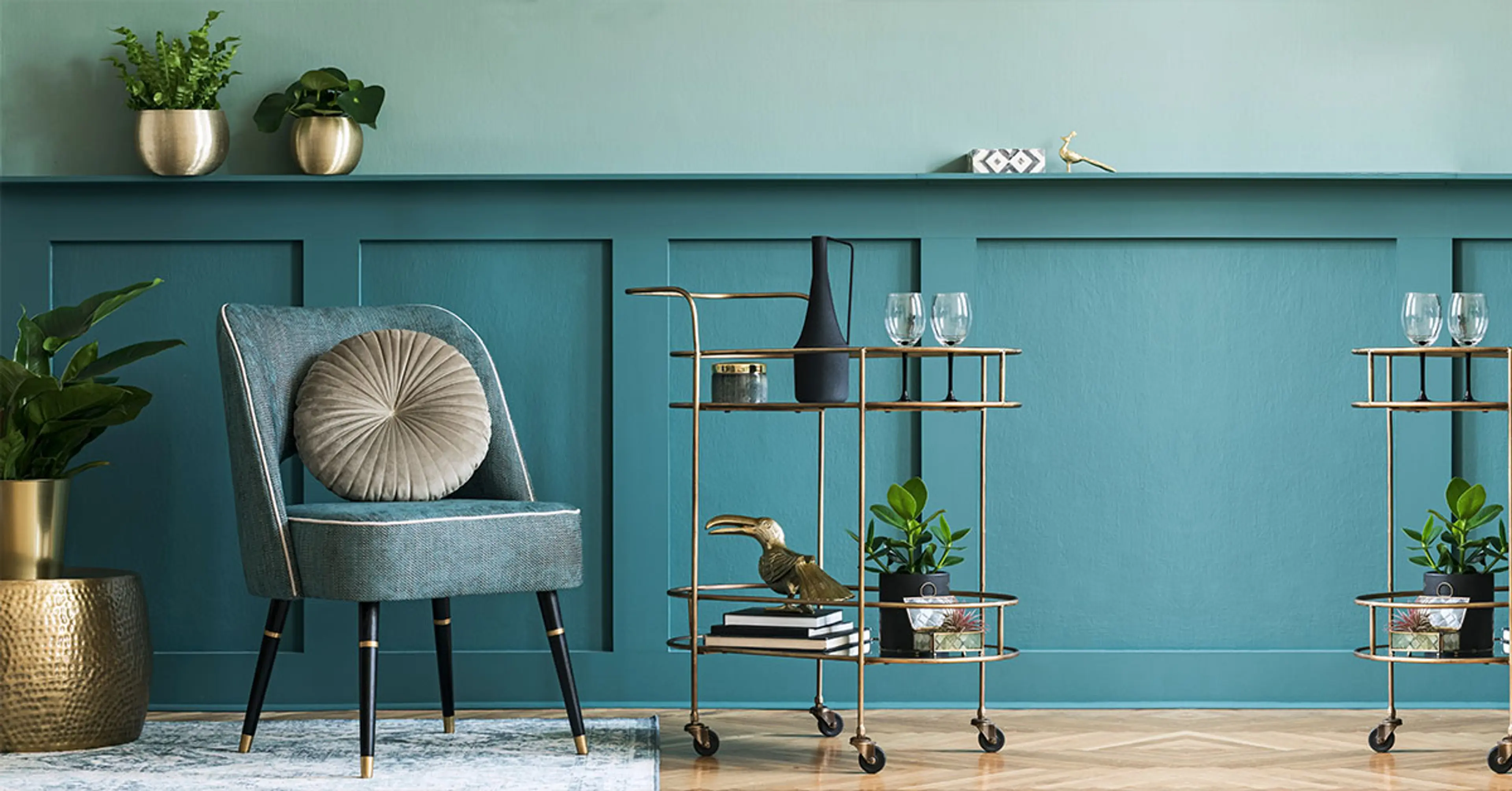
Even if it is a small home, transitioning colour from one room to the next can be tricky. If you think it is visually appealing to have a bright orange room followed by a bright pink room, you are mistaken. The whole house has to make sense as one for which all of your rooms need to feel connected. It has to have a cohesive flow as you would have read here: https://www.bergerpaints.com/blog/decor-tips/how-to-keep-a-cohesive-colour-flow-in-your-home
Paint alone cannot make a room. It cannot always do the heavy lifting. It is wise to use other things to bring the entire living space together. Try bringing in a statement piece like an accent rug or a striking piece of furniture or fun drapes to give your room a touch of sophistication.
Now that you are more aware and have some new learnings, next time, before putting the blame on the lighting of your house, see if you have committed any of the 5 faux pas we pointed out in this blog. These are some things the paint stores won’t tell you and some things that could just slip your mind.
If you have home painting on your mind, choose a professional painting service like Berger Express Painting if you wish to experience a smooth painting job. They know all the tricks of the trade and are well-equipped with automated painting tools for a faster, cleaner and dust-free painting experience. All you have to do is simply sit back and watch the experts at work.