Neutral Living Room Paint Ideas For An Effortless Colour Scheme
 May , 2025
- Berger Speaks
- 4 Min Read
Selecting a colour for your living room might be daunting due to the abundance of intriguing choices. You may find it difficult to settle on a single colour at times, or you may not be able to get the exact shade you're going for. Whether you're seeking for conventional or futuristic designs, you may find ideas for neutral living room colours here.
So, keep reading!
What Is A Neutral Colour?
Colours that are muted and lack brightness and intensity are called neutral colours. These colours complement practically every other colour, as their term "neutral" implies. In addition to providing a subdued yet vibrant backdrop for the other hues, they also produce an eye-soothing visual break when combined with vibrant furnishings, textures, or patterns.
The most elegant and sophisticated neutral colours for a living room are typically those that are not garish. Use a colour horoscope to find out the best neutral shade for you!
12 Neutral Living Room Paint Ideas
Metallic Neutrals
Metallic neutral living room colour ideas include colours like soft gold and silver. These shades add a touch of luxury to your living room.
Pair metallic neutrals with brown neutral living room colours for a sophisticated and Pinterest-perfect atmosphere.
Ivory Neutrals
Ivory can create a warm neutral colour living room, bringing calmness and elegance. It goes well in both modern and traditional decor and can be used as a base for different textures and patterns.
White Neutrals
White is one of the best neutral colours for living room. It is a fresh, popular option for small to medium-sized rooms that get less natural light. To add a little bit of warmth to the space, as white can create an office vibe, add wood accents or soft lighting.
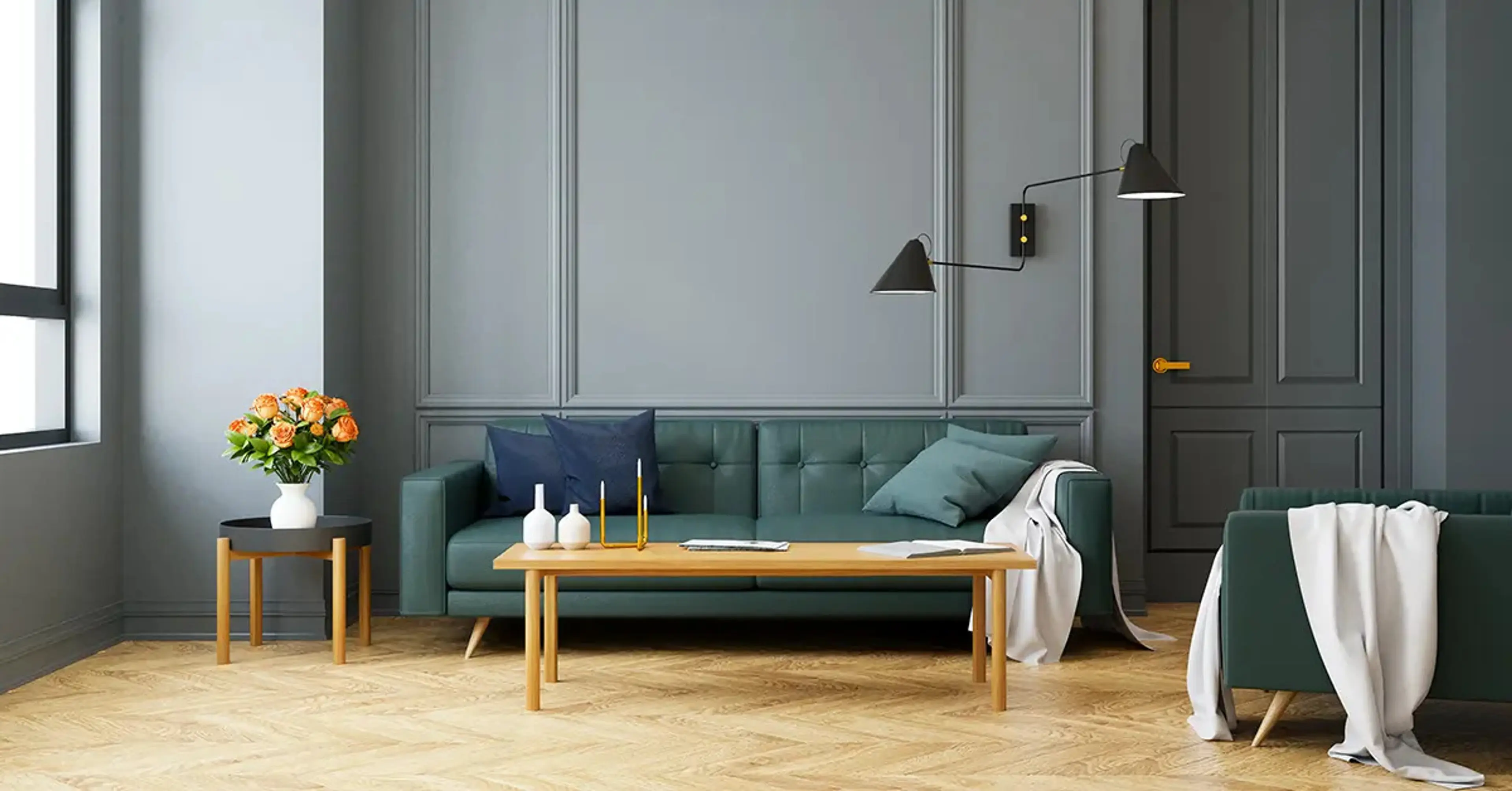
Contrasting Neutrals
This is one of the classic ways of bringing colour to your living room without overwhelming the senses. Pair darker colours with neutral colours for living room.
Mauve Neutrals
Mauve is one of the unexpected yet elegant neutral living room colour ideas. This soft, muted shade of purple brings old-school sophistication, taking the space from a living room to a parlour or lounge.
To tone it down a little, use mauve in textures or accents.
Grey Neutrals
Grey, like white, is every colour’s best friend. It creates a modern aesthetic as it wasn’t traditionally commonly used in homes in India. But it's quickly picked up now and it’s not uncommon to see light grey paint for living room. It goes beautifully with colours like bright yellow and red - invigorating the space while keeping it masculine.
Mix Cool Neutrals
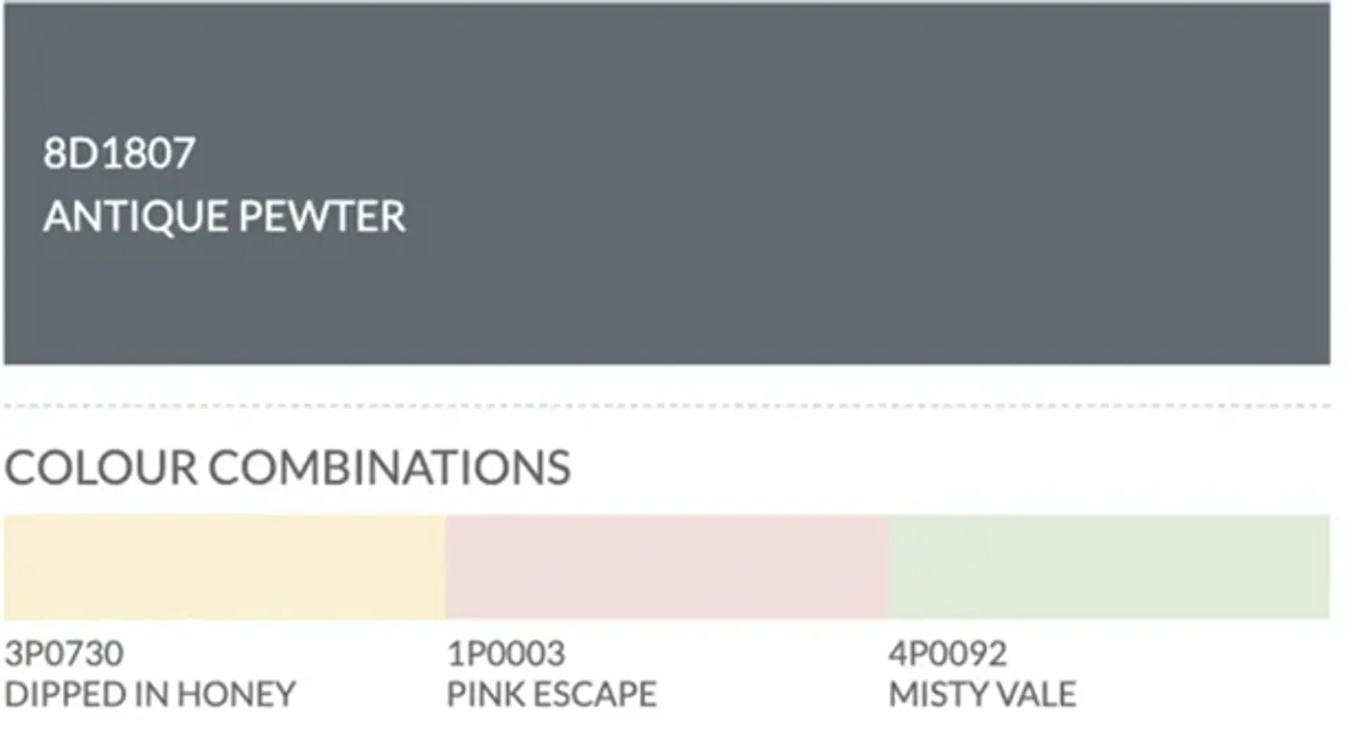
Cool neutrals include shades like brown and beige colour for living room. Both these shades have a number of shades and can be used to create a soothing, rich decor. Check out the different shades in this extensive colour catalogue.
Light Green Neutrals
Bring nature inside your house with light green neutral colours for living room. This soft shade will add freshness without overpowering the room. Light green complements brown neutral living room colours so you can add natural wood to your furniture to make the room even prettier.
Light Blue Neutrals
One of the best neutral colours for living room is light blue. In a recent study, nearly half the people said their favourite colour is blue, making it one of the most loved neutral living room colour ideas. Light blue colours will go well with a soothing beige colour for living room.
Monochromatic Style
Most people think that the best way to keep it simple is by choosing a monochromatic colour scheme. But it's not that easy. Even when it comes to a monochromatic neutral colour for living room, as seen in the colour catalogue, there are many different shades of the same colour – and there are countless ways to play around with each.
However, it is a great way to start a cohesive colour palette. All you need to do here is select your primary colour, then choose your walls, textures, and furniture in its many shades.
Lilac Neutrals
Lilac, another shade of purple, is a soft and sophisticated neutral colour. It brings a feminine, elegant charm to the room. As a pop of colour but in a very muted way, lilac works well in neutral colours for lounge.
Neutrals With Pops Of Colour
Keeping the colour scheme largely neutral but adding pops of colour through texture painting and furniture is another good way to bring energy into the room. For example, you can add yellow sofa cushions with light grey paint for living room.
Popular Neutral Two Colour Combinations For The Living Room
Neutral colour ideas for living room decor never go out of style if you want to bring elegance, calmness and sophistication to your space. They form a classic base to work with but leave a lot of room for styling and accessorising. The correct pairing of neutral colours can take your modern living room a long way with very little effort.
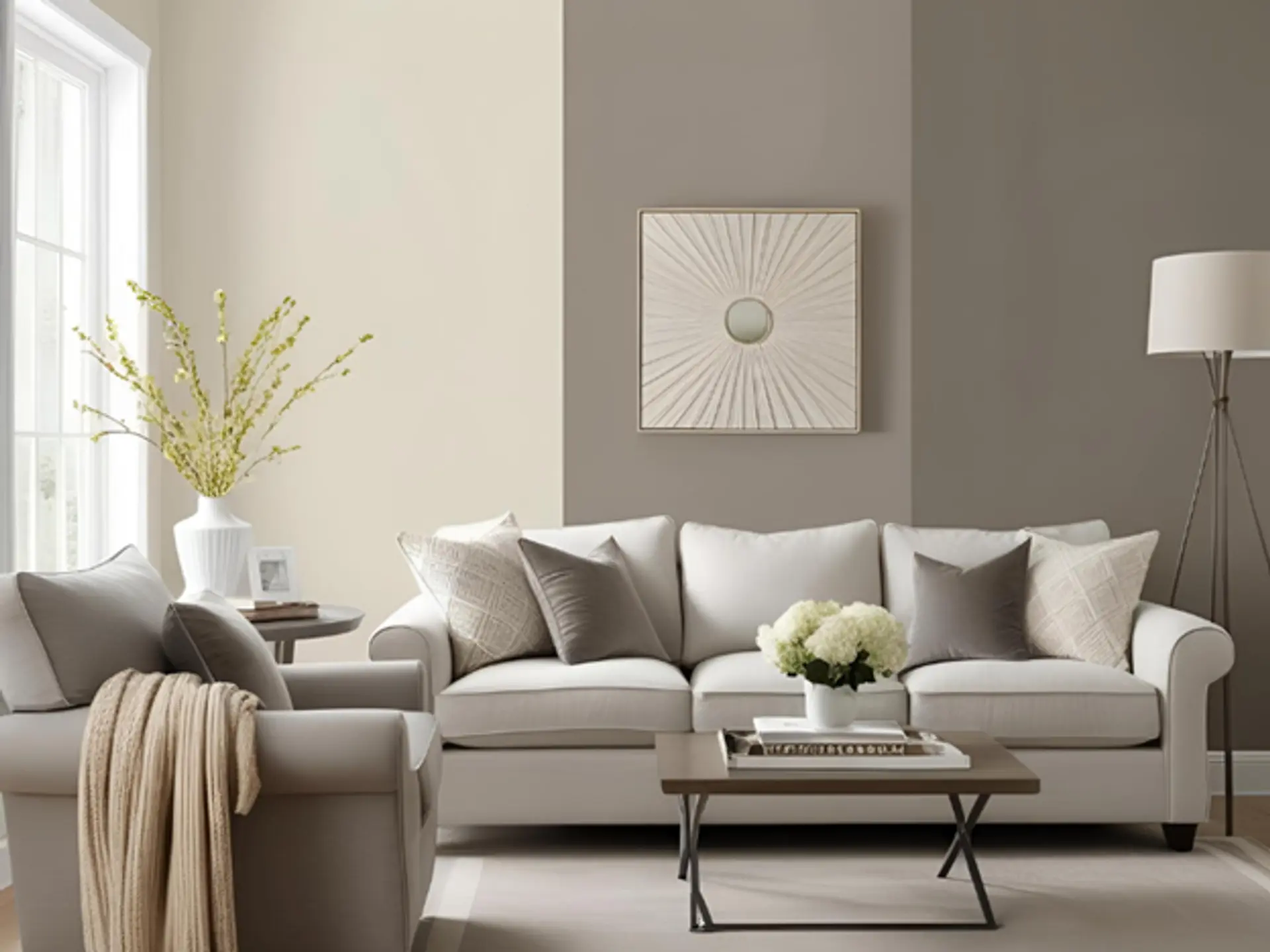
Beige And White

One of the most classic neutral colour pairings, beige and white, offers a perfect blend of warmth and brightness. Beige, known for its earthy tones, pairs seamlessly with crisp white to create an inviting and airy ambience. This duo reflects natural light beautifully, making your space appear larger and more open.
Beige also complements wooden textures and greenery, making it ideal for a tranquil, nature-inspired aesthetic. This is one of the best neutral paint colours combinations for minimalist or Scandinavian design styles. If you’re exploring neutral paint colours, beige and white remain unmatched for timeless charm.
Greige And Ivory
Greige—a mix of grey and beige—has become a favourite among designers for its versatility and depth. When paired with ivory, the space feels sophisticated yet soft. Greige adds a modern edge while ivory brings warmth, making it one of the best neutral wall colours for a contemporary living room. This duo works exceptionally well with metallic accents and modern furniture. Whether you prefer matte finishes or soft textiles, greige and ivory can adapt easily. It’s a smart neutral colour pairing for modern living rooms that aim for understated luxury and refinement.
Taupe And Cream

Taupe and cream combine to form a cosy, grounded atmosphere with a refined twist. Taupe offers a slightly deeper base tone, while cream lightens the mood, resulting in a balanced aesthetic. This neutral combination works well with both traditional and transitional design styles.
Taupe is often seen as one of the most reliable neutral beige paint colours due to its ability to anchor a room. Paired with the subtle elegance of cream, it creates a calming, luxurious look that suits both small and large living rooms. It’s a top choice for homeowners seeking elegant, neutral colours for living room.
Tips For Choosing The Perfect Neutral Colour
Consider Room Size And Lighting
Some colours like white neutral colours for living room are perfect choices for rooms that are small and receive less natural light. White maximises light reflection given the illusion of size. However, stark white walls don’t usually work well with warm white lighting, so you need to be careful to the smallest degree.
Create A Mood Board
To start with, we recommend creating a mood board. This does not have to be a physical board. A mood board is simply a collection of different aesthetics based on who you are and what you want out of a space.
In this case, you simply need to visualise going in what emotions your living room will evoke – then work backwards from there.
How To Apply Neutral Colours Effectively
- Preparation: Start by cleaning the walls/surfaces on which you will be applying the neutral colours for living room. Any dust or loose particles will not allow the paint to stick properly. Fill any holes or cracks for a perfect finish.
- Application Techniques: Apply a primer to the wall to increase paint adhesion. Then, paint over it in thin coats to allow the paint to dry off completely. Want to know how much paint you’ll need? Use a smart colour calculator tool to find out!
Conclusion
Neutral paint colours can transform your living room into a stylish and inviting space. Consider room size, lighting, and personal preferences when selecting your colour. Proper preparation and application will ensure a flawless finish. Embrace the timeless elegance of neutrals to create a harmonious and serene environment that effortlessly adapts to your style.
Find Your Perfect Neutral Shade with Berger Paints!
Ready to transform your living room with timeless neutral shades? Explore Berger Paints’ extensive colour catalogue to find the perfect hues for your space and start your makeover today!
check for any query you have about the blog
Frequently Asked Questions
A neutral colour for living room is any of the softer, muted shades such as beige, grey, cream or white that can be used as a versatile foundation for your choice of decor styles or accents.
Pair your greige with ivory for a soft touch, layer your textures for an ideal modern neutral living room, and add minimal metallic or wooden accents for a sleek, balanced look.
If you're looking for a cosy, warm neutral vibe in your living room consider using popular warm neutrals like taupe with cream or beige with white, along with wooden furniture and soft lighting.
Metallic neutrals are paints with metallic particles, such as soft gold and silver. You can use them as accents, in furniture, fittings, etc.
Have neutral colour walls and pair them with small hints of colours in furniture and textures.