How To Add Pantone Colour Of The Year – Very Peri Into Your Home Decor
 Dec , 2021
- Berger Speaks
- 5 Min Read
We are thrilled that Very Peri has been officially declared the Pantone Color of the Year. Here are some interesting ways to use the trendy hue to renew the look and feel of your living space.
Pantone has announced Pantone 17-3938 Very Peri as the Colour of the Year and we can’t keep calm! It has been described as the shade “whose courageous presence encourages personal inventiveness and creativity.”
Speaking of the shade, it is a beautiful blend of blues with undertones of violet-red. According to Pantone, Very Peri is “a periwinkle shade of blue”. This is not only a shade but also an emblem of the volatile times that we live in.
Considering how challenging and stressful the last couple of years have been against the backdrop of the pandemic, we all deserve a space that gives us peace. All Pantone shades are unique and symbolic, and the Very Peri shade is no different. Our colour experts believe in the power of the Very Peri shade in lending not just peace and calm but also joy. Keep reading to find out more!
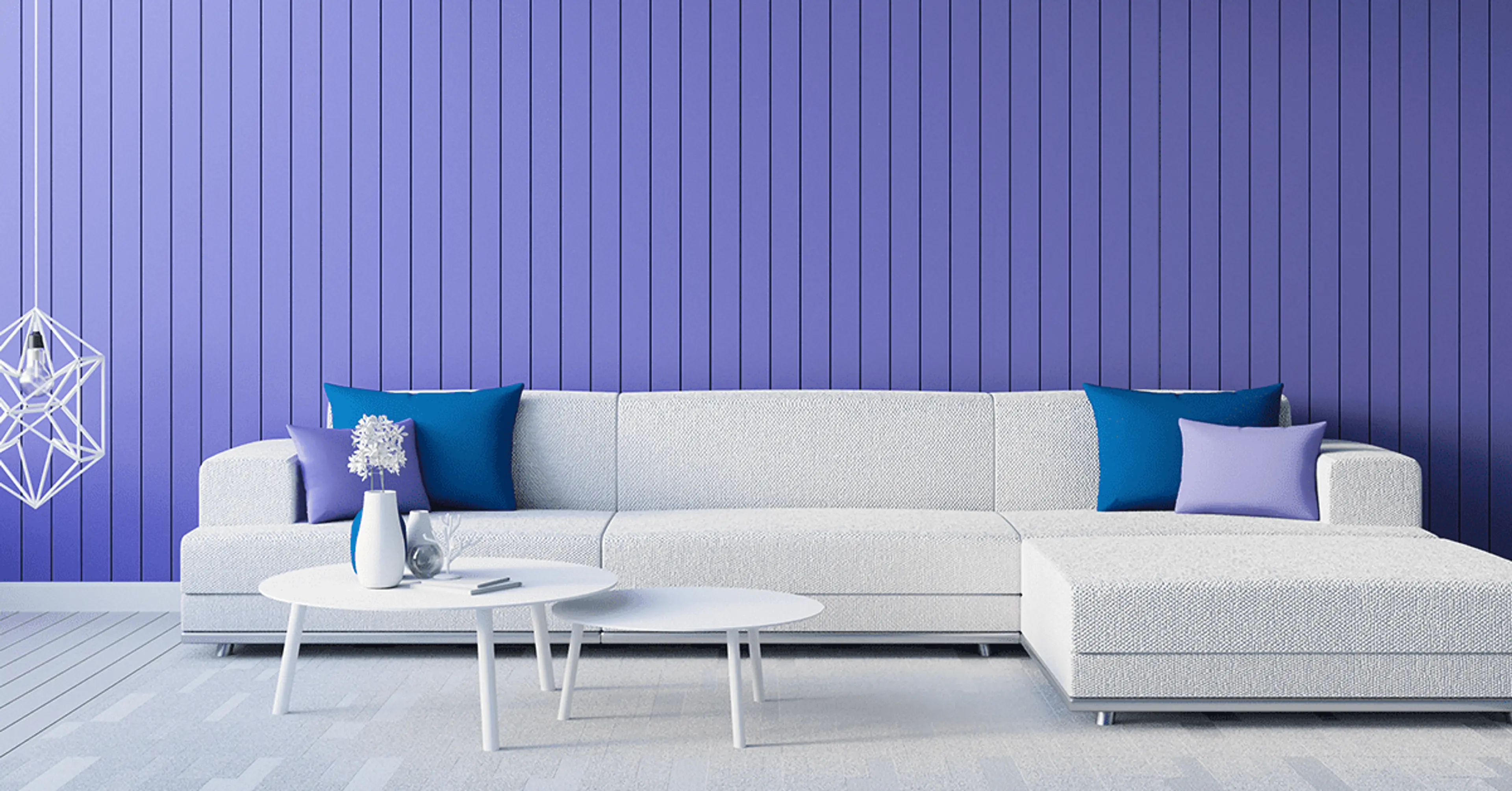
For The Living Room

How about kicking off the new year with a living room makeover using this aspirational Pantone shade – Very Peri? We think that using this hue on the walls can provide a pop of freshness, whether introduced on all four walls of the room or through a single accent wall.
Interestingly, the Very Peri shade can also help you recreate those statement-making lavender walls, lavender door along with the iconic yellow door frame made famous through the F.R.I.E.N.D.S sitcom. A perfect choice for the sitcom’s fan, we say!
We recommend LATE LILAC (6T1285) from the violet tones available in our Berger Colour Catalogue, coupled with LAVENDER THREAD (6D2333) from our collection for the living room.
For The Bedroom

Your bedroom is a place where you relax and recharge yourself. Taking inspiration from the bedroom photographed above, pair the Very Peri shade with décor pieces in white for a soothing vibe.
A shade like VIOLET VASE (6D2307) from Berger’s Colour Catalogue is sure to serve as the perfect backdrop for your master bedroom.
For The Kids Room

Add a playful touch to the kids room with a shade like Very Peri and complement it with upholstery in pastel tones such as blush pink and yellow.
We have picked two shades from Berger’s Colour Catalogue, namely VIOLET VALLEY (6D1238) and ENCHANTRESS EVE (6D1246) for the walls to achieve this look.
For The Kitchen

Presentation is an important element of food. And when we talk about presentation, it also includes the surroundings. You can enhance the look of the kitchen by pairing the Very Peri hue with cream walls for a beautiful contrast.
LILAC SCARF (6D2304) in combination with CREAM SWIRLS (7P0337) from Berger’s Colour Catalogue can create a striking impact.
Final Thoughts
As seen in the photographs above, you can observe how versatile the Very Peri hue is and how harmoniously it can work in combination with our colours as well. We believe that it is an absolute eye-candy and a great colour for interior designers and home improvement enthusiasts to play and experiment with!
You can opt for Berger Express Painting service to create similar such looks in your living space using shades from Berger’s Colour Catalogue that are the closest match to the Very Peri hue. SMS ‘XP’ to 56767 or click here and fill the contact form: https://bit.ly/38DEcoB