Decorating Your Space With Tertiary Hues And Striking Wall Colour Combinations
 Dec , 2022
- Berger Speaks
- 4 Min Read
If your home’s colour scheme is feeling flat, read on to learn how you can switch things up with the help of tertiary colours on the walls.
Before we talk about tertiary colours, it is important to have a good understanding of what primary colours and secondary colours are.
Primary colours are of three types namely yellow, blue and red. The three colours cannot be created by mixing other colours. However, primary colours can be combined to make secondary colours.
When you mix two primary colours, you get secondary colours. The secondary colours are mainly purple, green and orange.
The third set of hues are known as tertiary colours. Tertiary colours blend primary and secondary colours. Tertiary wall colours are perfect for home decorating as it can work beautifully in Indian homes.
Exciting Ways To Use Tertiary Colours On Walls
There are two approaches when it comes to decorating with tertiary colours. You can either use the combination of the two tertiary colours in your living space or add a splash of the single hue that is derived when you mix both tertiary colours.
If you are looking for decoration room ideas, possibilities are endless when you go with either of the approaches. Let us dive right into it!
Blue-Green Combination
As an ode to the sea and sky, you can have green and blue walls in your living space that represent tertiary colours. Inspired by nature, you cannot go wrong with this colour combination.
If you are looking for blue colour wall paint designs, you can choose a hue like THE BIG BLUE (5D1078) from Berger’s Colour Catalogue.
If you are seeking green colour wall paint designs, you can pick a hue like GREEN ECHO (4D0271) from Berger’s Colour Catalogue.
Colour Formed By Mixing Above Two Colours: Turquoise
It is a very intriguing colour and easily catches the eye. It is known to go well with any home decorating style and has a refreshing quality. Entering a space awash in blue-green hues like turquoise is ideal if you want an escape from looming deadlines and hectic schedules.
If you are planning your living room or bedroom interior design, you can go for WONDER LAKE (5T0287), which is a beautiful turquoise shade from Berger’s Colour Catalogue and create a wonderful oasis within your home.
Yellow-Orange Combination
When teamed together, this combination can turn any living area into a warm and cosy space. The pair can exude joy and excitement into the entire living space.
We recommend SUNNY AT HEART (3T0773), a fun yellow hue and LATE DAY SUN (2T0669), a warm orange hue from Berger’s Colour Catalogue to create a vibrant space.
Colour Formed By Mixing Above Two Colours: Amber
It is a great choice while planning home interior design and can instantly add warmth to a space. Since it might create too much intensity, it would be a better idea to use it in small doses, preferably as an accent wall colour.
We suggest you go for a hue like BRIGHT IDEA (3T0235), which is a stunning shade of amber from Berger’s Colour Catalogue.
Red-Orange Combination
Red and orange walls make a compelling case when it comes to wall combinations for home interiors. The colour duo has an invigorating effect on any living space that they are used in.
For colour combination ideas, ROSE BOUQUET (1D1980), a stunning red hue and ORANGE HAZE (2T0660), a lovely orange hue from Berger’s Colour Catalogue are our top picks.
Colour Formed By Mixing Above Two Colours: Vermilion
This hue is perfect if you wish to create a powerful impact. If this colour seems out of your comfort zone, you can use it for a feature wall, keeping the rest of the walls in a neutral shade.
You can try EMPRESS ROSE (1D0324), a sensuous shade of vermilion from Berger’s Colour Catalogue to achieve this effect.
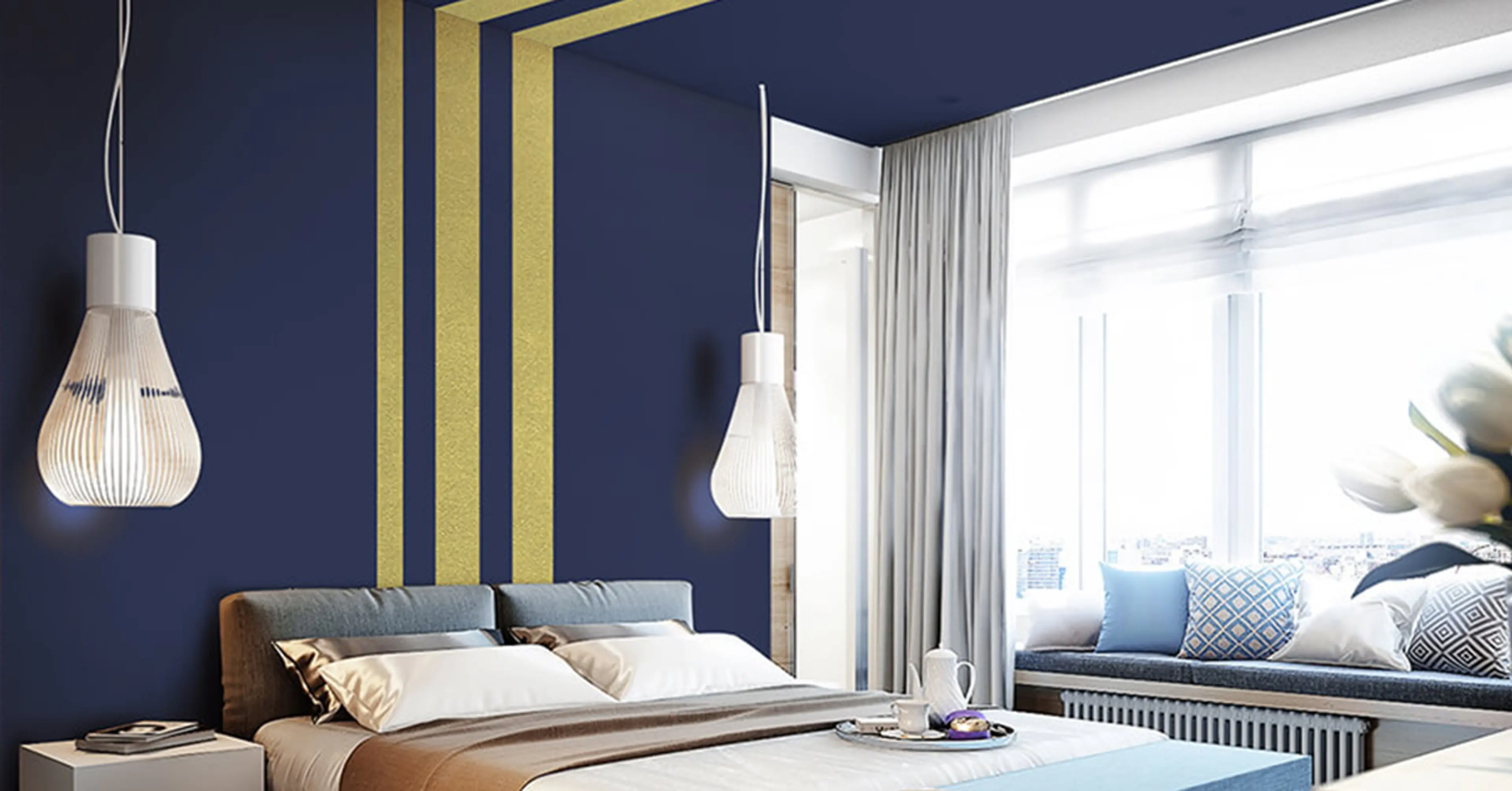
Blue-Purple Combination
With this colour power couple as your home colour combination, you can create an elegant living space for yourself. The combination has an air of sophistication and grandeur.
If you are looking for wall colours that complement the interior design trends for a glamorous living space in 2023, look no further. This is a great combination to work with.
PLEASANT LAKE (5D1070), a pleasing shade of blue and POWERFUL PASSION (5A0422), a glamorous shade of purple from Berger’s Colour Catalogue are an excellent choice to achieve a stylish blue-purple look.
Colour Formed By Mixing Above Two Colours: Lavender
This is a pleasant colour that has a spring-like freshness and a quality of youthful dewiness. This hue can amplify the cheerfulness in any living space.
Our vote goes to SWEET LAVENDER (5D0300) from Berger’s Colour Catalogue to create a similar effect in your home.
Yellow-Green Combination
This colour duo exudes freshness into any room it is used in. It can create the sunniest of spaces, irrespective of the décor.
You can try SUMMER SUN (3A0386), a yellow hue and HOLIDAY GREEN (4A0904), a lush green hue from Berger’s Colour Catalogue for a fabulous look.
Colour Formed By Mixing Above Two Colours: Lime
This hue has a rejuvenating appeal and can bring any room to life. Apart from that, it is a wonderful colour to be around after a long and tiring day.
FLASH OF GREEN (4A0405), an eye-pleasing shade of green from Berger’s Colour Catalogue is a great choice for your walls.
Red-Purple Combination
If you want your guests to be awestruck when they enter your living space, this is the colour duo you should go for on your walls. It is sure to create an interesting space and work as a conversation starter.
We recommend CHERRY PIE (1A0363), which is a deep red hue and ROYAL GIANT (6A1288), which is a lovely shade of purple from Berger’s Colour Catalogue to get this look.
Colour Formed By Mixing Above Two Colours: Magenta
This hue has the power to make a rich and luxurious statement as a wall colour in any room of your home. With this colour, you can create a sumptuous living space with effortless ease.
Since Magenta has been hailed as the Colour Of The Year by Pantone – the global colour authority, we recommend you to read one of our recent blogs, “Best Colour Combinations For Pantone’s Colour Of The Year 2023: Viva Magenta” as you may find inspiration to make your home walls a talking point using this gorgeous hue!
SWEET LOLLIPOP (6D0307), a delightful shade of magenta from Berger’s Colour Catalogue is a great option for the walls.
Conclusion
You can take any of the above tertiary colours in combination or go for a single hue that is formed by mixing the colour combinations mentioned in this blog. If you feel stuck, don’t worry. Our Berger Express Painting professionals are here to help you take the right decision and give your home walls a wonderful, new look!
To book a consultation, SMS ‘XP’ to 56767 or call our toll-free number 1800 103 6030.
You can connect with us by clicking on the ‘Get in Touch’ button below and filling a short form.