Choosing Paint Colours for Calming Interiors Made Easy!
 Jul , 2021
- Berger Speaks
- 4 Min Read
Want to know how to keep calm with the help of colours? Read this blog for some ingenious colour ideas for your home.
Your home is your refuge. It is where you can feel safe and relaxed when life gets overwhelming. It is your shelter, not only to the body but also to your psyche.
How you decorate a space in your home can have a huge impact on how you feel while you are in it. A well-designed space filled with items you love can be calming and helpful in relieving stress.
While the general aesthetic and furnishing choices can set the mood, colour, as it turns out, has been proven to affect your stress levels. Without colour, life would be bleak. Colour is truly the catalyst to your feelings, gently moulding your mood and changing your life.
However, with a rainbow of choice on offer, selecting a calming paint colour can be an agonising affair. Because as important as it is to find paint colours that quell anxiety, it is also equally important to source colour that you love, can live with and will help keep you calm.
Whether you are conscious about it or not, the influence of colours is observed more keenly in the place where you live – your home. The right colours can nurture the soul, revive happy memories, relax your senses and also control how you behave with others in the room.
When it comes to wall paint ideas, our in-house colour experts vouch for colours such as apricot, light green, sky blue, grey and cream. They believe that these colours can create relaxing, light-hearted environments to handle modern-day stresses, especially in the post-COVID world. Therefore, without any further ado, let’s dive right in to understand these colours better.
Apricot

Paint Swatches: Top 3 picks from Berger’s Colour Catalogue are ALPACA (2P0044), APRICOT BLUSH (2P0634), CHERISHED FLOWER (2P0225)
Styling: You may walk into a living room and feel instantly relaxed. Want to achieve the same results? Soften up your living space with warm apricot walls and soft, comfy furnishings, similar to what you see in the above picture. The ample use of wood lends warmth to the space while apricot shade emerges as a clear winner. When looking for interior wall paint that is best-suited for living spaces, you can surely consider this colour without batting an eyelid.
Light Green

Paint Swatches: Top 3 picks from Berger’s Colour Catalogue are ALPINE GLOW (4P0120), ANASTASIA (4P0095), PIXIE (4P0111)
Styling: Light green provides the softest backdrop, giving a sense of calm and warmth. It may be because the colour conjures up nature in our minds and spending time in nature has also been proven to reduce stress and bring peace. The colour green is believed to be the most soothing to the human eye so why not paint the walls a light shade of green to experience the effects of being in nature every single day?
Sky Blue

Paint Swatches: Top 3 picks from Berger’s Colour Catalogue are BLUE CABANA (5D2268), ARTIST’S LOFT (5D2270), BLUE RUG (5A2256)
Styling: Unsurprisingly, Sky Blue is a remarkably calm shade and a universal favourite. The colour is known to slow down heart rate, reduce anxiety and provoke a slower rhythm and a more natural resting state.
It serves as the perfect backdrop for unwinding in the living room after a long day. For a classic scheme that never goes out of style, you can go with a lovely sky-blue wall colour offset by crisp white furnishings – a time-honoured colour combination that never fails! This look is sure to create a serene and inviting appeal.
Grey

Paint Swatches: Top 3 picks from Berger’s Colour Catalogue are DEEP CURRENTS (8D0351), DOLPHIN BAY (8T1805), BAY FOG (8T1797)
Styling: Grey can help create a space of calm and serene wonder. It can slow down the pace and have a stress-relieving effect. With the right shade of grey and industrial furniture, you can achieve a sleek and stylish look. To create a warm and cosy atmosphere, it is wise to go for neutral furnishings. It is sure to bring you into a relaxed state and set a tranquil mood.
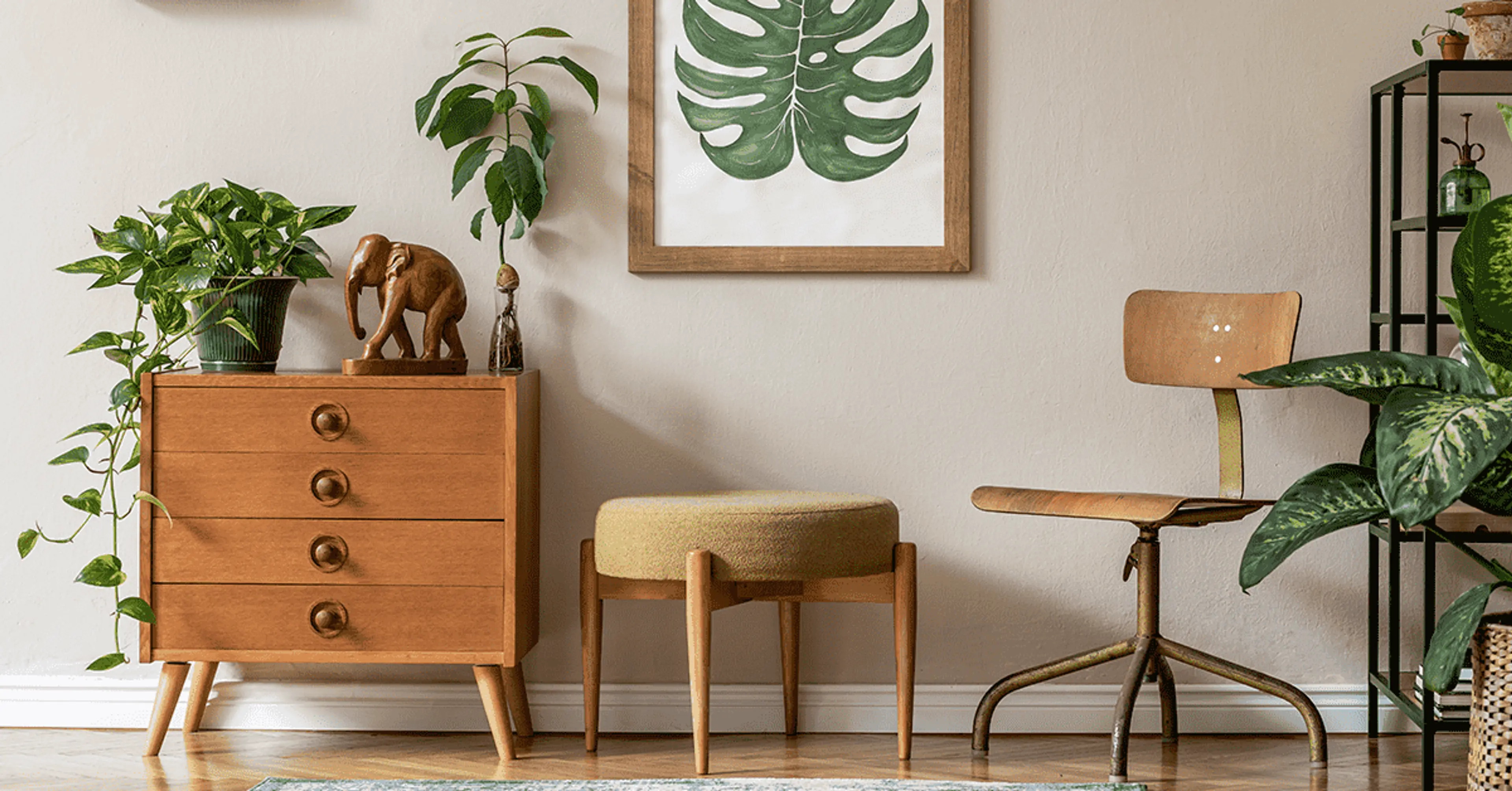
Cream
Paint Swatches: Top 3 picks from Berger’s Colour Catalogue are CREAM SWIRLS (7P0337), ALMONDINE (7P1601), SANDHURST (7P1610)
Styling: Cream is one of the most restful and quiet colours in the entire colour spectrum. Take a look at the photograph above. The wall colour complements the furnishings, helping to create a cosy, warm interior. This colour is so imbued with nurturing feelings that it can give sturdier wood finishes a softer look. You can achieve similar results using the same décor and colour tricks in your living room too.
By now you may have realised that each colour mentioned above tells a tale and has a personality of its own, just like you do. Bottomline is that colour can come to your rescue when you need a little pick-me-up.
We believe that implementing these colour tips will promote the calmest, sanctuary-like vibes in your home. If you don’t fancy plain, solid-coloured walls, you can add some visual interest with the help of iPaint Wall Stencil Kit by Berger Paints India. You can shop it right here in a few clicks: https://shop.bergerpaints.com/
If you need further assistance with home painting and colour consultancy, you can call our toll-free number – 1800 103 6030 or send an SMS ‘XP‘ to 56767. Our experts will be happy to guide you at every step, making your living space an epitome of tranquillity that you wouldn’t want to leave!
Hope you find this blog handy to help create a soothing environment that will de-stress your mind and foster that sense of peace that you need in distressing times like these. Do try out the colour tips and share your thoughts with us in the comments below. We look forward to hearing from you!