A Guide To Colour Blocking When Choosing Wall Paint Colours
 May , 2023
- Berger Speaks
- 4 Min Read
What Is Meant By Colour Blocking
Colour blocking is a new painting technique that is all about striking the perfect balance. In this technique, you need not settle for just one block of colours – you’re allowed to go all out and select contrasting colours that will all come together at the end.
But what exactly is colour blocking? It’s not randomly selecting any colour you like, the block of colours you select need to go together to look appealing.
We’re here to help you understand this exciting new painting method and look at the trending colour blocking walls ideas.
Start With A Palette
There are many blocks of colours to choose from – and it all starts with what energy you want the space to exude. Choose a colour palette that goes with the rest of the house for a more cohesive look.
When you're colour blocking, try using big blocks of colour on walls or furniture. You can also mix colours in smaller things like pillows or rugs to bring everything together.
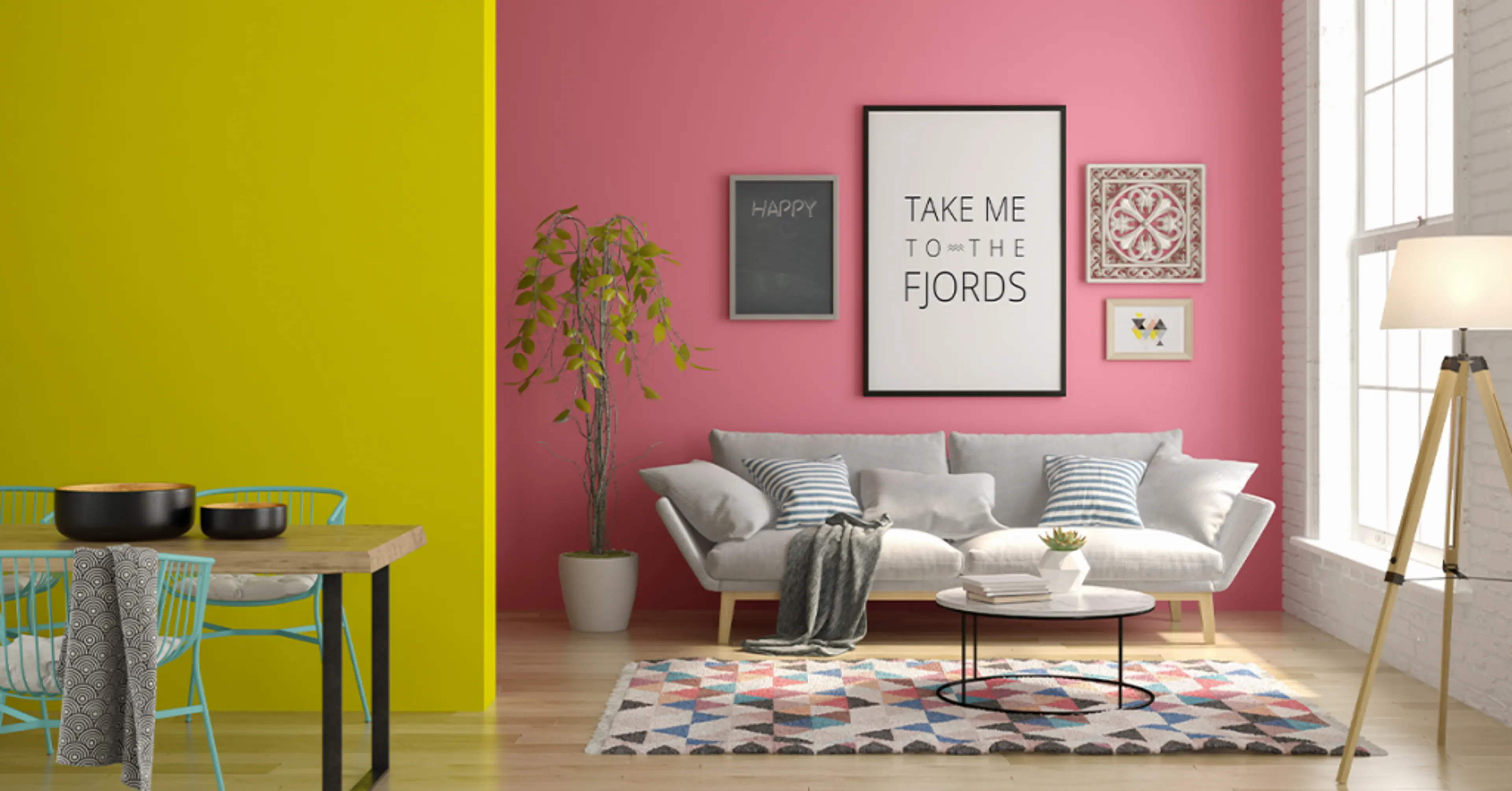
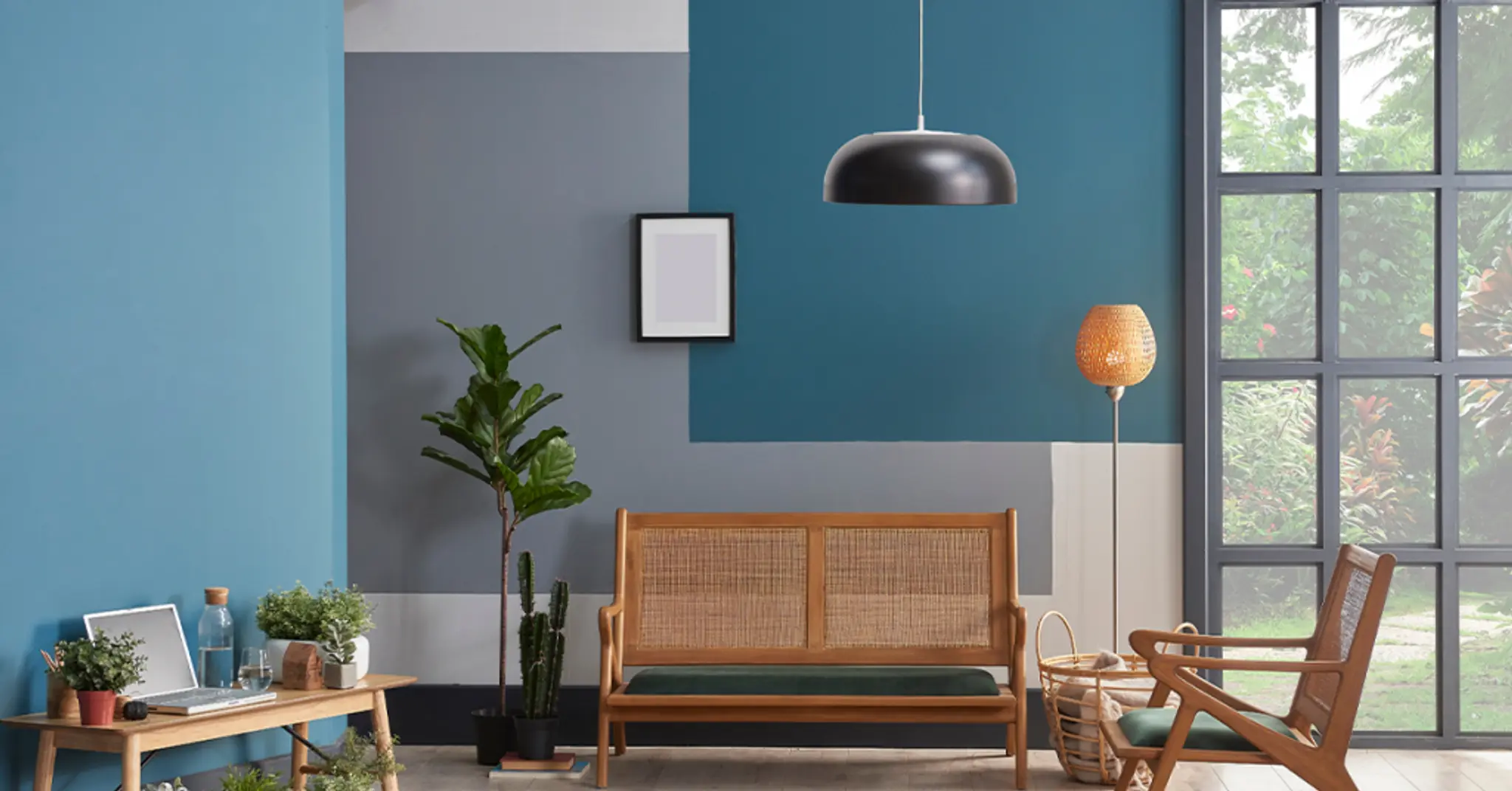
Use The 60-30-10 Rule
- 60% Main Colour: Use one colour for 60% of the room. This is your main colour blocking shade and will cover most of the walls. For example, if you choose light blue, this will be the main colour you see.
- 30% Secondary Colour: In the next block of colours, this other colour will make up 30% of the room. This is your secondary colour. It adds interest and variety. For example, you could use a darker blue or green.
- 10% Accent Colour: Use a third colour for 10% of the room. This is your accent colour, which adds little pops of fun. For instance, a bright white or a sunny yellow can be great accents.

Using this rule, you can create a geometric colour block wall. Imagine painting one large section of the wall light blue (60%), another section dark green (30%), and adding small touches of white (10%). This creates a balanced and visually interesting look. This way, you are also using colour-blocking walls ideas effectively.
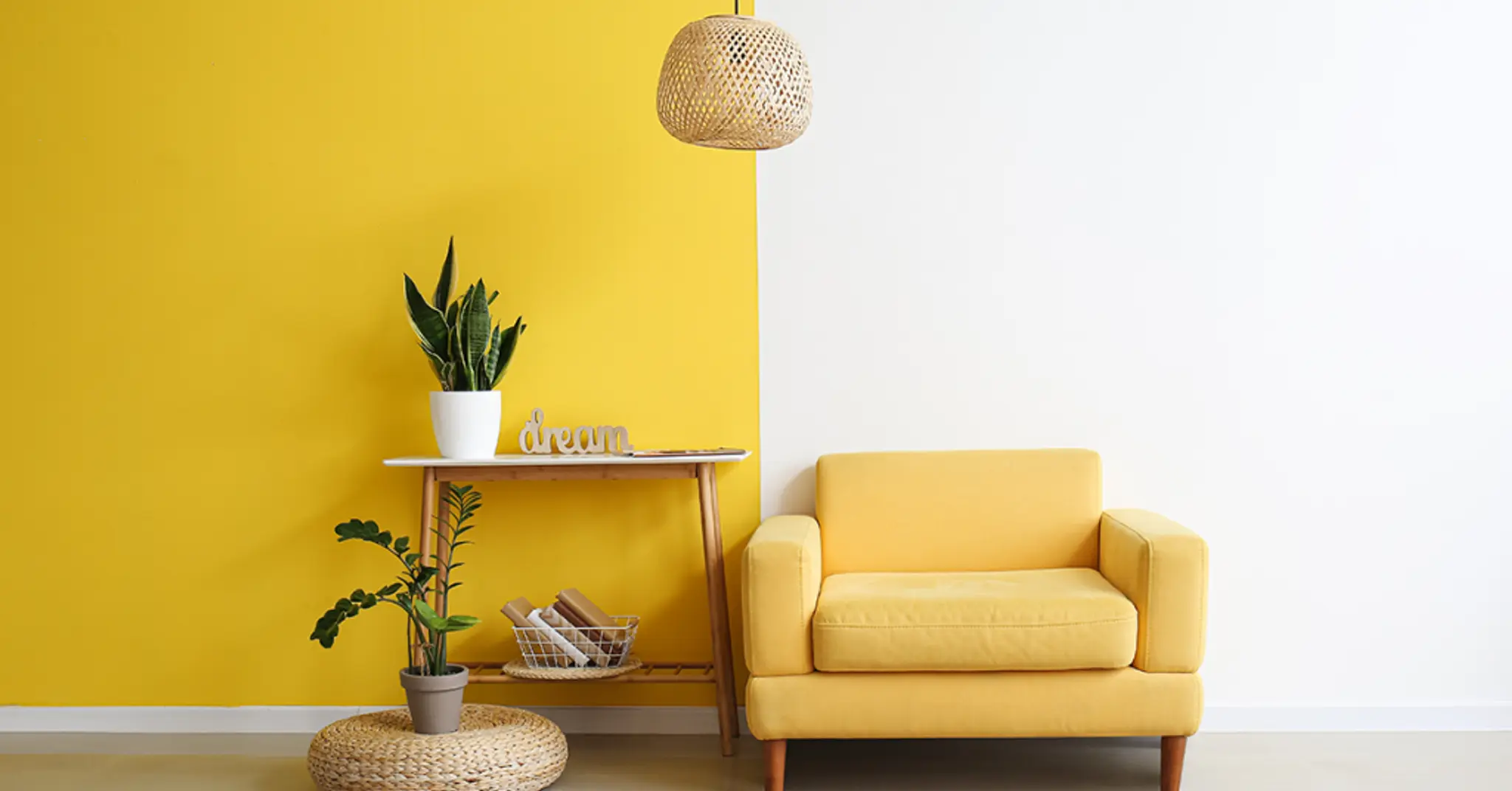
Play With Colour Intensity
Playing with colour intensity can make your walls look more interesting. You can pair a bright colour with a softer one to create contrast.
Imagine having a geometric colour block wall where you use bright yellow and soft grey. The bright yellow grabs your attention, while the soft grey keeps it calm. This mix makes your wall look fun and stylish.
Using intense colours on one wall or in a special area can make it stand out. It’s like giving that part of the room a spotlight!
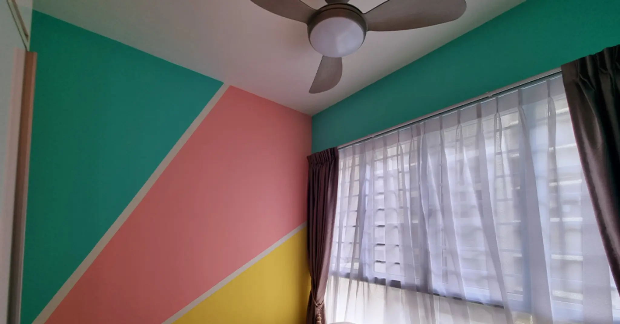
Go Big And Bold With Geometry
Using geometric shapes in your wall design can make your office look super modern and cool. A geometric colour block wall uses different shapes and colours to create a bold design.
Use tape to make fun shapes on your wall, like triangles or squares. Paint each shape a different colour.
This creates a striking and unique look. If you’re looking for colour blocking walls ideas, geometric shapes are a fantastic option. They let you mix and match colours and shapes to make a wall that really stands out.

Consider The Room’s Lighting
Lighting changes how colours look in a room. Natural light from windows can make colours look different at various times of the day. Artificial light, like from lamps, also changes how colours appear.
If your office gets a lot of natural light, go for darker colours. The light will balance them out. But if your office doesn’t get much light, it’s better to choose lighter, brighter colours to make the space feel more open.
Using a block of colours can help you see how different shades look in different lighting. This way, you can pick colours that look good all day long.
Take Note Of Your Furniture And Decor
Your wall colours should go well with your furniture and décor. This means you will need to look at the colours of your office desks, chairs, and drawers.
If your furniture is mainly of colours like black, white, or grey, you can select dark wall colours. For a minimalist look, maintain the colour palette and go for lighter walls. If your furniture is colourful, you will either need lighter walls or good lighting to make the space work-ready.
A colour block wall design can help tie everything together. By using colours that match or complement your furniture, you create a space that looks well put together.

Play With Patterns In A Kids’ Room
If your office is also a space for kids, you can have a lot of fun with colours and patterns. Kids’ areas can be bright and playful. For furniture and accessories, mix and match colours strategically. You can go for geometric colour block wall patterns, alternating blocks of contrasting colours to add visual interest and depth to the walls.

Don’t Be Afraid To Experiment
Finally, colour blocking is all about having fun with colours. Select your favourites and pick an interesting geometric colour block wall. For complete tips and tricks on colour blocking, check out Berger’s Express Painting service now!

check for any query you have about the blog
Frequently Asked Questions
Colour blocking is basically selecting colours on the opposite ends of the colour wheel that don’t clash. This technique is about creating visual contrasts and combinations to make a striking impression. This technique allows for expressive creativity in designing colour block wall designs or geometric colour block wall patterns, transforming spaces with vibrant colour arrangements.
Choosing colours for colour blocking involves a blend of science and artistic intuition. Start by understanding colour theory – how colours interact and their psychological effects. Go for contrasts like red and green or blue and orange to create dynamic energy.
Experimenting with tertiary colours, which blend primary and secondary colours, offers a nuanced approach, providing a rich visual experience.
Whether you're designing colour block wall designs for interiors or exploring colour block living room ideas, understanding these principles helps in creating spaces that not only look vibrant but also evoke specific emotional responses.
To do colour blocking, you'll need paints in different colours and brushes to paint with. You can also use digital tools like apps to plan how your colour block wall designs or geometric colour block wall will look.
Berger Paints has lots of different paint colours that are great for colour block wall designs and making your living room or bedroom look colourful. They can help you pick the right paints and show you how to put different colours together for colour block living room ideas or any other room in your house.
Yes, you can use more than two colours for colour blocking. Traditionally, colour blocking means two contrasting colours. But you can add your own twist to the technique with different combinations and patterns.