Every season is defined by its own set of colours and each colour has the power to transform spaces and spice up surroundings. It's almost magical what a colour can do to the look and mood of a room. How it adds a touch of style and elegance to interiors. So, if you are planning to paint your home in the colours that best capture your favourite season, read on.
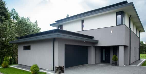
Exterior walls reflect the personality of the homemaker to the world. The right exterior colour makes a home fit snugly with nature, or enables it to stand out dramatically.
So, be it the serenity of the mountains or the mystery of the forests, the calm expanse of fertile plains or the youthfulness of the sea - every unique quality of nature may be reflected through the strokes of a paintbrush.
Berger's range of exterior wall paints have captured the essence of the elements to create a harmony that has an everlasting effect.
Colours can affect you, your home and your work environment. Emotions and moods swings could be the effect of the colour that surrounds you. You could lose your temper faster because you are surrounded by red walls. Or keep your calm longer all because of blue walls. It's surprising what colours can do so pick your colour carefully. We will help you reach the colour best for you.
A word of caution here – not every colour meets with everyone's approval so you could consider a quick dipstick before you pick a colour.
What is it that you are looking for, for your interiors? Something cozy and warm or something that whets your appetite and makes you feel grand? Something which invokes luxury or makes you feel powerful?
Red. That's the colour which you should pick if it's any of the above you are looking for. Be it a bedroom a living room, a restaurant or a corporate dining facility, the bold colour has more personal associations than any other.
For those prone to mood swings, red is a strict no no.
Feeling blue? Well, the colour blue on your walls could change your mood. Good for your health, blue has healing properties like the ability to lower blood pressure and slow down respiration.
You can create a conservative office environment with a dash of blue. Recreate the serenity and calm of the oceans in any room you please. The colour blue captures the airy blue skies – one of the few things that is constant in our lives. And if its serenity holds no charm for you, try the electric or brilliant blues for a more dynamic and dramatic look which make spaces more exhilarating.
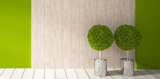
If you love the trees and the green meadows, paint your walls green. Capture the tranquility of nature. A symbol of fertility, success and harmony green doubles up as a warm and a cool colour. Refreshing and soothing to the eye, green works as an ideal backdrop in interior design because we are so used to seeing it everywhere.
The natural greens, from forest to lime, are seen as tranquil and stimulating, with a natural balance of cool and warm (blue and yellow) undertones.
Feel the sunshine. The warmth and the joy as you go humming through your rooms feeling like you are on top of the world.
Sometimes it's just a wee bit of yellow you need to raise your spirits and rediscover the bubbly you. A golden yellow to light up a much ignored closet space. A paler hue to add a bit of calm. A soft yellow to brighten a kid's room. With yellow you can infuse surroundings with optimism and energy.
Better check with those around you before you paint your rooms orange. It is the one colour which is either absolutely adored or hated passionately!
This close relative of red adds fun and flamboyance, warmth and energy to every situation. A colour that connotes 'get what you pay' philosophy can make or mar a business. Some of the tones of orange such as terra cotta, peach or rust have very broad appeal..
Want to give your rooms a delicate, sophisticated look? Or a colour which boosts your child's creativity and aids concentration?
Purple is what you are looking for. Contrast it with a warm grey and you have a great at combination for the home office.
Deep or bright purples add richness while lighter purples give rooms a more romantic and delicate air. Because purple is derived from the mixing of a strong warm and strong cool colour it has both warm and cool properties.
Be it fashion or environmentalism, economic and social trends have a direct effect on home décor and colour trends. Wondering if the adverse effect on the economy impacted the style and elegance of homes? Well, it did.
There is no denying the role played by it in creating the 2014 home décor trends. Take a look at the top 5 simply magical trends.
 Colours from
 This is to certify that Lewis Berger Home Painting have painted my house for the second time. I am extremely satisfied with the way they concluded the job and have no hesitation in recommending them wholeheartedly.
KNOW MORE + Green
Green This is to certify that Lewis Berger Home Painting have painted my house for the second time. I am extremely satisfied with the way they concluded the job and have no hesitation in recommending them wholeheartedly.
KNOW MORE + The Iron
 This is to certify that Lewis Berger Home Painting have painted my house for the second time. I am extremely satisfied with the way they concluded the job and have no hesitation in recommending them wholeheartedly.
KNOW MORE +This is to certify that Lewis Berger Home Painting have painted my house for the second time. I am extremely satisfied with the way they concluded the job and have no hesitation in recommending them wholeheartedly.
KNOW MORE + Timeless
 This is to certify that Lewis Berger Home Painting have painted my house for the second time. I am extremely satisfied with the way they concluded the job and have no hesitation in recommending them wholeheartedly.
KNOW MORE +